Vinayak M
Results-driven Creative Producer and Senior Hybrid Animator
New to Contra
Vinayak is building their profile!

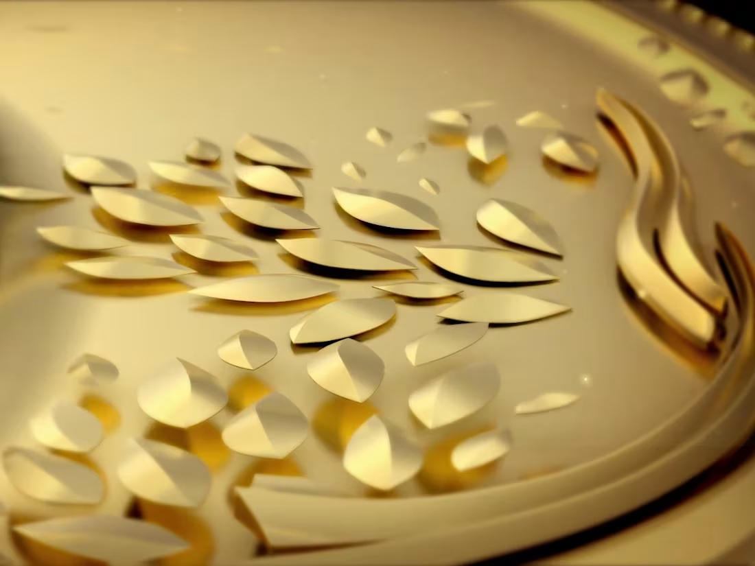
SWA Awards Trophy "Gold Spun from Words"
A screenwriter turns words into worlds - this trophy turns gold into a story.
At its heart is a phoenix-meets-quill emblem, wings unfurling outward. The phoenix captures the writer's craft: stories written, rewritten, and reborn draft after draft, until something rises and takes flight. The pen nib opening into wings is imagination set free.
Around it, concentric rings each carry meaning - a congregation of golden figures representing the writers' community, radiating spokes like a spotlight of recognition, and ornate borders of beaded rope, petals, and calligraphic flourishes that honour Indian artistic heritage. The "SWA Awards" name is engraved straight into the metal.
Every element was modelled as real 3D geometry - true bevels, depth, and edges - so light catches each surface like genuine jewellery-grade gold. Nothing is stock; every piece was built, lit, shaded, and animated from scratch.
The animation reveals it as a journey into the craft: opening deep inside the swirling detail, almost abstract, then pulling back and rising until the full emblem and name settle into frame - fragments resolving into a finished story, just like a script.
0
19

This project for BellAmore, a sub-brand of Asian Paints.
This project focuses on highlighting the premium quality and inspiration behind the faucet range from BellAmore. Our goal is to showcase the elegance and superior craftsmanship that define this collection.
0
36
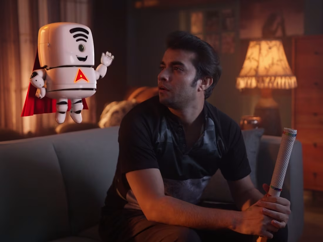
This Film is for the ACT Fibernet TVC. This campaign is specifically designed for the IPL (Indian Premier League) and features the "Jippy" mascot.
The concept revolves around "Jippy" resolving various internet-related issues to highlight ACT Fibernet's reliability during the cricket season.
0
49
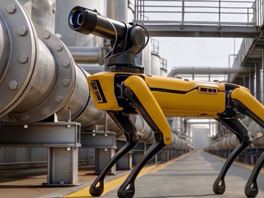
This is a short version of a film series for our client, which demonstrates how their technology supports oil refineries and desalination plants.
Notably, we created and animated every character and environment in this series entirely using AI tools.
2
1
87
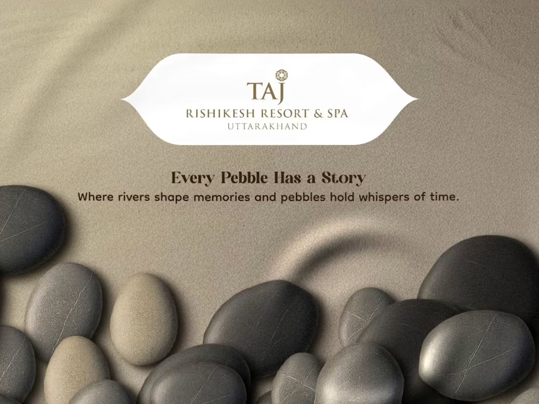
The project details and creative direction for Taj Rishikesh.
The objective is to create a premium interactive UI website-style motion reference that embodies calm, luxury hospitality. The design should utilize pebbles as the central metaphor; every button, navigation point, and transition should feel physically connected to a pebble and sand environment.
The overall UI must feel calm, premium, organic, and resort-like, moving away from anything that feels techy or corporate.
0
74