Vakul - Graphic Designer | Contra
Work by Vakul
Sign Up
Post a job
Sign Up
Log In
Vakul
UX & Graphic Designer
Message
Follow
New to Contra
Vakul is building their profile!
Followed by
GALLERY L
Plano, USA
Work
Posts
About
Plano, USA
1
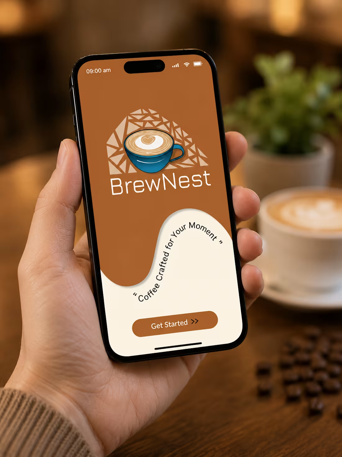
BrewNest Coffee App - > Why does ordering coffee on apps sometimes feel more complicated than it should be? So I set out to design a calmer, more intuitive experience - one that helps users decide faster, not think harder. With BrewNest, I focused on: ✨ Reducing cognitive load through clear visual hierarchy 📱 Creating a smooth, minimal ordering flow 🎯 Designing with intention - every screen, every interaction ⚡ Using subtle animations to make the experience feel responsive and alive One of my biggest learnings from this project was understanding that good design isn’t about adding more - it’s about removing what’s unnecessary.
1
74