
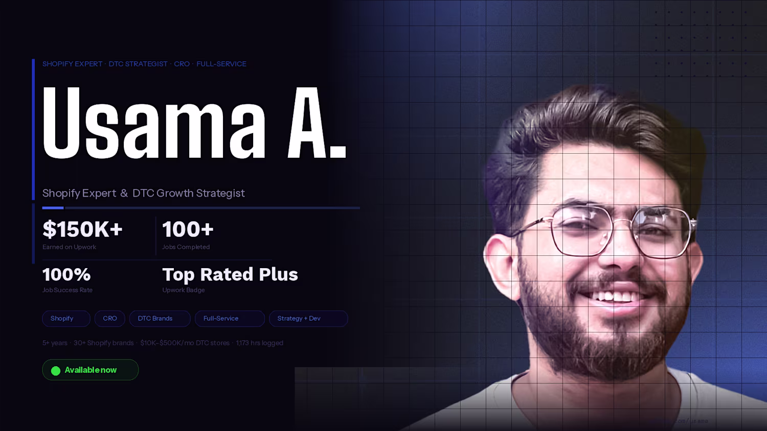
Usama Ashraf
Experienced Mobile & Web Developer
Ready for work
Usama is ready for their next project!
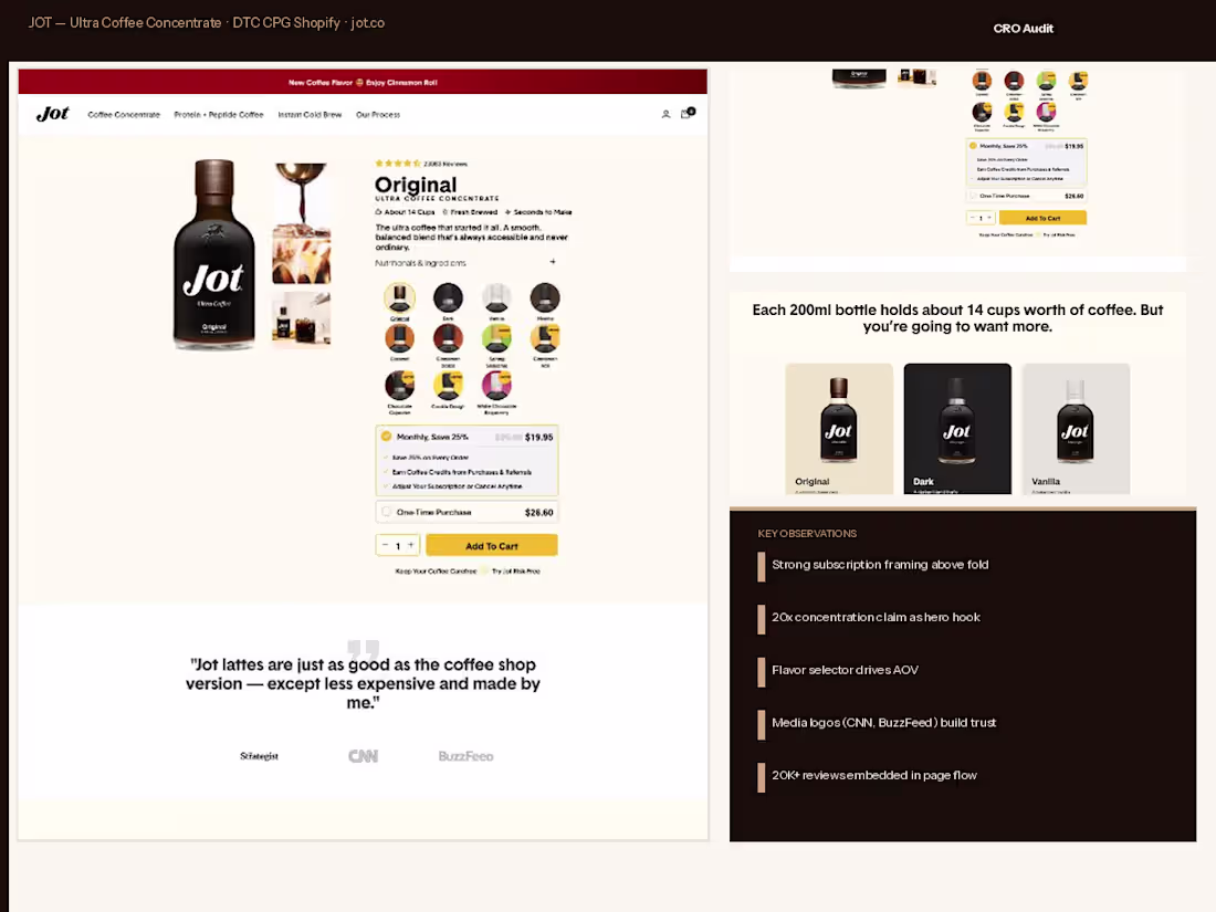
JOT Coffee
Jot already had proof.
CNN coverage, BuzzFeed features, 20,000 verified reviews, and a product that genuinely delivered on its promise of cafe-quality coffee in seconds.
Our job was to make sure the store did not get in the way of all that credibility. We came in full-service and started with a conversion audit that revealed the subscription pricing was buried and the 20x concentration claim, their single strongest hook, was not hitting above the fold. We redesigned the PDP from the top down.
The 20x statement became the anchor of the hero. The subscription plan was brought forward with a clear Save 25% label and a frictionless toggle between monthly and one-time purchase.
We built a custom flavor selector for Original, Dark, and Vanilla that pulled live inventory and visually differentiated each SKU with its own color treatment.
The media logos, Strategist, CNN, BuzzFeed, were repositioned as a trust strip directly under the hero rather than buried mid-page. Review cards were redesigned as a masonry grid to give the social proof section editorial weight.
Development was clean Shopify 2.0 with performance-first mobile builds. Jot had the brand. We built the store to match it.
0
20
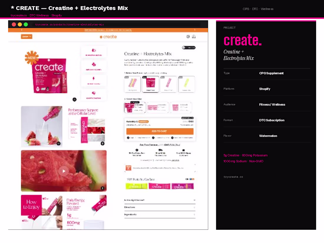
Tryecreate | Creatine + Electrolytes Mix
Brand came in with a bold visual identity, a clinically dosed formula, and a message they believed in deeply: this supplement is built for everybody, not just gym bros.
The challenge was translating that inclusivity into a Shopify store that could convert across a wide audience, athletes, runners, and people who had never touched a supplement in their life. We handled the full build. Strategy started with repositioning the ingredient story from a label-read into an education experience.
We designed the What's Happening In Your Body section as a week-by-week timeline showing exactly what creatine and electrolytes do from day one through week four, turning skeptics into buyers through transparency. The hero was rebuilt around the pink brand identity with the asterisk mark as a visual anchor, the Watermelon flavor leading, and the Subscribe and Save CTA above the fold.
Ingredient callouts for 5g Creatine, 600mg Potassium, and 1000mg Sodium were designed as bold stat cards rather than fine print. The UGC section was developed with video testimonial embedding and a scrolling review strip. Mobile was treated as the primary canvas throughout.
Development on Shopify with custom metafield-driven ingredient blocks for easy SKU expansion.
0
43
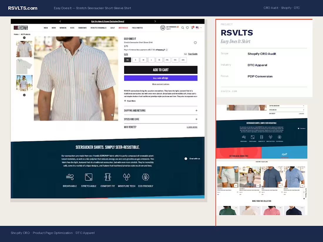
RSVLTS
https://rsvlts.com/
RSVLTS came to us with a product that sold itself, a stretch seersucker shirt with 20,000+ five-star reviews and a cult following.
The problem was their product page was not converting at the rate their brand deserved. We came in full-service: audited the entire PDP, restructured the above-the-fold layout to lead with the hero image and size selector simultaneously, and rewrote the copy hierarchy so the eco-friendly SORONA fabric claim hit before the scroll.
We rebuilt the social proof section to surface the review count earlier, repositioned the Afterpay badge directly under the price to reduce purchase anxiety, and tightened the feature icon row so Breathable, Stretchable, and Eco Friendly read in under two seconds.
On the development side, we optimized page load for mobile-first rendering since 70%+ of their traffic came from phones. The You May Also Like grid was rebuilt with intent-matched cross-sells pulling from the same seersucker collection to increase AOV.
End result: a product page that finally matched the energy of the brand, confident, clean, and built to convert the $70 price point without friction.
0
28
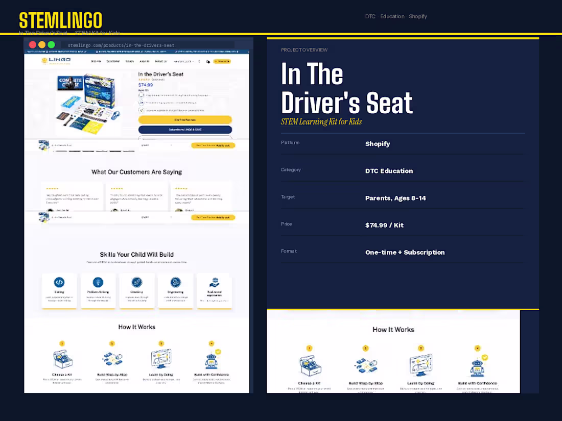
STEMLINGO
STEMLINGO reached out right before a major product launch. They had a solid STEM kit for kids, a genuine before-and-after story (doomscrolling to building), and a founder who deeply believed in the mission. What they did not have was a Shopify store that communicated any of that.
We took the project from zero, strategy, design, and development. The positioning work came first: we identified that parents were the buyer but kids were the user, so every section had to speak to both simultaneously.
We built the hero section around the transformation narrative, designed the How It Works flow as a four-step visual journey, and created a Before and After section using real lifestyle photography to make the emotional case before the logical one.
On the pricing page, we architected the subscription-first layout, making the monthly plan visually dominant while keeping the one-time kit available for lower-intent buyers.
The subscription card got a Best Value badge, a parent dashboard callout, and a cancel anytime reassurance to reduce commitment friction.
Development was Shopify with custom section builds for the skill grid and the comparison plan toggle. Launched on time, ready to scale.
0
40