

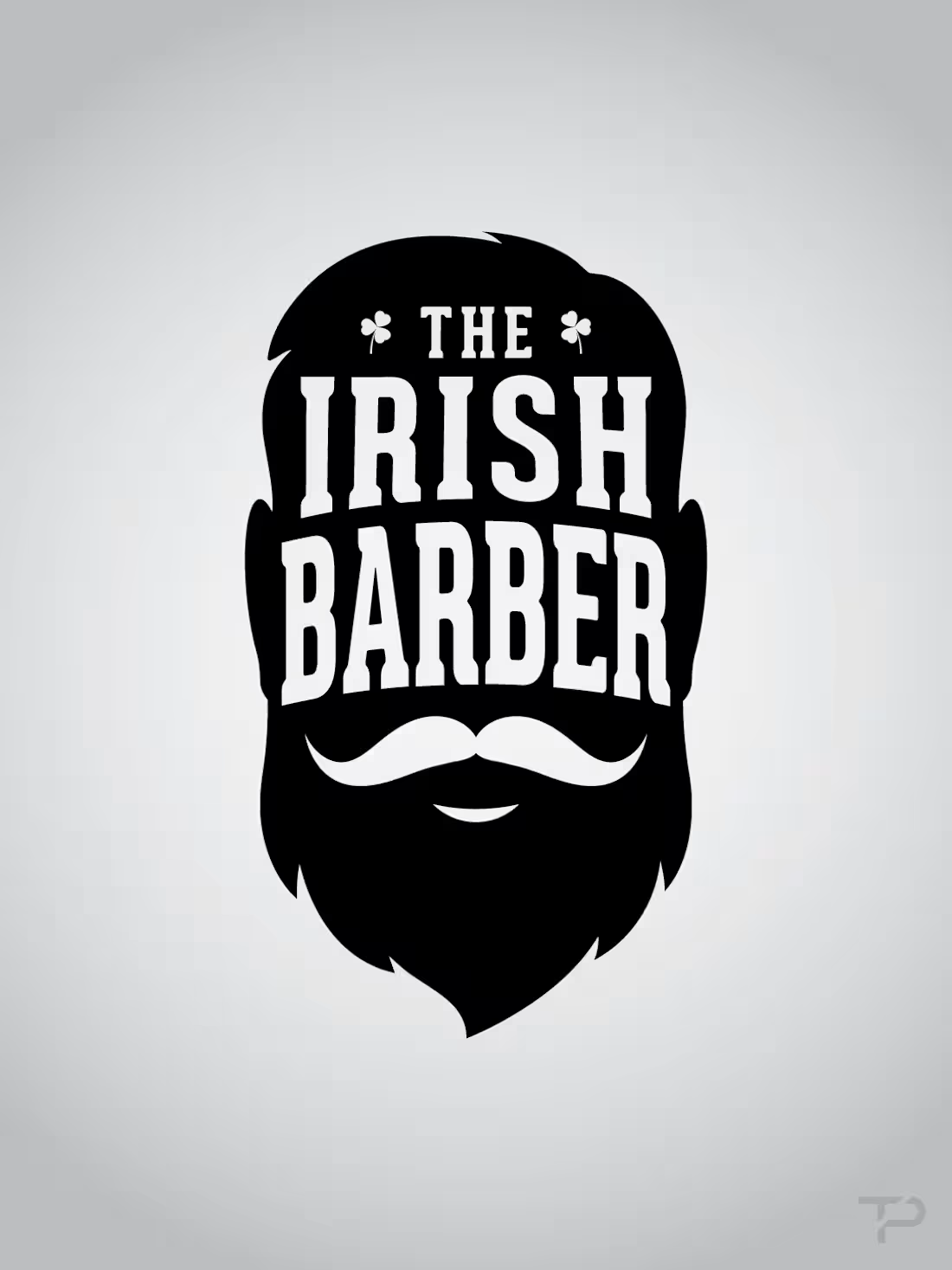
The Irish Barber needed a brand identity that felt classic, masculine, and rooted in Irish heritage without becoming overly themed or gimmicky. The project explored multiple logo directions, badge concepts, custom typography, clover and harp details, barbering symbols, and vintage-inspired mark systems built for a one-chair barbershop experience. The final concepts created a strong foundation for a memorable local brand that could carry across signage, apparel, social content, appointment materials, and shop merchandise.
0
9
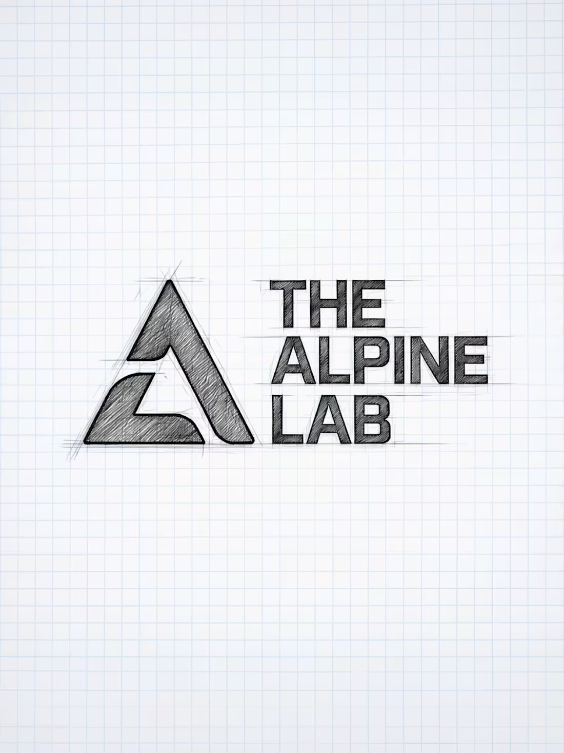
The Alpine Lab needed a rugged, trustworthy brand system for a personal outdoor project focused on simple, helpful products for real mountain use. The project included logo development, brand direction, photography, apparel concepts, business card design, and product packaging for the Kik Pik, a compact tool created for backcountry and climbing environments. The final identity feels clean, durable, and adventure-ready, giving the brand a flexible foundation that can grow from a single product into a broader outdoor lifestyle brand.
0
15
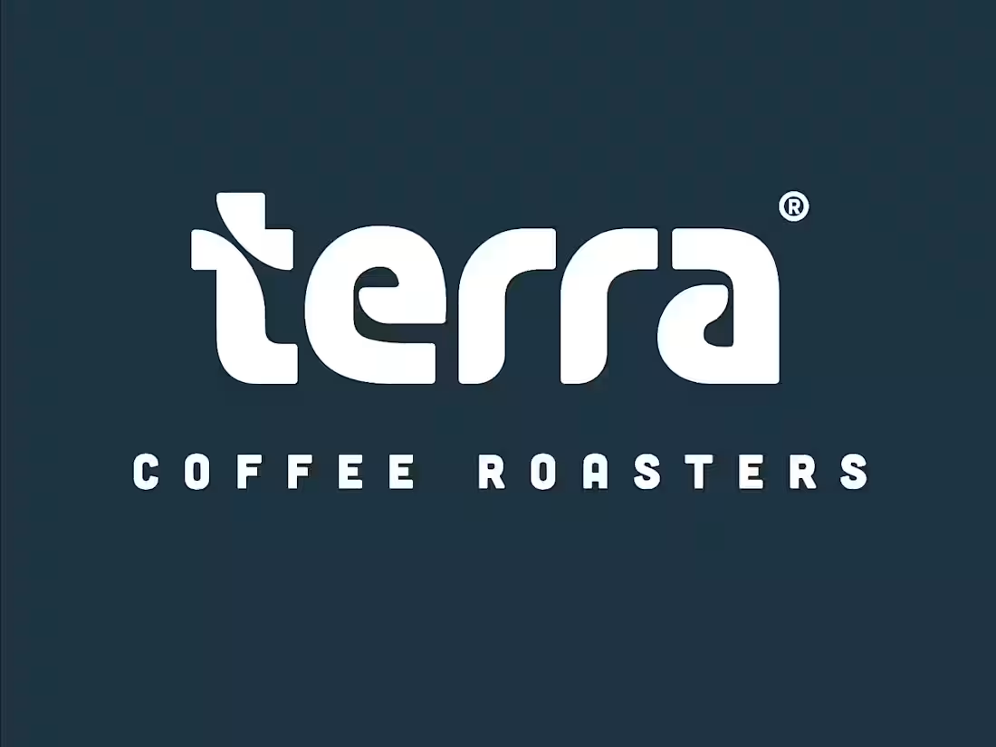
Terra Coffee Roasters needed a brand identity that felt modern, grounded, and premium while still feeling warm and approachable. The project explored a custom wordmark, distinctive “t” icon, color palette, packaging concepts, cup design, and storefront applications built around a clean, crafted visual system. The final direction creates a polished coffee brand with a strong sense of place, giving Terra a flexible identity that can carry across retail packaging, café signage, merchandise, and everyday customer touchpoints.
0
18
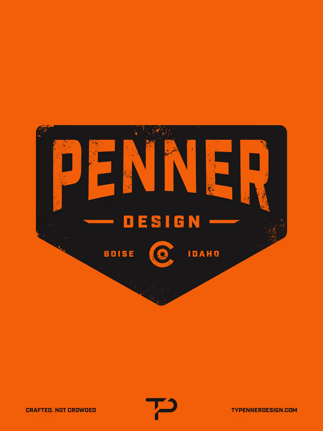
Penner Design needed a personal brand system that felt bold, crafted, and ownable while reflecting a hands-on approach to design. The project explored custom badge concepts, typography, brand marks, texture, color, and supporting visual elements built around a gritty, confident, and highly recognizable style. The final direction creates a strong foundation for a freelance design brand that feels memorable, practical, and ready to carry across a website, social content, merchandise, print materials, and client-facing touchpoints.
0
27
OC Auto Club needed a sleek visual identity that captured the energy of car culture while feeling polished enough for a premium automotive community. The project included logo development, typography, color exploration, horizontal and stacked logo variations, apparel concepts, signage, and branded touchpoints built around the ideas of speed, culture, and cars. The final identity feels modern, minimal, and performance-driven, giving the brand a strong foundation for events, merchandise, digital content, and future community growth.
0
31
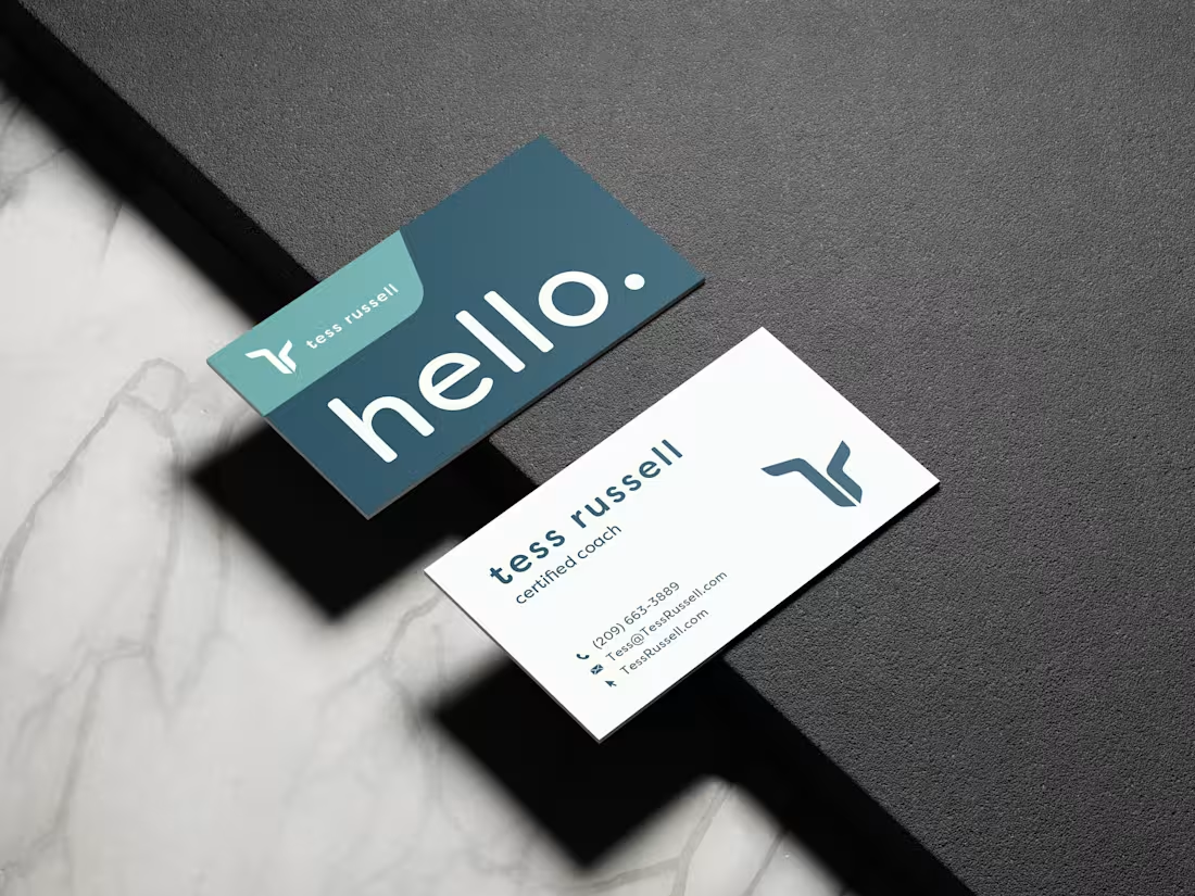
Tess Russell needed a clean, confident brand and website that matched the depth of her leadership and personal development coaching work. The project included logo development, visual identity, business card design, color and typography direction, and a full website design and build focused on clarity, trust, and ease of use. The final result gives Tess a polished, approachable presence that clearly communicates her services while feeling calm, structured, and personal.
1
1
45
Crazy Ape Brewing Company needed a bold, memorable brand identity with enough personality to stand out in the craft beer space. The project centered around a custom illustrated ape mascot, supported by a flexible logo system, badge marks, typography, color palette, pattern work, and branded merchandise applications. The final identity feels playful, gritty, and instantly recognizable, giving the brewery a strong visual foundation that can carry across packaging, apparel, taproom materials, and future brand touchpoints.
0
44
iCoachStrengths needed a brand identity and website that felt credible, professional, and approachable while supporting workshops, coaching, and digital resources. The project included a flexible logo system, supporting marks, typography, color palette, brand guidelines, website design, presentation materials, participant forms, and printed workshop pieces. The final result created a cohesive visual system that clearly communicates the brand’s focus on connection, collaboration, and personal growth across every client touchpoint.
1
1
46
Havoc Network Solutions needed a brand identity and website that felt modern, credible, and built for a technology-driven business. The project included logo design, color palette, typography, brand guidelines, business card design, and a responsive website that clearly presented their IT consulting, software development, and cybersecurity services. The final result gave Havoc a polished and professional presence that feels clean, confident, and easy to navigate across every touchpoint.
1
1
42