Abu Turab Asim - Product Designer | Contra
Work by Abu Turab Asim
Sign Up
Post a job
Sign Up
Log In
pro
Abu Turab Asim
Helping tech companies grow through design
Message
Follow
Ready for work
Abu Turab is ready for their next project!
Followed by
Sian V
,
Hella F
, and
Toukir R
Lisbon, Portugal
Work
Posts
Services
About
Lisbon, Portugal
1
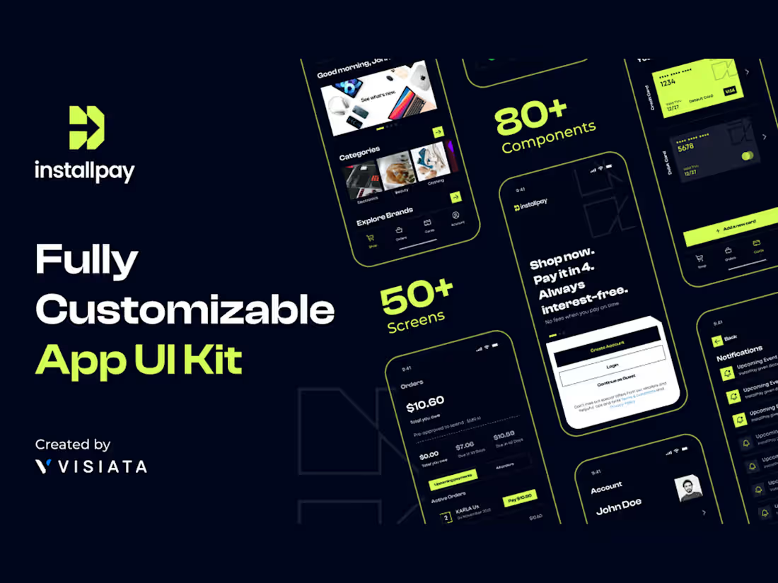
InstallPay: Buy Now, Pay Later App UI Kit InstallPay is a BNPL app UI kit I designed and released as a standalone product. It covers 50+ screens and 80+ components across onboarding, shopping, card management, orders, payments, notifications, and account settings, all sitting on one design system so a team can ship a working fintech product without starting from zero. Every screen is built around real BNPL behaviour: splitting a purchase into four interest-free payments, tracking total owed against what's due in 30 and 60 days, adding and switching between credit and debit cards, browsing brands, and setting a 4-digit PIN for quick login. Components use variables and auto layout, so colour, type, and spacing update across the whole file in a single pass instead of screen by screen. I made this because most fintech kits stop at pretty screens and fall apart the moment you need a real payment schedule or a card state that isn't the happy path. This one is meant to be picked up and built on. It's available on Figma Community and Lemon Squeezy. #UIDesign #UXDesign #MobileAppDesign #DesignSystems #Figma #Fintech #ProductDesign
1
1
6
0
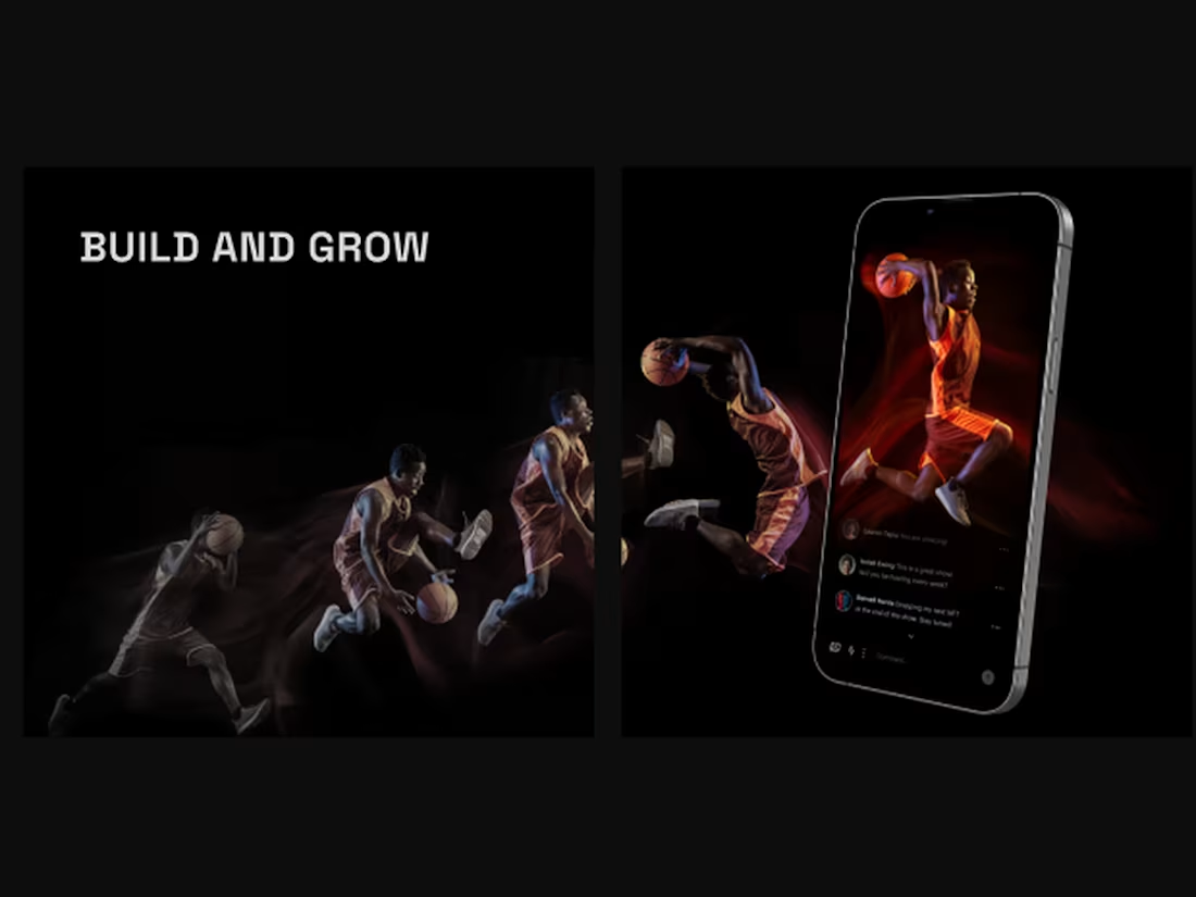
Streak wanted a platform where fans could connect with local sports players, follow athletes they already care about, and discover new talent early. Fans could also buy NFTs tied to the athletes they support, so backing someone actually meant something. I started by studying the client's existing app and mapping out product requirements before designing anything. From there came research, analysis, and low fidelity wireframes shared with the client to make sure we were aligned. Once that was locked, I moved into high fidelity concepts with prototyping, navigation, and micro interactions. The visual direction is dark and moody with fluorescent accents, built on Graphik with a black and white base palette so the athlete photography carries all the energy. I designed the marketing website and the mobile app together, covering athlete profiles, fan community feeds, live streaming, and exclusive access to collectibles. #ProductDesign #UIUX #Web3 #NFT #MobileAppDesign #WebDesign #SportsTech #DarkUI
0
44
1
Dunmor is a real estate lending platform serving investors who need financing fast. They came to us for a website design that could carry the brand and convert at the same time. The core problem was product complexity. Dunmor offers four lending products, fix and flip, bridge, construction, and rentals, and each one speaks to a different borrower with different questions. The old site treated them as a flat list. We rebuilt the site around modules so every product gets its own entry point, its own numbers, loan size, leverage, interest rate, and its own path to a quote. We ran interviews, competitor analysis, and research first, then used a moodboard to lock the visual direction with the client early. That saved rounds later. From there it was wireframing, prototyping, and visual design on top of a defined design system. The direction leans dark, electric blue and lime against deep navy. It reads like a fintech product rather than a mortgage broker, which was the point. Real photography keeps it grounded so the tech feel never gets cold. Mobile mattered more than usual. Dunmor's clients are contractors and investors checking loan terms between site visits, so every page works as a vertical scroll with full loan detail available, no desktop login needed. We delivered the website design, the responsive mobile experience, a reusable module library, and a design system the client's team can build on. #WebsiteDesign #UIUXDesign #ResponsiveWebDesign #Fintech #RealEstateTech
1
71
1
VMGNT — Talent Management is a UK talent agency representing models who work with names like Elle, Longchamp and Chloé, and until this project they had no real digital home. Everything lived on Instagram. They wanted a site that could carry that level of talent without competing with it, which is a harder brief than it sounds, because the work is photography and video and the design has to get out of its way. I went with a stark black and white palette and pushed the interface to the edges so imagery fills the screen, with the logo held quietly in the corner. The talent grid lets visitors browse by city and category, and each model gets a full profile with lookbooks, editorial work and social reach. Adding model lookbooks was the change that shifted the site from a directory into something people actually stay on. I designed it responsive from the start, since most people find talent on a phone, and ran contrast research through the colour work so the type stays legible against full bleed photography for anyone with a visual impairment.
1
1
143