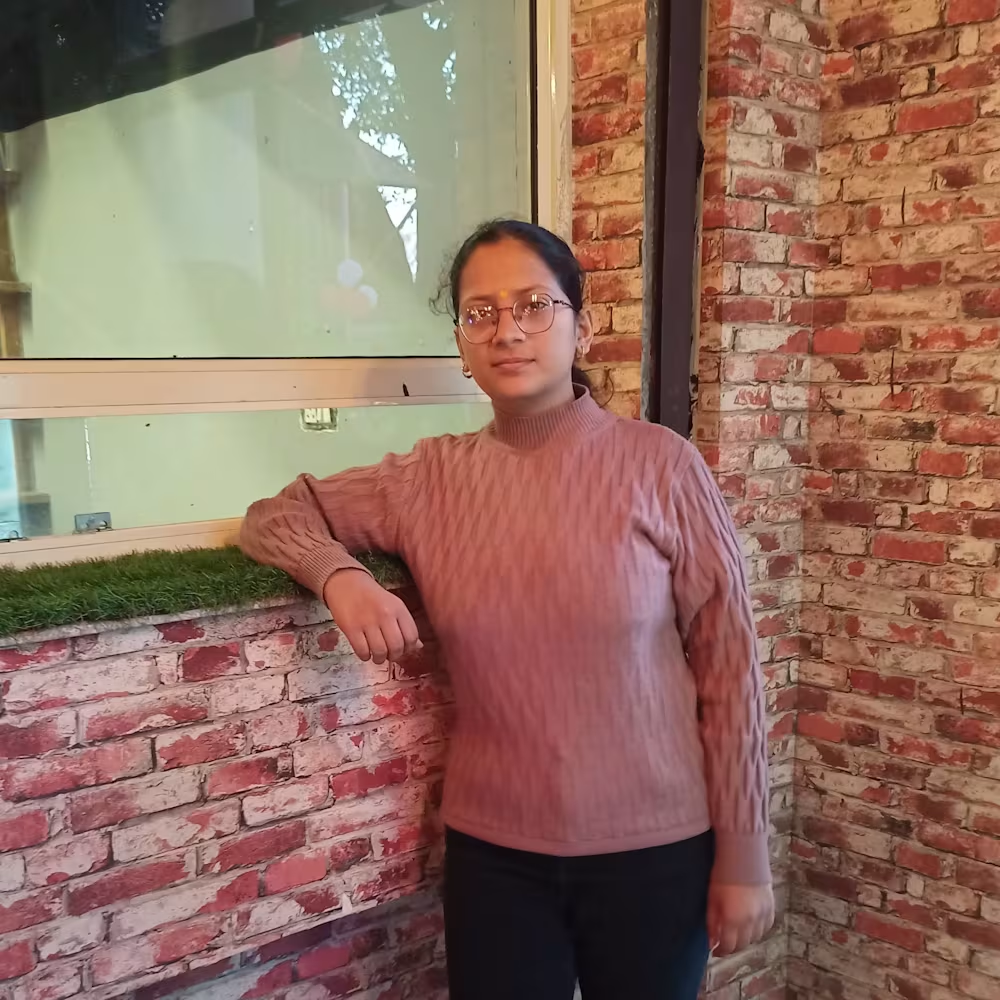
Toshika Bajpai
Bringing Your Vision to Life with Precision and Creativity
New to Contra
Toshika is building their profile!
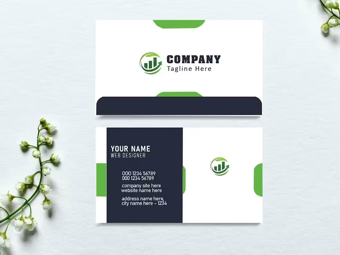
Minimalist Brand Identity | Premium Business Card Design
The Challenge
The goal was to translate a brand’s digital identity into a physical, tactile experience. A business card isn't just a contact tool—it’s a first impression. The challenge was to create a layout that felt high-end and modern while maintaining perfect legibility for essential information within a compact $3.5" \times 2"$ canvas.
The Solution
I developed a double-sided, print-ready design focused on "white space" and high-contrast typography to ensure a premium feel.
Visual Hierarchy: Front-side focus on a clean logo mark for brand recognition, with a back-side dedicated to a structured, easy-to-read contact layout.
Print-Ready Precision: Executed the design with industry-standard CMYK color profiles, 300 DPI resolution, and a $0.125".
1
18

Cinematic Product Commercial | Sunscreen Brand Campaign
The Challenge
The objective was to produce a high-energy, 40-second social media commercial for a premium sunscreen brand. The goal was to move beyond static imagery and create a sensory experience that communicates "refreshment" and "UV protection" instantly. I needed to ensure the pacing felt modern and high-end to match the skincare industry's aesthetic while maintaining brand clarity.
The Solution
I executed a full post-production workflow to transform raw product footage into a polished, conversion-focused advertisement.
Dynamic Pacing & Rhythm: Used "speed ramping" and rhythmic cuts synced to a summer-inspired soundtrack to maintain high viewer retention.
1
36

Real Estate Social Media Branding | Modern Property Listing
The Challenge
The goal was to design a premium, high-conversion social media post for a luxury real estate listing. The challenge was to balance a large amount of property information—including exterior and interior views, contact details, and brand messaging—without making the layout feel cluttered or overwhelming.
The Solution
I utilized a sharp, geometric design language to create distinct zones for imagery and text, ensuring the viewer's eye flows naturally from the property's beauty to the essential sales information.
Geometric Framing: Used angular, bold green and charcoal shapes to create a modern, structured feel that reflects architectural stability.
Typography & Hierarchy: Prioritized "ELEGANT HOME FOR SALE" in a clean, sans-serif font for immediate impact.
1
30
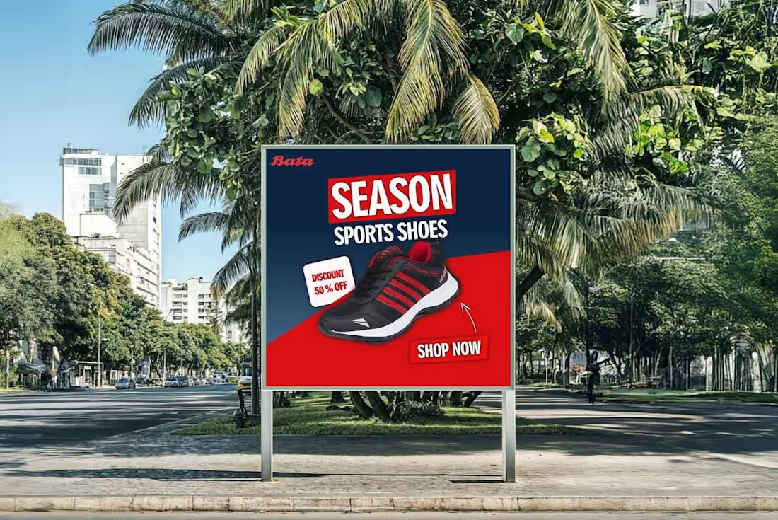
High-Impact Billboard Design | Sports Footwear Campaign
The Challenge
The objective was to create a bold, high-visibility outdoor advertisement for a seasonal sports shoe promotion. In a cluttered urban environment, the design needed to achieve three things: instant brand recognition, clear communication of the "50% Off" offer, and a strong call to action—all within a 3-second viewing window for passersby.
The Solution
I developed a high-contrast visual identity using a dynamic diagonal split.
Color Theory: Used a deep navy and vibrant red palette to create a sense of urgency and athletic energy.
Visual Hierarchy: Placed the product at the focal point with a clean "Shop Now" CTA and a secondary "Discount" callout to ensure the viewer's eye follows a logical path.:
1
41