
Praise Onyenwe
UI Designer & Framer Developer crafting high-converting webs
New to Contra
Praise is ready for their next project!

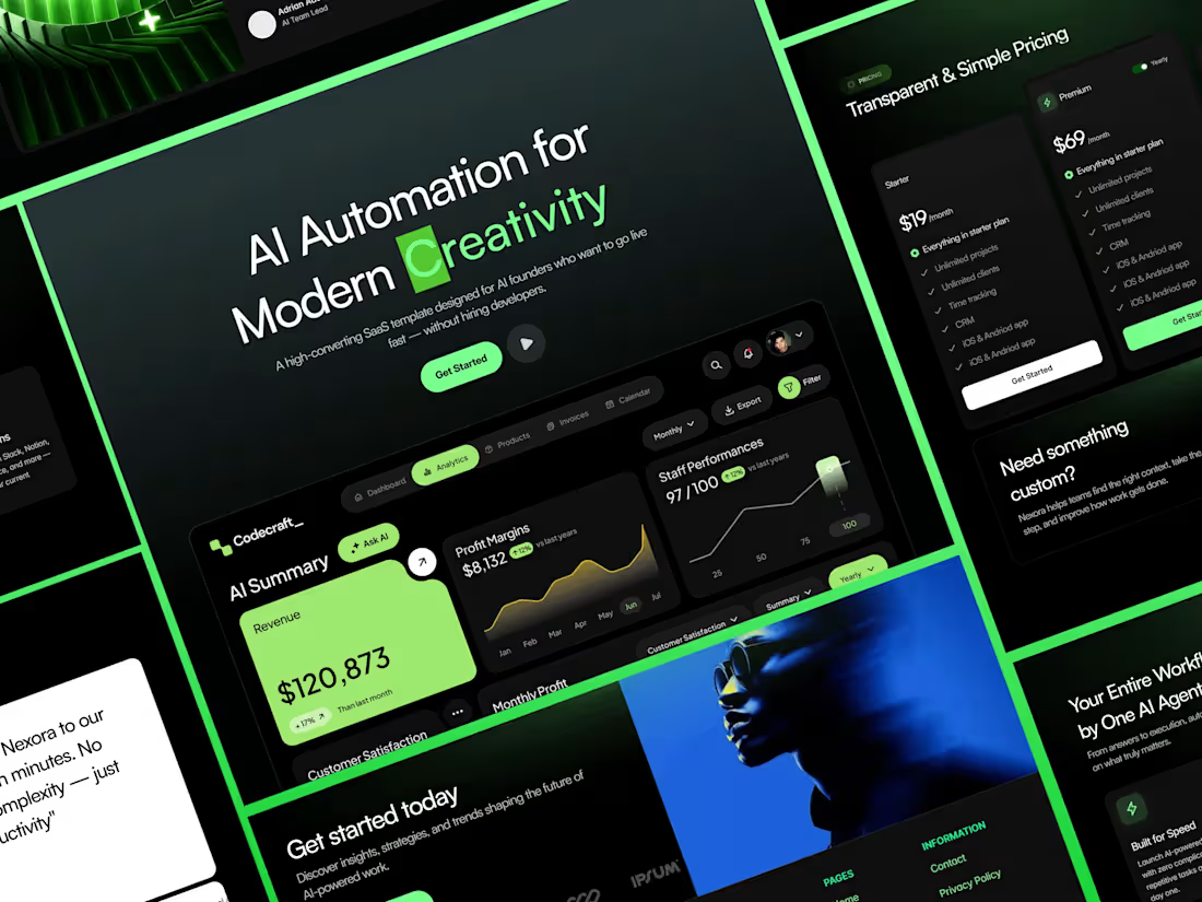
Nexzora is a premium AI startup and SaaS website template built for founders, creators, and businesses that want to launch a professional online presence quickly without compromising on quality. Designed with modern layouts, conversion-focused sections, and a clean visual system, Nexzora helps transform visitors into customers while maintaining a polished and credible brand experience.
Whether you're launching an AI product, SaaS platform, automation tool, productivity solution, agency, or digital product, Nexzora provides everything needed to create a high-converting website in hours rather than weeks.
The template includes an optional waitlist page for founders preparing for launch. If your product is already live, the waitlist can easily be replaced with call-to-action buttons such as “Get Started,” “Book a Demo,” or “Start Free Trial.”
Nexzora is built with a conversion-first approach, ensuring every section communicates value, builds trust, and encourages user action. Its fully customizable structure allows you to update content, colors, images, and branding while preserving design consistency.
Performance and SEO best practices are integrated throughout the template, helping websites load quickly, rank better in search engines, and deliver an excellent user experience. The Framer-friendly structure includes organized layers, reusable components, and CMS collections, making customization simple even for non-technical users.
Core Pages
Landing Page
Pricing Page
About Page
Contact Page
Content Hub (CMS)
Blog Index
Blog Detail Page
Growth Pages
Waitlist Page
FAQs Page
Legal Pages
Privacy Policy
Terms & Conditions
Essential Pages
404 Page
Perfect For
AI Startups
SaaS Products
Automation Platforms
Productivity Tools
Tech Founders
Software Companies
Agencies
Digital Products
1
38
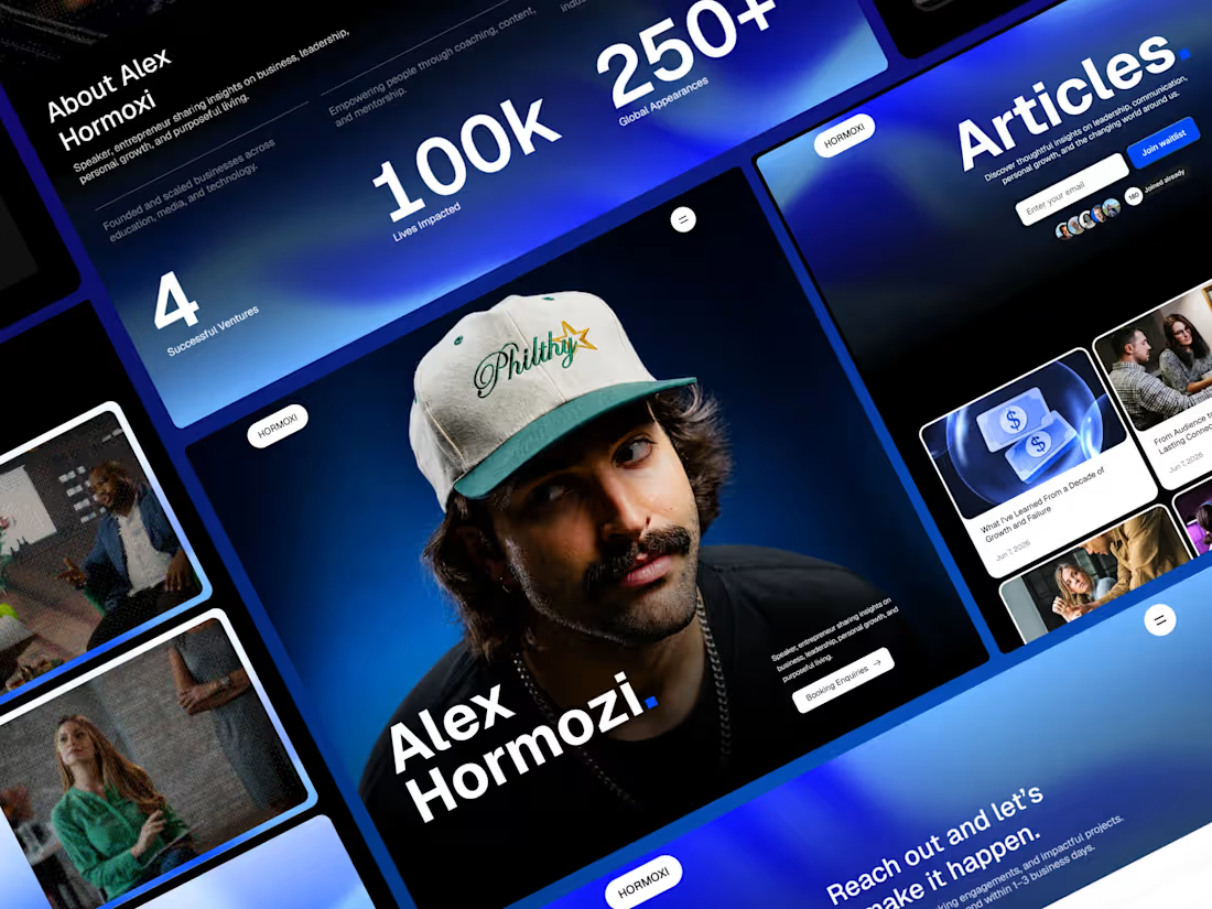
HORMOXI is a premium Framer template designed to help creators, founders, coaches, and consultants establish authority online. Publish articles, showcase your story, promote your expertise, and sell courses or programs, all within a beautifully crafted, conversion-focused experience.
From content management to lead generation, HORMOXI provides everything you need to turn visitors into followers, clients, and customers.
Features:
Home — a bold landing page to introduce your offer and build trust
Blog listing — a clean, scannable feed of your latest articles
Blog post (CMS detail page) — auto-generated layouts for every article
About — your story, mission, and credibility
Contact — a simple way for leads to reach you
Growth Lab — a dedicated hub to showcase your programs and approach
Course Creation (CMS detail page) — rich, sales-ready pages for each course
404 — a friendly, on-brand error page
2
4
147
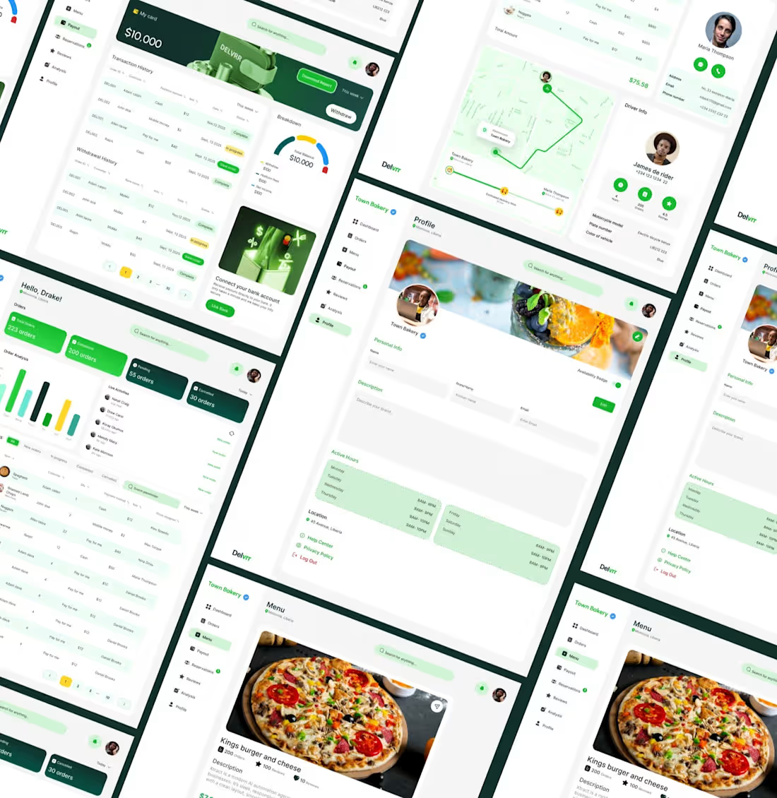
The Delvrr app is crafted to simplify how you order and receive your favorite meals.
Experience seamless delivery with intuitive design and real-time updates.
Designed with simplicity and speed in mind, Delvrr blends modern aesthetics with practical usability to deliver a seamless food ordering experience from start to finish.
Problem and Solution
Liberia faces a significant shortage of reliable food delivery services, making it difficult for people to conveniently access meals from their favorite local restaurants. Limited delivery options, inconsistent service, and lack of digital platforms have left many residents relying on traditional, time-consuming methods to get food. This gap highlights the need for a modern, efficient, and accessible food delivery system
Delvrr was created to bridge this gap by introducing a seamless, tech-driven food delivery experience tailored to the Liberian market. With an intuitive mobile app, real-time tracking, and partnerships with local restaurants, Delvrr makes ordering food fast, reliable, and effortless - empowering both customers and vendors through convenience and connectivity.
Share
0
32
FLIGHT BOOKING UI
Project Overview
A mobile flight-booking experience designed to make discovering, comparing, and booking flights feel simpler and more intuitive. The concept focuses on reducing friction throughout the booking journey while keeping important travel information clear and accessible.
The Problem
Booking a flight can quickly become overwhelming. Users often have to navigate through complex search forms, compare multiple flight options, review scattered travel details, and complete lengthy payment processes.
The goal was to create a more streamlined experience where users could find a flight, understand the details, and complete their booking with less friction.
Target Audience
The experience is designed for:
Frequent travelers looking for a faster booking process
Business travelers who value speed and clarity
Young travelers comparing affordable flight options
Users booking one-way, round-trip, or multiple-trip journeys
The Goal
The primary goal was to design a flight-booking experience that feels simple, visual, and effortless, while making important information such as destinations, departure times, prices, and booking details easy to understand.
The Solution
I designed a streamlined flight-booking experience centered around clarity and simplicity.
The interface brings flight search, discounted offers, trip information, payment, and booking details into a cohesive flow. Instead of overwhelming users with information, the experience uses clear visual hierarchy and card-based layouts to make each decision easier.
My Approach
I focused on three key areas:
1. Simplify the search experience
The flight search interface prioritizes the information users need first — origin, destination, trip type, and travel dates.
2. Make flight options easier to scan
Flight offers are presented using visual cards that combine imagery, route information, departure and arrival times, and pricing in a single glanceable component.
3. Reduce friction at checkout
The payment and confirmation screens were designed to clearly communicate what the user is purchasing, including passenger information, class, seat, terminal, price, and booking reference details.
0
27