This was my Third commission and my first Motion Graphic for iSolo Mobile.
The company was moving their shop to another location and wanted a short 9:16 reels format to reach multiple audience on Instagram and tiktok while keeping it fast paced.
The video offers 2 main sections. (excluding Ending/Logo animation)
(1) Intro - Map to show a visualization of where they are moving.
(1.5) Filler - text that appears to bridge the two scenes.
(2) End - An address card to show the exact street.
The main challenge was maintain a short 10 second animation while delivering the full address and entertaining the customer.
1
51
This was my first ever Motion Graphic advertisement commissioned. The client wanted a simple 30 second long motion graphic introduction to his new company. The brand accent was blue and white.
The main challenges were using as much as photo I could insert as the client requested while remaining in the 30 - 35 second mark.
I started by adding a soft blue & white gradient. I then planned to cut the video into 3 stages of 7-10 seconds. (Excluding Ending / logo animation)
(1) Intro - Typography movements.
(2) Middle - Brand/Company name introduction
(3) End - Projects overview
The project relied heavily on attention grabbing typography to give it a sense of mystery. To keep the project alive and not flat, I added a 3d section in the opening of the third section. The scene was a file opening and zooming out to multiple tabs opening to show a brief number of projects completed.
1
85
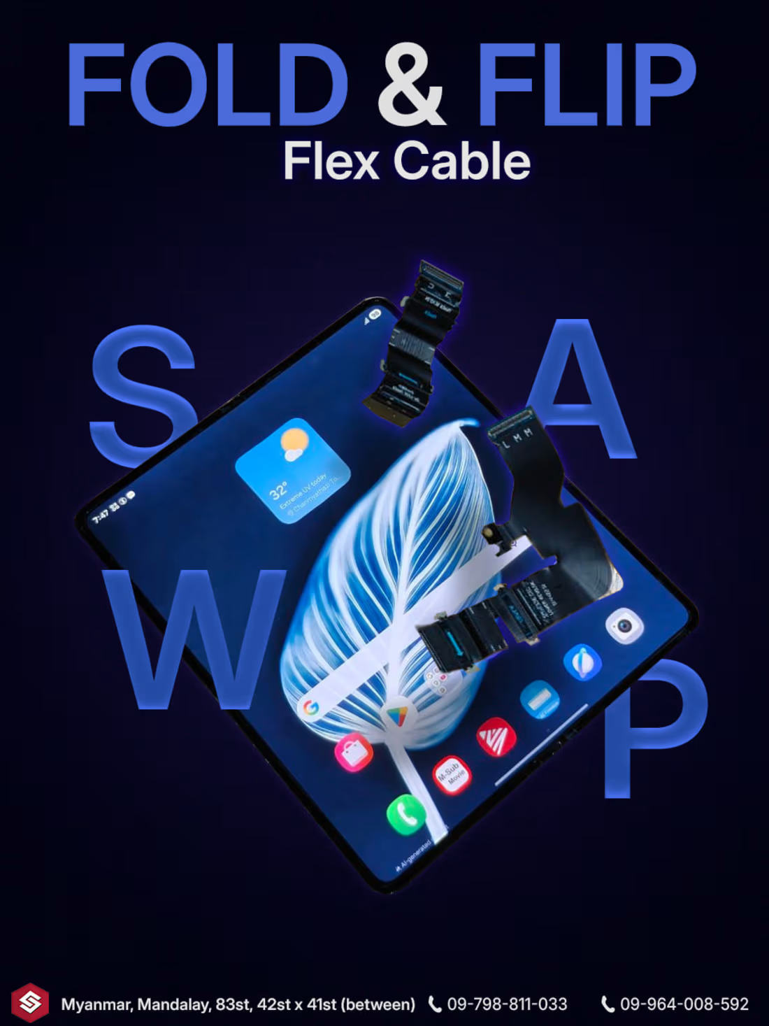
This was my second commission from iSolo Mobile after being pleased with my first graphic. This a cable replacement advertisement for the samsaung fold. The main goal was to reflect samsaung's futuristic blue while having the same feel as my first design, the secondary aim was to create a captivating graphic with jelly-like text.
I started by adding the samsaung fold and cable images iSolo Mobile provided. next I aligned them as said and made a subtle glow to highlight the elements. Then I started brainstorming and idea for my title. I went with a simple Blue and white bold title.
To fill the main element and knock out the negative spaces I added the text "SWAP" and positioned them behind and above the fold's layer to create a dynamic effect. Then I added an effect to make the text feel like a translucent jelly-like object.
1
52
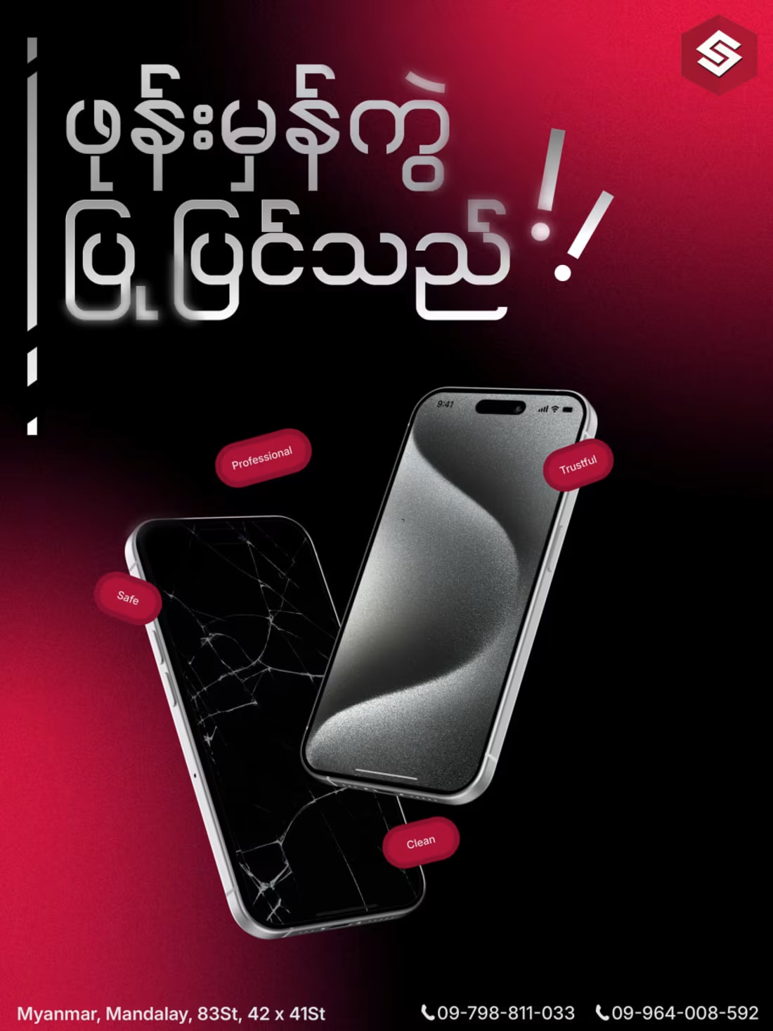
This is my first work commissioned by iSolo Mobile a local business in my town. The particular graphic was an ad for glass replacement service. My client wanted a technical look to it while feeling inviting. I started by adding a gradient with grain/noise then added bold typography in Burmese and added a subtle gradient to disclose the flat feel. next I added phone-mock ups as a reference then masked the screens out and replaced it with my desired image. At last, badges were added to clear negative spaces and give a source of trust to the customers.
1
63