
Jennifer Azubuko
Conversion-focused Web & Landing Page Designer (UX, Framer)
Ready for work
Jennifer is ready for their next project!
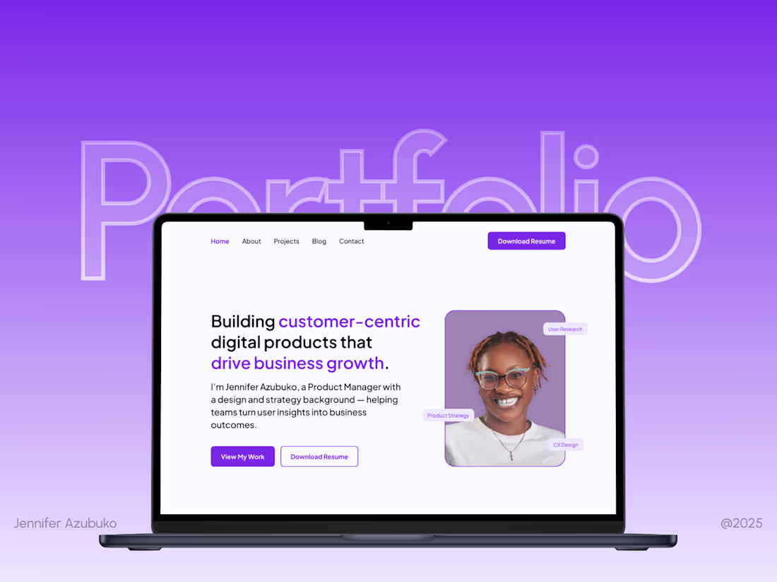
Personal Portfolio Website Design and Development
1
7
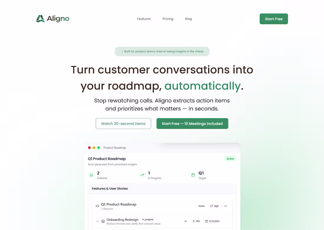
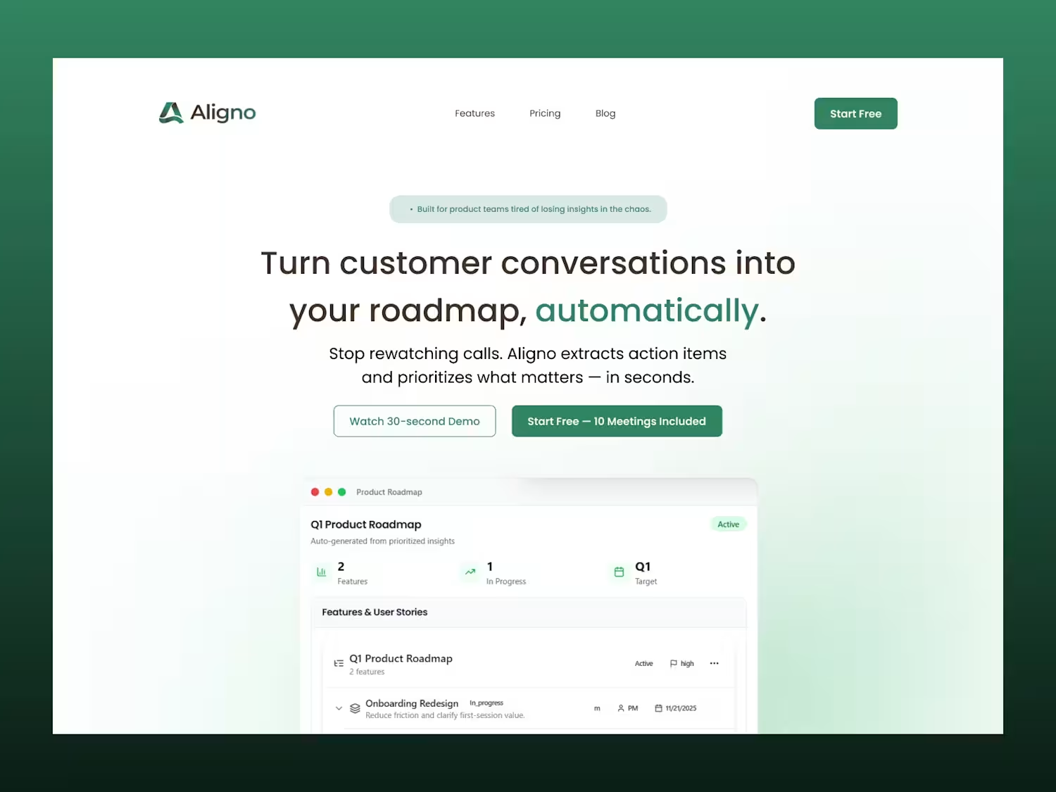
I redesigned Aligno’s hero section.
My goal was to improve how fast new users understand the product. That meant a clearer value proposition, a simpler narrative, and a CTA focused on activation (Start Free).
Attached is the before (1st frame) and after (2nd frame).
Which one helps you “get it” faster?
5
163
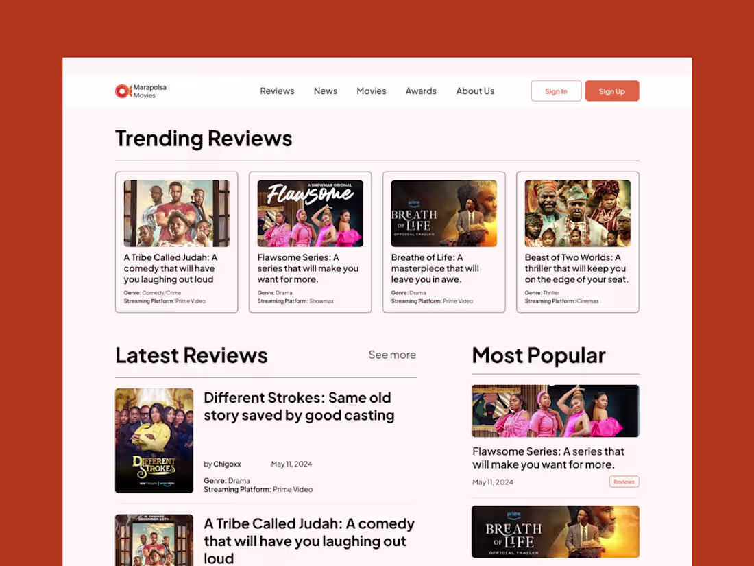
Marapolsa Movies Website Design and UX
1
2
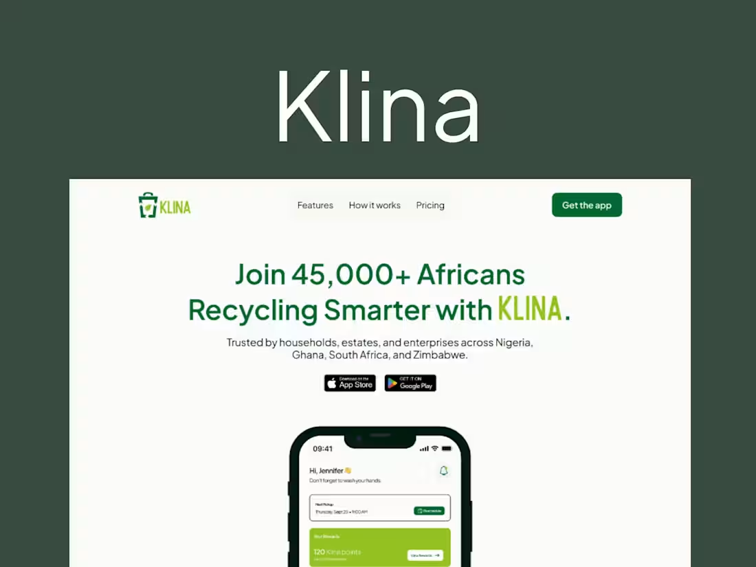
Klina — B2C Saas Landing Page
1
9
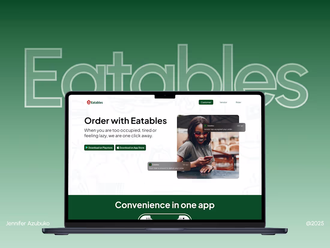
QuickEatables: Multi-User Platform Website
A multi-page website designed to communicate value to customers, vendors, and riders clearly.
Live website: https://quickeatables.com/
1
121