
Thee Sign
Branding, logo, website and creative design services online
New to Contra
Thee is ready for their next project!

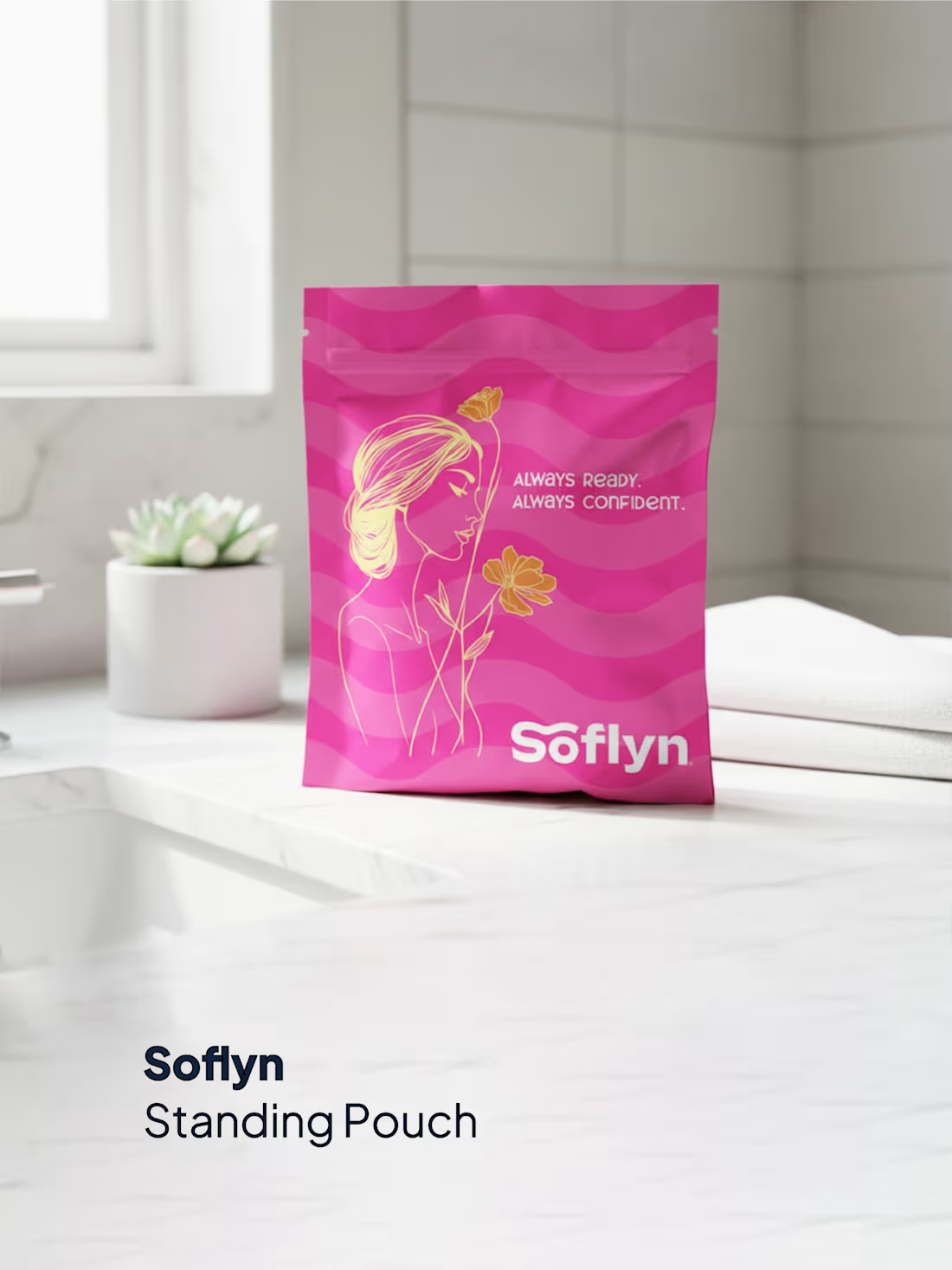
Packaging that speaks confidence, care, and modern femininity. 💗✨
Presenting our packaging design work for Soflyn — a women’s period essentials kit brand based in Canada, thoughtfully designed by Theesign Creative Marketing Solutions.
The goal was to create a clean, elegant, and empowering packaging identity that reflects comfort, confidence, and everyday readiness for women. From the soft visual aesthetics to the modern pouch presentation, every detail was crafted to build a strong emotional and shelf connection with the audience.
Our design approach focused on:
✅ Feminine & premium visual identity
✅ Modern stand-up pouch packaging
✅ Clean typography & soft aesthetics
✅ Brand-focused color psychology
✅ Packaging that builds trust & relatability
Because packaging is more than design — it’s how a brand emotionally connects with its customers. 🌸
Looking for packaging designs that make your product stand out globally?
📩 Connect with Theesign for branding, packaging & creative solutions.
3
1
44
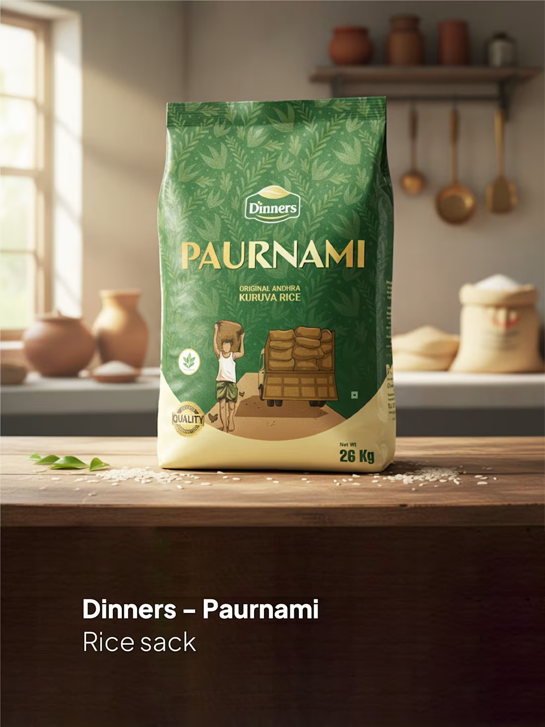
From shelf presence to brand identity — packaging is what makes a product speak before the customer even touches it. 🌾✨
Presenting our packaging design work for Dinners – Paurnami Original Andhra Kuruva Rice, crafted by Theesign Creative Marketing Solutions. Designed with a balance of tradition, premium feel, and modern shelf appeal, this packaging was created to instantly communicate quality, authenticity, and trust.
Our focus in this design:
✅ Strong brand visibility
✅ Premium yet traditional visual identity
✅ Consumer-friendly packaging aesthetics
✅ Market-ready product presentation
✅ High-impact shelf attraction
Great packaging doesn’t just protect a product — it sells the story behind it. 💡
Looking for packaging that makes your brand stand out in stores and online?
📩 Connect with Theesign for packaging, branding & creative solutions.
#Theesign #PackagingDesign #Branding #ProductPackaging #GraphicDesign #RicePackaging #BrandIdentity #CreativeAgency #PackagingMockup
0
36
Not every logo is designed to just look good.
Some are designed to carry a vision.
For Ethanova Knowledge Village, Kerala, Theesign developed a brand identity that reflects the institution’s mission of shaping students through education, values, and lifelong growth — from KG to UG.
The logo is built on four powerful foundations:
⬆️ Growth
The rising layered structure represents the journey of continuous learning, personal development, and the step-by-step progress of every student. It reflects how Ethanova guides learners toward a brighter future with confidence and purpose.
“E” for Ethanova
The flowing stacked lines subtly form the letter “E,” creating a unique visual identity directly connected to the brand name. The structure gives the logo a modern, intelligent, and memorable character.
📖 Knowledge
Inspired by the form of an open book, the symbol represents wisdom, education, curiosity, and the endless pursuit of learning. It reflects Ethanova’s commitment to building strong academic foundations.
🛡️ Trust
The shield-inspired base symbolizes safety, discipline, integrity, and reliability — values that every parent seeks in an educational institution. It reflects a secure environment where students can grow academically and morally.
The deep blue palette conveys professionalism, wisdom, and stability, while the gold accent adds a sense of excellence, achievement, and prestige.
This logo animation was created to visually express Ethanova’s philosophy — a place where education is not limited to classrooms, but focused on building character, confidence, leadership, and future-ready individuals.
A meaningful identity crafted with strategy, symbolism, and purpose.
Brand Identity & Logo Animation by Theesign Creative Marketing Solutions
#EthanovaKnowledgeVillage #Theesign #LogoAnimation #BrandIdentity #EducationalBranding #KeralaEducation #LogoDesign #CreativeBranding #SchoolBranding #KGtoUG #EducationMatters #BrandStrategy #KeralaBrands #VisualIdentity #MotionDesign #CreativeAgency #GrowthKnowledgeTrust
0
43
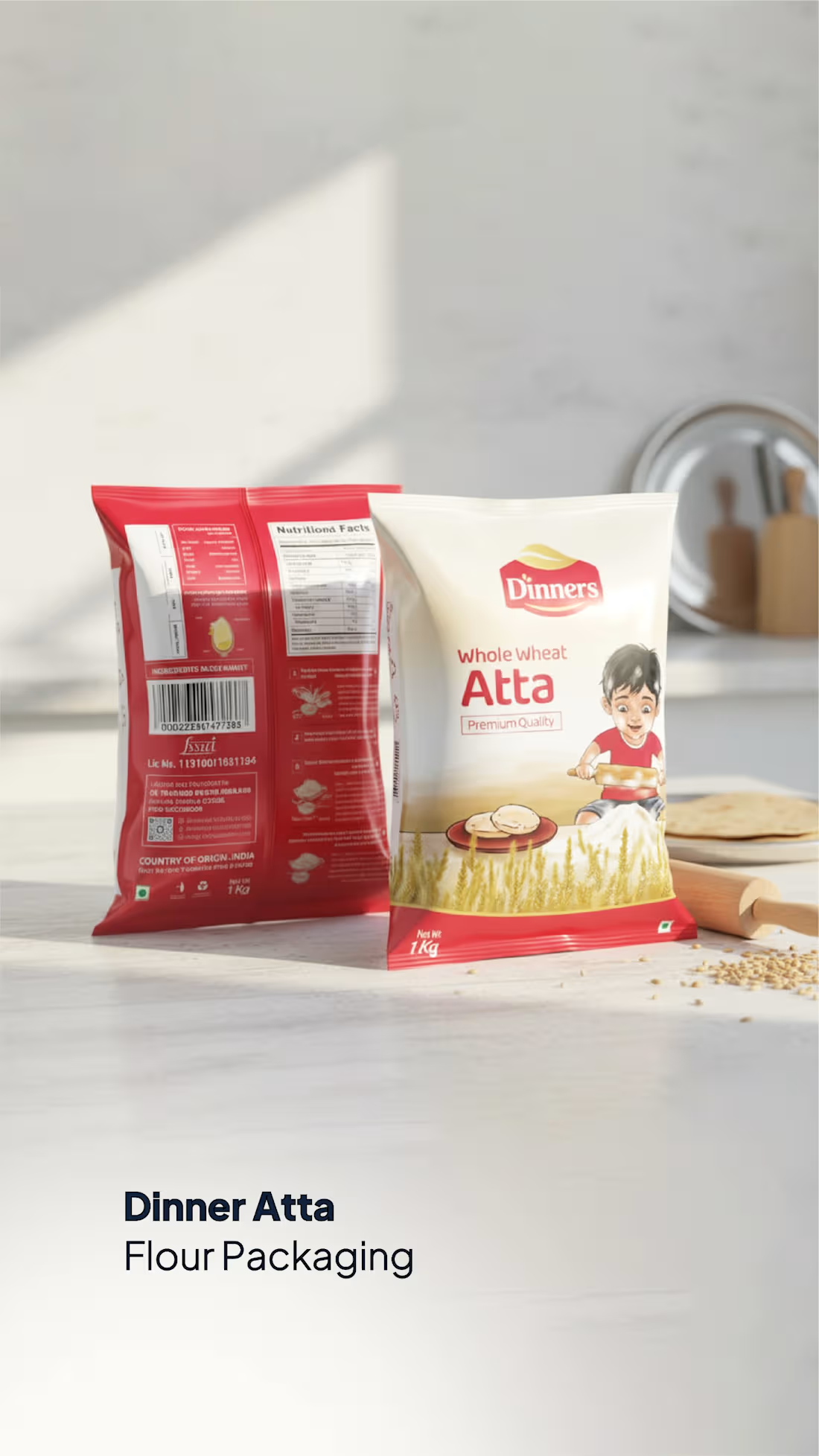
Dinners Atta Packaging Design – Created by Theesign
This packaging was designed to emotionally connect with Indian households by incorporating a playful illustration of a mischievous Indian boy making roti, symbolizing the warmth of home cooking and the traditional bond between mother and child. The character was developed as a brand icon to create recall value and a friendly, family-oriented identity.
The red color palette was strategically chosen to create a sense of warmth, appetite appeal, and strong shelf visibility while communicating energy and trust. The overall design balances tradition and modern packaging aesthetics to position the product as both authentic and premium.
Created by Theesign – Branding & Creative Design Agency.
1
76