Tetiana Lundiak
Graphic Designer | Illustrator | Branding
New to Contra
Tetiana is building their profile!
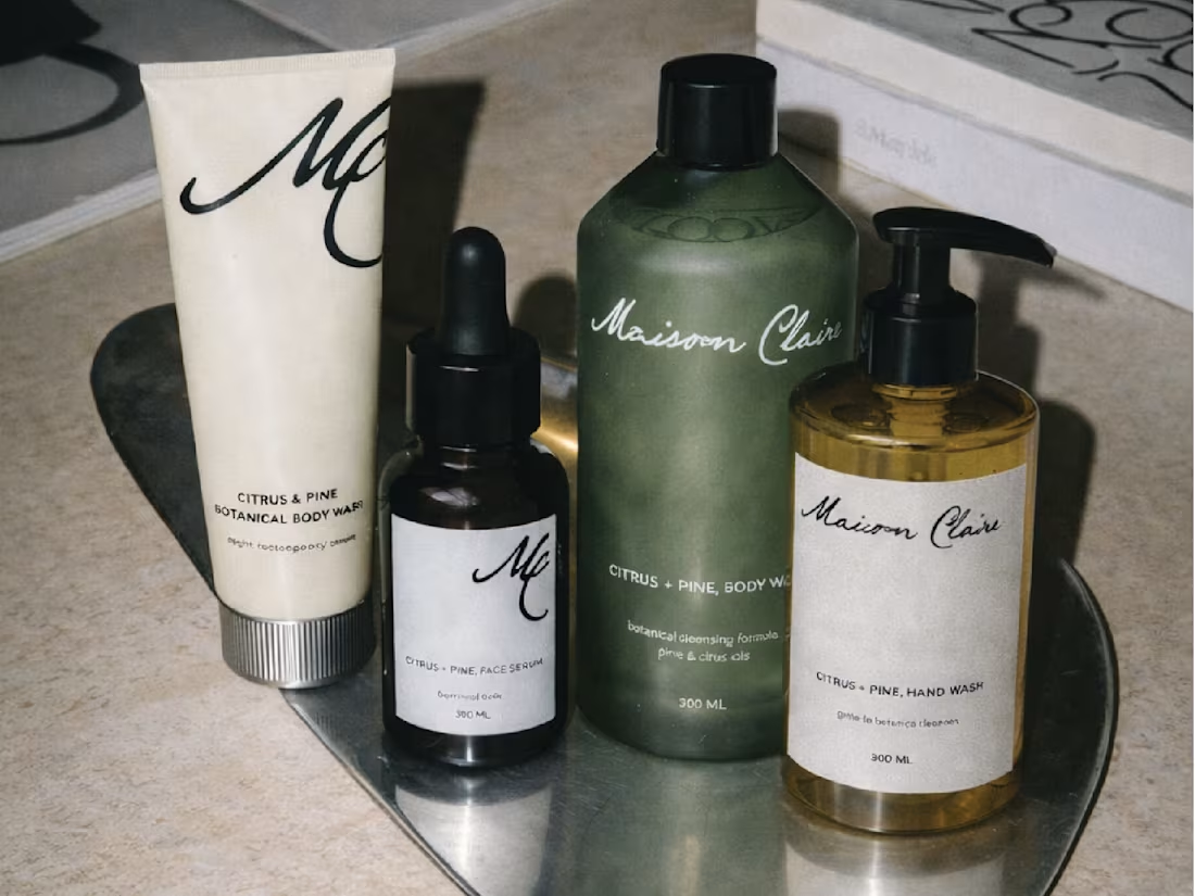
Maison Clair – Citrus & Pine / Bathe slowly. Breathe citrus. Feel the forest.
Maison Clair is not just a bath and body care brand. It is an atmosphere, a small ritual of slowing down, and a quiet moment of care in the middle of everyday life. The brand is built around the contrast of two sensations – bright citrus and calming pine. One awakens the senses, the other gently brings balance. The visual language of Maison Clair is minimal and calm: clean typography, soft neutral tones, and compositions that feel almost like still-life photography. Products appear alongside citrus fruits, transparent liquids, foam, and natural textures – elements that emphasize purity, freshness, and simplicity.
Maison Clair is about sensory pause. About warm water, light, and the quiet rhythm of self-care. It is for people who enjoy small rituals and believe that everyday moments can feel special.
1
9
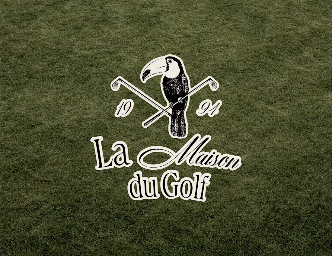
La Maison du Golf – Leisure & Play / Play gently. Linger longer. Enjoy the round.
La Maison du Golf is not just a golf club identity. It is an atmosphere shaped by leisure, elegance, and the quiet pleasure of the game. The project is built around the idea that golf is more than sport – it is a social ritual, a slower rhythm, and a refined way of spending time. It brings together play, comfort, good company, and the understated luxury of the clubhouse experience.
The visual language of La Maison du Golf is classic yet soft: muted greens, warm creams, deep neutrals, and editorial-style compositions that feel cinematic and composed. The identity moves between the course and the clubhouse – golf carts, scorecards, flags, tailored apparel, drinks on the grass, and details of the game presented as part of a complete lifestyle. The toucan emblem adds character and distinction, giving the brand a signature symbol that feels both elegant and memorable.
La Maison du Golf is about the pleasure of the round. About texture, movement, conversation, and the moments that happen between swings. It is for people who see golf not only as a game, but as a culture of comfort, style, and shared experience.
1
1
18
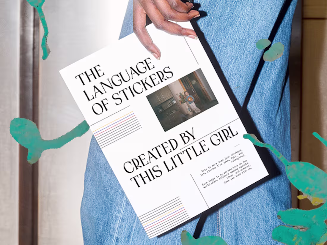
A personal zine exploring a fascination with stickers. The goal was to transform a personal theme into a structured and visually engaging publication, balancing emotional storytelling with editorial clarity.
The zine combines expressive layouts, playful visuals, and refined typography – merging childhood nostalgia with a mature design approach.
1
1
6
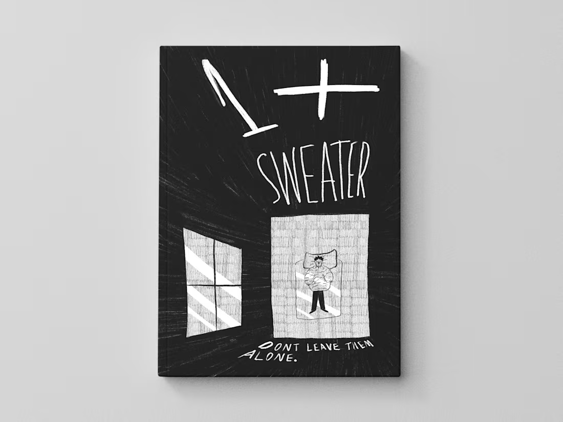
1+ sweater comic
The comic is created in A4 format and consists of six black-and-white pages. The project was produced in Procreate, with a focus on hand-drawn aesthetics, texture, and panel rhythm. The visual style is minimalist, using a limited palette, strong light-and-shadow contrast, simple shapes, and recurring visual elements. Page compositions are designed to convey tension through panel scale, line density, and the gradual filling of space.
The concept of the comic is based on a visual metaphor of anxiety as physical pressure. The protagonist’s inner state gradually materializes as growing layers that compress the body and surrounding space, reinforcing a sense of confinement and loss of control. This approach connects form and meaning, resulting in a cohesive project suitable for both print and digital presentation, with a clear and recognizable visual language.
1
3