
Tegar Putra Pratama
Fast & Accurate UI/UX Designs for Mobile and Web
Ready for work
Tegar Putra is ready for their next project!
Jump into the details ✈️
2
16
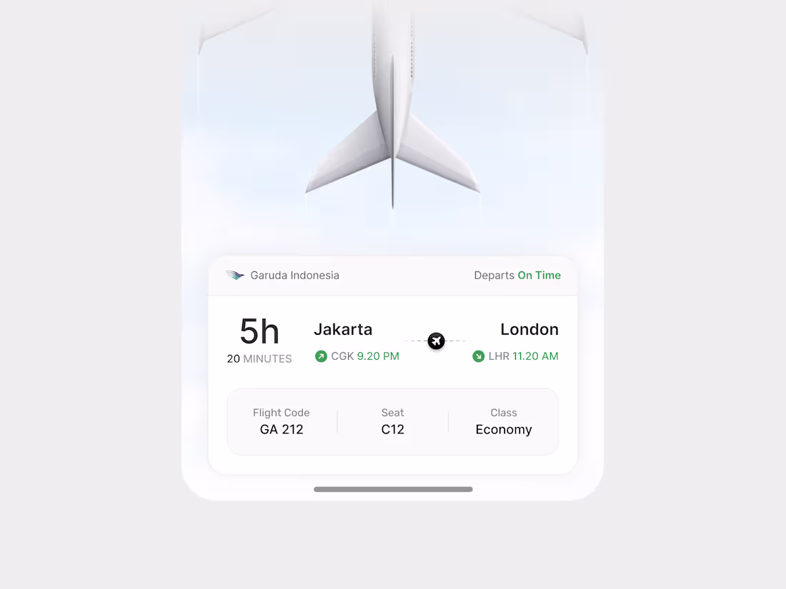
Clean flight tracking UI designed for a smooth and minimal travel experience. Focused on clarity, timing, and essential details to help users understand their journey at a glance.
0
27
Exploring a modern dashboard design focused on clarity, structure, and smooth user flow. The layout is built to make complex data feel simple, with clear hierarchy and easy navigation.
Designed with consistency in spacing, components, and visual balance to improve usability and overall experience. The goal is to help users understand information faster and take action with less friction.
Feedback is welcome.
0
9
Exploring a clean and structured healthcare dashboard focused on clarity and usability. The layout highlights key features like patient management, appointment scheduling, and analytics in a simple, easy-to-scan interface.
The goal is to reduce complexity while keeping the experience intuitive for both staff and administrators. Built with a modern design system, consistent spacing, and clear hierarchy to improve overall workflow.
Feedback is welcome.
0
11
Just sharing one of my recent UI explorations 👀
I really enjoy turning complex ideas into clean and simple interfaces. The goal is always the same, make it easy to understand and easy to use.
For me, good design is not about adding more things. It’s about knowing what to remove.
I mostly design SaaS, dashboards, and modern web products that feel clear, structured, and smooth.
If you’re building something cool and need a fresh pair of eyes on the UI, I’m always open to chat.
So… what are you building these days?
0
20