Arthur Atelier - Brand Designer | ContraWork by Arthur Atelier
Arthur  Atelier

Arthur Atelier

Social media designer for premium, high-end brands

New to Contra

Arthur is ready for their next project!

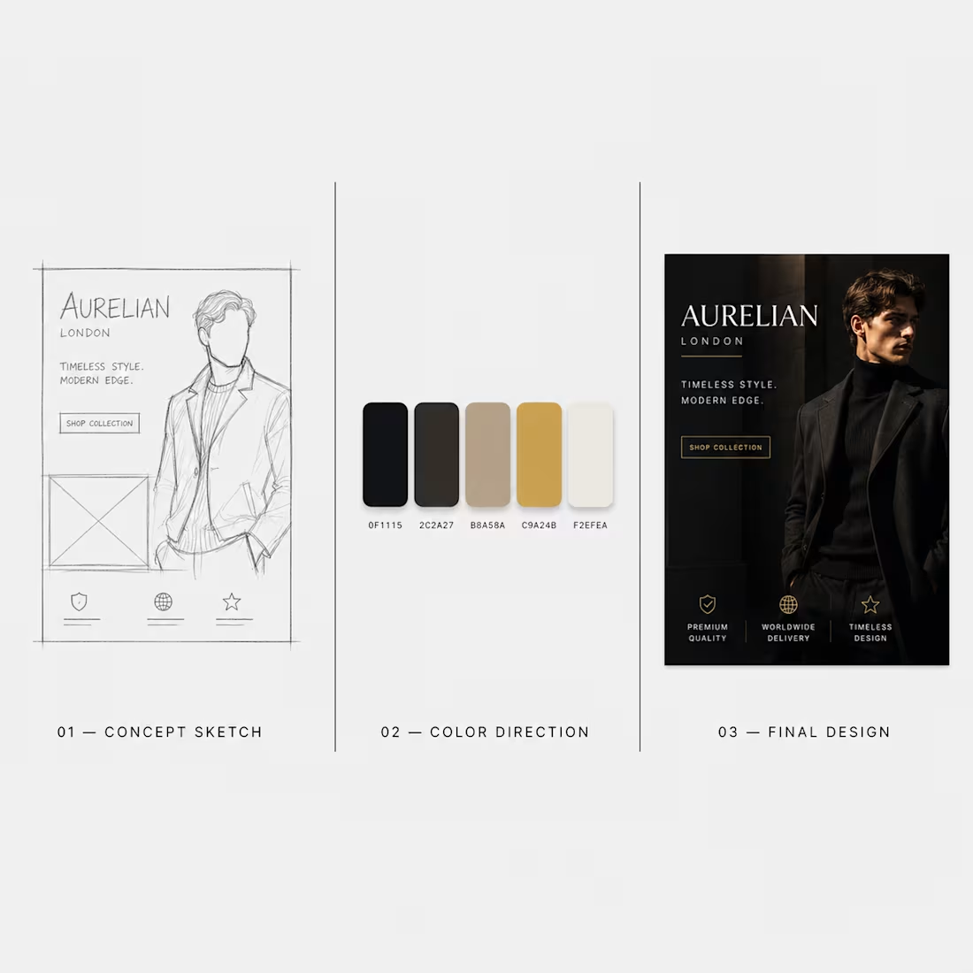
Cover image for Design Process Breakdown (Aurelian London
Design Process Breakdown (Aurelian London case study) People don't just buy the final design. They buy the thinking behind it. Here's a breakdown of how one of my campaign concepts actually came together — sketch, color direction, final execution. Three stages, one process. Showing the "how" builds more trust than just showing the "what." I'm Tanishk — this is a small look into how I actually design, not just what I deliver. Open to freelance projects. DMs open. 🎨
1
5
Cover image for Auric Time — Chronograph Product
Auric Time — Chronograph Product Ad A self-initiated concept project created to demonstrate premium product advertising design for a luxury watch brand. The Brief Design a product ad that feels less like generic stock photography and more like a considered, technical advertisement — the kind of visual a luxury watch brand would actually run. The Approach The design leans into a dark, high-contrast aesthetic with technical detailing in the background, polished satin black ceramic textures, and confident, bold typography ("POWER. TECHNICALITY. ORIGINALITY.") to communicate precision and craftsmanship at a glance. Every element — from the lighting on the watch face to the placement of supporting text — was built to feel expensive and intentional, not templated. The Result A product ad that could sit comfortably in a real luxury brand's Instagram feed. This project set the visual foundation for Arthur Atelier's dark, cinematic design style that now runs through the rest of my portfolio.
1
16
Cover image for A self-initiated concept project built
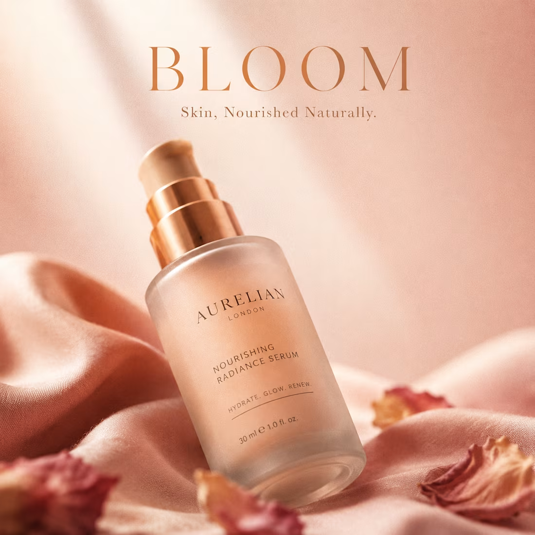
A self-initiated concept project built to demonstrate multi-post content system design — not just single graphics. The Brief Create a 3-panel Instagram carousel for a premium skincare brand that feels like one cohesive story, not three disconnected posts stitched together after the fact. The Approach Each panel was designed to do a different job in the buyer's journey. Panel one establishes premium positioning with a clean product shot on marble. Panel two builds sensory trust with a close-up texture shot of the serum. Panel three closes the loop with a before/after result paired with ingredient callouts, giving the viewer a clear reason to believe the product works. All three panels share the same typography, spacing, and sage-green color language, so the feed reads as one intentional brand — not scattered templates pulled from different sources. The Result A carousel that builds trust in three swipes. This is the kind of system-level thinking most brands are missing on their feed — consistency across every post, not just within one.
1
28
Cover image for A self-initiated concept project created
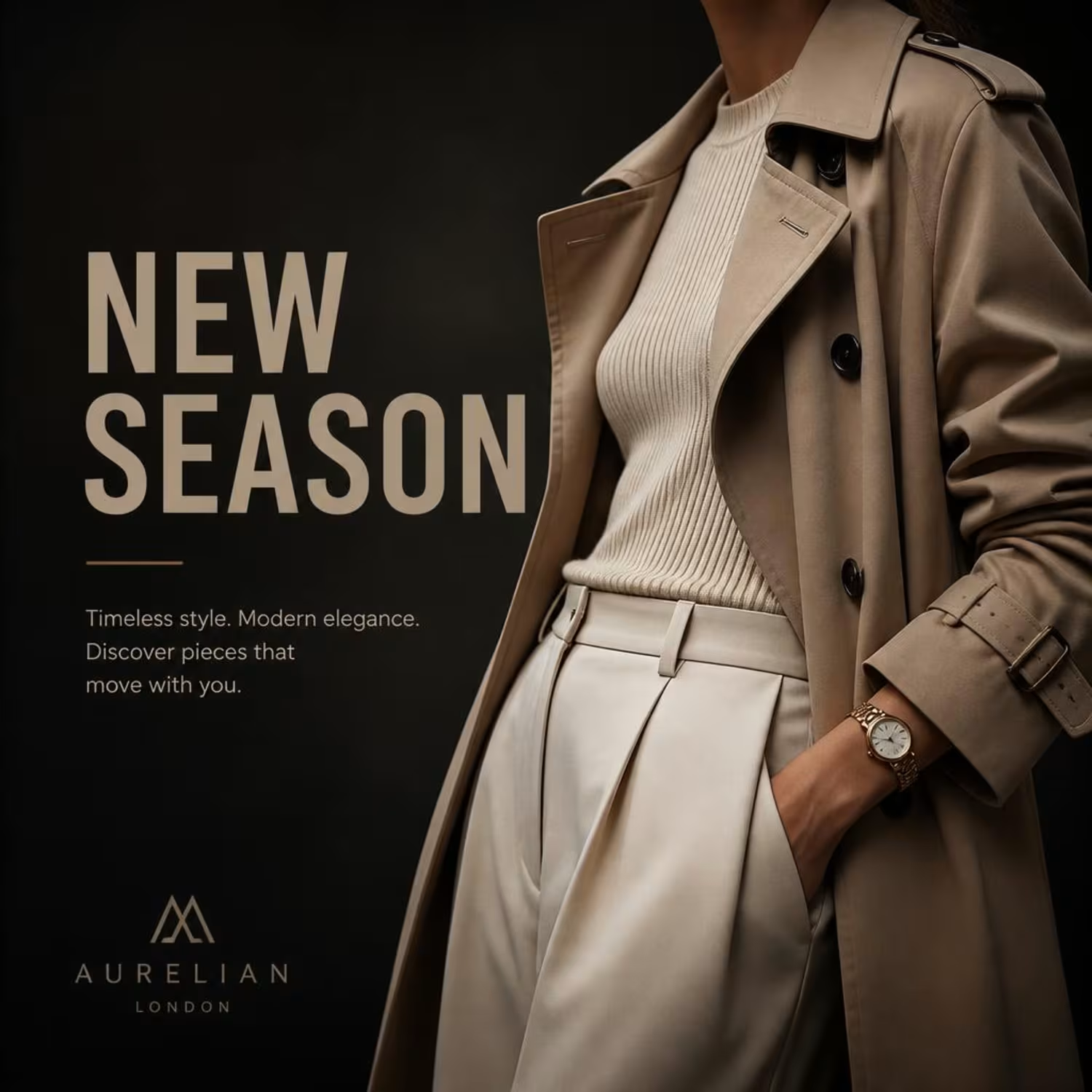
A self-initiated concept project created to explore premium fashion brand advertising for Instagram. The Brief Design a post that feels less like an ad and more like an editorial spread — the kind of visual that makes a scrolling customer stop and actually look twice, without relying on loud sales language. The Approach I built this around a dark, cinematic aesthetic with intentional negative space, luxury-style typography, and a muted, neutral color palette — the same visual language high-end fashion brands use to signal quality before a customer reads a single word of copy. Key design decisions included cropping the model shot to keep focus on styling and texture rather than a specific face, pairing a bold headline with lighter body copy for clear visual hierarchy, and giving the logo and tagline enough breathing room to avoid a cluttered, "designed-in-a-rush" feel. The Result A single Instagram post that reads as a full brand campaign — the level of polish I bring to every project, regardless of budget or scope.
1
31