
Syed Jawad
Product & Web Designer for AI/Tech Startups
Ready for work
Syed is ready for their next project!
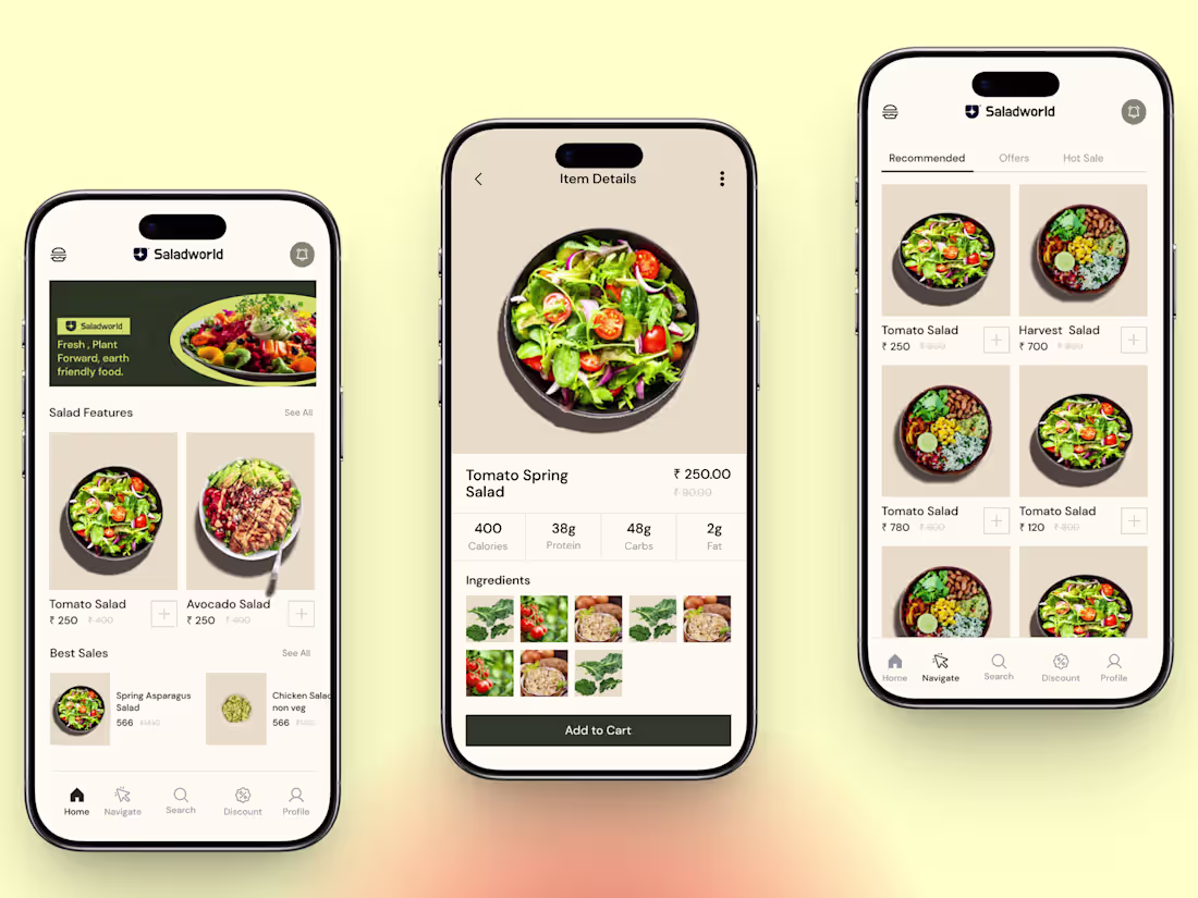
Saladworld — Fresh, Plant-Forward Mobile UI
Designing for food that's good for you and the planet deserves an interface that feels the same way. Warm tones, clean hierarchy, and a browsing experience that makes healthy choices feel effortless.
Swipe through: Home feed → Item Detail → Browse Grid
Available for new projects — drop me a message 🌿
#mobileui #uidesign #foodapp #appdesign #uxdesign #figma #productdesign #ios😍
1
20
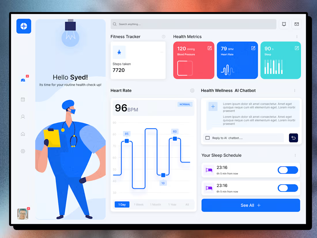
Bringing healthcare insights closer to everyday users.😊
I designed this health dashboard to help patients track their routine checkups, fitness activity, heart metrics, sleep schedule, and even chat with an AI wellness assistant, all in one clean, calming interface.
The direction focuses on soft blues, rounded cards, and clear visual hierarchy so users can quickly scan vitals, understand trends, and take action without feeling overwhelmed.
Open to collaborations on: SaaS dashboards, health/fitness apps, and data-heavy B2B products.
Let’s build something together
DM me for freelance or contract projects.
Hashtags:
#ProductDesigner #UIDesign #UXDesign #DashboardDesign #HealthTech #MedicalApp #SaaSDesign #DataVisualization #InterfaceDesign #FreelanceDesigner #RemoteDesigner #BangaloreDesign
1
23
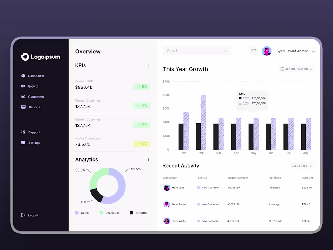
Customer Growth & Revenue Dashboard – a clean overview for SaaS teams to track what truly matters.
This concept brings KPIs like MRR, current and active customers, yearly growth, and customer analytics into one focused view, plus a recent activity feed that highlights new customers and revenue in real time.
I am ready for #figmamakeathon
Excited to be part of this challenge. Lets do our best.
3
145
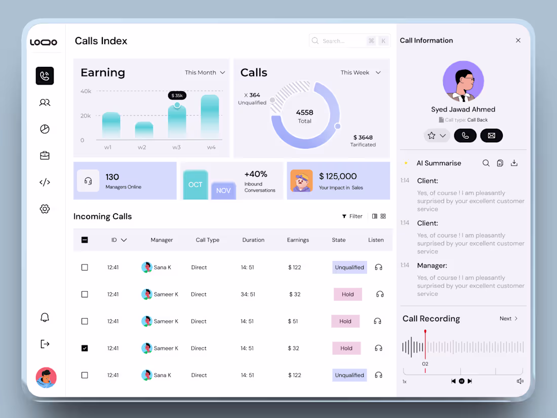
Just wrapped up this Call Index Dashboard concept for a customer support/sales team platform.
The goal: give managers a clear, calm overview of how their calls are performing, without overwhelming them with data
Design focus:
1. Clean layout with clear hierarchy between overview metrics, call list, and call details.
2. Soft gradients and friendly illustrations to make an analytical dashboard feel more human and less “enterprise cold”.
3. Accessible color contrasts and pill‑style states to quickly distinguish call outcomes.
Would love your feedback on how this could fit into a real-world CX/sales team workflow and what you’d improve next.
1
70