
Swan Design Agency
Design + No-Code Development for SaaS, Web3 & E-commerce
New to Contra
Swan Design is building their profile!
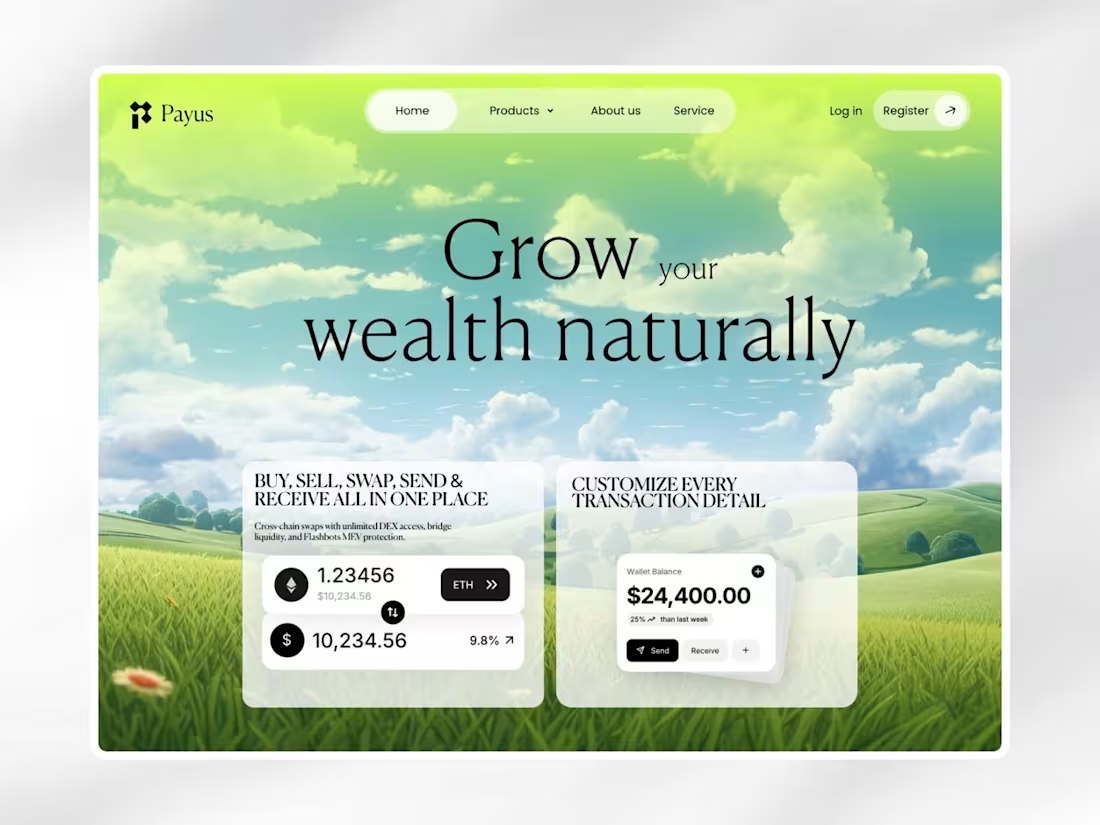
Designed a modern fintech landing page focused on making digital wealth management more approachable and intuitive. The experience combines glassmorphism, clean typography, and structured layouts to simplify crypto transactions and portfolio insights. By balancing aesthetics with usability, the concept creates a premium financial experience that feels trustworthy, modern, and easy to navigate.
1
36
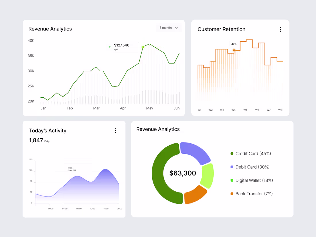
This dashboard component collection was designed to improve how users interact with business data through clear and scalable visualizations. The set includes revenue analytics, customer retention tracking, activity monitoring, and financial reporting components designed for SaaS platforms and admin dashboards. The focus was on creating reusable UI elements that simplify complex information while maintaining consistency, usability, and visual clarity across the product experience.
1
41
This travel booking experience was designed to simplify the journey from destination search to final ticket generation. The animation focuses on smooth transitions, intuitive interactions, and clear visual feedback that help users move through the booking process with confidence. By combining motion design with clean UI patterns, the experience feels faster, more engaging, and easier to understand while creating a more memorable travel product experience.
1
51
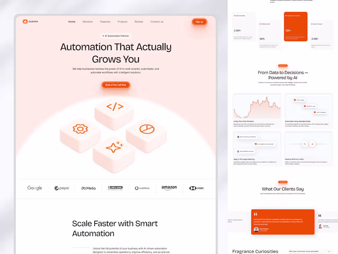
This AI automation SaaS website was designed to help businesses better understand how automation can improve efficiency and scale operations. The project combines modern UI design, structured content hierarchy, and motion design to create a more engaging and intuitive user experience. By using visual storytelling and interactive sections, the website simplifies complex concepts and guides users through the product journey while maintaining a premium and conversion-focused experience.
1
55
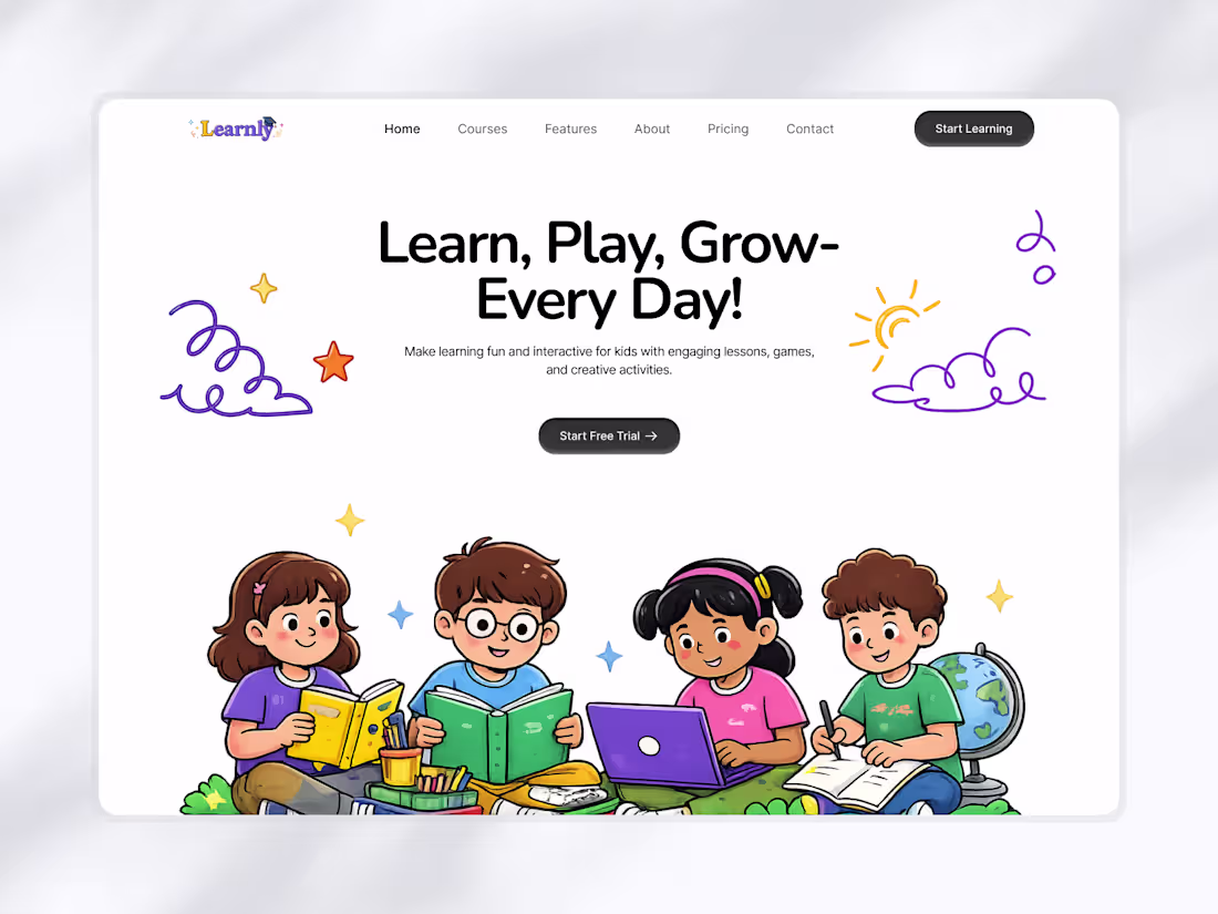
This educational platform was designed to make online learning more engaging and approachable for children through playful visuals, interactive layouts, and gamified learning sections. The experience focuses on balancing education with creativity while keeping navigation simple and intuitive for both kids and parents. From lesson discovery to reward-based interactions, every section was crafted to encourage curiosity, engagement, and a more enjoyable learning experience.
1
68
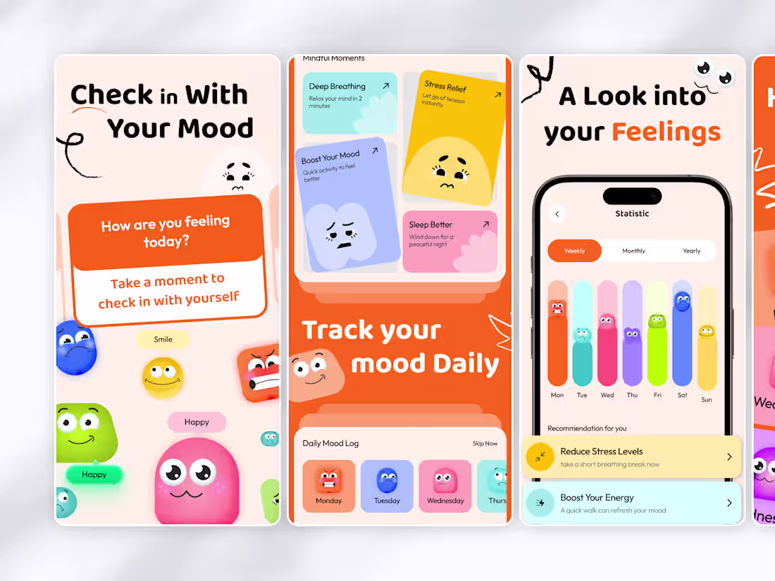
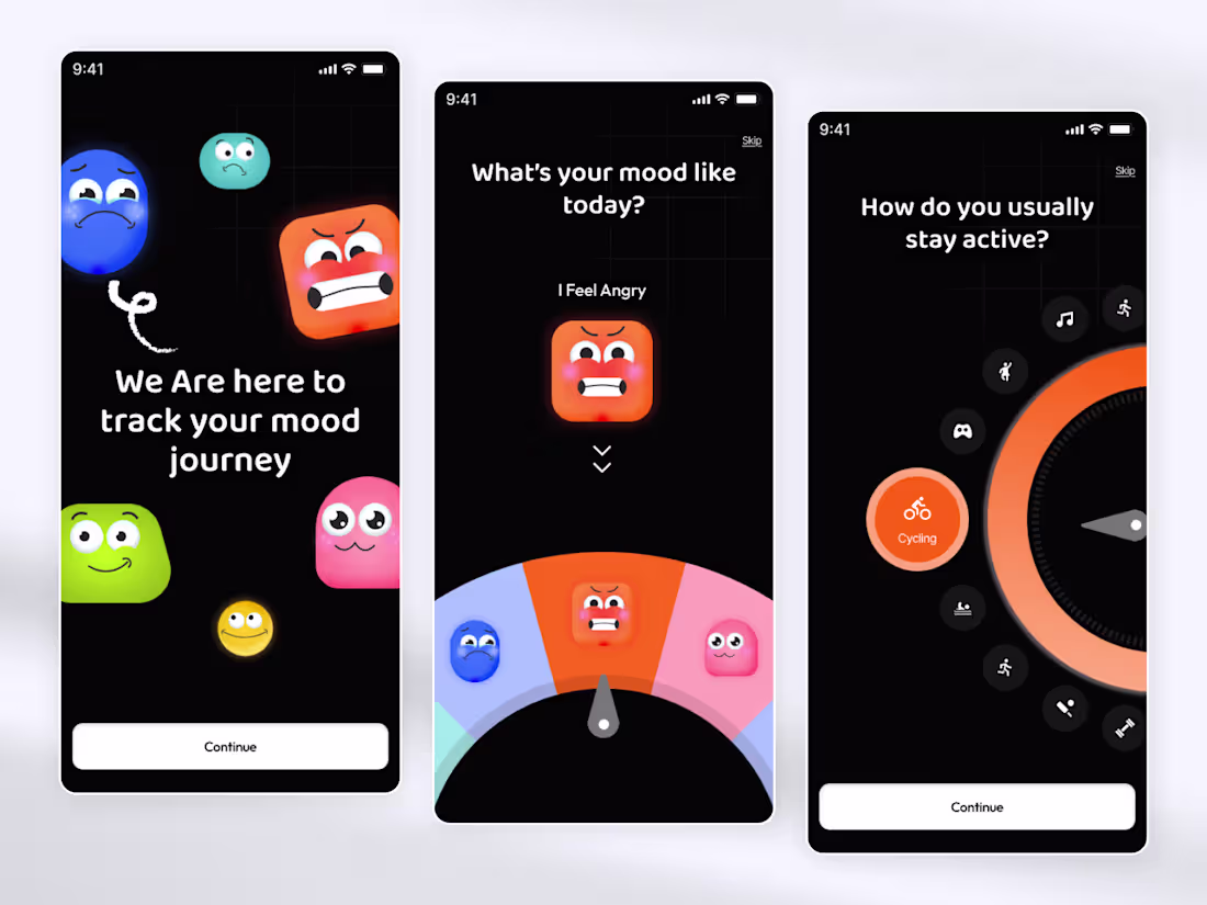
This App Store screenshot set was designed to visually communicate the mood tracking experience in a more expressive and emotionally engaging way. The focus was on combining playful interactions, clear storytelling, and vibrant UI elements to help users instantly understand the product before downloading it. Every screen was crafted to create a stronger emotional connection while presenting the app in a clean and modern format.
1
93
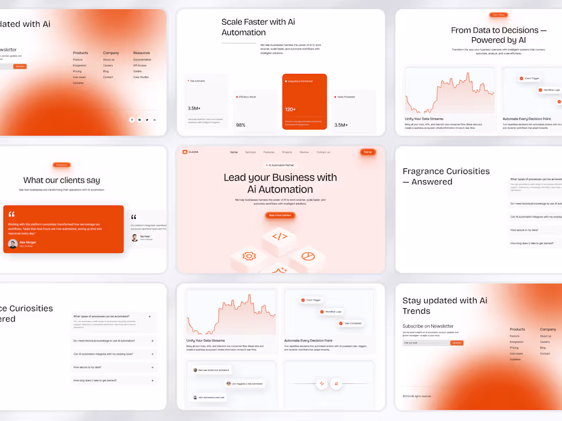
This AI automation SaaS website was designed to simplify how businesses understand and interact with automation products. The experience focuses on structured layouts, reusable UI systems, and clear visual hierarchy to make complex workflows feel easier to navigate. From landing page components and testimonial sections to data visualization and FAQ flows, every element was designed to improve clarity, build trust, and support conversion through a scalable design system.
5
4
185
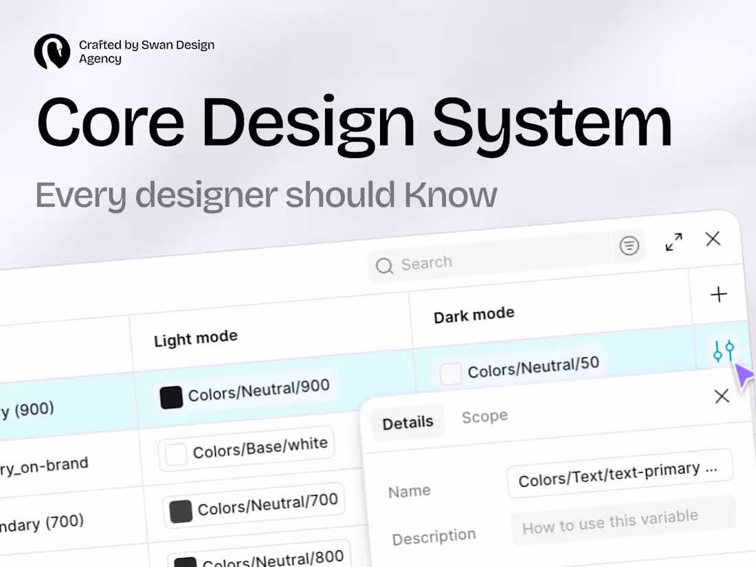
Most designers focus on visuals but ignore systems — and that’s where growth stops. This post highlights key design systems like Material, Fluent, Carbon, and Atlassian that power real-world products. Understanding how these systems work helps you design faster, stay consistent, and build scalable experiences. If you’re serious about product design, this is something you can’t skip.
1
92
This AI automation SaaS landing page was designed to simplify how businesses understand and adopt automation solutions. The focus was on creating a clear structure that communicates value, reduces confusion, and guides users through the product journey. By combining strong messaging, clean UI, and scalable design components, the experience helps users quickly understand the benefits and take action with confidence. The result is a modern, conversion-focused interface built for growth.
1
81
This mood tracking app was designed to make emotional check-ins feel more engaging and easier to maintain over time. The focus was on combining playful interactions, intuitive mood tracking, and activity-based flows to support healthier habits through a more approachable user experience. The result is a wellness product concept centered around consistency, reflection, and meaningful interaction.
1
89
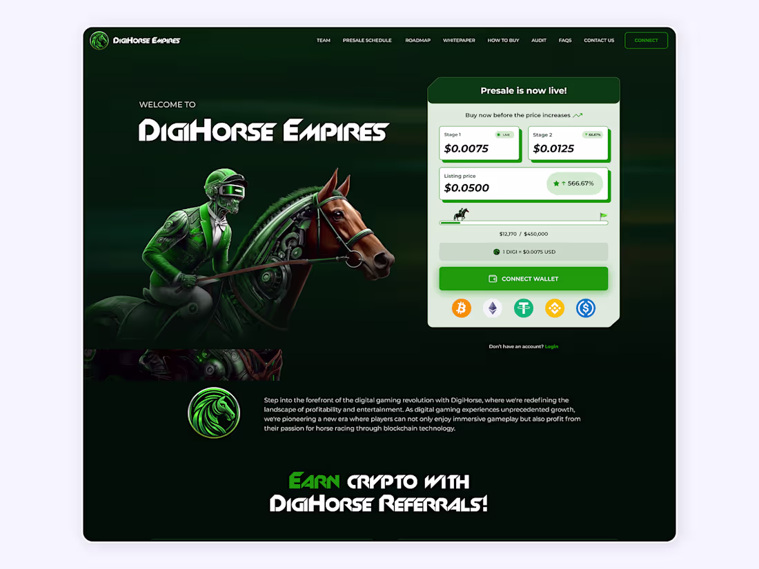
This Web3 gaming landing page was designed to simplify how users engage with crypto presales while keeping the experience immersive and high-converting. The focus was on combining strong visual storytelling with clear token information, wallet interactions, and structured navigation so users can understand the product and take action with confidence. The result is a digital experience built around trust, engagement, and conversion.
1
75
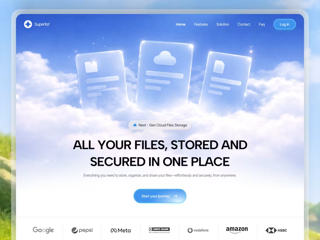
This cloud storage landing page is designed to make complex concepts like file management and security feel simple and easy to understand. The 3D hero section helps visually communicate storage, organization, and accessibility, while the clean layout ensures users can quickly grasp the product’s value. The overall experience focuses on clarity, trust, and scalability, making it easier for users to connect with the product from the first interaction.
2
105
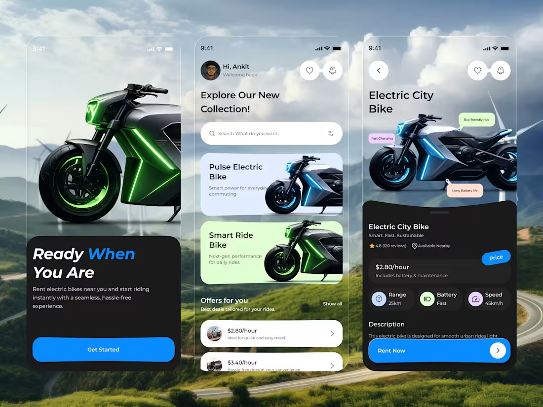
This EV bike rental app is designed to make the entire booking experience simple and intuitive for users. The focus was on reducing confusion by presenting key details like pricing, range, and performance in a clear and structured way. Users can easily explore nearby bikes, compare options, and make quick decisions without friction. The interface is built with a clean visual hierarchy and smooth navigation to guide users naturally through the flow. From discovery to booking, every interaction is optimized for speed and clarity. The result is a seamless mobility experience that feels fast, reliable, and easy to use.
2
2
87
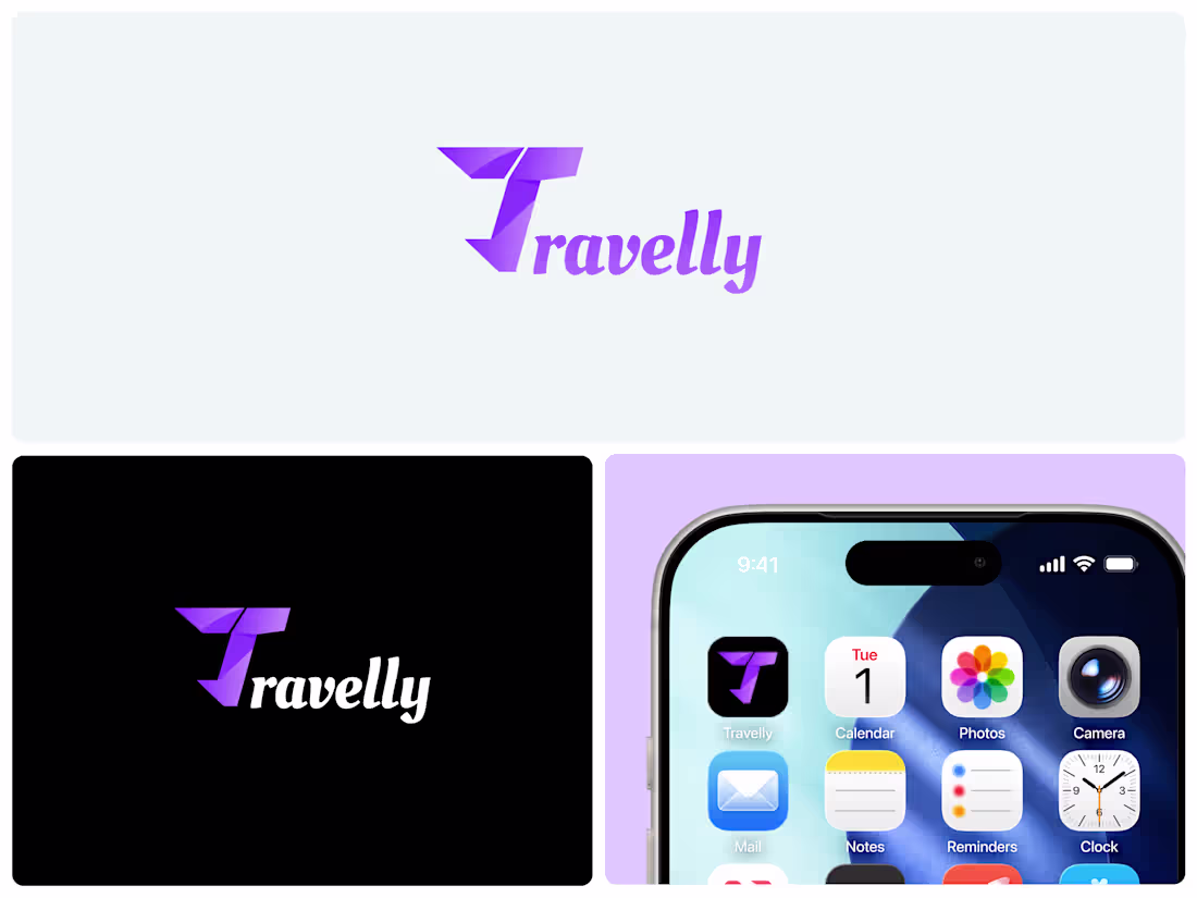
Travelly Brand Identity & Logo Design
Modern logo and app icon design for Travelly, built for scalability, consistency, and seamless integration across digital products.
1
80
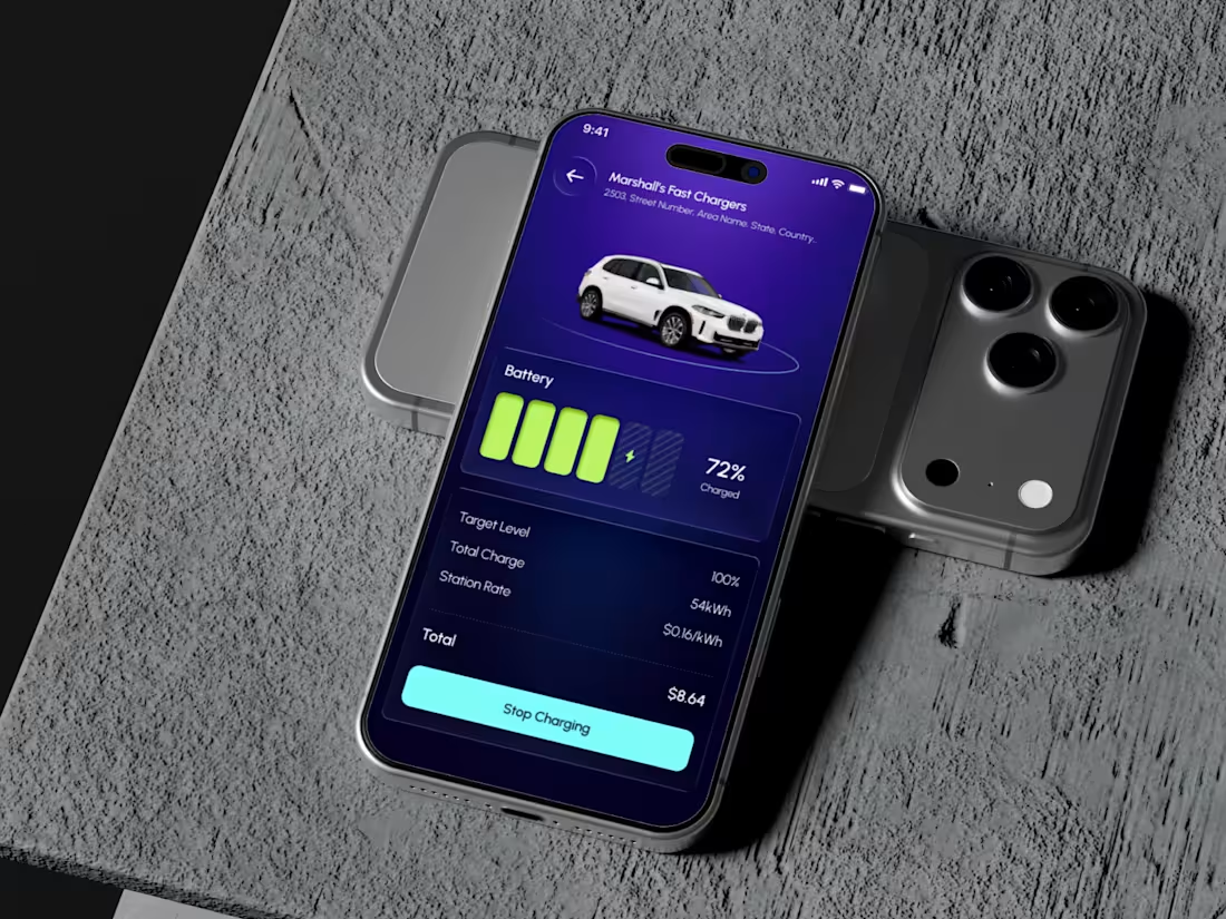
Revion — EV Charging App UI/UX Design
EV charging app design with battery insights, trip planning, and charger discovery built for clarity, usability, and smarter mobility.
1
104
SmashRise — Brand Identity & Logo Design System
Complete brand identity for SmashRise — logo, visual system, and scalable brand guidelines built for consistency across digital and physical platforms.
1
104
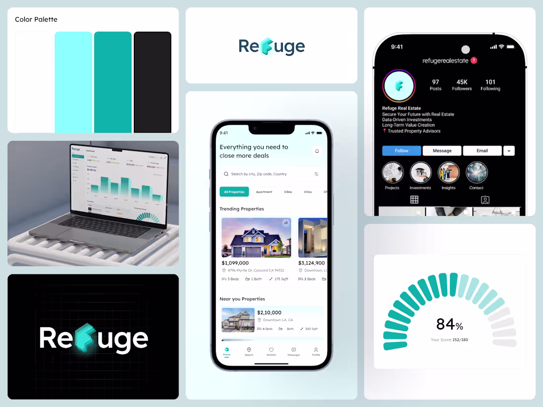
Refuge — End-to-End Product - Design Branding, Dashboard
1
1