
Suraj Kumar
One stop solution for branding, graphics & more.
Ready for work
Suraj is ready for their next project!

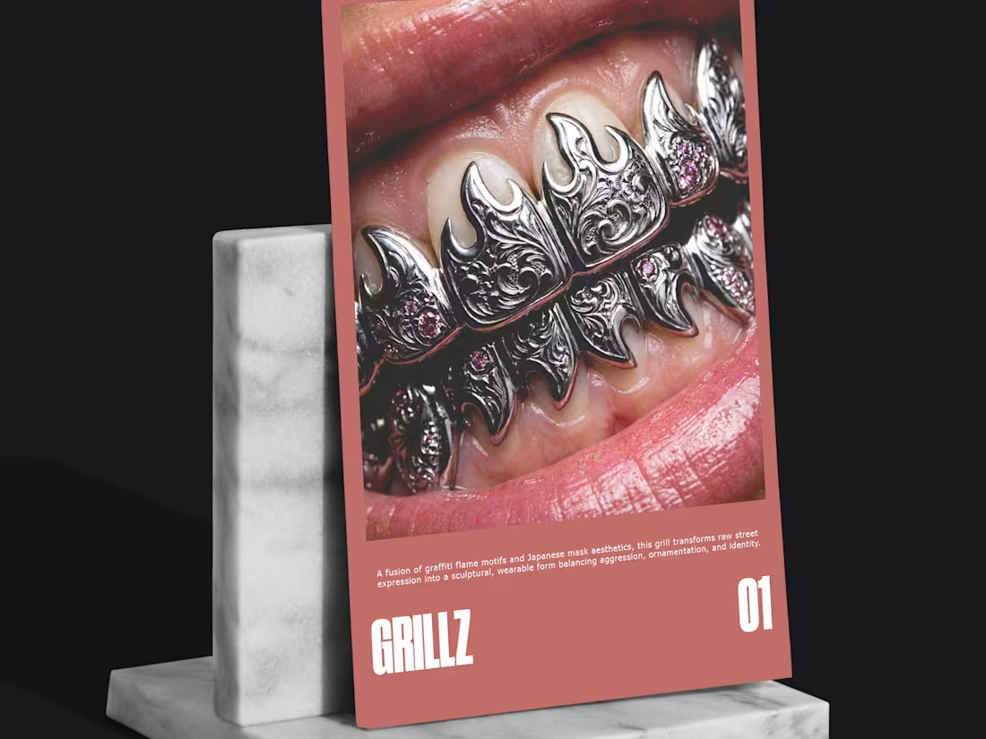
Some traditions don't survive because they resist change.
They survive because they learn how to evolve.
That thought stayed with me while building CUT DIFFERENT.
Long before grills became part of contemporary culture, they were shaped by craftsmanship through precision, patience, and the desire to create something deeply personal.
Today, the tools continue to evolve. The way we make things changes. The responsibility behind those decisions doesn't.
Craft has never been defined by the tools.
It's defined by the judgment behind them.
That's what I wanted this project to explore: the space where traditional craftsmanship meets contemporary creative direction.
For me, the future of design isn't about choosing between tradition and technology.
It's about knowing when each one deserves a place in the process.
—
Explore the complete CUT DIFFERENT case study on my Contra profile.
0
44
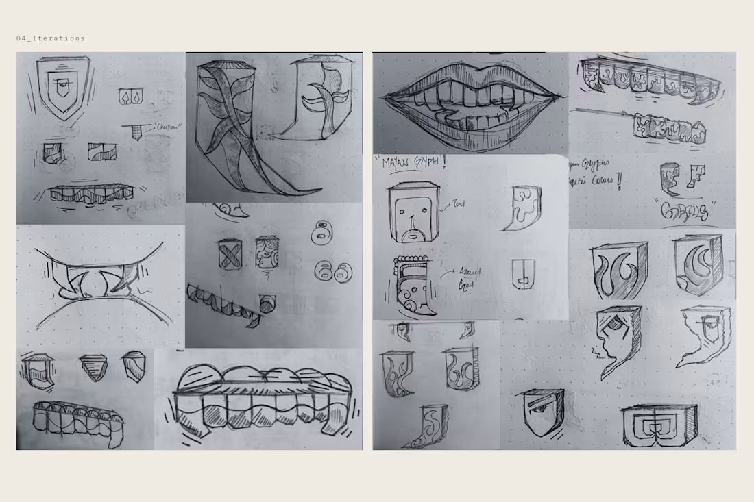
The strongest brands don't invent identity.
They reveal it.
I've been thinking about that while building CUT DIFFERENT.
Long before brands existed, people expressed who they were through symbols, rituals, clothing, and the objects they chose to wear.
Identity came first.
Branding came later.
Somewhere along the way, we started believing that branding could manufacture meaning on its own.
I don't think it can.
A visual identity can't compensate for the absence of a real one.The role of branding isn't to create authenticity.
It's to uncover it, give it structure, and make it recognizable.
That idea stayed with me throughout this project.
Maybe the most memorable brands aren't the ones trying to look different.
Maybe they're the ones willing to reveal what already makes them different.
—
Explore the complete CUT DIFFERENT case study on my Contra profile.
2
1
102
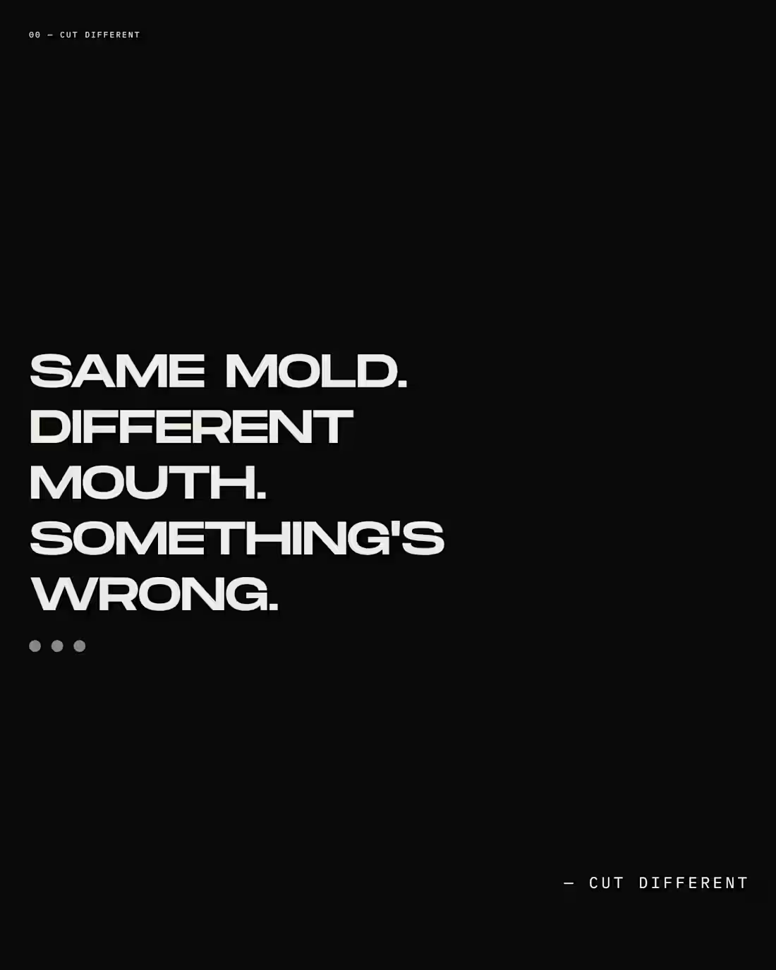
We have more ways than ever to express who we are.
Yet somehow, we keep looking more alike.
That contradiction stayed with me while researching identity, culture, and self-expression.
For centuries, people modified their bodies to communicate belonging, status, rebellion, and individuality. These weren't trends. They were symbols shaped by culture, craft, and personal meaning.
Today, self-expression is more accessible than ever. But accessibility often comes with standardization. The same trends spread faster. The same symbols become commodities. Individuality becomes easier to buy, but harder to own.
That question eventually became CUT DIFFERENT.
Not as a project about grillz, but as an exploration of what identity means when everyone has access to the same tools, the same trends, and increasingly, the same aesthetics.
I think the same tension exists in branding.
When every brand has access to the same technology, the same AI, and the same tools, differentiation no longer comes from what you use. It comes from how you think.
It comes from perspective.
Explore the complete CUT DIFFERENT case study on my Contra profile.
0
83
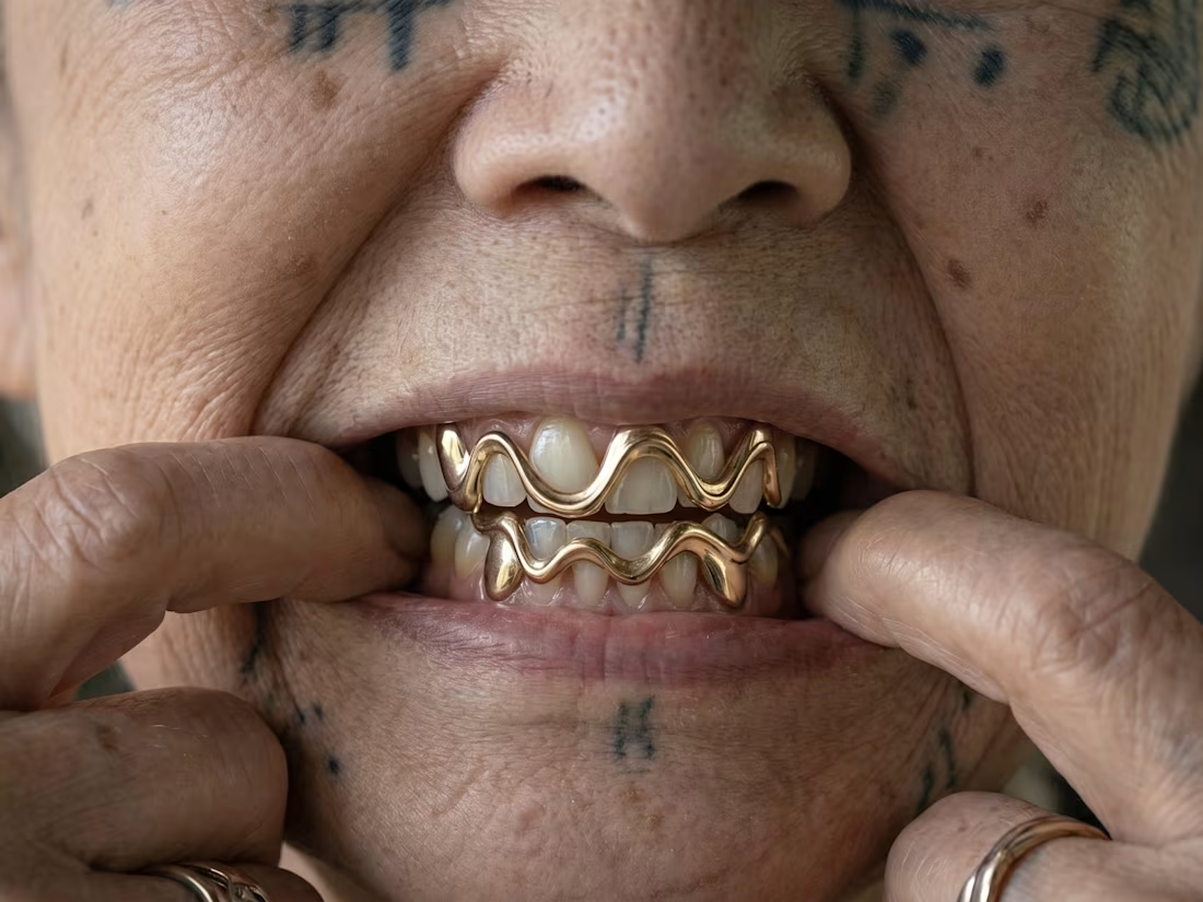
Most people see grillz as jewelry.
The more I researched, the more I realized they were originally markers of identity, craftsmanship, and personal expression before becoming widely standardized through mass production.
CUT DIFFERENT is my exploration of that shift questioning what happens when individuality begins to look the same.
This campaign extends the project beyond a visual identity, imagining how the brand's philosophy could translate into a contemporary campaign through creative direction and AI-assisted visualization.
The complete case study is available on my profile. I'd love to hear your thoughts.
1
114