
Sumit Tambitkar
Excel & Data Analyst: Data Entry, Cleaning & SQL
New to Contra
Sumit is building their profile!

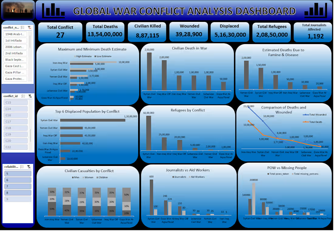
This is a comprehensive Global War Conflict Analysis Dashboard focused on tracking the heavy humanitarian impact of global conflicts. The objective of this project was to organize historical data and highlight critical figures regarding casualties, civilian suffering, and human displacement.
Here is how I worked on this sensitive dataset:
Data Wrangling: Cleaned and structured large volumes of raw historical records in Excel, sorting out timeline gaps and making sure the massive numbers are completely accurate.
Tracking Key Metrics: Extracted high-level global indicators, including Total Conflicts (27), Total Deaths (13.54 Crores), Civilian Deaths (8,87,115), and Displaced Populations (5.16 Crores).
Visualizing Impact: Built specialized bar charts and trend lines to show refugee distributions, top displaced populations by conflict, and a comparison between deaths and wounded individuals.
I chose a professional deep blue layout to suit the research theme of the data. I also included active slicers on the side so anyone can filter the visuals by specific war phases or years instantly.
Tools used: Advanced Excel (Data Organization, Pivot Tables, Complex Formulas, Dashboard Layout)
1
30
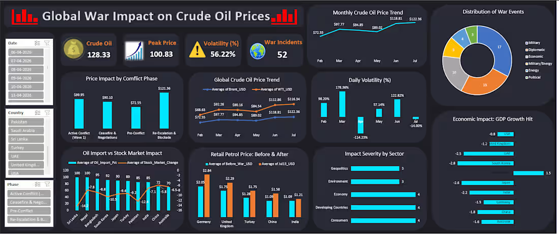
I designed this specialized dashboard to analyze how global geopolitical conflicts and wars directly impact crude oil prices, stock markets, and GDP growth. The goal was to take a highly complex global dataset and turn it into clear, visual trends.
Here is how I worked on this analytical project:
Data Prep & Sorting: Filtered and cleaned a huge raw dataset in Excel, fixing timeline gaps and aligning historical oil price variations properly.
Tracking Global Metrics: Tracked critical high-level data points, such as crude oil peak prices ($130.33), volatility rates (56.22%), and the exact number of war incidents (52).
Analytical Visualizations: Built dynamic trend lines showing monthly and daily crude oil fluctuations, bar charts for sector-wise impacts, and stock market response graphs.
I chose a dark theme with bright teal indicators to give it a modern data terminal look. The dashboard is fully interactive, letting you check the specific impact of different conflict phases instantly.
Tools used: Microsoft Excel (Data Cleaning, Advanced Analytics, Pivot Charts, Dashboard Architecture)
1
33
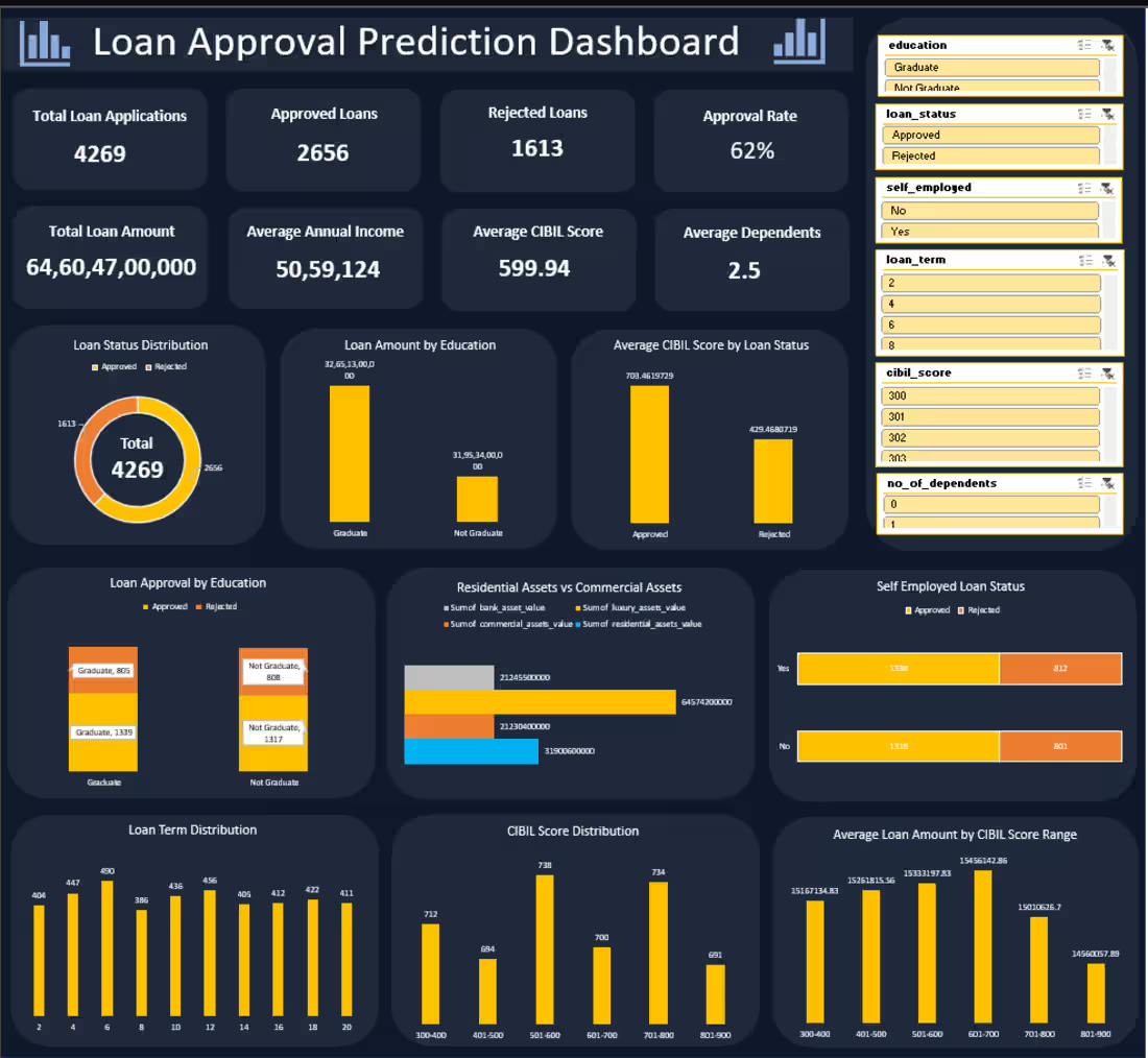
This is a banking credit dashboard I built from scratch to turn messy loan application records into clear, actionable visuals. The main goal was to analyze what factors actually cause a loan to get approved or rejected.
Here is how I worked on this project manually:
Data Formatting: I cleaned and sorted the raw dataset in Excel, fixing missing rows and organizing the numbers for a flawless setup.
KPI Calculation: I calculated core credit metrics, such as total loan amounts, average annual income, average CIBIL scores (599.9), and the final approval percentage (62%).
Insightful Charts: I created custom visuals to show important comparisons, like loan approval rates based on education levels and a breakdown of residential vs commercial assets.
I designed this entire dashboard on a dark background to make the charts stand out and look clean. Anyone can click the filters on the side to update the whole screen instantly.
Tools used: Advanced Excel (Pivot Tables, Slicers, Data Visualization, Data Analysis)
1
37
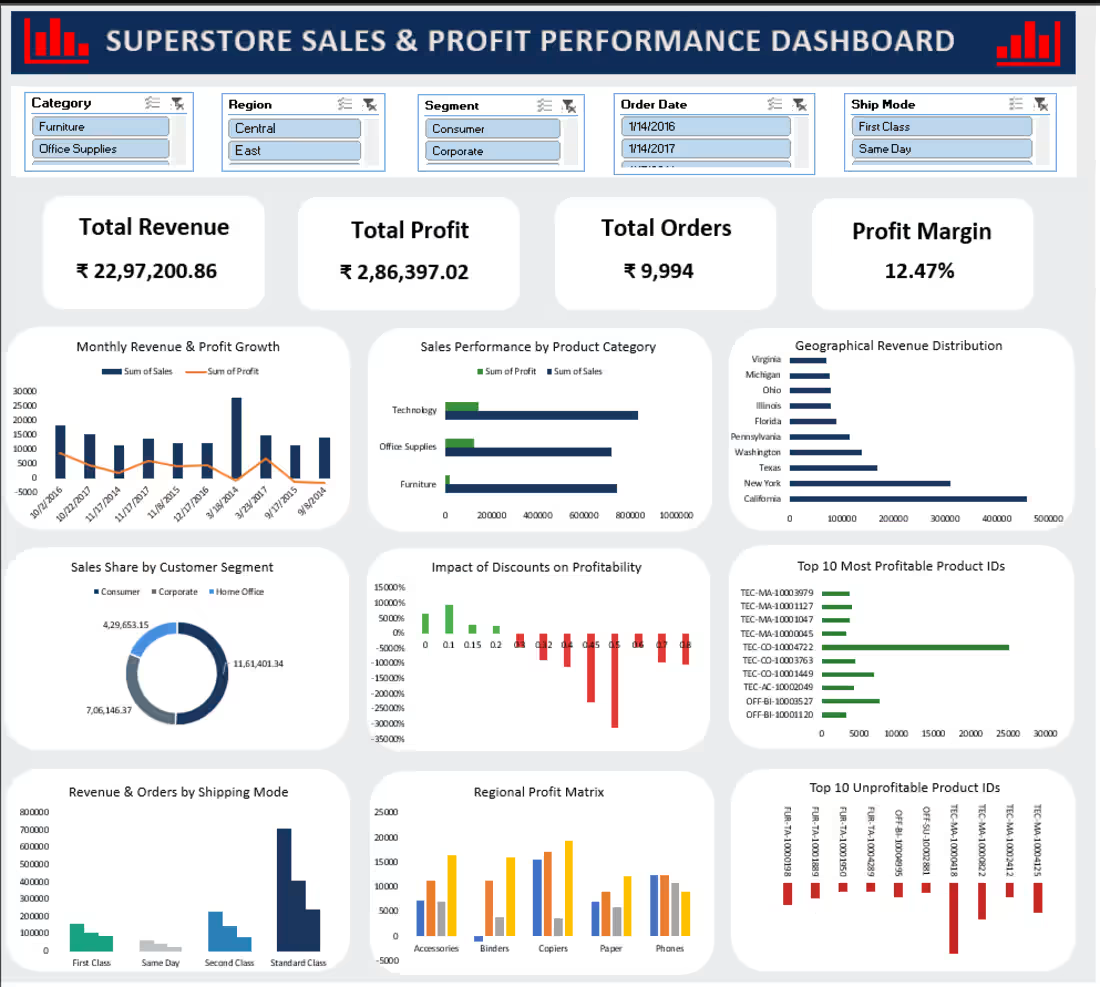
This is a retail sales and profit dashboard I built from scratch to turn complex spreadsheet data into easy-to-read visuals. The main goal of this project was to make a messy dataset meaningful so a business owner can instantly check how their store is performing.
Here is how I worked on this project:
Data Cleaning: I went through the entire raw file in Excel, filtered out bad entries, and organized the rows to make sure the dashboard numbers are completely accurate.
KPI Tracking: I used Excel formulas to pull out core business metrics, such as total revenue, total orders, and the overall profit margin (12.47%).
Designing Charts: I set up clean visuals to show key trends, like sales by shipping modes, customer segments, and a breakdown of top-performing products.
I also added dynamic slicers, so you can click on any region or year and the whole screen updates automatically. I handled this entire project manually from start to finish.
Tools used: Advanced Excel (Pivot Tables, Slicers, Formulas, Dashboard Design)
1
56