
Somtochukwu Nwobodo
• Brand/Visual Identity Designer •
Ready for work
Somtochukwu is ready for their next project!
Day 26/100
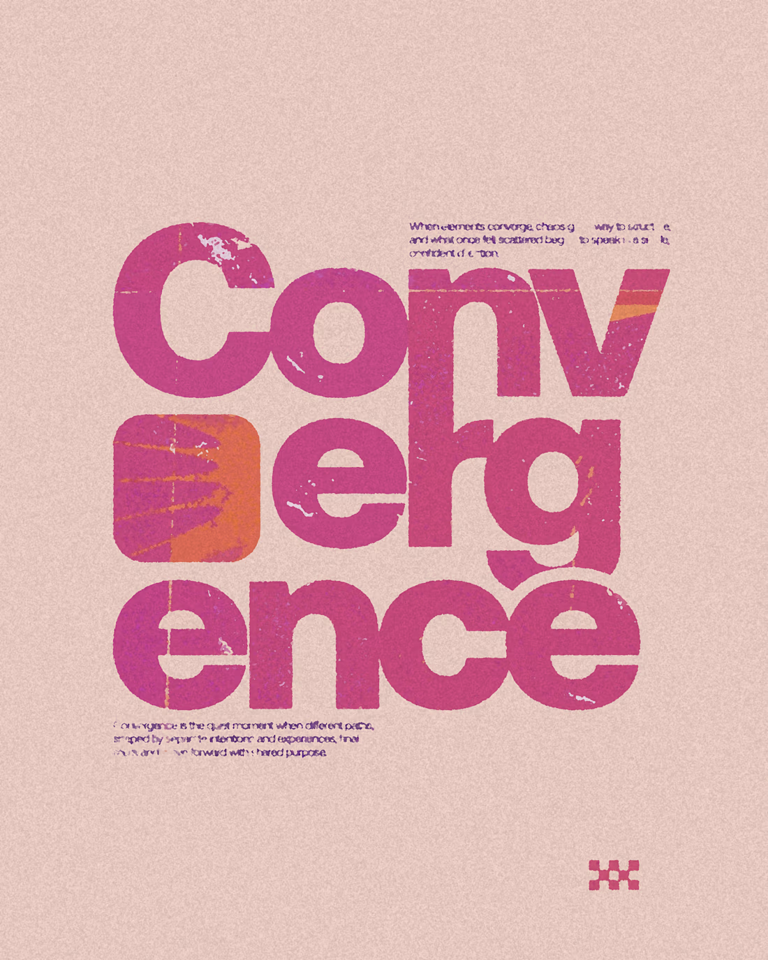
Convergence
0
36
Day 3/100.
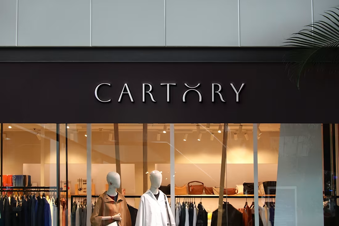
Brand: Cartory, an online marketplace for curated lifestyle and fashion products.
Mission: To connect shoppers with quality, stylish essentials.
The Cartory wordmark is designed to exude simplicity and elegance. The refined typography reflects quality and style, while maintaining a clean, modern feel.
The arched “O” adds a subtle yet distinctive detail, symbolizing stylish expression and fashion-forward thinking.
0
34
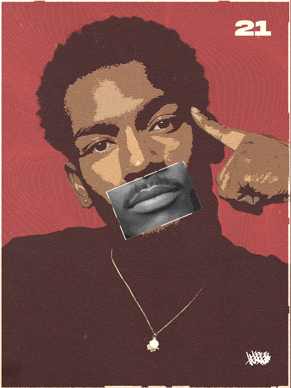
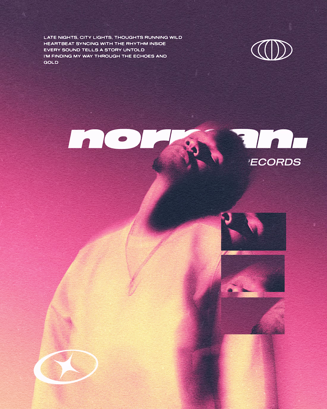
Day 14/100.
A proper name for the poster? Anyone?
0
30
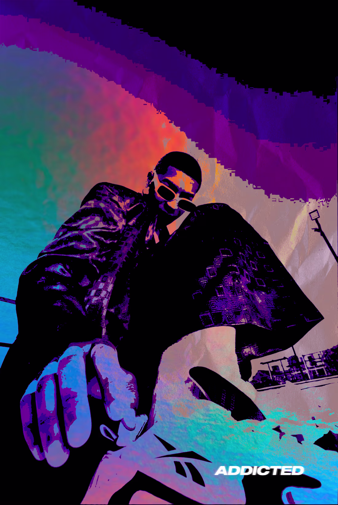
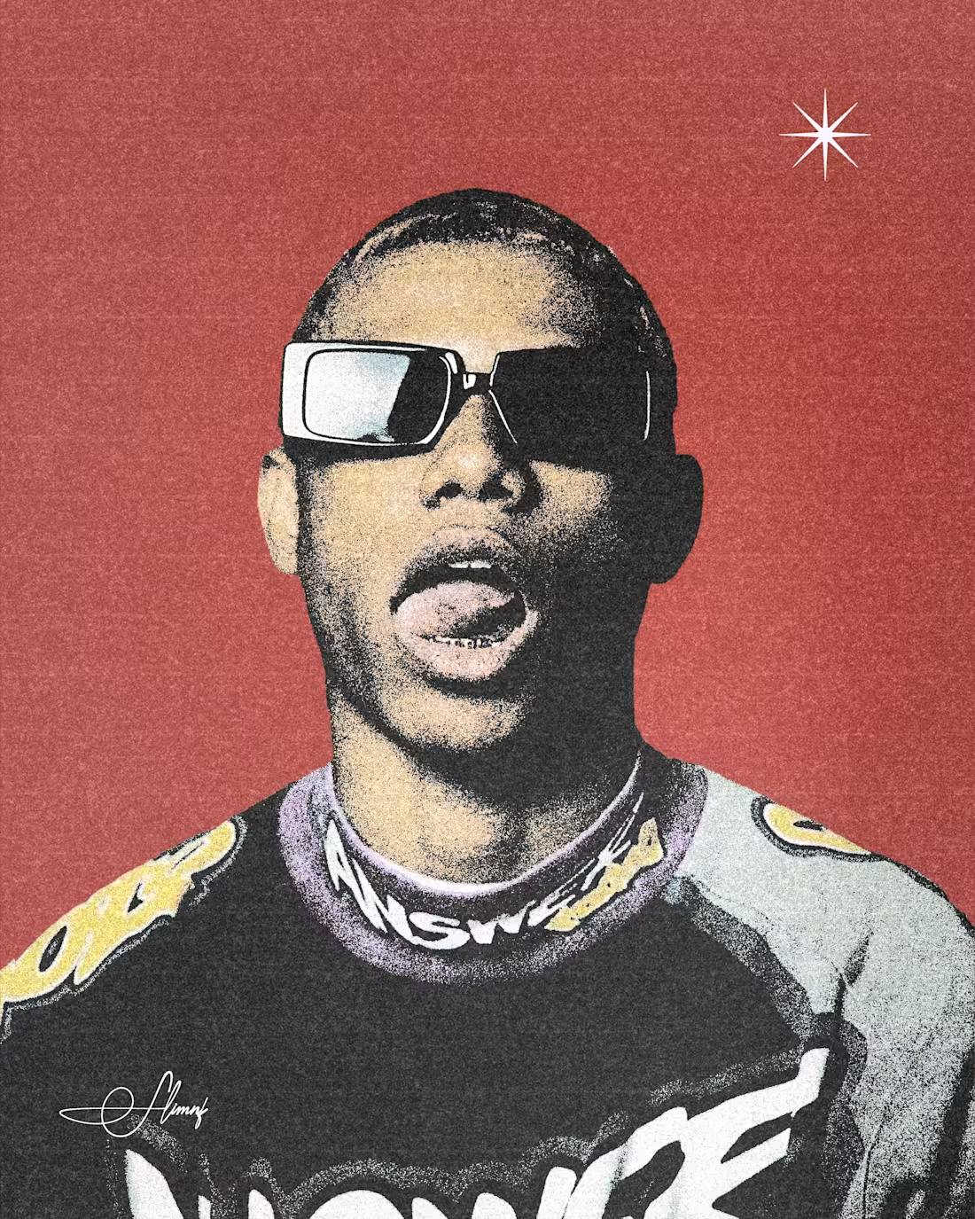
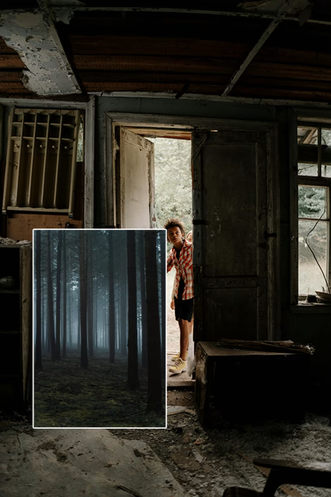
Neo-psychedelic.
I have become addicted to this style of design.
1
29
Day 11.
Explored Pointillism.
Also tried merging blur effect.
2
1
29
Day 10/100
It’s been quite a journey so far, and honestly, it hasn’t been rosy. Here are a few things I’ve picked up while journeying through the past 10 days:
Good design takes time.
You have to think and analyze properly.
It goes beyond just “adding color.” Understanding hues, saturation, ranges, and how to grade them plays a huge role in how visuals appear and feel.
Discovered new tools, understood how they work, and I’m still discovering more every day.
Finally, I won’t say I’m exactly where I want to be yet, but I’m getting there. Am I perfect now? Not at all. But am I growing? Definitely.
Cheers to the next 10 days 🚀
1
1
26

Day 7/100
Ring on display.
1
1
12
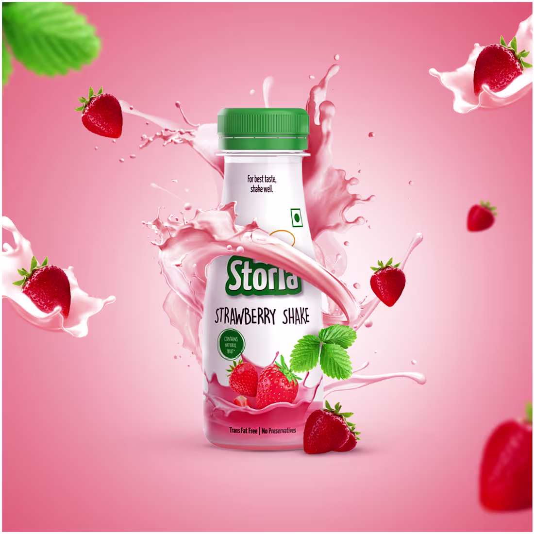
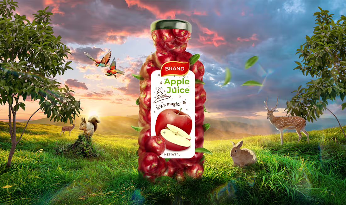
Day 6
Strawberry Juice.
1
1
14
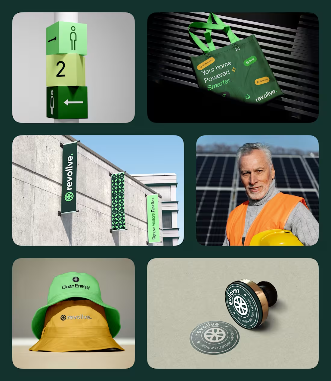
We’re live. 🚀
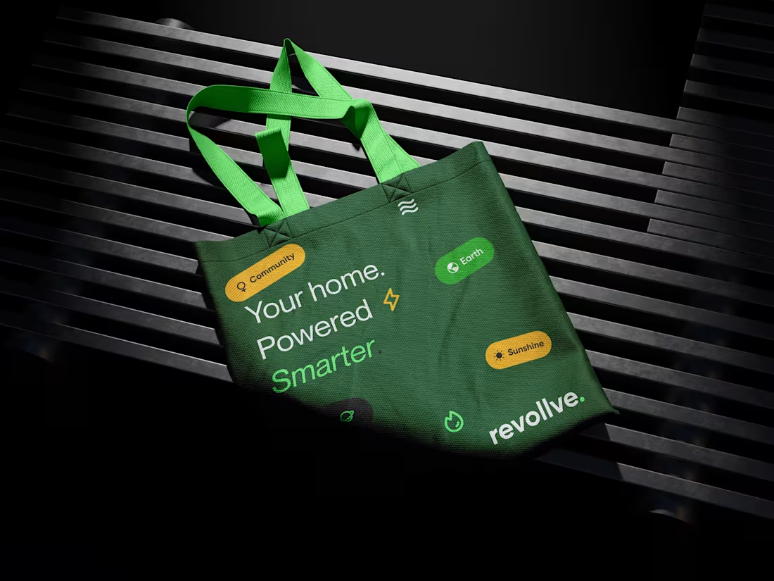
Revollve is a renewable-energy brand built on accessibility, community, and sustainability, with the goal of making clean energy easier to understand and easier to adopt.
Every point was designed with intention, not just to look good, but to reflect Revollve’s commitment to clean, modern, and human-centered energy solutions.
Excited to finally share this with YOU.
I worked on this project with my amazing teammates
Charles Nnamdi (https://www.linkedin.com/feed/#) Ernest Ekeoma (https://www.linkedin.com/feed/#) Noble Chibueze Ugorji (https://www.linkedin.com/feed/#)
You can click on the link to view the full project.
https://www.behance.net/gallery/240322199/Revollve-Brand-Identity
3
42

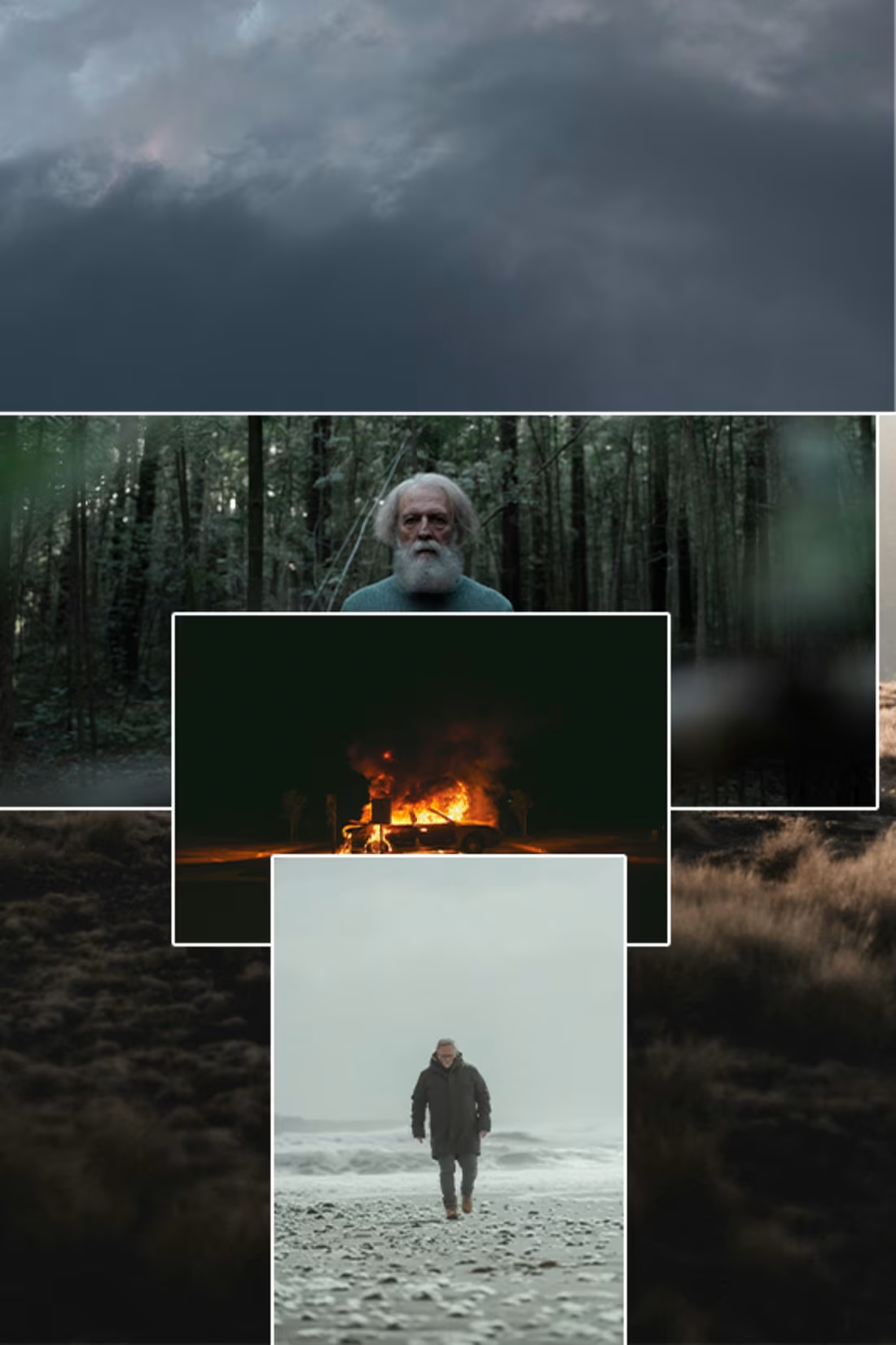
Day 4/100
The Battlefield.
1
1
25
It's not too late to post.
Day 3/100.
Movie Poster.
2
24
We’re going live tomorrow, and I’m really excited about it Revollve’s brand values revolve around accessibility, community, sustainability, and everything that represents renewable energy.
We carried out extensive research, and throughout the entire branding process, we were intentional about making sure every touchpoint reflected those values clearly.
2
18
Day 2/100
Horror
1
18
I started a 100-day photo manipulation journey, not just for fun, but to level up my branding and design skills.
Strong storytelling visuals matter, and I want my deliverables to speak, connect, and work.
Today's day 1/100.
1
3
19
While working on Revollve, I took time to really understand the solar and renewable-energy space. I researched different solar companies across the UK, compared how they communicate, and paid attention to where customers often feel confused or overwhelmed.
Revollve was created with a lot of intention.
From the visuals to the tone of voice, the goal was to remove unnecessary noise and build a brand that feels clean, straightforward, and genuinely human.
And honestly, that’s what branding is about for me, intentionality.
It’s not just about making things “look nice.” It’s about solving a communication problem, shaping perception, and designing an experience that actually works for the people using it.
With Revollve, the intention was clear:
create a brand that communicates clean energy with the same clarity it promises.
4
8
47
I’ve learnt that good design isn’t about choosing between speed and precision, it’s about understanding the role each one plays.
Speed helps me unlock possibilities. When I’m exploring ideas, I move quickly so creativity can breathe. I sketch, test, and iterate without getting stuck on perfection too early. That early momentum gives me clarity.
But once the right direction reveals itself, I switch gears. Precision becomes the priority. This is where I slow down, refine the structure, tidy the alignment, question the hierarchy, and make intentional decisions about spacing, typography, and visual flow. It’s the stage where the work transforms from “good” to “carefully crafted.”
Balancing both phases is what allows me to deliver efficiently without compromising quality.
3
2
20
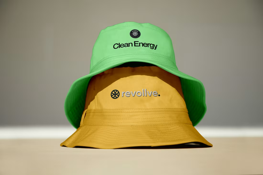
For this project, I decided to try my hands on badge design, and my goodness, I’m in love with the Revollve brand badge on the bucket hat.
What do you think about it?
0
13
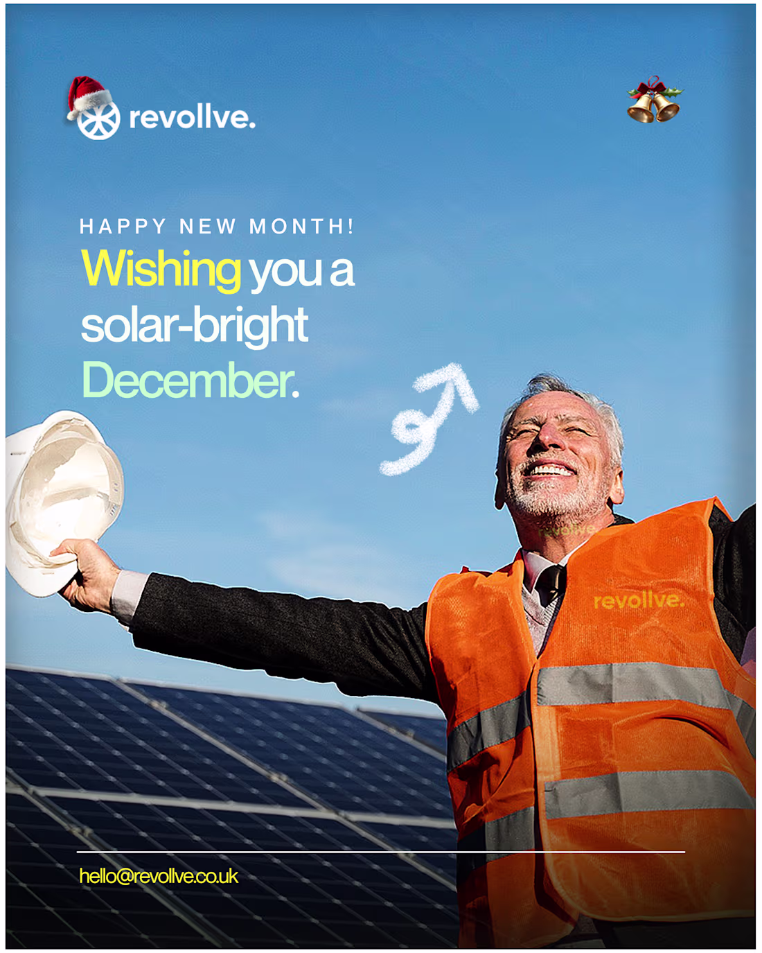
At Revollve, one of their core brand values is simplicity and minimalism.
In developing their identity, I’ve been focused on translating those values into all their media.
Wishing you all a bright, solar-powered new month from Revollve.
0
11
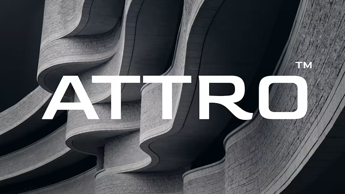
I’m currently working on a project for ATTRO, an architectural firm that focuses on building spaces that inspire, connect, and endure. Their work goes beyond structures, they craft environments where people genuinely feel at home, engaged, and inspired.
I’m also open to collaborating with motion designers and UI designers. If you’re interested, let’s create something amazing together.
4
3
39
I’m really excited about this project.
Based in the UK, they’re making renewable energy accessible to communities and helping households meet their energy needs with smarter, cleaner solutions.
Revollve, powering you forward.
2
35
We created something insane for this brand design project.
Koin is a fintech & web3-driven brand that reimagines the way people see and use money. Inspired by the traditional concept of a coin but evolved with a "K," Koin represents the shift from physical currency to digital assets in a secure, simple, and modern way.
Check it out on Behance: https://www.behance.net/gallery/239019027/Koin-Fintech-Brand-Identity
1
32
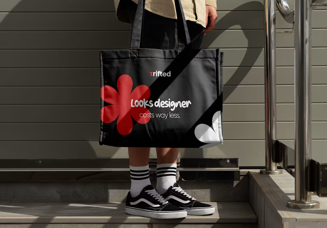
Trifed, Nigeria’s Thrift Revolution
Find it. Trust it. Love it.
Trifed is reshaping Nigeria’s second-hand (okrika) fashion economy, a massive market that remains largely chaotic and unstructured.
Rooted in the everyday style of Nigerian streets, Trifed brings order, trust, and style to thrift fashion. No more digging through endless piles in Yaba, Dugbe, or Ogbete markets. No more DM-for-price culture, claim rushes, or scams.
Trifed bridges the gap between traditional thrift shopping and modern e-commerce, giving buyers an organized, secure, and seamless experience. Vendors gain structure and visibility. Buyers gain trust and convenience.
2
3
27
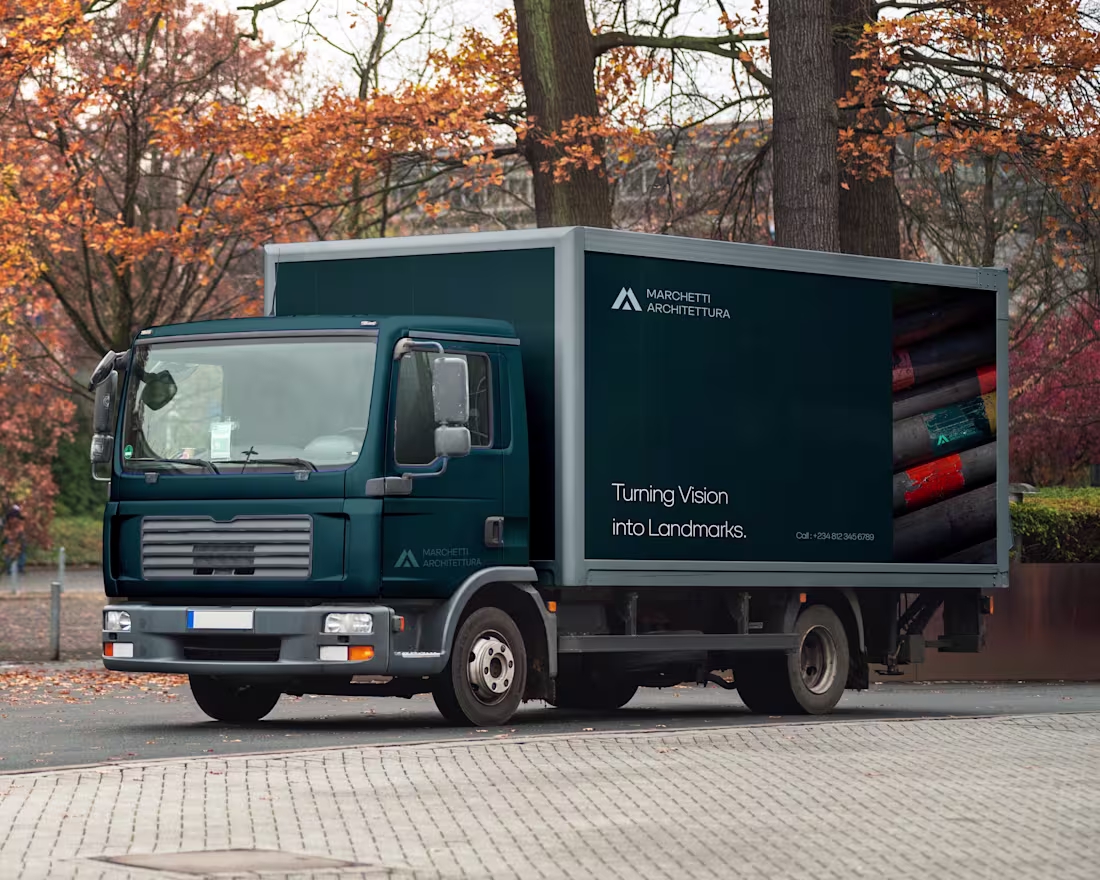
Marchetti Architettura is a modern Italian-inspired architecture and development studio built on precision, creativity, and a deep respect for structural beauty.
Founded on the belief that every space can become a masterpiece, Marchetti blends contemporary design with timeless Italian craftsmanship to create environments that feel refined, intentional, and enduring.
1
27