
Sidra Siddique
Data Analyst | Power BI Dashboards & Data Visualization
New to Contra
Sidra is building their profile!
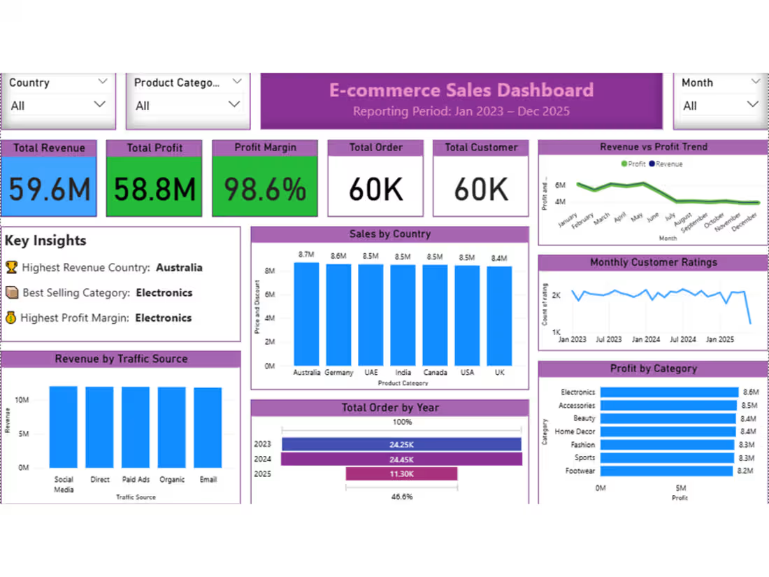
E-commerce Dashboard
An interactive dashboard created to explore e-commerce product performance, pricing, sales, ratings, reviews, discounts, and seller trends.
The dashboard provides visual insights into product categories, price tiers, sales performance, customer ratings, review activity, and seller-related metrics. Interactive visuals make it easier to compare products and categories and identify important marketplace patterns.
0
26
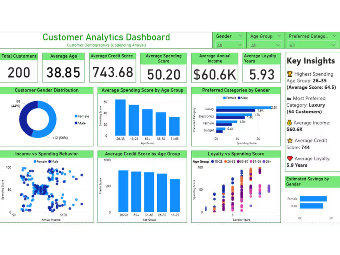
Customer Analytics Dashboard
An interactive Power BI dashboard designed to analyze customer demographics,
spending behavior, income levels, loyalty, and customer segments. The dashboard presents key metrics and visual insights across age groups, gender, annual income, spending scores, credit scores, loyalty years, and preferred categories. It provides a clear view of customer patterns and helps compare different customer segments.
0
31
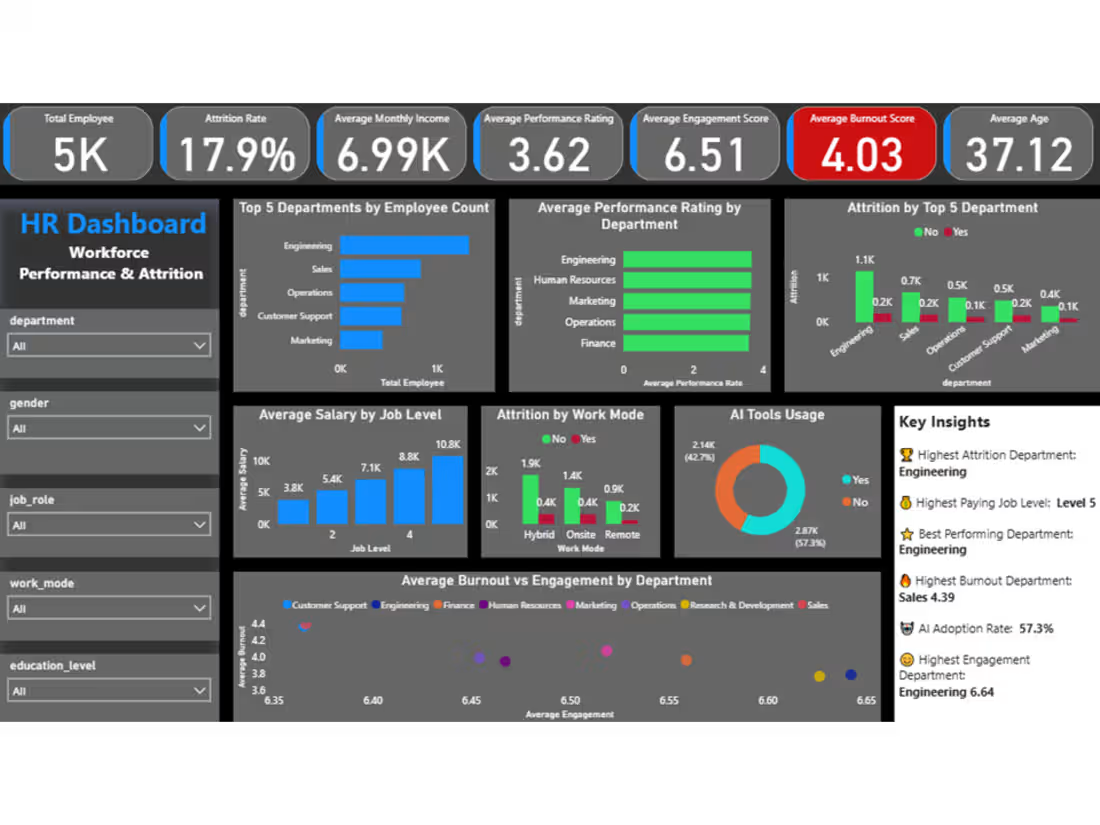
HR Analytics Dashboard
An interactive Power BI dashboard created to explore workforce trends, employee engagement, burnout, performance, AI adoption, and attrition. The
dashboard combines key HR metrics with interactive visualizations to analyze departments, job roles, work modes, overtime, engagement, burnout, performance ratings, and employee attrition. It provides a structured overview of workforce patterns and highlights areas that may require further attention.
0
36
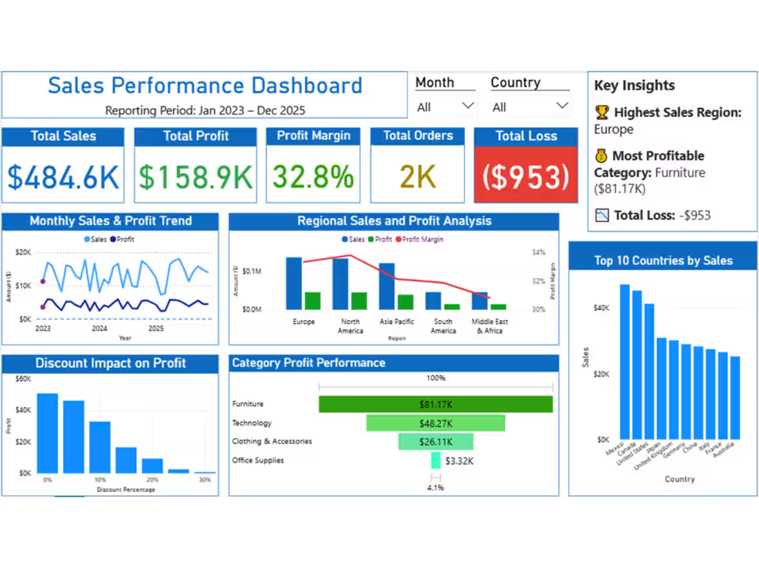
Sales Performance Dashboard | Power BI
Designed an interactive Sales Performance Dashboard in Power BI to analyze revenue, sales, profit, and overall business performance. The
dashboard provides clear insights into sales trends, product and category
performance, and key business metrics through interactive visualizations and KPI cards. Data was prepared and transformed using Power Query, then presented in a clean and user-friendly dashboard to support data-driven decision-making.
0
61