
Lately, I’ve been thinking less about “making things look good”
and more about making things make sense.
As a designer, my goal is simple:
Clarity over noise. Function over hype.
From fintech flows to product systems, I focus on designing experiences people can trust.
Open to new projects, Let’s talk.
X: ayotheUX (https://x.com/ayotheUX) | LinkedIn: Shuaib Ayomide (https://www.linkedin.com/in/shuaib-ayomide-2358b725a/)
1
6
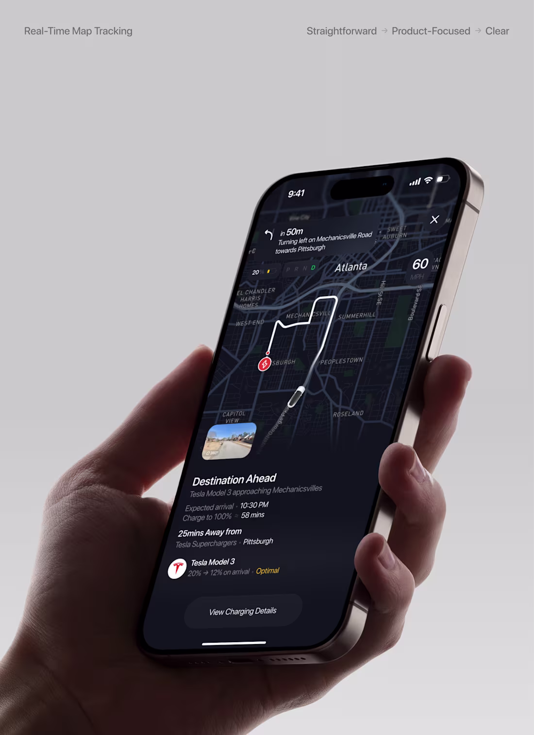
I designed a concept
While exploring EV experiences, I noticed something:
Most navigation systems show directions, but don’t address energy confidence.
Users are left wondering:
• Will I arrive safely?
• Is this charger the best option?
• What happens after I get there?
So instead of focusing only on navigation, I designed around the idea of a journey to charge.
The experience introduces:
• Predictive battery on arrival
• Charging-focused destination context
• Clear, status-driven communication
But I didn’t stop there.
I explored a future scenario where your car can charge itself.
Imagine being anywhere and simply sending your vehicle to a nearby charger powered by advancements from companies like Tesla in autonomous driving.
• Send car to charge remotely
• Track its journey in real time
• Get updates while it charges
• Have it return or stay parked
The goal was simple:
Make EV navigation feel less uncertain and eventually, effortless.
0
6
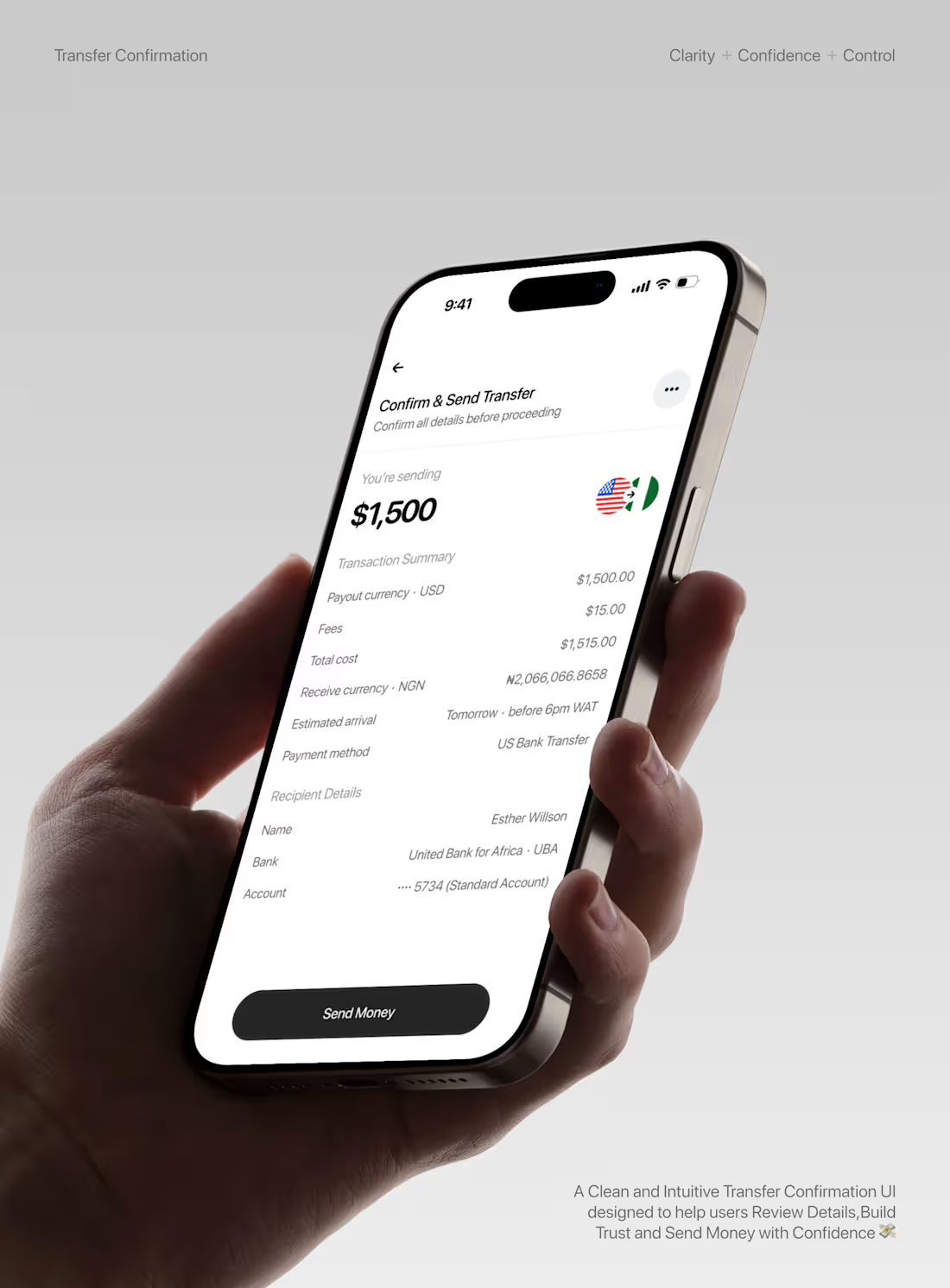
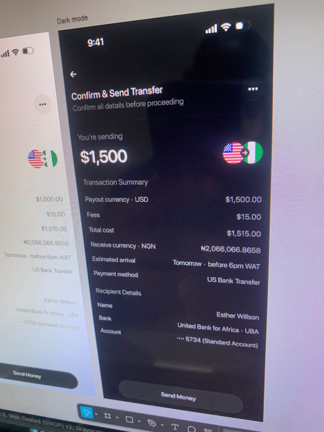
I recently worked on a transfer confirmation experience, and it pushed me to think beyond visuals.
At this stage of a product flow, users aren’t browsing or exploring, they’re making a decision.
And not just any decision….they’re about to send money.
That changes everything.
The goal of this UI wasn’t just to look clean.
It was to create Clarity, Confidence, and Control in a high-stakes moment.
So the design focuses on what truly matters:
• The amount being sent (clear and dominant)
• The recipient (no ambiguity)
• The breakdown (fees, exchange rate, total)
• The final action (simple and decisive)
Everything else is intentionally reduced or pushed into the background.
Because in moments like this, even small friction can create hesitation:
“Did I enter the right details?”
“Am I being charged correctly?”
“Can I trust this?”
The interface answers those questions before they’re even asked.
One key decision was structuring the layout to guide the eye naturally:
Top → Context → Amount → Breakdown → Action
No guesswork. No cognitive load. Just flow.
I also paid close attention to tone and microcopy.
Instead of sounding system-heavy or robotic, the language is calm, clear, and human—reinforcing trust without adding pressure.
This project reminded me of something important:
Good design is about aesthetics.
Great design is about decision-making.
It’s not just about how things look,
It’s about how people feel when they’re about to take action.
And in fintech, that feeling needs to be confidence.
hashtag#UXDesign (https://www.linkedin.com/search/results/all/?keywords=%23uxdesign&origin=HASH_TAG_FROM_FEED) hashtag#ProductDesign (https://www.linkedin.com/search/results/all/?keywords=%23productdesign&origin=HASH_TAG_FROM_FEED) hashtag#UIDesign (https://www.linkedin.com/search/results/all/?keywords=%23uidesign&origin=HASH_TAG_FROM_FEED) hashtag#Fintech (https://www.linkedin.com/search/results/all/?keywords=%23fintech&origin=HASH_TAG_FROM_FEED) hashtag#DesignThinking (https://www.linkedin.com/search/results/all/?keywords=%23designthinking&origin=HASH_TAG_FROM_FEED)
1
10
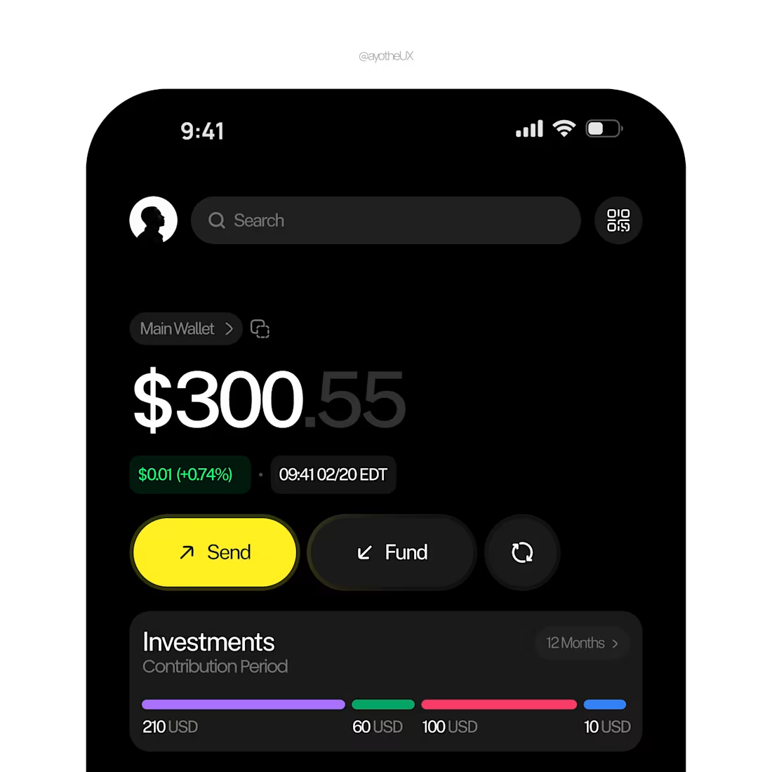
Crypto wallet + Investment dashboard
Users can view balance, send/fund assets, track performance, and monitor top holdings.
1
28
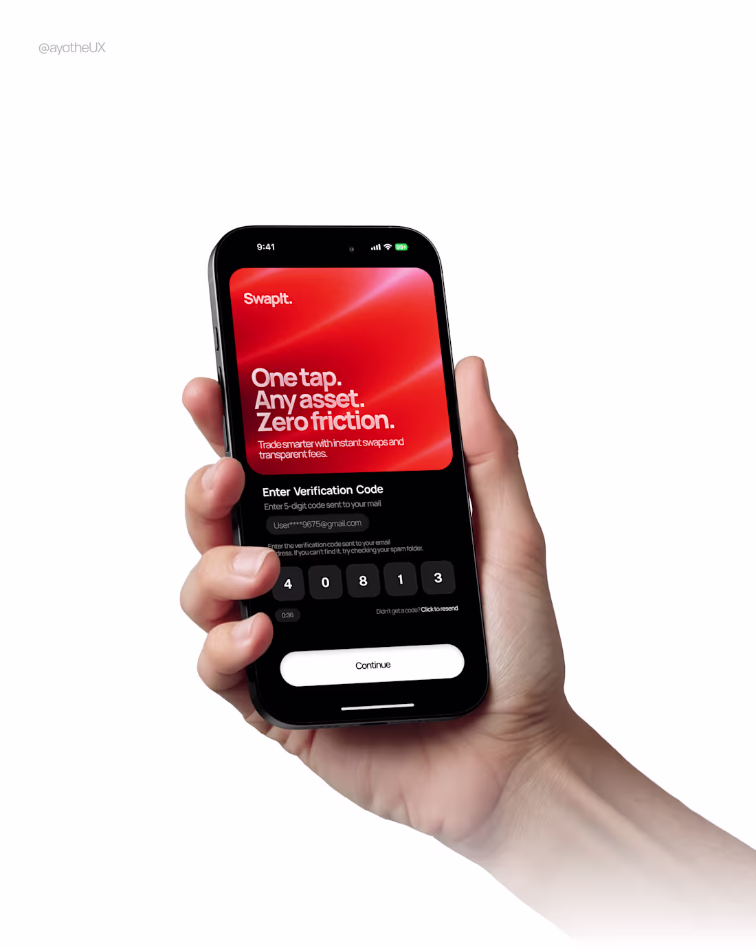
OTP screen concept for a crypto swap app.
Focused on clarity, trust, and zero friction.
1
29
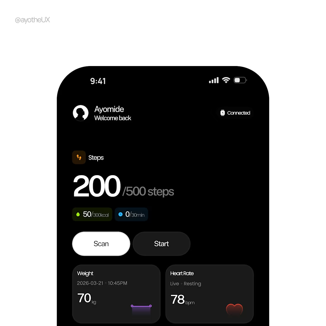
This dashboard is very strong from a product-thinking perspective. It doesn’t just look good; it communicates clarity, control, and calm, which is exactly what a health/fitness product should do.
1
58