
shalai amte
Building brand experiences from scratch.
Profile in progress
shalai is building their profile!
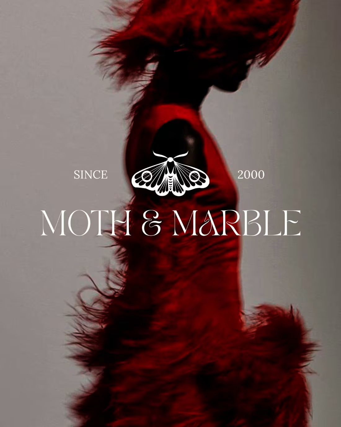
Maroon nights and old-money whispers. This one was about translating a feeling into form that specific energy of expensive dresses, dim candlelight, and the kind of beauty that doesn't need to announce itself.
The challenge: create a luxury brand identity that felt whimsical without being cutesy. Dark without being heavy. Expensive without being cold.
Visual identity includes: primary wordmark + secondary moth seal (symmetrical, obsessive detail), and secondary system for applications.
The moth as metaphor felt right drawn to something beautiful, a little dangerous, endlessly intricate.
Design is about choices. Every color, every line, every detail of that envelope mock-up had a reason. That's what separates a pretty logo from an identity that means something.
2
4
40