
shailendra kushwaha
Hi, I'm Shailendra kushwaha freelance graphic designer.
New to Contra
shailendra is ready for their next project!
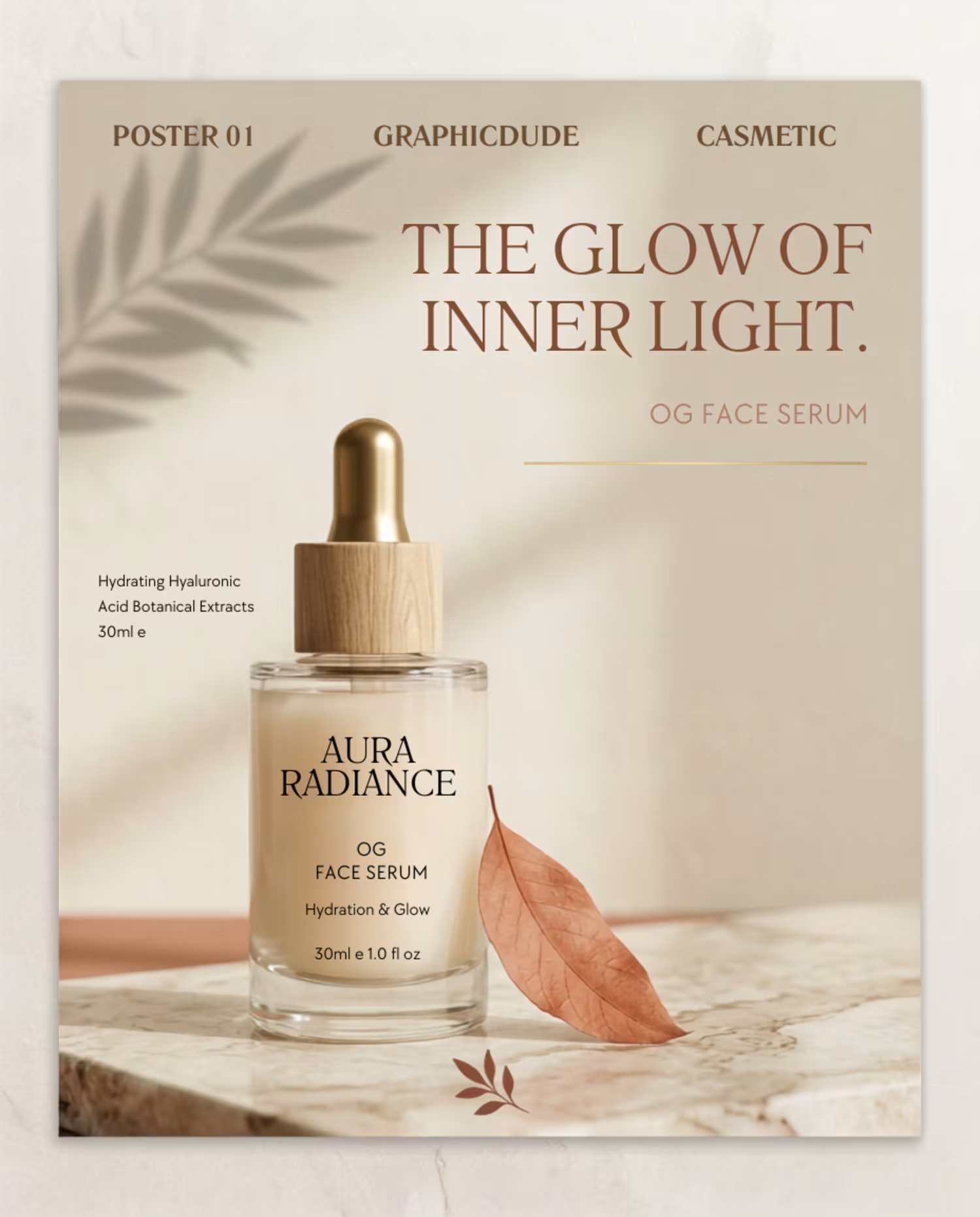
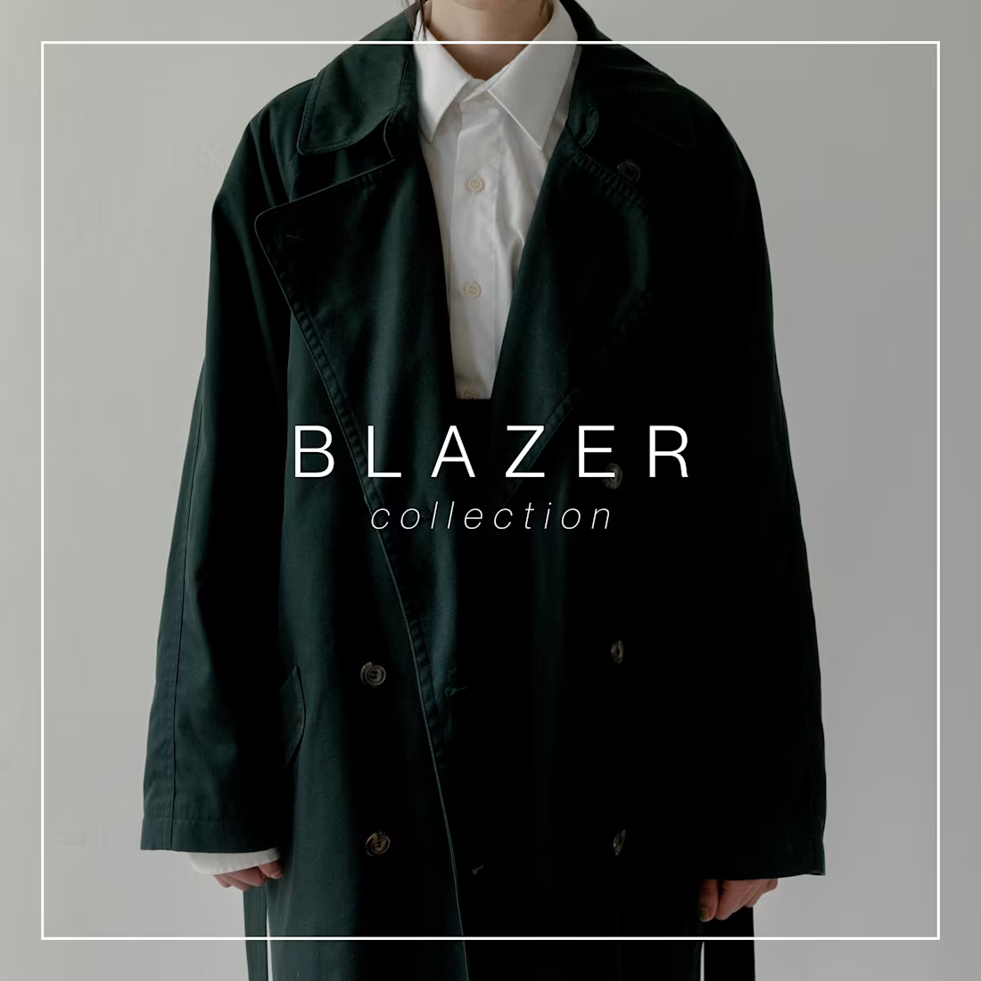
Minimal. Premium. Product-focused. 🖤
A blazer campaign concept designed with clean typography and a refined visual style.
Looking for graphics for your fashion brand? Let’s work together.
0
13
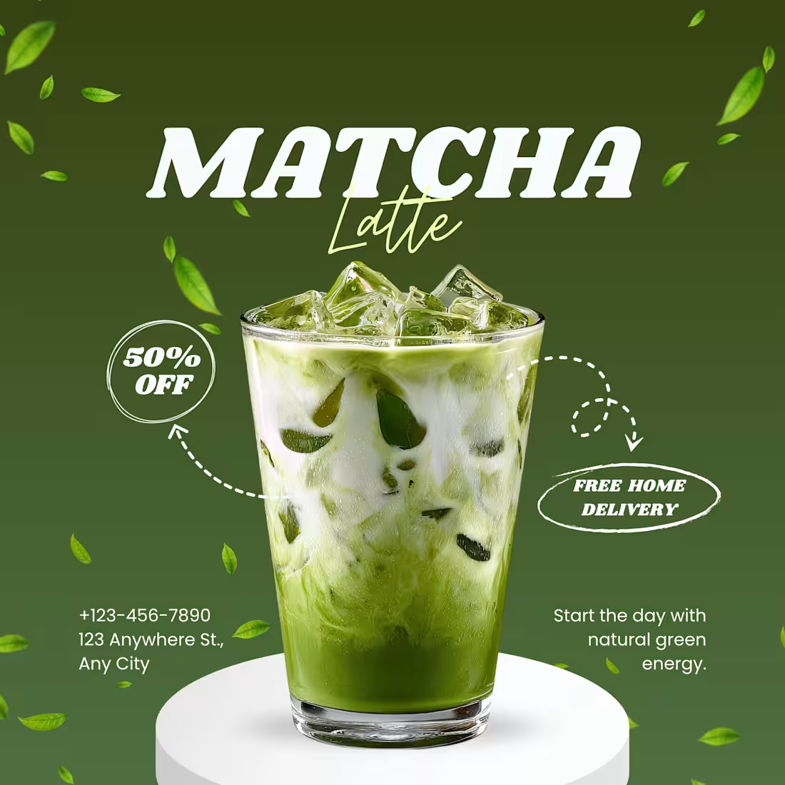
A social media ad designed to make the product impossible to ignore. 🍵
Bold typography, product-focused composition, and clear promotional messaging come together to create a visually engaging Matcha Latte campaign.
0
15
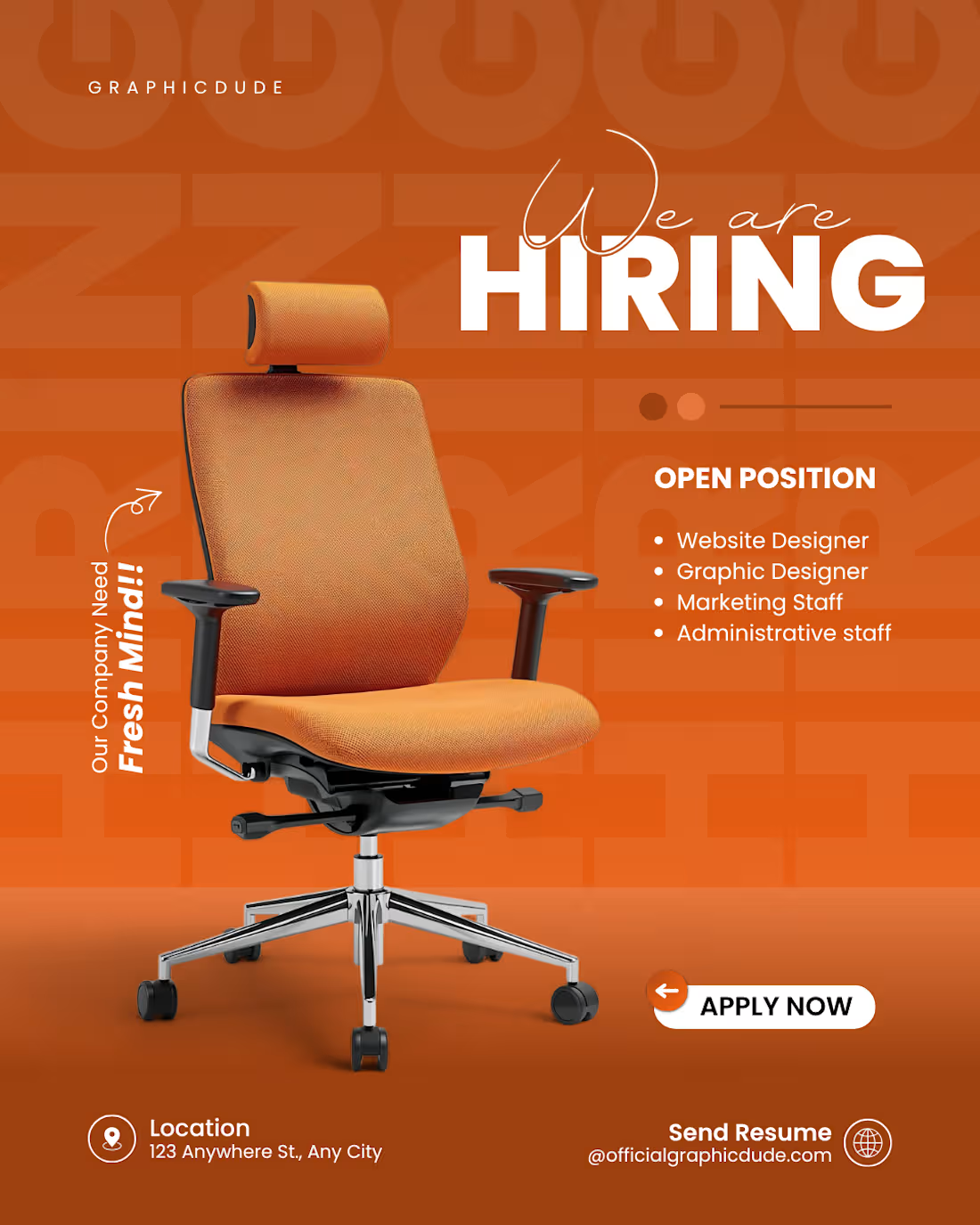
A bold, vibrant, and highly engaging corporate recruitment flyer designed for a modern agency or startup. The design leverages high-contrast color theory, strong product/object positioning, and clear typographic hierarchy to attract top talent and drive job applications.
Key Highlights:
High-Impact Monochrome Palette: Utilizes a striking, energetic orange gradient background paired with a bold, oversized "HIRING" text watermark in the background to create deep layers and visual interest.
3D Product Centric Focus: Features a crisp, high-resolution premium office chair with realistic shadows as the central hero element, instantly communicating the corporate/workspace theme.
Smart Typography Pairing: Combines an elegant, flowing script font for "We are" with a heavy, clean sans-serif for "HIRING," creating an eye-catching header focal point.
Conversion-Optimized Layout: Uses a clean bulleted list for open positions ("Website Designer", "Graphic Designer", etc.) paired with a high-contrast, rounded "APPLY NOW" CTA button for seamless navigation.
0
43
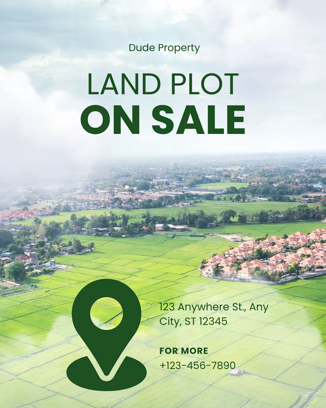
A clean, high-impact marketing flyer designed for a real estate brand showcasing land plots for sale. The layout focuses on strong visual hierarchy, clear contact details, and a high-angle landscape shot that immediately captures the scale and potential of the property.
Key Highlights:
Aerial Photography Integration: Features a stunning, bright drone/aerial view of lush green fields and nearby development, giving potential buyers an instant sense of the location and environment.
Bold Commercial Typography: Employs a heavy, strong sans-serif typeface for the primary hook ("LAND PLOT ON SALE") to instantly grab attention, balanced by a softer weight for the brand name ("Dude Property").
High-Visibility Location Branding: Uses an oversized, custom green location pin icon as a primary visual element, making the ad instantly recognizable as a real estate/location-based post.
Clean Information Hierarchy: Keeps the address and call-to-action (CTA) text minimal, readable, and properly aligned next to the graphic elements for seamless user navigation.
0
47