shahzeen kiran
Cinematic Video Editor & Social Media Strategist.
New to Contra
shahzeen is building their profile!
The Real Problem
When addressing mental barriers like perfectionism or creative block, standard talking-head videos feel too detached. The viewer hears the words, but they don't experience the feeling, causing their attention to drift. The challenge was to visually trap the audience within the frame, using geometric layout constraints to mirror the psychological state of being "paralyzed by a plan."
The Visual Architecture: Grid DistortionI engineered a progression of tight, restrictive compositions and unexpected angle cuts to intentionally build and release structural tension:
Typography Contrast & Temporal Audio
The text layout plays heavily with stylized, fluid script fonts in hot pink ("Biggest," "Management," "Yourself") contrasted against blocky, grounded sans-serif titles. Every spatial transition is anchored by a deep bass pad mixed with realistic environmental sound tracking (door latches clicking, glass sliding), ensuring the fast cuts maintain high sonic fidelity.
What I Handled
On-Screen Grid Layout Overlay Design
High-Angle Structural Blocking & Camera Direction
Psychological Tension Architecture & Pacing
Audio-Tactile Sound FX Synchronization.
1
3
The Real Problem
When creators talk about abstract concepts like "creating for yourself" or "experimentation," the audience's brain struggles to connect if the visual stays solely on the speaker's face. The narrative becomes an academic lecture, and the viewer swipes. The challenge was to anchor dense, introspective scripting to physical, relatable actions that break visual stagnation instantly.
The Visual Architecture:
Macro Cutaway InterceptionInstead of staying on a single wide plane, I engineered an edit that swings violently between high-concept monologue frames and tight, texturized macro shots to keep the viewer’s dopamine levels high:
Audio Continuity & Kinetic Typography
While the visuals jump from wide shots to tight macros, a seamless ambient audio track and rapid, crisp sound designs (the keyboard clicks, paper textures) act as the connective tissue. The typography plays with scale and style—juxtaposing heavy, boxy capitalized fonts for "CREATE" with elegant, handwritten script styles for "Yourself," visually mapping out the artistic theme.
What I Handled
Macro Cinematography & Studio Lighting Texturing
Dynamic Typographic Scale & Script Integration
Non-Linear Continuity & Asset Interception Editing
Spatial Layering & Dual-Performance Directing.
0
3
The Real Problem
Most philosophical or educational content fails because it's static. A creator sits in front of a lens for 40 seconds, and the viewer’s brain adapts to the environment within the first 4 seconds. Once the novelty fades, the user swipes. The challenge was to deliver a heavy psychological message about neutrality and labeling without allowing the viewer's eyes to settle for a single moment.
2. The Visual Architecture: Spatial RotationInstead of using artificial B-roll or generic stock footage, I used the speaker’s physical location as the retention mechanic. By rapidly shifting environments, I constantly reset the viewer’s cognitive adaptation clock:
3. Kinetic Transitions & TypographyThe video relies on physical movement to drive transitions, including an intentional hand-to-lens black-out wipe that completely resets the spatial plane. The typography uses a high-contrast serif font with dynamic color shifts (yellow, white, and red text fills) mapped directly to key psychological trigger words like "Look," "Life," and "Labels."
4. What I Handled
Multi-Location Production & Environmental Directing
High-Contrast Exterior Color GradingKinetic
Hand-Wipe & Spatial Transition
EditingMetric-Driven Typography Placement.
0
4
The moment an educational video turns into just a generic talking head droning on with a white wall behind them, it dies. Education doesn't have to look like a boring classroom lecture; it can look and feel like cinema.Some of the most successful, high-value channels on the internet right now make millions of views on dense, educational, or philosophical topics because they use visual metaphors and atmospheric storytelling instead of just a face talking at a lens.
Case Study: Engineering High-Pacing
Using Structural Speed and High-Contrast Aggression for Retention
1. The Real Problem
In short-form media, if you don't hit the viewer with immediate visual changes, they swipe. The challenge was to deliver a heavy, philosophical message about routine and consistency, but keep the pacing aggressive enough that the modern, low-attention-span viewer couldn't find a single second to scroll away.
2. The Visual Architecture
To balance heavy thoughts with high speed, I used a high-contrast, moody visual aesthetic but backed it up with aggressive editing mechanics
Rapid Spatial Jumps: Instead of staying in one room, the video jumps rapidly between a tight stairwell, a roof at sunset, a brick cutout, and a doorway to keep the eyes locked to the screen.
High-Contrast Typography: I utilized bold, high-impact text overlays directly synced to the vocal delivery as a visual anchor.
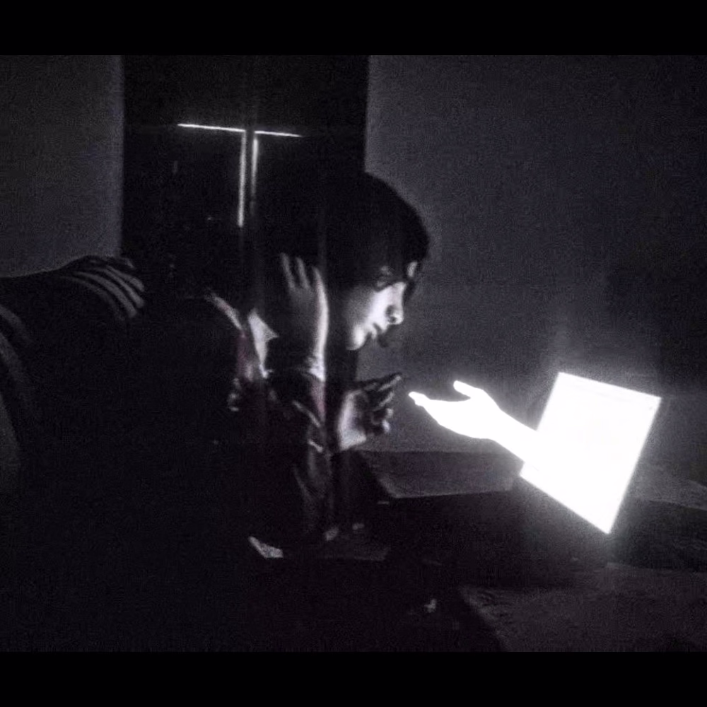
The Metaphorical Split: Integrated a dual-presence clone shot to give a fast-moving edit an underlying layer of depth and psychological friction.
Pacing & Sonic Drive
The video relies on a fast-paced audio track to dictate the speed of the cuts. Every transition and movement is tied to the rhythmic drive of the music. By keeping the vocal delivery tight and the visual transitions rapid, the edit creates a momentum that carries the viewer straight to the final loop.
What I Handled
Fast-Paced Spatial Editing & Multi-Location Cuts
High-Impact Retention Typography
Audio-Synced Pacing & Sound Tracking
High-Contrast Color Grading
0
2