
Waleed K
Visual branding + Product Design // Mobile Apps, Websites
Ready for work
Waleed is ready for their next project!
A complete website redesign for a law firm focused on improving trust, clarity, and conversion.
The goal was to simplify the user journey, strengthen the firm's credibility, and create a modern experience that helps potential clients find the right legal support with confidence.
Every screen was designed with usability, accessibility, and business goals in mind.
#WebDesign #UXDesign #UIDesign #ProductDesign #LawFirm #WebsiteRedesign #Figma #Portfolio
1
3
32
New Branding on the process
0
16
Another App: Done and Dusted 😍 💯
0
48
An app design for bank
0
63
TravelMind: Discover places that match your vibe
2
2
87
Goating the Goat
0
58
Brand Design: 3d Assets
3
82
Straight from Heart
Longest Duration Product i have ever worked on
1
68
Some Dashboards should be energetic
0
63
Some Banger Shots from VOYAGR Branding
0
61
Some Recent Branding with Website
0
57
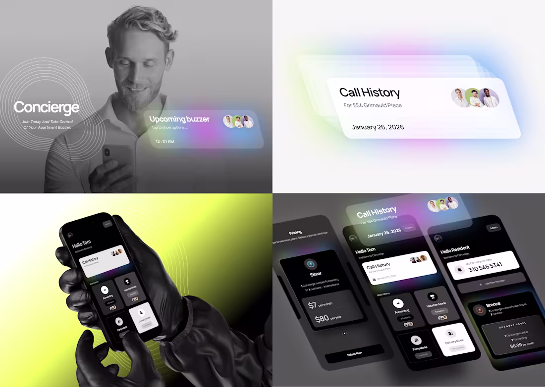
Concierge reimagines the apartment buzzer experience.
I helped shape a digital product that lets residents manage access effortlessly, removing friction from a daily interaction and replacing it with control, clarity, and convenience.
0
93
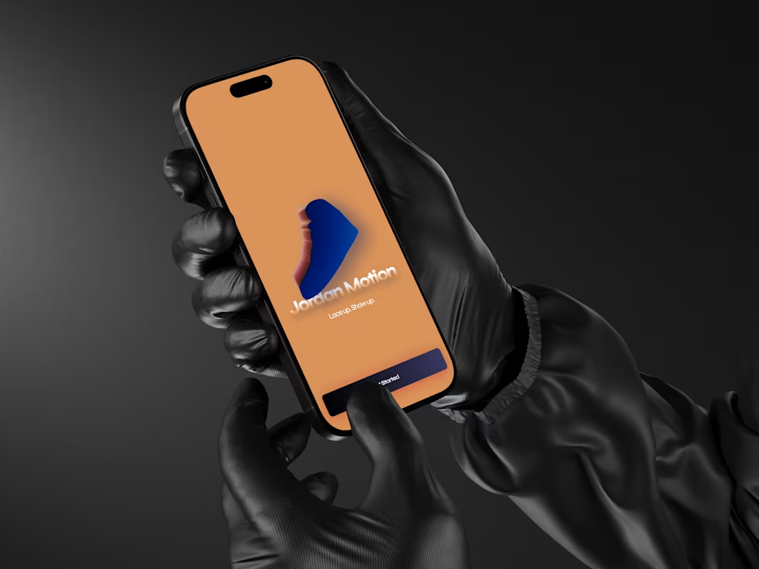
Jordan Tracker helps you stay consistent, motivated, and moving every single day.
Set clear fitness goals, track your progress, and turn daily activity into measurable wins. From weekly workouts to step count and calories burned, Jordan Tracker gives you a simple snapshot of how you’re performing and where to push next.
What you can track at a glance
Weekly workout progress such as 4 of 6 workouts completed
Daily step count such as 7,500 steps today
Calories burned in real time such as 430 calories burned
Whether you’re building a routine or leveling up your fitness game, Jordan Tracker keeps your goals visible and your momentum strong.
Step up your goals. Lace up. Get moving.
2
166
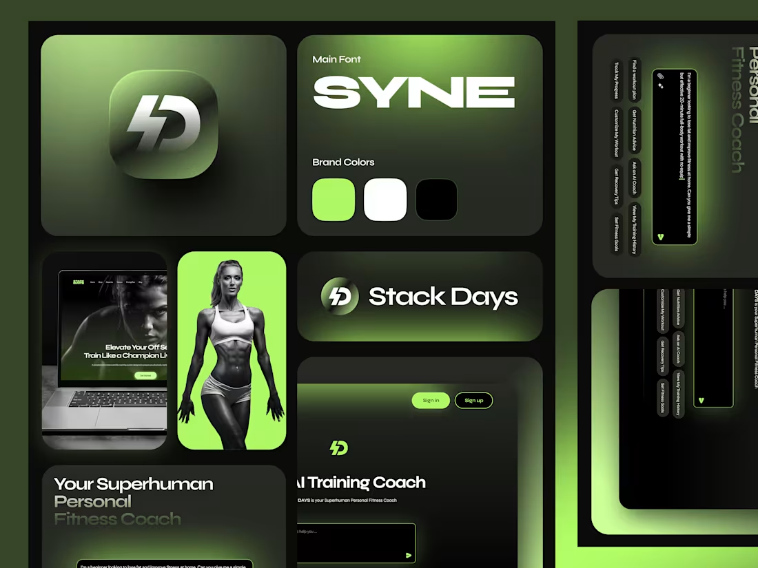
Stack-Days is an AI-based fitness platform designed to simplify how people approach health.
Ask anything about workouts, nutrition, routines, or recovery, and get instant, personalized guidance.
This project focuses on:
• Clean, intuitive UI
• AI-driven interactions
• Simplifying complex fitness decisions
Stay tuned for more Stack Days updates
Designing products that actually help people is the goal. 💯🔥
2
169
Some Visual Branding
With Visiting Cards
1
179
From Design to Kits
Fitness Landing Page
A conversion-focused fitness landing page designed to feel motivating, clear, and approachable. The goal was to present the program in a way that builds trust quickly while guiding users toward a clear call to action.
The layout focuses on strong visual hierarchy, clear messaging, and simple interactions to keep users engaged without overwhelming them. Typography, spacing, & color choices were kept intentional to support energy and clarity.
Process:
I started by understanding the target audience and the core goal of the page. From there, I structured the content to highlight key benefits early, followed by social proof and program details.
Design was refined with visual exploration, layout iterations, & CTA optimization to ensure page feels both inspiring and easy to navigate on devices.
1
155
Cease merely reviewing job descriptions.
PREVIEWED transforms job listings into comprehensive previews, enabling users to fully understand the role prior to application.
Currently developing additional visual assets for the product.
Checkout the landing page design in my profile for further details.
1
178
Voyagr, a bold new identity for a cross-border delivery startup.🧢🧢🧢
Some Mobile Onboarding is designed to connect Senders and Travelers with trust, clarity, and a spark of adventure.
This is just the beginning, more design process coming soon
Stay Tuned ✌️
5w
1
178
I took the Boomerang logo and transformed it into a fully realized 3D mark, keeping the brand essence intact while adding depth, realism, and presence.
This is how I approach design: Not just making things look good, but knowing how and when to evolve a brand across mediums
1
164
Boomerang Landing Page Design
Designed a conversion-focused landing page for Boomerang with a clear visual hierarchy and minimal layout. The process focused on understanding the product, structuring content for quick comprehension, and guiding users toward a strong call-to-action. The final design balances clarity, usability, and modern aesthetics to support engagement and conversions.
0
143
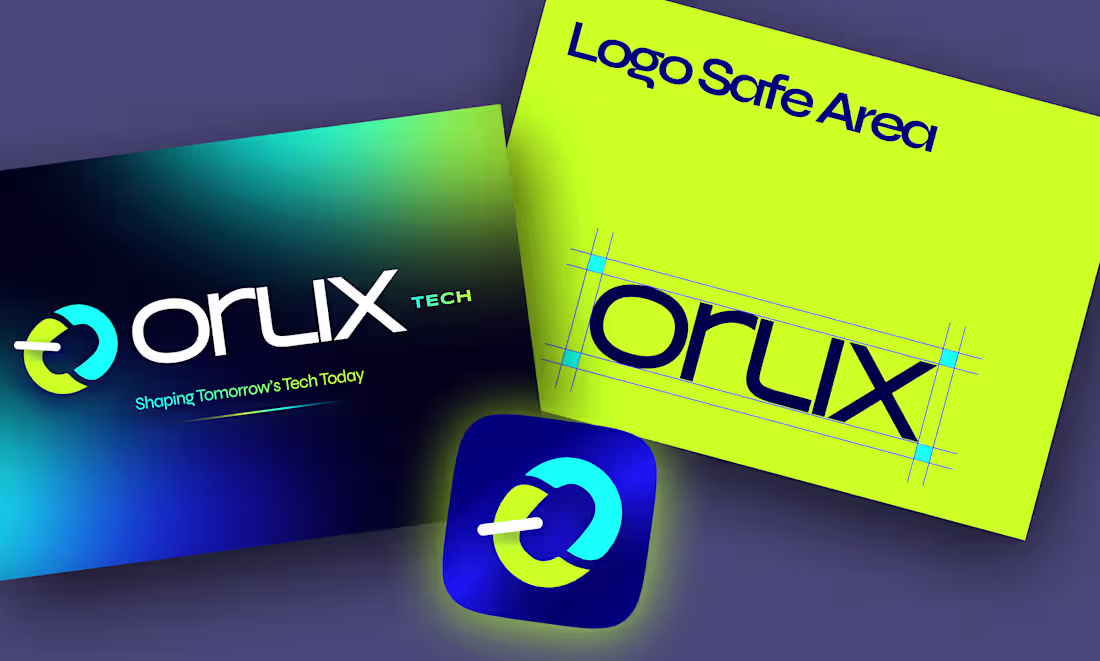
Recent Brand Identity Design for ORLIX TECH
OrlixTech is a product-focused tech startup built around clarity, performance, and scalable design. I worked on shaping the visual direction and product experience, focusing on clean UI, thoughtful interactions, and a system that can grow with the product.
The work covered product UI/UX, visual exploration, and structured design flows, with an emphasis on usability and consistency across screens. The goal was to create an experience that feels modern, intuitive, and practical for real users.
This project reflects my approach to building design systems that balance aesthetics with functionality and long-term product needs.
Stay Updated // More updates coming soon
1
164
Landing Page Design for
PREVIEWED turns job listings into real previews.
See what the role actually looks like before you apply.
Understand the work, the team, and the expectations upfront.
No guessing. No surprises.
Just clearer decisions for candidates and better matches for companies.
This is how hiring UX should feel.
Thoughtful. Clear. Human
1
158
Your onboarding has 5 seconds to win trust.
Smooth animations. Clear flow. Zero friction.
This is how you turn first-time users into confident users.
Let's design your product together ✌️
1
170
Buzz Me Up 🪰
Connecting your buzzer to your phone
Visual direction is coming strong
More shots coming 👍
1
159
Here's a peek at how 'Stackdays' is coming along.
From the brand stuff to the fancy design, it's been non-stop.
Now we're ready to make it even better for users.
Let's get your fitness designed together.
Hit up Serveekay.
0
167
VOYAGR
A bold new identity for a cross-border delivery startup.🧢🧢🧢
Designed to connect Senders and Travelers with trust, clarity, and a spark of adventure.
This is just the beginning, more design process coming soon
Stay Tuned ✌️
4
216
Previewed Dashboard
Stop reading jobs.
Start previewing them.
PREVIEWED turns job listings into real previews
so users know what they’re signing up for before applying.
This is how hiring UX should feel.
Thoughtful. Clear. Human.
3
8
233
Some Bangers From 2025 Work
From concept → visual identity → UX/UI → wireframes → interactive prototypes → final design.
2
2
227
🔐 Verdilock
Crafting a Cybersecurity Web Experience That Feels Safe and Simple.
Sharing one of my web design project for Verdilock, a cybersecurity brand focused on digital protection and user trust.
The goal was to create a clean, confident experience that makes security feel approachable instead of complex.
✨ The Process
I started by shaping a clear visual hierarchy, bold headlines, balanced spacing, and a color system that communicates reliability.
The layout was built around clarity:
• Problem–solution messaging that users can understand instantly
• A strong hero section that establishes trust at first glance
• Minimal, meaningful icons to explain features without clutter
• Smooth micro-interactions to make the interface feel responsive and alive
Every decision make users feel protected without overwhelming them.
6
17
258
Your clothes have secrets. KL reveals them.
🔍 Scan the tag → get full details:
👕 Fabric & origin
🧴 Care instructions
🌿 Sustainability Smart, simple, instant.
💡 Ready to bring your app idea to life? DM for professional design services!
3
200