
Sarthak Goyal
Senior Product Designer | UI/UX for Dashboards, Mobile & Web
Profile in progress
Sarthak is building their profile!

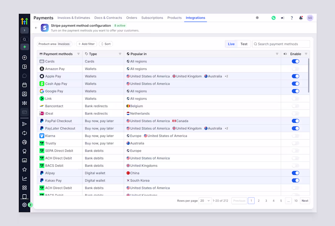
A good SaaS payments UI answers 3 questions instantly:
• What can I accept?
• Where will it work?
• What’s enabled right now?
Anything more is friction.
0
6
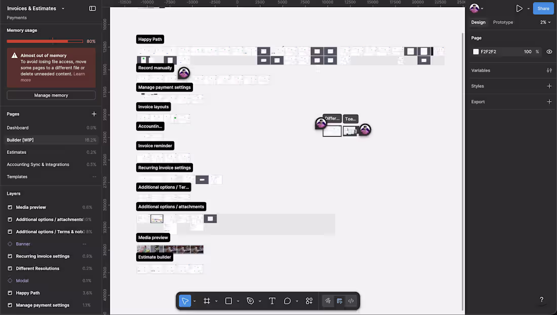
If your invoice builder looks simple,
it’s because someone mapped everything that could go wrong.
That’s the job.
1
10
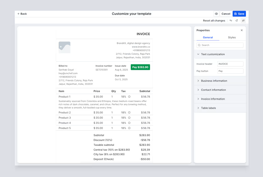
Most invoice tools stop at “send & pay.”
This one goes further:
-> brand control
-> layout flexibility
-> tax + discount clarity
-> fewer back-and-forths
Designing an invoice builder for modern SaaS, not accounting software.
1
22
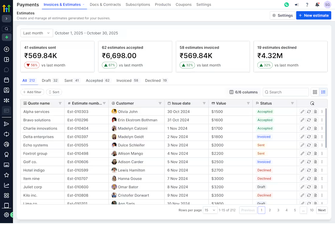
Most estimate tools stop at “Create PDF.”
Good SaaS thinks further:
• What happens after it’s sent?
• How does it get accepted?
• How does it turn into an invoice?
This is what designing estimates as a system looks like.
1
15
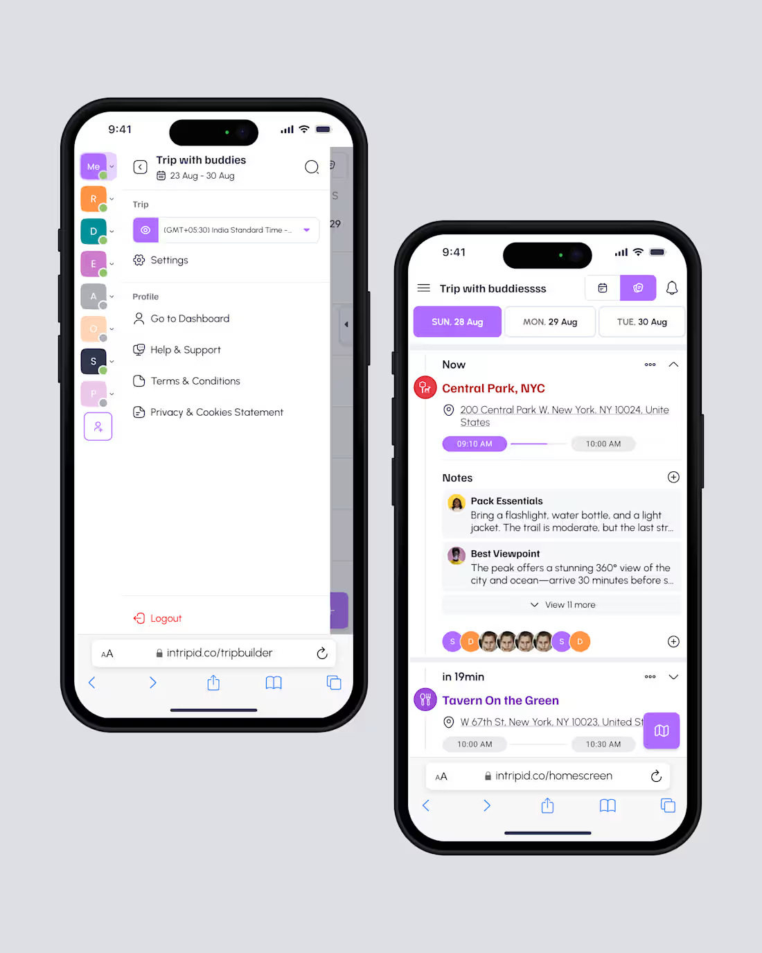
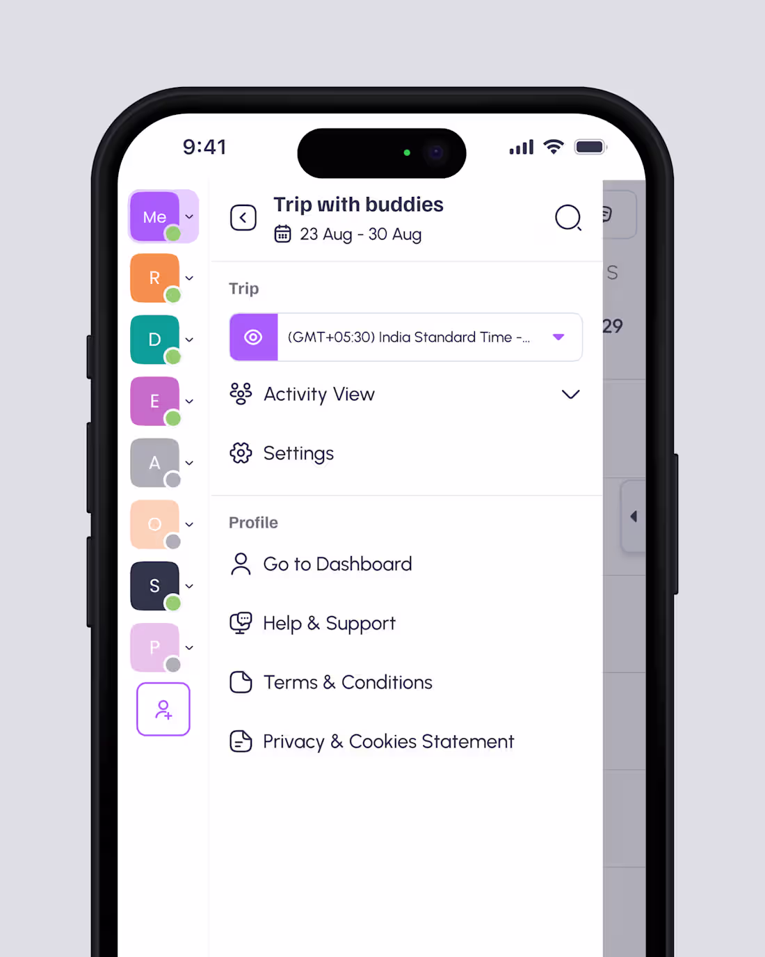
Notes, participants, timing.
Trips fail when any one of these breaks.
Good UX turns chaos into coordination.
2
2
23
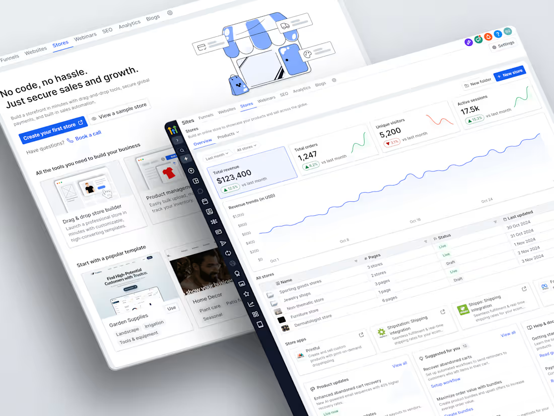
Building a lifecycle-driven ecommerce system
1
0

When nothing’s open, clarity matters more than options.
Designing empty states that respect time, context, and mood.
1
26
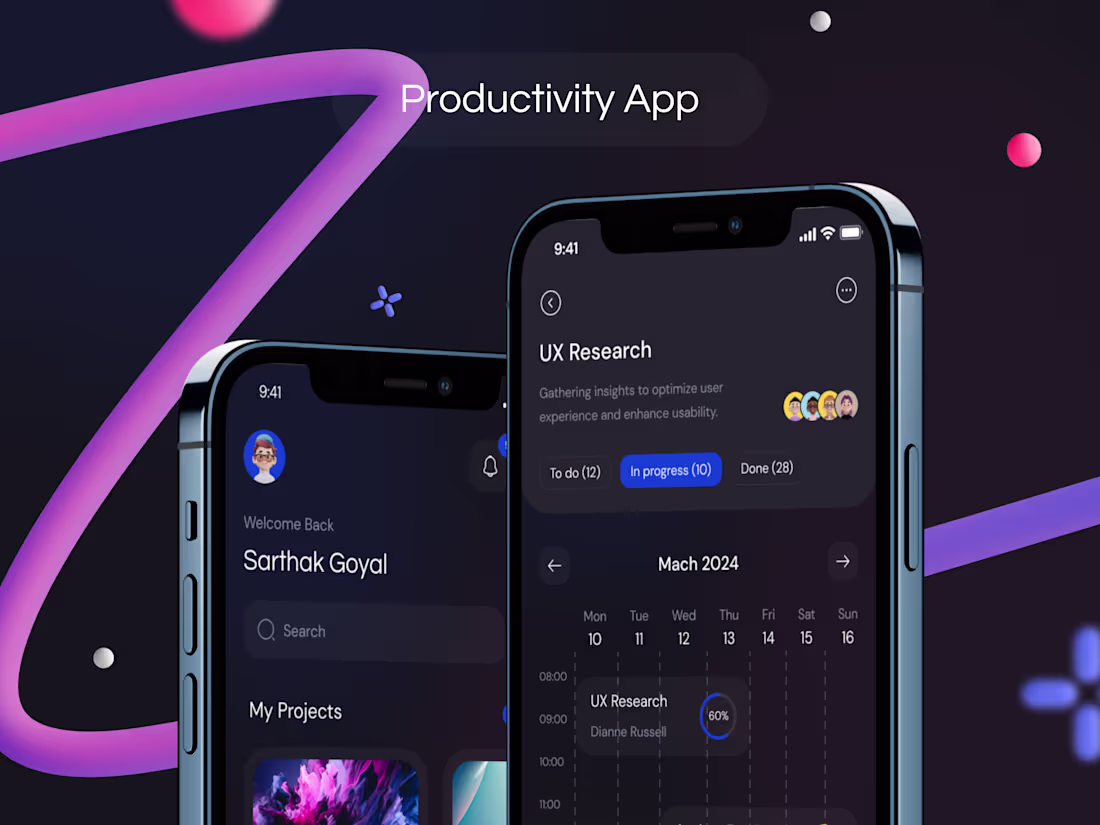
Productivity apps shouldn’t just look good.
They should move work forward.
Designing a system where focus, progress, and context stay visible, without overwhelming the user.
Dark mode. Clear states. Real momentum.
2
77

Even failure states deserve empathy.
Design doesn’t stop at success paths.
0
19
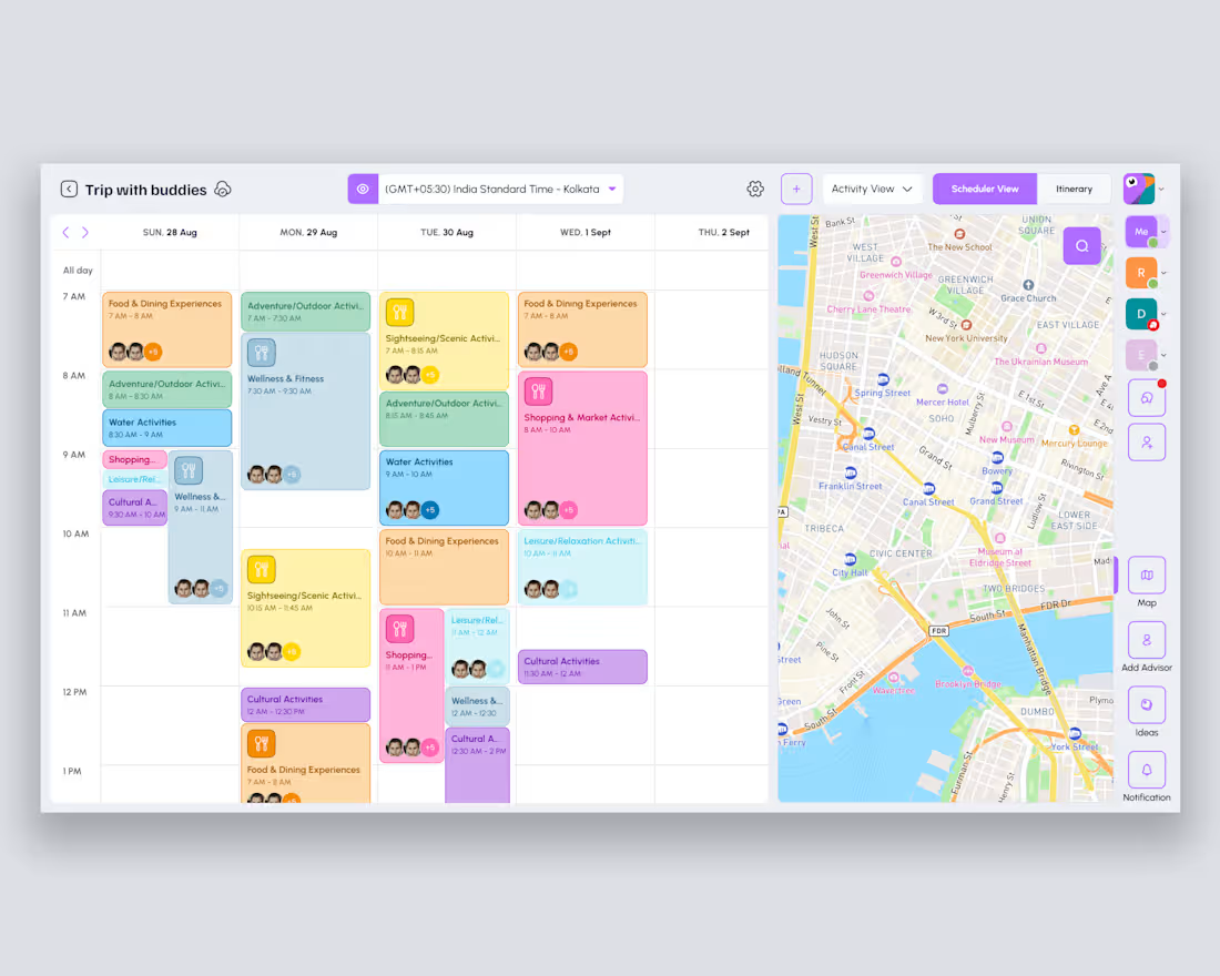
From blank canvas to a shared plan.
Designing a scheduler that makes group trips feel effortless, not chaotic.
1
36
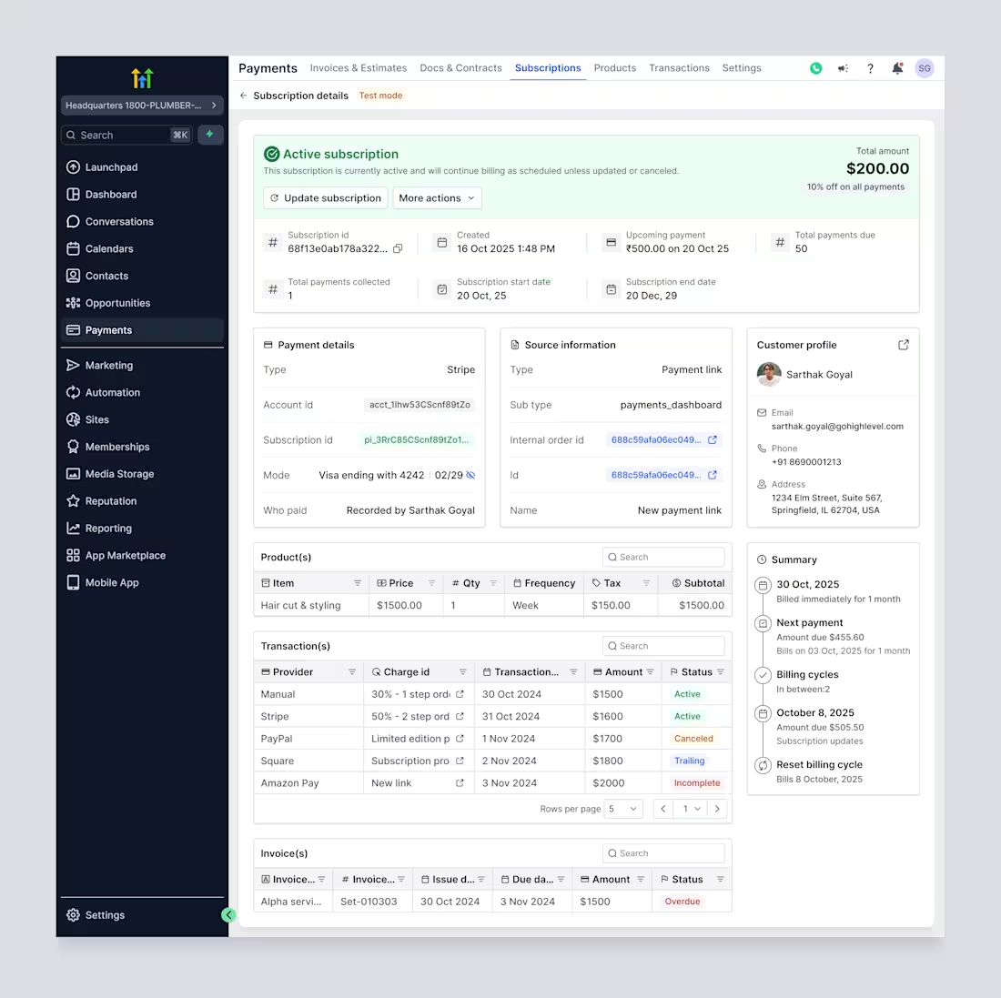
Subscriptions shouldn’t be a black box.
Every payment, status, and lifecycle, visible in one place.
1
32
AI-powered trip planning tool redesigned to simplify itinerary creation for travelers and advisors through clean workflows, and intuitive UI patterns. (https://www.uixchef.com/case-studies/case-studies-intripid-trip-builder)
1
55