
This collection is a great example of E-commerce Product Visualization. It shows you can take a single physical product and create a full "Listing Kit" that explains features visually, which is exactly what Amazon and Shopify sellers look for.
Here is how to describe this project professionally:
Project Title: E-commerce Product Feature Suite – Convertible Child Safety Seat
Project Overview
The goal of this project was to create a comprehensive set of "Feature Tiles" for an e-commerce product listing. I focused on transforming technical product specifications into easy-to-understand visual infographics that address parent concerns—safety, longevity, and comfort.
Design Strategy & Key Features
Growth Visualization: Created a comparative "Newborn to 12 Years" infographic using lifestyle composites. This effectively communicates the product's long-term value proposition in a single glance.
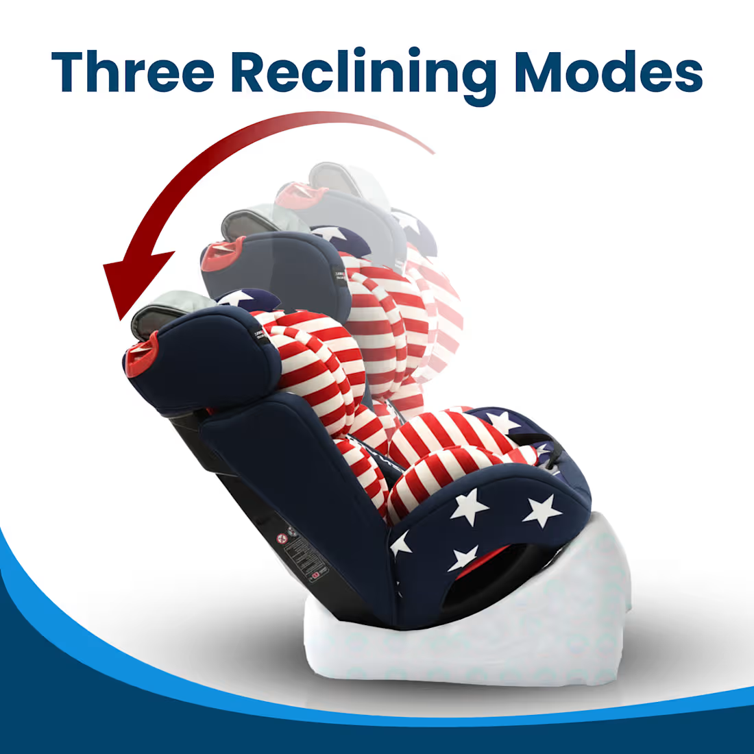
Mechanical Explainer Graphics: * Used ghosted overlays and directional arrows to demonstrate the Three Reclining Modes, making a stationary product feel functional and adjustable.
Implemented a "360° Rotation" hero image with circular vector cues to highlight ease of use for parents.
Detail Call-outs: Integrated high-resolution "magnifier" crops (e.g., the 5-point harness) to emphasize safety build quality and material texture.
Consistent Branding: Established a cohesive visual language using a curved blue "wave" footer and high-contrast navy typography, ensuring the brand feels professional and trustworthy throughout the slide deck.
Technical Execution
Product Retouching: Applied consistent lighting and shadow matching across multiple angles to ensure the product looks premium.
Visual Hierarchy: Strategically used bold headlines for "USP" (Unique Selling Points) while keeping the background clean (White/Studio style) to maintain focus on the product itself.
0
3
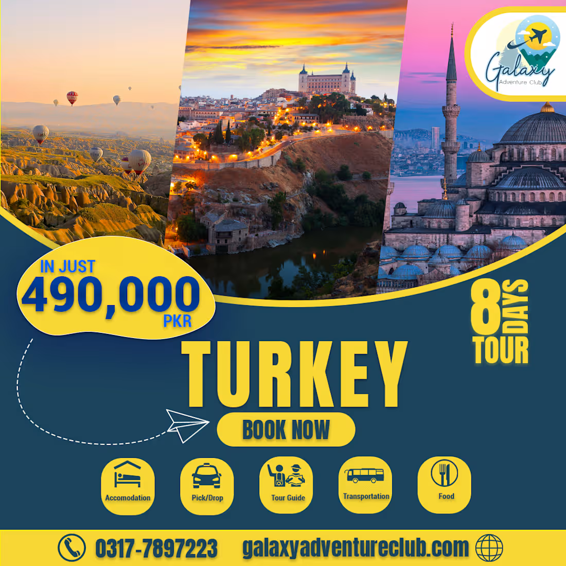
The objective was to design a comprehensive promotional flyer for an 8-day international tour to Turkey. This project required a balance of high-end destination imagery with technical package details (pricing, duration, and inclusions) to provide a one-stop information hub for potential travelers.
Design Strategy & Key Features
Split-Panel Composition: I utilized a three-panel diagonal layout to showcase the diversity of the trip—featuring the iconic hot air balloons of Cappadocia, historic architecture, and the evening skyline of Istanbul. This gives the viewer a "complete story" of the destination in a single glance.
Information Architecture:
High-Contrast Pricing: The "490,000 PKR" is placed in a bold yellow badge in the top-left, utilizing the primary gaze-path of the user to ensure price transparency immediately.
Iconography for Inclusions: I designed a custom set of minimalist icons (Accommodation, Transport, Food, etc.) to simplify complex package details into easily digestible visual cues.
Themed Color Palette: I pulled the deep navy and vibrant yellow from the Galaxy Adventure Club brand identity, creating a professional and trustworthy "corporate travel" aesthetic.
Clear Call-to-Action (CTA): The "Book Now" button is centrally anchored, supported by a footer that cleanly displays contact information and the website for high conversion.
The Technical Edge
By using diagonal dividers instead of standard vertical blocks, I created a sense of "dynamic motion," which is a psychological design choice intended to evoke the feeling of travel and movement.
0
7
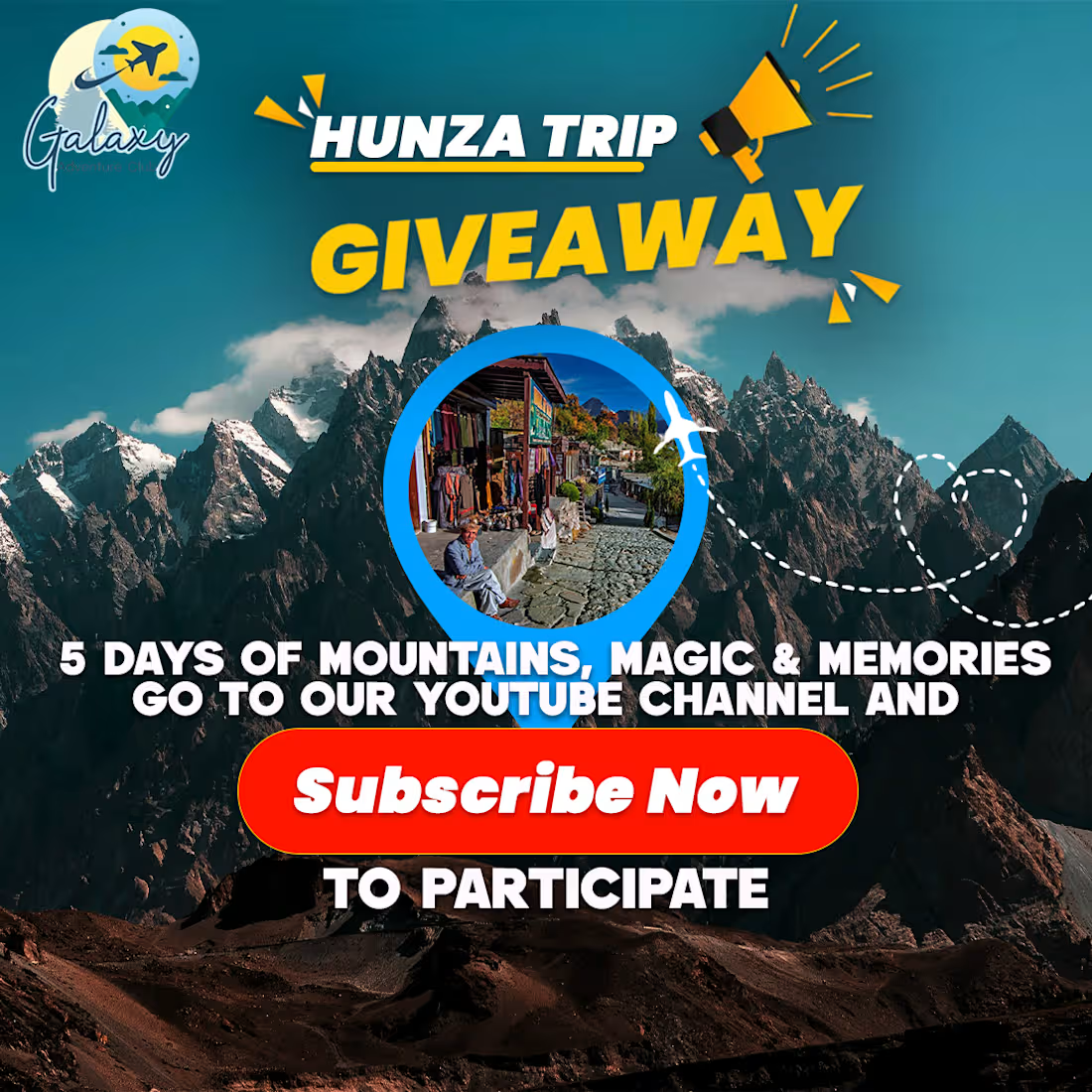
The objective was to design a high-impact social media giveaway post for a travel agency, specifically aimed at driving YouTube subscriptions. I focused on creating a "Hero" visual that instantly transports the viewer to Hunza while maintaining a high-contrast promotional layout.
Design Strategy & Key Features
Epic Landscape Backdrop: I used a majestic, wide-angle shot of the Karakoram range to establish an immediate emotional connection and sense of adventure.
Targeted Inset Visual: Using a circular "location pin" mask, I featured a localized shot of Hunza's culture/streets. This creates a focal point that breaks up the mountain texture and grounds the design in the actual travel experience.
High-Contrast Call-to-Action (CTA): The "Subscribe Now" button uses a vibrant red to mimic the YouTube brand identity, creating a subconscious link for the user and making the primary instruction impossible to miss.
Balanced Typography: I paired a bold, yellow "GIVEAWAY" header—optimized for mobile "thumb-stopping"—with clean, white secondary text for readability against the dark mountain shadows.
Graphic Accents: Added playful elements like the megaphone icon and plane vectors to enhance the "announcement" feel and maintain the travel theme.
The Marketing Result
This design is built to convert. By placing the "5 Days" value proposition directly above the CTA, it answers the user’s "What's in it for me?" question before they even reach the button, increasing the likelihood of a subscription click.
0
11
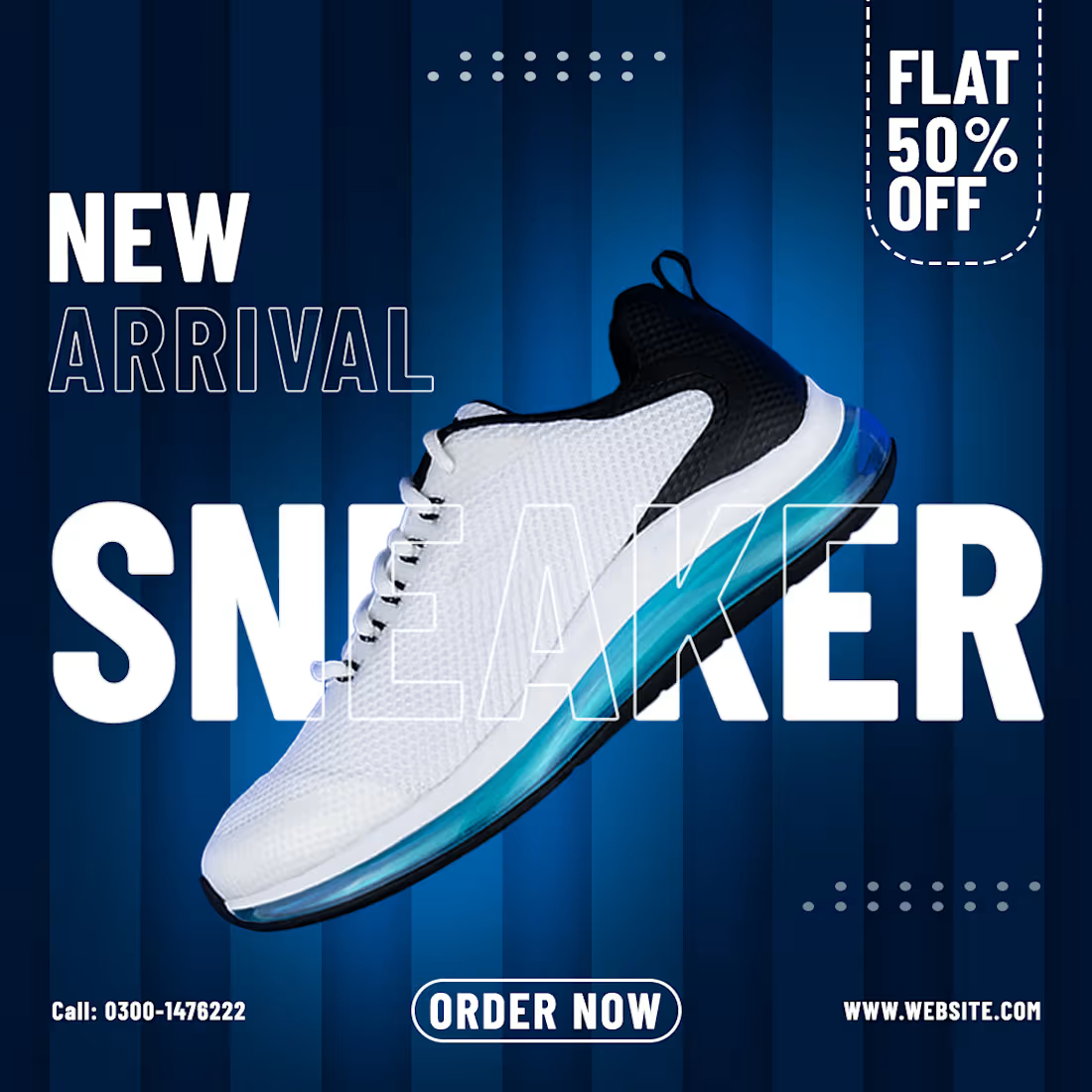
The goal of this project was to create a high-energy, modern social media advertisement for a new sneaker launch. I focused on a "Digital Blue" aesthetic to evoke a sense of technology, comfort, and speed, specifically designed to stop the scroll on platforms like Instagram and Facebook.
1
16