
Brand Identity + Creative Direction for Brands People RememberAsh Ome
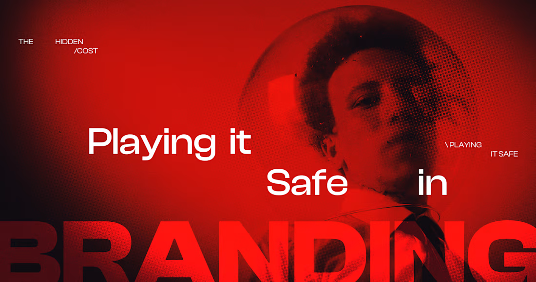
YOUR BRAND LOOKS FINE THAT’S THE PROBLEM.
You need to build a brand people recognize before they even see the logo.
Strategy, identity and creative direction designed to turn a decent-looking brand into something distinct, recognizable and difficult to confuse with anyone else.
About this service
Most brands do not look bad and that is exactly the problem.
They have a tasteful logo, a respectable typeface, nice color palette.
And somehow they still look like five other brands in the same category.
This project is about getting past “looks good.”
I build a brand around a clear idea, then create the visual and verbal behaviours that make that idea recognizable wherever the customer encounters it.
Not just a logo, or a moodboard. And obviously not an 80 page guideline nobody uses.
The objective is to create a brand people can recognize, remember and choose.
I lead the strategy and creative direction personally, then work with my team at MOTIF where additional design execution is required.
The problem we are solving
Your brand may need this if:
People like the product but struggle to describe what makes the brand different.
Your identity feels polished but interchangeable.
Your social, website, packaging and campaigns look like different brands.
You rely heavily on your logo because nothing else is recognizable enough.
Competitors are beginning to look increasingly similar to you.
Your business has matured but the brand still looks like the company you were two years ago.
Your campaigns require reinventing the visual direction every time.
You are entering a more premium market and the current identity cannot carry the perception.
You are launching something new and want to build distinction before spending heavily on acquisition.
What you get
01. Brand diagnosis
Before designing anything, I look at what customers are currently seeing and what the category has trained them to expect.
We review:
Current identity
Brand perception
Products and offer
Customer behaviour and reviews where available
Competitive visual patterns
Category conventions
Existing messaging
Website and social presence
Current campaign creative
Commercial direction
The question is not:
“What should the new logo look like?”
It is:
“What should people remember about this brand?”
02. Strategic direction
We establish the thinking behind the identity.
This includes:
Brand idea
Positioning direction
Customer frame
Value proposition
Core brand tension
Brand personality
Creative principles
Messaging direction
Reasons to believe
Competitive distinction
This gives the design something meaningful to express.
03. Creative territories
I develop two distinct creative directions for the brand.
Each territory can include:
Visual idea
Art direction
Typography
Color behavior
Photography direction
Composition
Graphic language
Product presentation
Messaging examples
Digital application examples
We choose one direction and develop it into the full system.
04. Visual identity
The selected direction becomes a working identity system.
Depending on what the brand needs:
Primary logo
Secondary marks
Wordmark refinement
Symbol or monogram
Typography system
Color system
Graphic devices
Layout system
Composition rules
Icon direction
Photography direction
Product image direction
Digital behavior
Motion direction where relevant
The objective is consistency without making everything look identical.
05. The Recognition System
This is the part I care about most.
Most brand guidelines explain how not to misuse a logo.
A Recognition System answers a more useful question:
What should customers repeatedly see, hear and experience until they know it is you without needing to see your name?
We identify the repeatable devices that should become associated with your brand.
These may include:
Typography behaviour
How type is used, scaled, interrupted, aligned or repeated.
Composition
How your layouts behave across campaigns, social and commerce.
Color behaviour
Not simply a palette, but how the colors actually appear.
Photography
Subject, framing, crop, lighting, environment and attitude.
Product framing
How the product is presented and given perceived value.
Graphic language
Shapes, patterns, textures, symbols or recurring treatments.
Verbal patterns
The kinds of phrases, rhythm and language customers begin to associate with you.
Motion
How the brand moves where digital behaviour matters.
The goal is simple:
Recognition before the logo.
06. Verbal direction
A visual identity becomes much stronger when the brand also knows how to speak.
Depending on scope, this includes:
Core messaging
Brand statement
Messaging hierarchy
Tone direction
Key phrases
Product language principles
Campaign language direction
Headline behaviour
Do / don’t examples
This is verbal direction, not full website copywriting.
07. Key brand applications
We show the system working in the places customers actually encounter the brand.
Applications are selected around the business and can include:
Website / ecommerce direction
Product page
Social
Paid creative
Email
Packaging concepts
Campaign graphics
Lookbook
Retail
Digital launch materials
The exact application set is agreed before kickoff.
08. Brand handoff
At the end, you receive:
Final identity assets
Editable source files
Typography specifications
Color specifications
Logo system
Recognition System
Art direction
Photography direction
Messaging direction
Application examples
Practical brand guidelines
Recorded walkthrough
The handoff should make it easier for your internal team, designers, marketers and future partners to make good decisions without reinventing the brand every week.
How the project works
Week 1: Understand
Brand, customer, market, competitors and current identity.
Week 2: Decide
Strategic direction and two creative territories.
Week 3: Build
Selected territory becomes the identity and Recognition System.
Week 4: Apply
Applications, messaging direction and brand behaviour.
Week 5: Refine + handoff
Final refinements, documentation, files and walkthrough.
Most projects take 4–5 weeks, depending on feedback speed and scope.
Scope
The fixed $18,900 project includes:
One brand
One primary audience / market
Brand diagnosis
Strategic direction
Two initial creative territories
One selected identity direction
Core visual identity
Recognition System
Verbal direction
Agreed application set
Two refinement rounds during each major approved stage
Final files
Brand documentation
Recorded handoff
Not included
Quoted separately where needed:
Naming
Trademark/legal work
Full website design
Ecommerce development
Large packaging systems
Full copywriting
Photography production
Video production
Talent or location costs
Large-scale campaign production
Paid advertising management
Large localization requirements
Additional brands/sub-brands
Best fit
This service is especially suited to:
Fashion
Beauty
Jewelry
Lifestyle
Wellness
Luxury / premium consumer products
DTC and retail brands
Particularly when the product is stronger than the brand currently presenting it.
Probably not for you if
You just need someone to draw a logo.
You want dozens of speculative concepts before making a decision.
You want the identity to look exactly like a competitor.
You need production support but already have a complete strategy and creative direction.
Or price is the primary deciding factor.
Pricing
$18,500 fixed
Recommended milestone structure:
50% at kickoff, 30% after creative direction approval, 20% at final handoff.
Natural next steps
After the identity is complete, the brand can move into:
Shopify Brand Experience Redesign
Bring the identity into the complete commerce experience.
Campaign Concept + Creative Direction
Give the new brand a proper entrance.
Brand + Commerce Transformation
For businesses that need brand and commerce solved together from the start.
You are not hiring me to make the brand look different. You are hiring me to make it difficult to mistake for anyone else.
FAQs
Starting at$18,500
Duration5 weeks
Tags
Art Director
Brand Strategist
Creative Director
Beauty
Fashion & Apparel
direct to consumer
Service provided by
Ash Ome proNew York, USA
- 5.00
- Rating
- 12
- Followers
Brand Identity + Creative Direction for Brands People RememberAsh Ome
Starting at$18,500
Duration5 weeks
Tags
Art Director
Brand Strategist
Creative Director
Beauty
Fashion & Apparel
direct to consumer
YOUR BRAND LOOKS FINE THAT’S THE PROBLEM.
You need to build a brand people recognize before they even see the logo.
Strategy, identity and creative direction designed to turn a decent-looking brand into something distinct, recognizable and difficult to confuse with anyone else.
About this service
Most brands do not look bad and that is exactly the problem.
They have a tasteful logo, a respectable typeface, nice color palette.
And somehow they still look like five other brands in the same category.
This project is about getting past “looks good.”
I build a brand around a clear idea, then create the visual and verbal behaviours that make that idea recognizable wherever the customer encounters it.
Not just a logo, or a moodboard. And obviously not an 80 page guideline nobody uses.
The objective is to create a brand people can recognize, remember and choose.
I lead the strategy and creative direction personally, then work with my team at MOTIF where additional design execution is required.
The problem we are solving
Your brand may need this if:
People like the product but struggle to describe what makes the brand different.
Your identity feels polished but interchangeable.
Your social, website, packaging and campaigns look like different brands.
You rely heavily on your logo because nothing else is recognizable enough.
Competitors are beginning to look increasingly similar to you.
Your business has matured but the brand still looks like the company you were two years ago.
Your campaigns require reinventing the visual direction every time.
You are entering a more premium market and the current identity cannot carry the perception.
You are launching something new and want to build distinction before spending heavily on acquisition.
What you get
01. Brand diagnosis
Before designing anything, I look at what customers are currently seeing and what the category has trained them to expect.
We review:
Current identity
Brand perception
Products and offer
Customer behaviour and reviews where available
Competitive visual patterns
Category conventions
Existing messaging
Website and social presence
Current campaign creative
Commercial direction
The question is not:
“What should the new logo look like?”
It is:
“What should people remember about this brand?”
02. Strategic direction
We establish the thinking behind the identity.
This includes:
Brand idea
Positioning direction
Customer frame
Value proposition
Core brand tension
Brand personality
Creative principles
Messaging direction
Reasons to believe
Competitive distinction
This gives the design something meaningful to express.
03. Creative territories
I develop two distinct creative directions for the brand.
Each territory can include:
Visual idea
Art direction
Typography
Color behavior
Photography direction
Composition
Graphic language
Product presentation
Messaging examples
Digital application examples
We choose one direction and develop it into the full system.
04. Visual identity
The selected direction becomes a working identity system.
Depending on what the brand needs:
Primary logo
Secondary marks
Wordmark refinement
Symbol or monogram
Typography system
Color system
Graphic devices
Layout system
Composition rules
Icon direction
Photography direction
Product image direction
Digital behavior
Motion direction where relevant
The objective is consistency without making everything look identical.
05. The Recognition System
This is the part I care about most.
Most brand guidelines explain how not to misuse a logo.
A Recognition System answers a more useful question:
What should customers repeatedly see, hear and experience until they know it is you without needing to see your name?
We identify the repeatable devices that should become associated with your brand.
These may include:
Typography behaviour
How type is used, scaled, interrupted, aligned or repeated.
Composition
How your layouts behave across campaigns, social and commerce.
Color behaviour
Not simply a palette, but how the colors actually appear.
Photography
Subject, framing, crop, lighting, environment and attitude.
Product framing
How the product is presented and given perceived value.
Graphic language
Shapes, patterns, textures, symbols or recurring treatments.
Verbal patterns
The kinds of phrases, rhythm and language customers begin to associate with you.
Motion
How the brand moves where digital behaviour matters.
The goal is simple:
Recognition before the logo.
06. Verbal direction
A visual identity becomes much stronger when the brand also knows how to speak.
Depending on scope, this includes:
Core messaging
Brand statement
Messaging hierarchy
Tone direction
Key phrases
Product language principles
Campaign language direction
Headline behaviour
Do / don’t examples
This is verbal direction, not full website copywriting.
07. Key brand applications
We show the system working in the places customers actually encounter the brand.
Applications are selected around the business and can include:
Website / ecommerce direction
Product page
Social
Paid creative
Email
Packaging concepts
Campaign graphics
Lookbook
Retail
Digital launch materials
The exact application set is agreed before kickoff.
08. Brand handoff
At the end, you receive:
Final identity assets
Editable source files
Typography specifications
Color specifications
Logo system
Recognition System
Art direction
Photography direction
Messaging direction
Application examples
Practical brand guidelines
Recorded walkthrough
The handoff should make it easier for your internal team, designers, marketers and future partners to make good decisions without reinventing the brand every week.
How the project works
Week 1: Understand
Brand, customer, market, competitors and current identity.
Week 2: Decide
Strategic direction and two creative territories.
Week 3: Build
Selected territory becomes the identity and Recognition System.
Week 4: Apply
Applications, messaging direction and brand behaviour.
Week 5: Refine + handoff
Final refinements, documentation, files and walkthrough.
Most projects take 4–5 weeks, depending on feedback speed and scope.
Scope
The fixed $18,900 project includes:
One brand
One primary audience / market
Brand diagnosis
Strategic direction
Two initial creative territories
One selected identity direction
Core visual identity
Recognition System
Verbal direction
Agreed application set
Two refinement rounds during each major approved stage
Final files
Brand documentation
Recorded handoff
Not included
Quoted separately where needed:
Naming
Trademark/legal work
Full website design
Ecommerce development
Large packaging systems
Full copywriting
Photography production
Video production
Talent or location costs
Large-scale campaign production
Paid advertising management
Large localization requirements
Additional brands/sub-brands
Best fit
This service is especially suited to:
Fashion
Beauty
Jewelry
Lifestyle
Wellness
Luxury / premium consumer products
DTC and retail brands
Particularly when the product is stronger than the brand currently presenting it.
Probably not for you if
You just need someone to draw a logo.
You want dozens of speculative concepts before making a decision.
You want the identity to look exactly like a competitor.
You need production support but already have a complete strategy and creative direction.
Or price is the primary deciding factor.
Pricing
$18,500 fixed
Recommended milestone structure:
50% at kickoff, 30% after creative direction approval, 20% at final handoff.
Natural next steps
After the identity is complete, the brand can move into:
Shopify Brand Experience Redesign
Bring the identity into the complete commerce experience.
Campaign Concept + Creative Direction
Give the new brand a proper entrance.
Brand + Commerce Transformation
For businesses that need brand and commerce solved together from the start.
You are not hiring me to make the brand look different. You are hiring me to make it difficult to mistake for anyone else.
FAQs
$18,500