
AI Dashboard & Data-Viz Design — 2 WeeksMykola Popov

For products where the data is right and users still don't act on it.
Dashboards are a commodity. If your users can read your charts correctly and still can't name a next step, more visualization won't fix it — the information model will.
What this is
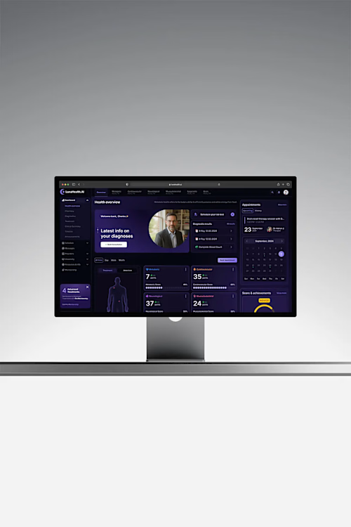
A two-week engagement to redesign your data or AI-output surface around decisions instead of display. I did exactly this at Veltrix AI (week-4 retention 22% → 49%), Luna Health AI (correct self-reading 45% → 82%) and Dreamteam (weekly return 18% → 41%).
The approach
Answer first, evidence on demand. Lead with the finding in plain language; the chart sits underneath as proof, not as the headline.
Make the AI legible. Every output traceable to its numbers and source. Low-confidence results framed as questions, not claims. In anything financial or clinical, trust is the product.
One decision at a time. A single prioritized action per insight, alternatives tucked behind. Ending paralysis, not relocating it.
One atomic unit, every surface. Design a single insight/metric component well and it scales from marketing site to product to mobile without redesigning trust each time.
What we cover
Information hierarchy and dashboard IA · chart and gauge selection (and what to delete) · empty, loading, partial-data and error states · confidence and uncertainty treatment · responsive and mobile behavior · a reusable data-viz component set in Figma.
FAQs
Example work

Starting at$2,800
Duration2 weeks
Tags
Figma

AI
B2B SaaS
Data Visualizer
Product Designer
UX Designer
Service provided by
Mykola Popov Warsaw, Poland
- 1
- Followers
AI Dashboard & Data-Viz Design — 2 WeeksMykola Popov
Starting at$2,800
Duration2 weeks
Tags
Figma
AI
B2B SaaS
Data Visualizer
Product Designer
UX Designer
For products where the data is right and users still don't act on it.
Dashboards are a commodity. If your users can read your charts correctly and still can't name a next step, more visualization won't fix it — the information model will.
What this is
A two-week engagement to redesign your data or AI-output surface around decisions instead of display. I did exactly this at Veltrix AI (week-4 retention 22% → 49%), Luna Health AI (correct self-reading 45% → 82%) and Dreamteam (weekly return 18% → 41%).
The approach
Answer first, evidence on demand. Lead with the finding in plain language; the chart sits underneath as proof, not as the headline.
Make the AI legible. Every output traceable to its numbers and source. Low-confidence results framed as questions, not claims. In anything financial or clinical, trust is the product.
One decision at a time. A single prioritized action per insight, alternatives tucked behind. Ending paralysis, not relocating it.
One atomic unit, every surface. Design a single insight/metric component well and it scales from marketing site to product to mobile without redesigning trust each time.
What we cover
Information hierarchy and dashboard IA · chart and gauge selection (and what to delete) · empty, loading, partial-data and error states · confidence and uncertainty treatment · responsive and mobile behavior · a reusable data-viz component set in Figma.
FAQs
Example work
$2,800