
Mobile app UI Design Mohammad Umer
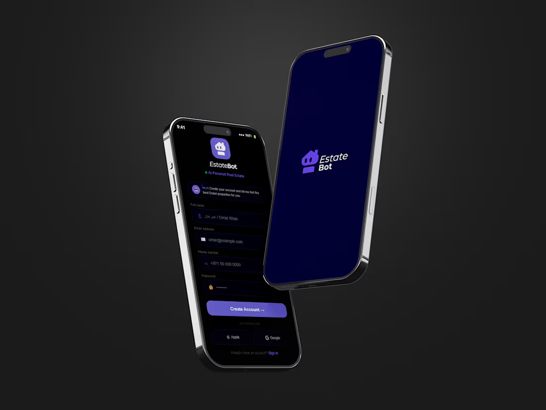
A screen has one job. Most apps give it four and hope the user sorts it out.
I design mobile apps that stay legible under real conditions one hand, small screen, bad lighting, half your attention. That starts with sequencing rather than styling: what a user is trying to do, what they need on this screen to do it, and what can wait until the next one.
From there it's the craft that makes an app feel considered instead of assembled. Type that holds at thumb distance, hierarchy that puts the next action where the eye lands, spacing that stays consistent across forty screens, and color reserved for the things that matter rather than sprayed across the interface.
You get the full flow designed in Figma every state drawn, not implied as a proper component system with variants, tokenized color and type, and an interactive prototype so you can feel the transitions before anyone writes code. Files are organized for handoff, so your engineers build from them without asking what a loading state looks like.
Built for iOS and Android, from an MVP's first flows to an existing app that's grown inconsistent.

Mohammad's other services
Contact for pricing
Duration1 week
Tags
Brand Designer
Mobile Designer
UI Designer
landing page
ux ui
Service provided by
Mohammad Umer Karachi, Pakistan
- 18
- Followers
Mobile app UI Design Mohammad Umer
Contact for pricing
Duration1 week
Tags
Brand Designer
Mobile Designer
UI Designer
landing page
ux ui
A screen has one job. Most apps give it four and hope the user sorts it out.
I design mobile apps that stay legible under real conditions one hand, small screen, bad lighting, half your attention. That starts with sequencing rather than styling: what a user is trying to do, what they need on this screen to do it, and what can wait until the next one.
From there it's the craft that makes an app feel considered instead of assembled. Type that holds at thumb distance, hierarchy that puts the next action where the eye lands, spacing that stays consistent across forty screens, and color reserved for the things that matter rather than sprayed across the interface.
You get the full flow designed in Figma every state drawn, not implied as a proper component system with variants, tokenized color and type, and an interactive prototype so you can feel the transitions before anyone writes code. Files are organized for handoff, so your engineers build from them without asking what a loading state looks like.
Built for iOS and Android, from an MVP's first flows to an existing app that's grown inconsistent.
Mohammad's other services
Contact for pricing