
Strategic Brand IdentitySurya A
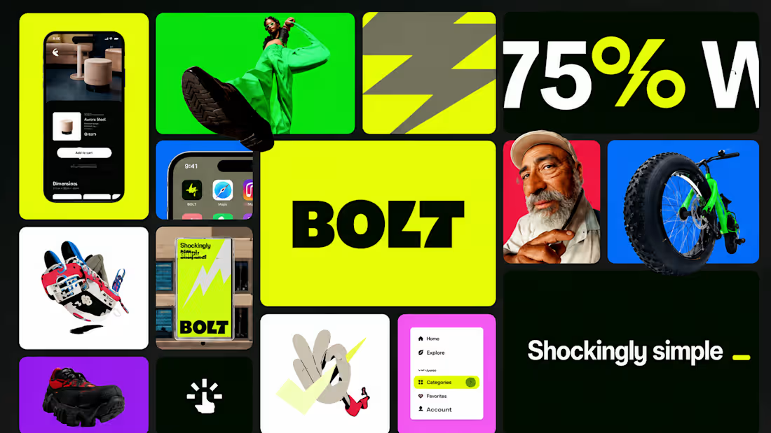
A logo is one asset. What you need is the system that governs every asset after it.
Brands rarely feel broken because the logo is bad. They feel broken because there's a logo, a few colours someone picked in 2023, a deck template, and a product UI, and none of them came from the same set of rules. Every new surface becomes a fresh argument.
Over three weeks I build the governing logic: identity, type, colour, and the visual language that makes you recognizable even with the logo removed. Then I stress-test it on the surfaces you'll actually ship.
One direction, not three
I don't present three concepts to vote on. Three concepts means two were built to lose and the strategic thinking got divided by three. I do the positioning work upfront and present one refined route, argued against your competitive set. If it's not right, we iterate on it.
What you walk away with
Positioning & competitive audit — Where your category sits visually and where the open space is. Written down, not just discussed.
Core identity — Primary logo and wordmark with the responsive lockups your team actually needs: favicon, app icon, social avatar, horizontal, stacked.
Typography system — Pairings, scale, and hierarchy rules built for digital product use, not just for a poster.
Colour system — Primary, secondary, and neutrals with usage rules and accessible contrast pairs. Light and dark mode where relevant.
Visual language — The shapes, textures, imagery direction, and treatments that make you recognizable without the logo present. This is what separates a brand from a logo.
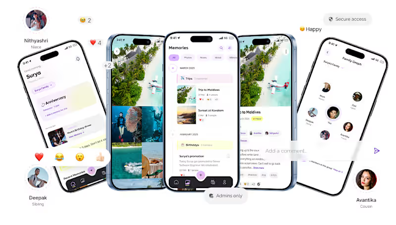
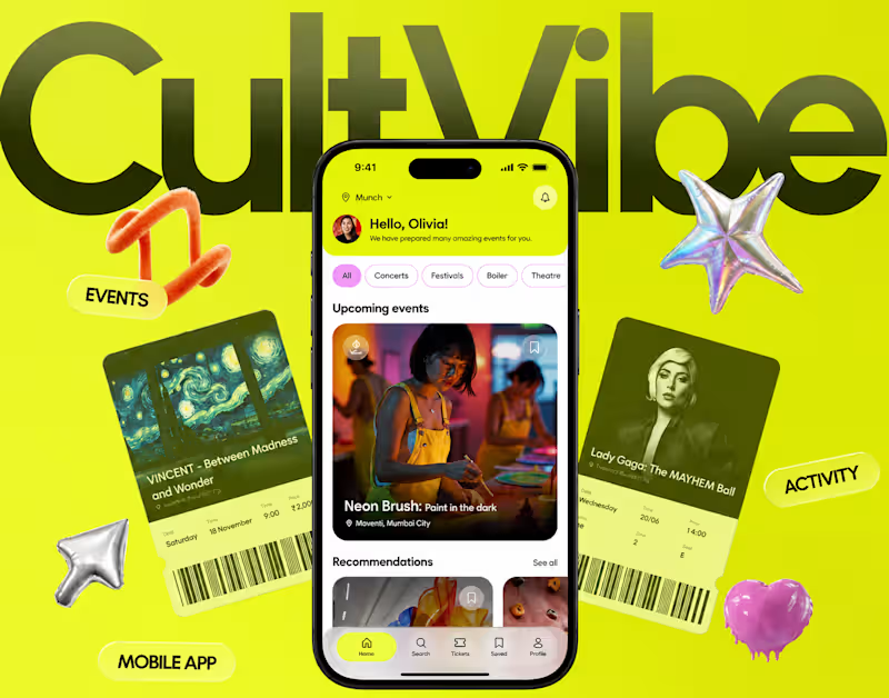
Applied surfaces — The system proved out on real screens: a landing page hero, a product UI frame, social templates. Rules that haven't been applied to anything are just opinions.
Figma brand kit — A working, organized library your team pulls from directly. Components, styles, variables. Not a 60-page PDF nobody opens twice.
How it ships
Week 1 — Kickoff, positioning, competitive audit. We agree what the brand's job is before I open Figma.
Week 2 — One direction, presented and defended. Refined with your feedback.
Week 3 — System build and application, Figma kit finalized and handed off.
Where this leads
Because I also build, this doesn't have to stop at handoff. The system can roll straight into a landing page build or an MVP sprint, coded by the person who designed it. The gap between "here's the brand kit" and "here's the live site obeying it" is where most identity work quietly dies. I can just close it.
Who this fits
Funded or revenue-generating startups whose visual identity stopped matching the quality of the product. Teams preparing for a launch, a raise, or a move upmarket.
FAQs
Contact for pricing
Duration3 weeks
Tags
Adobe Illustrator

Figma

Brand Designer
Brand Strategist
Design Systems Specialist
Logo Designer
Typographer
Visual Identity
Service provided by
Surya A Chennai, India
- $1k+
- Earned
- 11
- Followers
Strategic Brand IdentitySurya A
Contact for pricing
Duration3 weeks
Tags
Adobe Illustrator
Figma
Brand Designer
Brand Strategist
Design Systems Specialist
Logo Designer
Typographer
Visual Identity
A logo is one asset. What you need is the system that governs every asset after it.
Brands rarely feel broken because the logo is bad. They feel broken because there's a logo, a few colours someone picked in 2023, a deck template, and a product UI, and none of them came from the same set of rules. Every new surface becomes a fresh argument.
Over three weeks I build the governing logic: identity, type, colour, and the visual language that makes you recognizable even with the logo removed. Then I stress-test it on the surfaces you'll actually ship.
One direction, not three
I don't present three concepts to vote on. Three concepts means two were built to lose and the strategic thinking got divided by three. I do the positioning work upfront and present one refined route, argued against your competitive set. If it's not right, we iterate on it.
What you walk away with
Positioning & competitive audit — Where your category sits visually and where the open space is. Written down, not just discussed.
Core identity — Primary logo and wordmark with the responsive lockups your team actually needs: favicon, app icon, social avatar, horizontal, stacked.
Typography system — Pairings, scale, and hierarchy rules built for digital product use, not just for a poster.
Colour system — Primary, secondary, and neutrals with usage rules and accessible contrast pairs. Light and dark mode where relevant.
Visual language — The shapes, textures, imagery direction, and treatments that make you recognizable without the logo present. This is what separates a brand from a logo.
Applied surfaces — The system proved out on real screens: a landing page hero, a product UI frame, social templates. Rules that haven't been applied to anything are just opinions.
Figma brand kit — A working, organized library your team pulls from directly. Components, styles, variables. Not a 60-page PDF nobody opens twice.
How it ships
Week 1 — Kickoff, positioning, competitive audit. We agree what the brand's job is before I open Figma.
Week 2 — One direction, presented and defended. Refined with your feedback.
Week 3 — System build and application, Figma kit finalized and handed off.
Where this leads
Because I also build, this doesn't have to stop at handoff. The system can roll straight into a landing page build or an MVP sprint, coded by the person who designed it. The gap between "here's the brand kit" and "here's the live site obeying it" is where most identity work quietly dies. I can just close it.
Who this fits
Funded or revenue-generating startups whose visual identity stopped matching the quality of the product. Teams preparing for a launch, a raise, or a move upmarket.
FAQs
Contact for pricing