
Design Services for Websites, Mobile Apps, and UI/UXCapi Product
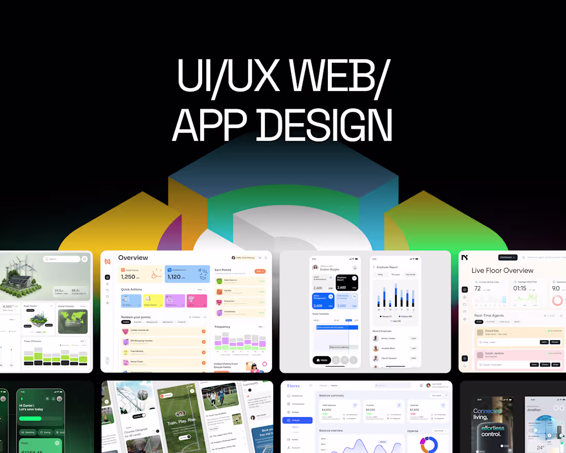
We offer innovative design services for websites, mobile apps, and web applications, focusing on enhancing user interface (UI) and user experience (UX) to drive engagement and effectiveness. What sets us apart is our collaborative approach, utilizing tools like Figma for seamless design iterations, and our commitment to understanding user needs through in-depth research. This ensures that every project not only looks stunning but also functions optimally in a competitive landscape.
What's included
Design Services for Websites, Mobile Apps, and UI/UX
We offer a comprehensive service package for new designs or redesigns of websites, mobile apps, web apps, and landing pages. Our experienced design team is dedicated to delivering visually stunning solutions that optimize user interface (UI) and user experience (UX), enhancing user engagement and overall effectiveness.
Every project follows a professional process, from researching user needs and behaviors to developing intuitive interfaces that are user-friendly and efficient. We focus not only on aesthetic appeal but also on ensuring that our final products function seamlessly, helping you stand out in a competitive market.
Let us partner with you to create a strong brand presence that captivates customers! With our expertise in tools like Figma, we’re ready to elevate your design strategy.
Deliverable of UX Design Services
User Research Findings: A summary of insights gathered from user research, including user personas, empathy maps, and key pain points identified during interviews and surveys.
User Journey Maps: Visual representations of the user’s journey through the application or website, highlighting their interactions, thoughts, and feelings at each stage. This helps in understanding the user experience from start to finish.
Information Architecture: A sitemap outlining the structure of the application or website, illustrating how different pages and features are organized and connected.
Wireframes: Low-fidelity wireframes for key screens that demonstrate the layout, navigation, and functionality of the design. These serve as blueprints for the visual design and development phases.
Prototypes: Interactive prototypes that allow stakeholders to experience the design in action. These prototypes showcase the flow and functionality of the user interface.
Usability Testing Reports: Findings and recommendations from usability testing sessions, including feedback from real users and any necessary adjustments to the design based on their experiences.
Design Specifications: Detailed guidelines for the visual design, including color palettes, typography, icons, and other UI elements that should be used in the final product. This ensures consistency across the application.
Deliverable of UI Design Services
High-Fidelity Mockups: Detailed, pixel-perfect designs of each screen that demonstrate the visual aesthetics, including colors, typography, icons, and layout. These mockups provide a clear representation of the final product.
Style Guide: A comprehensive style guide that outlines the visual identity of the application. This includes color palettes, font choices, button styles, and other design elements to ensure consistency throughout the product.
Interactive Prototypes: Clickable prototypes that simulate the user interface and interactions, allowing stakeholders to experience the flow and functionality of the design. This helps in gathering feedback before development.
Design Assets: All graphic elements needed for implementation, such as icons, images, and any custom graphics created during the design process. These assets are provided in appropriate formats for development.
Design Specifications: Detailed specifications for developers, including dimensions, spacing, and behavior of UI elements. This ensures that the development team accurately implements the design.
Responsive Design Guidelines: Guidelines on how the UI should adapt across different devices and screen sizes. This includes breakpoints and design adjustments to ensure a seamless experience on mobile, tablet, and desktop.
Collaboration Tools Access: Access to collaborative tools (such as Figma or Adobe XD) where the design files are hosted. This allows for real-time collaboration and feedback during the implementation phase.
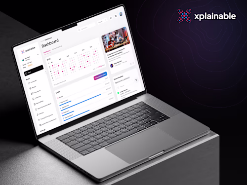
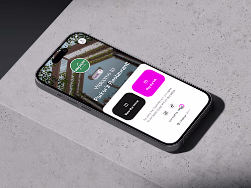
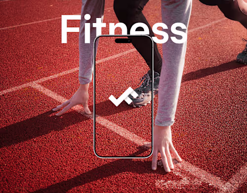
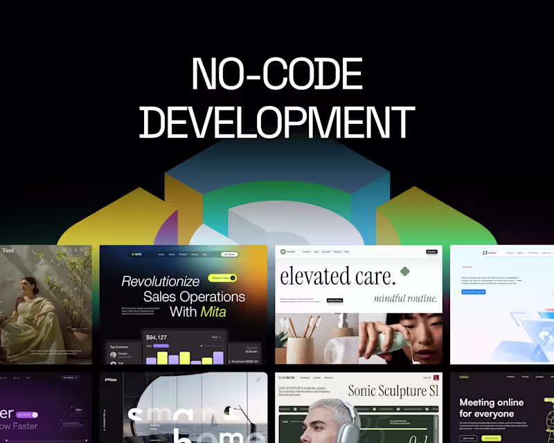
Example work
Capi's other services
Starting at$25 /hr
Tags
Figma
Sketch
UI Designer
UX Designer
Web Designer
Service provided by
Capi Product maxVietnam
- $100k+
- Earned
- 46
- Paid projects
- 4.91
- Rating
- 175
- Followers
Design Services for Websites, Mobile Apps, and UI/UXCapi Product
We offer innovative design services for websites, mobile apps, and web applications, focusing on enhancing user interface (UI) and user experience (UX) to drive engagement and effectiveness. What sets us apart is our collaborative approach, utilizing tools like Figma for seamless design iterations, and our commitment to understanding user needs through in-depth research. This ensures that every project not only looks stunning but also functions optimally in a competitive landscape.
What's included
Design Services for Websites, Mobile Apps, and UI/UX
We offer a comprehensive service package for new designs or redesigns of websites, mobile apps, web apps, and landing pages. Our experienced design team is dedicated to delivering visually stunning solutions that optimize user interface (UI) and user experience (UX), enhancing user engagement and overall effectiveness.
Every project follows a professional process, from researching user needs and behaviors to developing intuitive interfaces that are user-friendly and efficient. We focus not only on aesthetic appeal but also on ensuring that our final products function seamlessly, helping you stand out in a competitive market.
Let us partner with you to create a strong brand presence that captivates customers! With our expertise in tools like Figma, we’re ready to elevate your design strategy.
Deliverable of UX Design Services
User Research Findings: A summary of insights gathered from user research, including user personas, empathy maps, and key pain points identified during interviews and surveys.
User Journey Maps: Visual representations of the user’s journey through the application or website, highlighting their interactions, thoughts, and feelings at each stage. This helps in understanding the user experience from start to finish.
Information Architecture: A sitemap outlining the structure of the application or website, illustrating how different pages and features are organized and connected.
Wireframes: Low-fidelity wireframes for key screens that demonstrate the layout, navigation, and functionality of the design. These serve as blueprints for the visual design and development phases.
Prototypes: Interactive prototypes that allow stakeholders to experience the design in action. These prototypes showcase the flow and functionality of the user interface.
Usability Testing Reports: Findings and recommendations from usability testing sessions, including feedback from real users and any necessary adjustments to the design based on their experiences.
Design Specifications: Detailed guidelines for the visual design, including color palettes, typography, icons, and other UI elements that should be used in the final product. This ensures consistency across the application.
Deliverable of UI Design Services
High-Fidelity Mockups: Detailed, pixel-perfect designs of each screen that demonstrate the visual aesthetics, including colors, typography, icons, and layout. These mockups provide a clear representation of the final product.
Style Guide: A comprehensive style guide that outlines the visual identity of the application. This includes color palettes, font choices, button styles, and other design elements to ensure consistency throughout the product.
Interactive Prototypes: Clickable prototypes that simulate the user interface and interactions, allowing stakeholders to experience the flow and functionality of the design. This helps in gathering feedback before development.
Design Assets: All graphic elements needed for implementation, such as icons, images, and any custom graphics created during the design process. These assets are provided in appropriate formats for development.
Design Specifications: Detailed specifications for developers, including dimensions, spacing, and behavior of UI elements. This ensures that the development team accurately implements the design.
Responsive Design Guidelines: Guidelines on how the UI should adapt across different devices and screen sizes. This includes breakpoints and design adjustments to ensure a seamless experience on mobile, tablet, and desktop.
Collaboration Tools Access: Access to collaborative tools (such as Figma or Adobe XD) where the design files are hosted. This allows for real-time collaboration and feedback during the implementation phase.
Example work
Capi's other services
$25 /hr