
Premium Design BundleJan Janeczek

Your brand and product designed as one unified experience
This bundle brings together everything from the Brand and App packages. It covers visual identity, full app design, and development-ready files. A complete solution for teams that want consistency and impact from day one.
What's included
User Flow & IA Diagrams
Mapped user journeys and content structure for intuitive navigation.
Lo-fi Wireframes
Core layout and functionality in simple, low-fidelity screens.
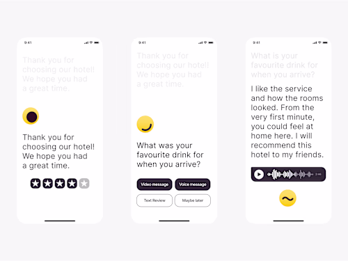
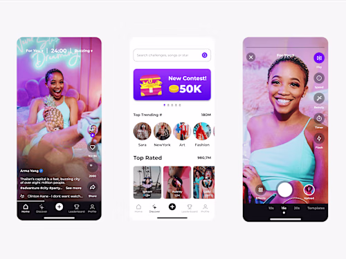
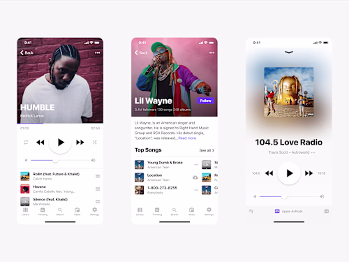
Figma App Mockups
High-fidelity designs, neatly organized by flow and fully annotated.
Component Library
Includes all UI elements, color styles, and typography for scalable design.
Developer Handoff (on request)
Assets, design specs, Framer or Webflow template and implementation notes to make development seamless.
Logo & Brand Identity
Primary and secondary logos, logo usage rules, and favicon design.
Color Palette & Typography
Harmonized styles to ensure brand recognition and visual coherence.
Visual Direction
Moodboards, imagery style, and sample brand use across key touchpoints.
Brand Guidelines
A polished reference doc to maintain consistency across platforms.
Example work
Jan's other services
Starting at$5,000
Duration4 weeks
Tags
Adobe Suite
FigJam
Figma
Framer
Webflow
Brand Designer
UI Designer
UX Designer
Service provided by
Jan Janeczek Poland
- 74
- Followers
Premium Design BundleJan Janeczek
Starting at$5,000
Duration4 weeks
Tags
Adobe Suite
FigJam
Figma
Framer
Webflow
Brand Designer
UI Designer
UX Designer
Your brand and product designed as one unified experience
This bundle brings together everything from the Brand and App packages. It covers visual identity, full app design, and development-ready files. A complete solution for teams that want consistency and impact from day one.
What's included
User Flow & IA Diagrams
Mapped user journeys and content structure for intuitive navigation.
Lo-fi Wireframes
Core layout and functionality in simple, low-fidelity screens.
Figma App Mockups
High-fidelity designs, neatly organized by flow and fully annotated.
Component Library
Includes all UI elements, color styles, and typography for scalable design.
Developer Handoff (on request)
Assets, design specs, Framer or Webflow template and implementation notes to make development seamless.
Logo & Brand Identity
Primary and secondary logos, logo usage rules, and favicon design.
Color Palette & Typography
Harmonized styles to ensure brand recognition and visual coherence.
Visual Direction
Moodboards, imagery style, and sample brand use across key touchpoints.
Brand Guidelines
A polished reference doc to maintain consistency across platforms.
Example work
Jan's other services
$5,000