
App Design BundleJan Janeczek
A complete app design system created for clarity and usability
From user flows and wireframes to polished Figma mockups and a full component library, everything is designed for a seamless user experience. Developer handoff is available to ensure smooth implementation.
What's included
Structure
User flow and Information Architecture diagrams to ensure a seamless and intuitive user experience by outlining user interactions and content organization.
Lo-fi Wireframes
That clearly outline the basic structure and layout of your app.
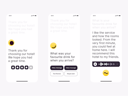
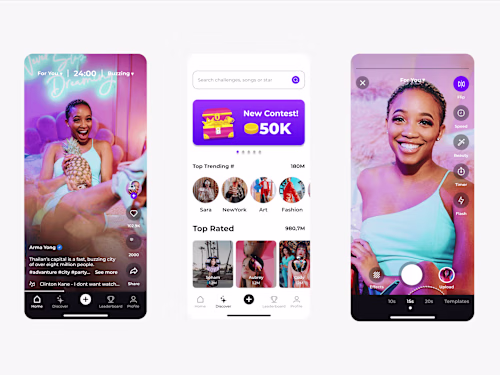
App mockups in Figma
Featuring designs, neatly annotated and organized by flows.
Component Library
Packed with Color Styles, Typography Styles, and all Components used during design, making future updates easy and maintaining design consistency.
Developer hand-off (upon request)
All necessary Assets, Guidelines, and annotations to ensure a smooth transition from design to development.
Example work
Jan's other services


Starting at$3,500
Duration4 weeks
Tags
FigJam
Figma
Framer
Mobile Designer
Product Designer
UX Designer
Service provided by
Jan Janeczek Poland
- 74
- Followers
App Design BundleJan Janeczek
Starting at$3,500
Duration4 weeks
Tags
FigJam
Figma
Framer
Mobile Designer
Product Designer
UX Designer
A complete app design system created for clarity and usability
From user flows and wireframes to polished Figma mockups and a full component library, everything is designed for a seamless user experience. Developer handoff is available to ensure smooth implementation.
What's included
Structure
User flow and Information Architecture diagrams to ensure a seamless and intuitive user experience by outlining user interactions and content organization.
Lo-fi Wireframes
That clearly outline the basic structure and layout of your app.
App mockups in Figma
Featuring designs, neatly annotated and organized by flows.
Component Library
Packed with Color Styles, Typography Styles, and all Components used during design, making future updates easy and maintaining design consistency.
Developer hand-off (upon request)
All necessary Assets, Guidelines, and annotations to ensure a smooth transition from design to development.
Example work
Jan's other services
$3,500