Design System Creation and ManagementJacob McDaniel
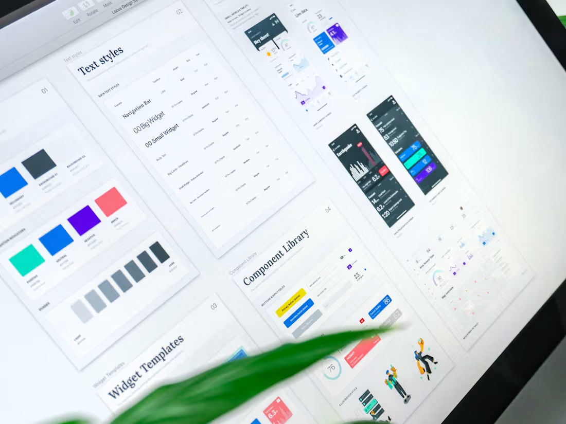
A comprehensive design system ensures consistency, scalability, and efficiency across all digital products. By creating and managing a unified system of reusable components, styles, and guidelines, we streamline collaboration between designers and developers, reduce redundancy, and enhance the overall user experience.
What's included
Discovery and Research
Description: Establishing the foundation for a design system that meets your organization's needs.
Stakeholder Interviews: Gathering input from key team members to understand goals and requirements.
Audit of Existing Assets: Analyzing current design files, components, and code libraries.
Competitor Analysis: Benchmarking design systems in your industry.
Component Library
Description: A library of reusable UI components designed for consistency and scalability.
Core Components: Buttons, inputs, forms, modals, and navigation elements.
Responsive Design: Ensuring components adapt seamlessly across devices.
State Variants: Documenting hover, active, disabled, and error states.
Visual Design Guidelines
Description: A clear and cohesive visual language for your product.
Typography System: Fonts, sizes, line heights, and usage guidelines.
Color Palette: Primary, secondary, and accent colors, with accessibility considerations.
Iconography: A consistent set of icons with usage rules.
Spacing and Layout: Grid systems, spacing scales, and alignment principles.
Interaction and Motion Guidelines
Description: Standards for micro-interactions and animations to create delightful experiences.
Animation Library: Predefined animations for transitions, loading states, and feedback.
Interaction States: Defined behaviors for clickable and focusable elements.
Documentation
Description: Comprehensive, accessible documentation for easy reference and adoption.
Style Guide: Detailing visual and interaction guidelines.
Usage Documentation: Explaining when and how to use each component.
Developer Integration Notes: Clear instructions for integrating the system into codebases.
Design Tools Integration
Description: Seamless integration with your team’s tools and workflows.
Figma Library: A centralized library of components for design teams.
Prototyping Assets: Ready-to-use assets for rapid prototyping.
Accessibility Standards
Description: Ensuring inclusivity through adherence to accessibility best practices.
WCAG Compliance Guidelines: Meeting or exceeding WCAG standards.
Accessible Components: Building components designed for screen readers and keyboard navigation.
Additional Options
Developer Handoff, Governance Model, Rollout and Adoption Plan, Post-Launch Support
Starting at$75 /hr
Tags
FigJam
Figma
Design Systems Specialist
UI Designer
UX Designer
Service provided by
Jacob McDaniel Austin, USA

Design System Creation and ManagementJacob McDaniel
A comprehensive design system ensures consistency, scalability, and efficiency across all digital products. By creating and managing a unified system of reusable components, styles, and guidelines, we streamline collaboration between designers and developers, reduce redundancy, and enhance the overall user experience.
What's included
Discovery and Research
Description: Establishing the foundation for a design system that meets your organization's needs.
Stakeholder Interviews: Gathering input from key team members to understand goals and requirements.
Audit of Existing Assets: Analyzing current design files, components, and code libraries.
Competitor Analysis: Benchmarking design systems in your industry.
Component Library
Description: A library of reusable UI components designed for consistency and scalability.
Core Components: Buttons, inputs, forms, modals, and navigation elements.
Responsive Design: Ensuring components adapt seamlessly across devices.
State Variants: Documenting hover, active, disabled, and error states.
Visual Design Guidelines
Description: A clear and cohesive visual language for your product.
Typography System: Fonts, sizes, line heights, and usage guidelines.
Color Palette: Primary, secondary, and accent colors, with accessibility considerations.
Iconography: A consistent set of icons with usage rules.
Spacing and Layout: Grid systems, spacing scales, and alignment principles.
Interaction and Motion Guidelines
Description: Standards for micro-interactions and animations to create delightful experiences.
Animation Library: Predefined animations for transitions, loading states, and feedback.
Interaction States: Defined behaviors for clickable and focusable elements.
Documentation
Description: Comprehensive, accessible documentation for easy reference and adoption.
Style Guide: Detailing visual and interaction guidelines.
Usage Documentation: Explaining when and how to use each component.
Developer Integration Notes: Clear instructions for integrating the system into codebases.
Design Tools Integration
Description: Seamless integration with your team’s tools and workflows.
Figma Library: A centralized library of components for design teams.
Prototyping Assets: Ready-to-use assets for rapid prototyping.
Accessibility Standards
Description: Ensuring inclusivity through adherence to accessibility best practices.
WCAG Compliance Guidelines: Meeting or exceeding WCAG standards.
Accessible Components: Building components designed for screen readers and keyboard navigation.
Additional Options
Developer Handoff, Governance Model, Rollout and Adoption Plan, Post-Launch Support
$75 /hr


