
Design SystemPriyanka Patel
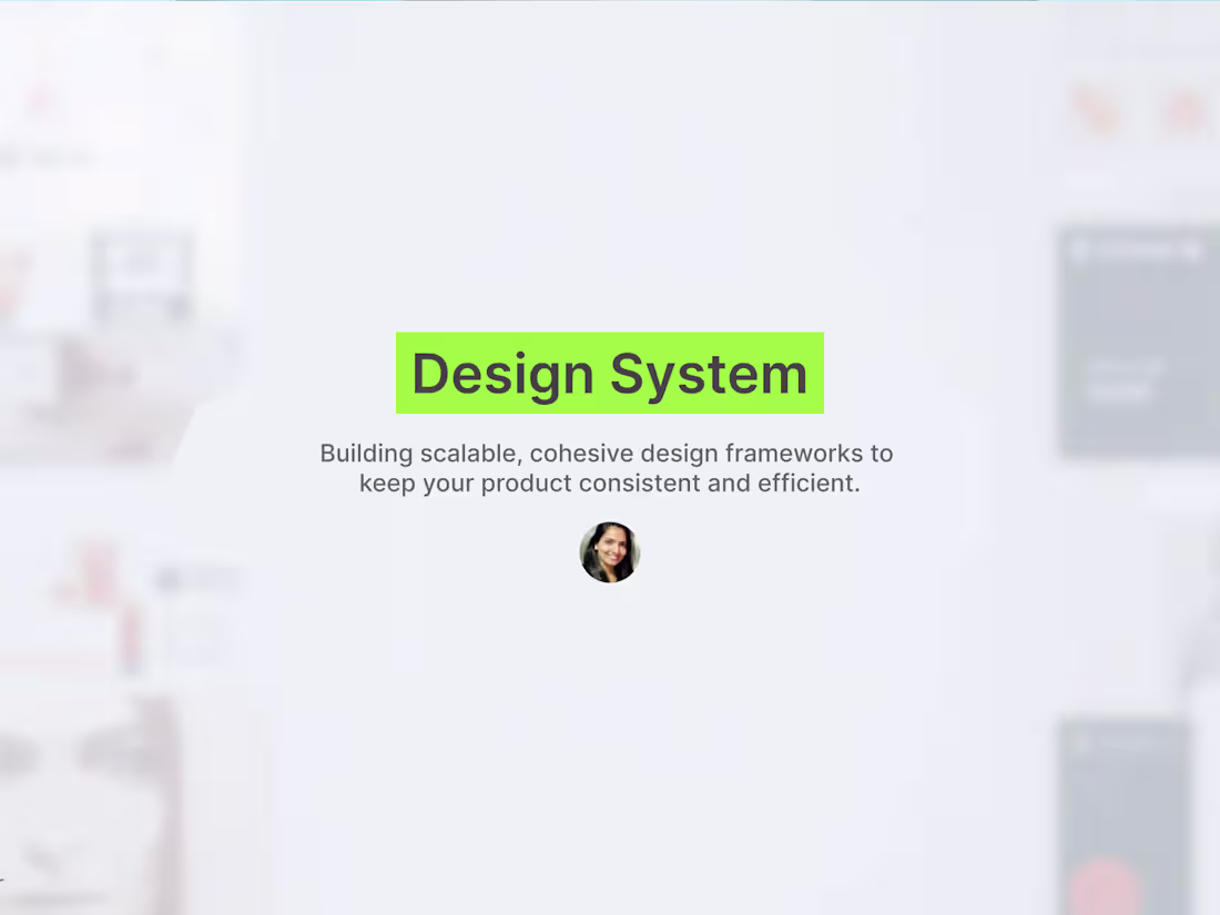
I create robust, scalable design systems that streamline product development, maintain consistency, and enhance user experience. From reusable components and typography systems to color guidelines and interaction rules, every element is designed to work together seamlessly. Whether you’re building a new product or scaling an existing one, my design systems ensure efficiency, cohesion, and a professional, polished interface across all platforms.
I also offer Design Systems built using MagicPath.
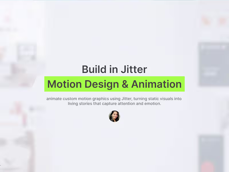
For teams who want to visualize motion and interaction directly within their system, I use MagicPath to prototype transitions, flows, and animation guidelines. It helps teams see how components behave in motion, making the system more dynamic, intuitive, and developer-friendly.
What's included
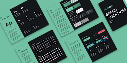
Component Library:
Reusable UI elements such as buttons, forms, cards, navigation, and interactive components for consistency across products.
Typography & Color Systems:
Defined type hierarchies and color palettes to maintain visual harmony throughout your product.
Layout & Grid Guidelines:
Standardized spacing, alignment, and layout rules for a clean and organized interface.
Interaction & Motion Guidelines:
Specifications for animations, transitions, and interactive behavior to ensure a polished user experience.
Documentation & Usage Guidelines:
A comprehensive guide explaining how to use each component, apply colors, typography, and follow accessibility best practices.
Integration Support:
Guidance for developers to implement the design system efficiently in your product.
Scalability & Updates:
Built to evolve as your product grows, allowing easy updates without breaking consistency.
FAQs

Priyanka's other services

Contact for pricing
Tags
Figma
MagicPath
Design Engineer
Design Systems Specialist
Service provided by
Priyanka Patel proSan Francisco, USA
- $1k+
- Earned
- 2
- Paid projects
- 5.00
- Rating
- 54
- Followers
Design SystemPriyanka Patel
I create robust, scalable design systems that streamline product development, maintain consistency, and enhance user experience. From reusable components and typography systems to color guidelines and interaction rules, every element is designed to work together seamlessly. Whether you’re building a new product or scaling an existing one, my design systems ensure efficiency, cohesion, and a professional, polished interface across all platforms.
I also offer Design Systems built using MagicPath.
For teams who want to visualize motion and interaction directly within their system, I use MagicPath to prototype transitions, flows, and animation guidelines. It helps teams see how components behave in motion, making the system more dynamic, intuitive, and developer-friendly.
What's included
Component Library:
Reusable UI elements such as buttons, forms, cards, navigation, and interactive components for consistency across products.
Typography & Color Systems:
Defined type hierarchies and color palettes to maintain visual harmony throughout your product.
Layout & Grid Guidelines:
Standardized spacing, alignment, and layout rules for a clean and organized interface.
Interaction & Motion Guidelines:
Specifications for animations, transitions, and interactive behavior to ensure a polished user experience.
Documentation & Usage Guidelines:
A comprehensive guide explaining how to use each component, apply colors, typography, and follow accessibility best practices.
Integration Support:
Guidance for developers to implement the design system efficiently in your product.
Scalability & Updates:
Built to evolve as your product grows, allowing easy updates without breaking consistency.
FAQs
Priyanka's other services
Contact for pricing