
Arabic-Inspired Latin Logo for MENA BrandsStéphane Gabrielli
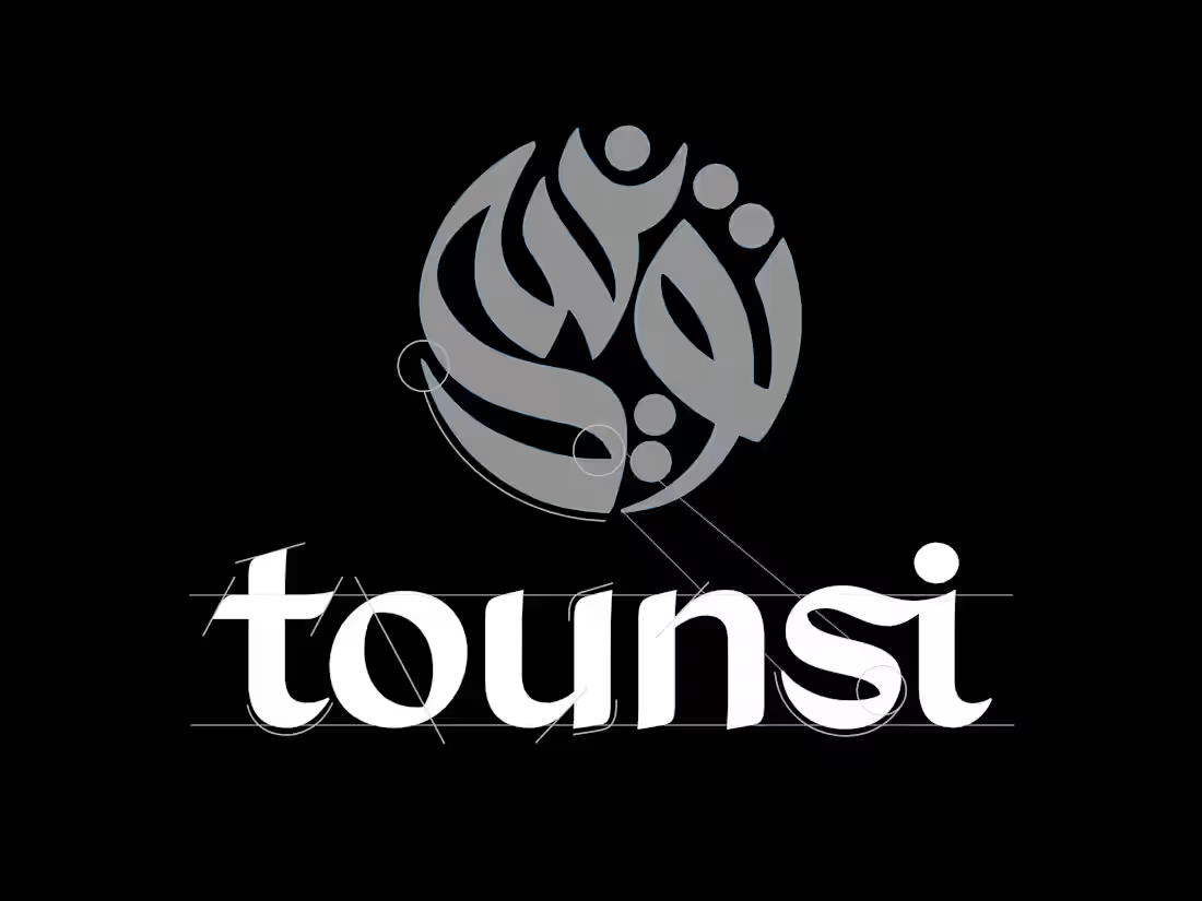
Your brand speaks Latin letters. It should feel like it belongs in the Gulf.
When a Western or international brand enters the MENA market, the logo often feels foreign. Not because of the language, but because of the visual temperature. Latin letterforms carry a European DNA: sharp angles, rigid geometry, mechanical rhythm. They can feel cold and disconnected in a region shaped by calligraphic tradition, flowing curves, and organic warmth.
The usual fix? Slap an Arabic translation underneath the Latin logo and call it bilingual. But that doesn't solve the real problem. The Latin logo itself still looks like it was designed for a different continent.
I take a different approach.
I design your logo entirely in Latin characters, but I infuse every letterform with the visual language of Arabic calligraphy. The curves borrow from Naskh fluidity. The stroke contrast echoes Thuluth elegance. The rhythm and spacing breathe with the same organic logic found in Arabic script. The result is a Latin logo that feels native to the region without pretending to be something it's not.
Already have an Arabic logo or calligraphy? Even better. If your brand already has an established Arabic identity, I use it as the design foundation and create its Latin counterpart. Same weight, same contrast, same personality, same visual DNA, transposed into Latin letterforms. This is the cleanest path for brands that already own a strong Arabic mark and want to open Western or GCC export markets with a professional, cohesive identity.
This is not decoration. It's strategic design.
Cultural resonance without translation. Your logo remains fully readable to any Latin-script audience worldwide, but it carries a visual warmth and sophistication that resonates deeply in Arabic-speaking markets. You don't need two logos. You need one that bridges both worlds.
Differentiation in a crowded market. Most international brands entering the Gulf look interchangeable: the same geometric sans-serifs, the same sterile minimalism. An Arabic-inspired Latin logo stands out immediately because it speaks the visual dialect of the region while remaining globally legible.
A clean, professional bridge to new markets. For brands based in the GCC looking to expand internationally, a Latin logo that carries the spirit of their Arabic identity is the most effective way to enter new markets without losing what makes them distinctive. No cultural disconnect. No starting from zero.
No licensing risk, no borrowed letterforms. Every letter is drawn from scratch, by hand. No existing font is used, modified, or sampled. Your logo is an original creation, legally and visually yours alone.
Authenticity that audiences feel. Consumers in the UAE, Saudi Arabia, and across the MENA region are sophisticated. They can tell when a brand has made a genuine effort to connect with their culture versus when it's just been localized on the surface. This kind of typographic sensitivity builds trust.
My process:
Cultural & strategic briefing — I study your brand, your existing Arabic identity (if you have one), your target markets, and the specific Arabic calligraphic traditions that best align with your brand's personality.
3 typographic explorations — Each direction is a fully hand-drawn Latin logo with a distinct Arabic calligraphic influence: different scripts, different rhythms, different moods. If you have an existing Arabic logo, each direction interprets its DNA into Latin letterforms.
Refinement — Based on your feedback, I fine-tune the chosen direction: weight, contrast, stroke modulation, spacing, and every micro-detail that makes the Arabic influence feel natural rather than forced.
Delivery — Production-ready vector files (AI, SVG, PDF), plus monochrome, reversed, and icon variations. Usage guide included.
Every letter drawn from nothing, every curve informed by centuries of calligraphic tradition.
FAQs
Contact for pricing
Duration1 week
Tags
Logo Designer
Arabic Typography
Custom Lettering
MENA Branding
Type Design
Service provided by
Stéphane Gabrielli Lyon, France
Arabic-Inspired Latin Logo for MENA BrandsStéphane Gabrielli
Contact for pricing
Duration1 week
Tags
Logo Designer
Arabic Typography
Custom Lettering
MENA Branding
Type Design
Your brand speaks Latin letters. It should feel like it belongs in the Gulf.
When a Western or international brand enters the MENA market, the logo often feels foreign. Not because of the language, but because of the visual temperature. Latin letterforms carry a European DNA: sharp angles, rigid geometry, mechanical rhythm. They can feel cold and disconnected in a region shaped by calligraphic tradition, flowing curves, and organic warmth.
The usual fix? Slap an Arabic translation underneath the Latin logo and call it bilingual. But that doesn't solve the real problem. The Latin logo itself still looks like it was designed for a different continent.
I take a different approach.
I design your logo entirely in Latin characters, but I infuse every letterform with the visual language of Arabic calligraphy. The curves borrow from Naskh fluidity. The stroke contrast echoes Thuluth elegance. The rhythm and spacing breathe with the same organic logic found in Arabic script. The result is a Latin logo that feels native to the region without pretending to be something it's not.
Already have an Arabic logo or calligraphy? Even better. If your brand already has an established Arabic identity, I use it as the design foundation and create its Latin counterpart. Same weight, same contrast, same personality, same visual DNA, transposed into Latin letterforms. This is the cleanest path for brands that already own a strong Arabic mark and want to open Western or GCC export markets with a professional, cohesive identity.
This is not decoration. It's strategic design.
Cultural resonance without translation. Your logo remains fully readable to any Latin-script audience worldwide, but it carries a visual warmth and sophistication that resonates deeply in Arabic-speaking markets. You don't need two logos. You need one that bridges both worlds.
Differentiation in a crowded market. Most international brands entering the Gulf look interchangeable: the same geometric sans-serifs, the same sterile minimalism. An Arabic-inspired Latin logo stands out immediately because it speaks the visual dialect of the region while remaining globally legible.
A clean, professional bridge to new markets. For brands based in the GCC looking to expand internationally, a Latin logo that carries the spirit of their Arabic identity is the most effective way to enter new markets without losing what makes them distinctive. No cultural disconnect. No starting from zero.
No licensing risk, no borrowed letterforms. Every letter is drawn from scratch, by hand. No existing font is used, modified, or sampled. Your logo is an original creation, legally and visually yours alone.
Authenticity that audiences feel. Consumers in the UAE, Saudi Arabia, and across the MENA region are sophisticated. They can tell when a brand has made a genuine effort to connect with their culture versus when it's just been localized on the surface. This kind of typographic sensitivity builds trust.
My process:
Cultural & strategic briefing — I study your brand, your existing Arabic identity (if you have one), your target markets, and the specific Arabic calligraphic traditions that best align with your brand's personality.
3 typographic explorations — Each direction is a fully hand-drawn Latin logo with a distinct Arabic calligraphic influence: different scripts, different rhythms, different moods. If you have an existing Arabic logo, each direction interprets its DNA into Latin letterforms.
Refinement — Based on your feedback, I fine-tune the chosen direction: weight, contrast, stroke modulation, spacing, and every micro-detail that makes the Arabic influence feel natural rather than forced.
Delivery — Production-ready vector files (AI, SVG, PDF), plus monochrome, reversed, and icon variations. Usage guide included.
Every letter drawn from nothing, every curve informed by centuries of calligraphic tradition.
FAQs
Contact for pricing