
Complete Brand and PackagingMarta Custic
Picture this: Your product lands on the shelf beside competitors.
Same quality. Same price point.
But to shoppers? Yours looks like it should come with a coupon.
Meanwhile, your competitor is charging 40% more for essentially the same thing because their packaging looks like it went to private school.
Here’s the hard truth: professional products with amateur packaging get amateur prices.
It’s like showing up to a job interview in Crocs. Nobody cares how qualified you are.
I fix that. Because strategic packaging doesn’t just look beautiful. It makes people want to spend money they don’t have on things they don’t need.
And honestly, isn’t that the dream?
What's included
Brand Strategy
40-page brand foundation document - your strategic roadmap before any design starts
What I figure out before touching my sketch pad:
Who you actually are (not who you think you should be)
Your ideal customer (the one who'll pay premium without flinching)
How to talk to them (voice + messaging that converts)
Market positioning (why you're worth more than competitors)
Creative direction (visual strategy for all future decisions)
Why this matters: Most designers skip straight to pretty pictures. I don't design anything until we know exactly who's buying and why they'll choose you over cheaper options.
What you get: Complete clarity on your brand positioning, messaging strategy, and visual direction. No more second-guessing design decisions or wondering if you're targeting the right people.
The result: Confident pricing, clear differentiation, and packaging that actually sells your premium positioning instead of fighting it.
Logo and brand identity
Logo family, typography, and color palette - the visual foundation that makes everything else work
What's included:
Primary logo + variations (horizontal, stacked, icon versions)
Typography system (headlines, body text, accent fonts that actually work together)
Color palette (primary, secondary, accent colors with exact specs for print/digital)
Brand guidelines (how to use everything properly so it doesn't look like shit)
Why this foundation matters: Your packaging is only as strong as the brand identity behind it. Skip this step and you get pretty packaging that feels disconnected from everything else you do.
What you get: A cohesive visual system that works across every touchpoint - from your packaging to your website to your business cards. Everything feels intentionally designed, not randomly assembled.
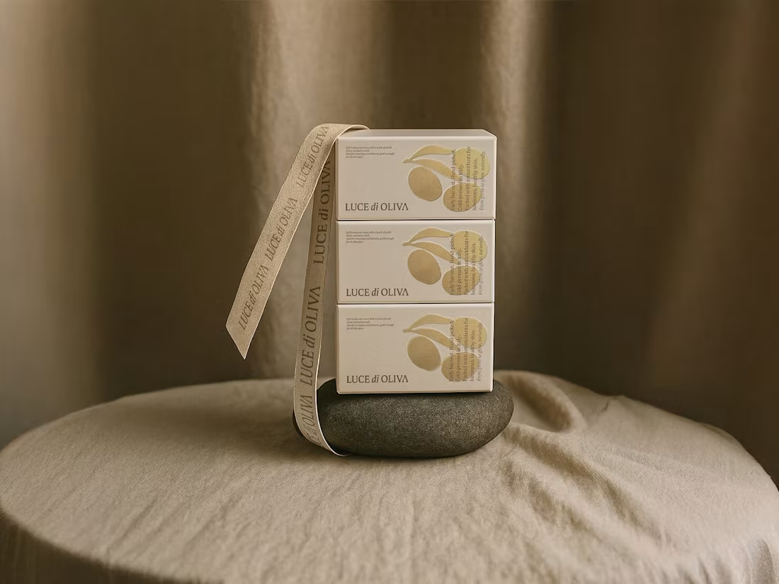
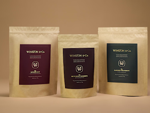
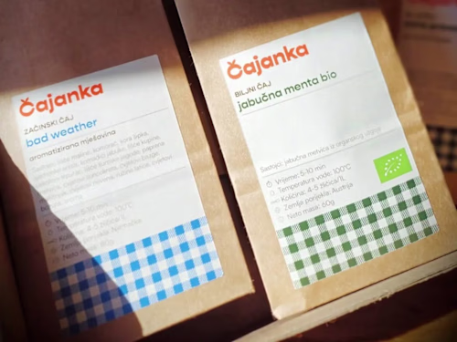
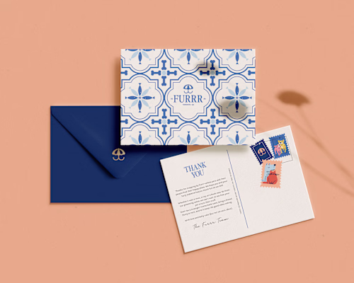
Packaging
Complete packaging ecosystem - from individual SKUs to the full unboxing experience
What's included:
Primary packaging design (labels, boxes, pouches - whatever your product needs)
Multiple SKU variations (consistent system that works across your product line)
Unboxing experience (tissue paper, stickers, thank you notes that make people want to post about it)
Marketing materials (shelf talkers, promotional cards, anything that supports sales)
Production-ready files (print specs, dielines, color guides - everything your printer needs)
The full experience: Your customer's journey doesn't end at purchase. From the moment they see your product on the shelf to opening it at home, every touchpoint reinforces why they made the right choice paying premium.
What you get: Packaging that doesn't just protect your product - it elevates the entire brand experience and justifies your pricing without you having to explain why you're worth it.
Add ons
Brand extensions - because your packaging is just the beginning
Available extras:
Social media templates (Instagram stories, posts, highlight covers that match your brand)
Email templates (newsletters, product launches, campaigns that look intentional)
Marketing collateral (business cards, flyers, shelf talkers, promotional materials)
Large format (billboards, signage, trade show displays for when you go big)
Digital applications (website headers, social ads, anything your marketing team dreams up)
Why add-ons matter: Your brand doesn't live in a vacuum. Every touchpoint either reinforces your premium positioning or undermines it. These extensions ensure everything you put out there looks like it came from the same strategic brain - yours.
The goal: Complete brand consistency across every single thing your customers see, from your Instagram feed to that billboard on the highway. No mixed messages, no "did the intern design this?" moments.
Guidelines
The rulebook - so anyone who touches your brand doesn't mess it up
What's included:
Logo usage (do's, don'ts, minimum sizes, clear space requirements)
Typography rules (which fonts for what, hierarchy, never-ever combinations)
Color specifications (exact hex codes, CMYK, Pantone - for every application)
Voice and tone (how to sound like your brand, not like everyone else)
Photography style (lighting, composition, filters that reinforce your positioning)
Application examples (real-world usage across different materials and contexts)
Why this matters: You're not always going to be the one implementing your brand. Printers, web developers, marketing assistants, that freelancer you hire next year - they all need to know how to handle your brand without accidentally making it look cheap.
What you get: A comprehensive guide that protects your investment. Anyone who comes in contact with your brand knows exactly how to maintain the premium positioning you paid for.
Example work
Marta's other services

Contact for pricing
Tags
Adobe Illustrator
Adobe InDesign
Adobe Photoshop
Canva
Brand Strategist
Logo Designer
Packaging Designer
Service provided by
Marta Custic proCroatia
- $25k+
- Earned
- 17
- Paid projects
- 5.00
- Rating
- 526
- Followers
Complete Brand and PackagingMarta Custic
Contact for pricing
Tags
Adobe Illustrator
Adobe InDesign
Adobe Photoshop
Canva
Brand Strategist
Logo Designer
Packaging Designer
Picture this: Your product lands on the shelf beside competitors.
Same quality. Same price point.
But to shoppers? Yours looks like it should come with a coupon.
Meanwhile, your competitor is charging 40% more for essentially the same thing because their packaging looks like it went to private school.
Here’s the hard truth: professional products with amateur packaging get amateur prices.
It’s like showing up to a job interview in Crocs. Nobody cares how qualified you are.
I fix that. Because strategic packaging doesn’t just look beautiful. It makes people want to spend money they don’t have on things they don’t need.
And honestly, isn’t that the dream?
What's included
Brand Strategy
40-page brand foundation document - your strategic roadmap before any design starts
What I figure out before touching my sketch pad:
Who you actually are (not who you think you should be)
Your ideal customer (the one who'll pay premium without flinching)
How to talk to them (voice + messaging that converts)
Market positioning (why you're worth more than competitors)
Creative direction (visual strategy for all future decisions)
Why this matters: Most designers skip straight to pretty pictures. I don't design anything until we know exactly who's buying and why they'll choose you over cheaper options.
What you get: Complete clarity on your brand positioning, messaging strategy, and visual direction. No more second-guessing design decisions or wondering if you're targeting the right people.
The result: Confident pricing, clear differentiation, and packaging that actually sells your premium positioning instead of fighting it.
Logo and brand identity
Logo family, typography, and color palette - the visual foundation that makes everything else work
What's included:
Primary logo + variations (horizontal, stacked, icon versions)
Typography system (headlines, body text, accent fonts that actually work together)
Color palette (primary, secondary, accent colors with exact specs for print/digital)
Brand guidelines (how to use everything properly so it doesn't look like shit)
Why this foundation matters: Your packaging is only as strong as the brand identity behind it. Skip this step and you get pretty packaging that feels disconnected from everything else you do.
What you get: A cohesive visual system that works across every touchpoint - from your packaging to your website to your business cards. Everything feels intentionally designed, not randomly assembled.
Packaging
Complete packaging ecosystem - from individual SKUs to the full unboxing experience
What's included:
Primary packaging design (labels, boxes, pouches - whatever your product needs)
Multiple SKU variations (consistent system that works across your product line)
Unboxing experience (tissue paper, stickers, thank you notes that make people want to post about it)
Marketing materials (shelf talkers, promotional cards, anything that supports sales)
Production-ready files (print specs, dielines, color guides - everything your printer needs)
The full experience: Your customer's journey doesn't end at purchase. From the moment they see your product on the shelf to opening it at home, every touchpoint reinforces why they made the right choice paying premium.
What you get: Packaging that doesn't just protect your product - it elevates the entire brand experience and justifies your pricing without you having to explain why you're worth it.
Add ons
Brand extensions - because your packaging is just the beginning
Available extras:
Social media templates (Instagram stories, posts, highlight covers that match your brand)
Email templates (newsletters, product launches, campaigns that look intentional)
Marketing collateral (business cards, flyers, shelf talkers, promotional materials)
Large format (billboards, signage, trade show displays for when you go big)
Digital applications (website headers, social ads, anything your marketing team dreams up)
Why add-ons matter: Your brand doesn't live in a vacuum. Every touchpoint either reinforces your premium positioning or undermines it. These extensions ensure everything you put out there looks like it came from the same strategic brain - yours.
The goal: Complete brand consistency across every single thing your customers see, from your Instagram feed to that billboard on the highway. No mixed messages, no "did the intern design this?" moments.
Guidelines
The rulebook - so anyone who touches your brand doesn't mess it up
What's included:
Logo usage (do's, don'ts, minimum sizes, clear space requirements)
Typography rules (which fonts for what, hierarchy, never-ever combinations)
Color specifications (exact hex codes, CMYK, Pantone - for every application)
Voice and tone (how to sound like your brand, not like everyone else)
Photography style (lighting, composition, filters that reinforce your positioning)
Application examples (real-world usage across different materials and contexts)
Why this matters: You're not always going to be the one implementing your brand. Printers, web developers, marketing assistants, that freelancer you hire next year - they all need to know how to handle your brand without accidentally making it look cheap.
What you get: A comprehensive guide that protects your investment. Anyone who comes in contact with your brand knows exactly how to maintain the premium positioning you paid for.
Example work
Marta's other services
Contact for pricing