
Mobile App UI/UX Design in FigmaUthman Akinsawe
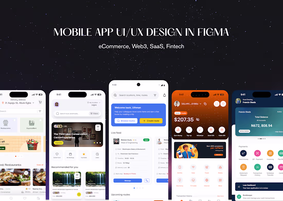
I design mobile apps that feel simple for users and clear for developers. Together, we’ll clarify the problem, map end‑to‑end flows, and turn them into clean, modern UI in Figma. You’ll get a clickable prototype, a small but scalable design system, and a dev‑ready file, plus collaboration during implementation so the final build matches the vision.
What's included
User Research Snapshot
Lightweight discovery to understand your users and context (quick calls, surveys, or reviewing existing data), summarized into key insights that guide every design decision.
User Flows & Low‑Fidelity Wireframes
Clear end‑to‑end flows showing how users move through the app, plus simple wireframes that define structure and interactions before we invest in visuals.
High‑Fidelity Mobile UI Screens
Polished screen designs in Figma for all key journeys, using your brand (or a new visual direction) so the app feels modern, consistent, and ready to show stakeholders or investors.
Interactive Figma Prototype
A clickable prototype that simulates real usage for core flows (onboarding, main task, checkout, etc.), great for testing with users and aligning the team before development.
Design System & Components
A lightweight design system with colors, typography, spacing, and reusable components (buttons, inputs, cards, nav, etc.) so new screens can be added without reinventing patterns.
Responsive/Adaptive Behavior
Guidance on how layouts and components adapt across common device sizes and orientations, so your app feels intentional whether it’s on a small Android or a large iPhone.
Accessibility Considerations
Baseline accessibility baked into the design: color contrast, touch targets, typography choices, and content patterns that work better for a wider range of users.
Developer‑ready Figma file
Clean, organized Figma file with components, styles, and clear naming, so engineers don’t waste time guessing spacing, states, or which variant to use where.
Handoff Notes & Collaboration
Short annotations, specs, and Loom/meet walkthroughs as needed, plus direct collaboration with your devs during implementation to keep the build aligned with the design.
FAQs
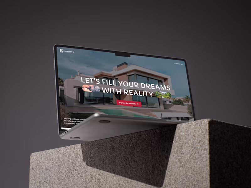
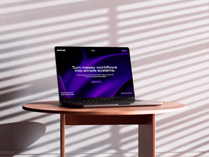
Example work

Starting at$1,899.99
Duration4 weeks
Tags
Figma
LottieFiles
Notion
Relume
Slack
Interaction Designer
Mobile Designer
UI Designer
Service provided by
Uthman Akinsawe Lagos, Nigeria
- 5.00
- Rating
- 11
- Followers
Mobile App UI/UX Design in FigmaUthman Akinsawe
Starting at$1,899.99
Duration4 weeks
Tags
Figma
LottieFiles
Notion
Relume
Slack
Interaction Designer
Mobile Designer
UI Designer
I design mobile apps that feel simple for users and clear for developers. Together, we’ll clarify the problem, map end‑to‑end flows, and turn them into clean, modern UI in Figma. You’ll get a clickable prototype, a small but scalable design system, and a dev‑ready file, plus collaboration during implementation so the final build matches the vision.
What's included
User Research Snapshot
Lightweight discovery to understand your users and context (quick calls, surveys, or reviewing existing data), summarized into key insights that guide every design decision.
User Flows & Low‑Fidelity Wireframes
Clear end‑to‑end flows showing how users move through the app, plus simple wireframes that define structure and interactions before we invest in visuals.
High‑Fidelity Mobile UI Screens
Polished screen designs in Figma for all key journeys, using your brand (or a new visual direction) so the app feels modern, consistent, and ready to show stakeholders or investors.
Interactive Figma Prototype
A clickable prototype that simulates real usage for core flows (onboarding, main task, checkout, etc.), great for testing with users and aligning the team before development.
Design System & Components
A lightweight design system with colors, typography, spacing, and reusable components (buttons, inputs, cards, nav, etc.) so new screens can be added without reinventing patterns.
Responsive/Adaptive Behavior
Guidance on how layouts and components adapt across common device sizes and orientations, so your app feels intentional whether it’s on a small Android or a large iPhone.
Accessibility Considerations
Baseline accessibility baked into the design: color contrast, touch targets, typography choices, and content patterns that work better for a wider range of users.
Developer‑ready Figma file
Clean, organized Figma file with components, styles, and clear naming, so engineers don’t waste time guessing spacing, states, or which variant to use where.
Handoff Notes & Collaboration
Short annotations, specs, and Loom/meet walkthroughs as needed, plus direct collaboration with your devs during implementation to keep the build aligned with the design.
FAQs
Example work
$1,899.99