
Interactive Mobile Application | UX/UI DesignVictor Churchill
Crafting Intuitive, Visually Stunning Mobile Experiences (iOS & Android)
What's included
User Research & Design Rationale Documentation
This deliverable provides in-depth insights from user studies and a detailed account of the evolution of design. It clarifies user behaviours, pain points, and motivations while explaining the logic behind key design choices. Documenting this journey promotes openness and ensures solutions remain anchored in a user-focused approach while meeting project goals.
Wireframe Blueprints
These skeletal layouts map the app’s structure, content hierarchy, and core interactions. As a visual framework, they establish a user-friendly experience by organizing elements logically and prioritizing usability early in the design phase.
Low-Fidelity Prototypes
Simplified interactive models of the app are created to demonstrate basic workflows and screen relationships. These prototypes focus on functionality over aesthetics, enabling rapid testing of navigation patterns and user journeys. Early feedback from these drafts informs adjustments before investing in detailed design.
User Testing Reports
A methodical account of usability tests, including goals, participant demographics, task scenarios, and observed behaviours. This report pinpoints successes and friction points, translating raw feedback into actionable insights to refine the app’s usability and alignment with user expectations.
Visual Design Mockups
High-fidelity static screens depict the app’s polished aesthetic, including finalized colours, fonts, imagery, and spacing. These visuals offer a pixel-perfect interface preview, ensuring brand consistency and serving as a reference for developers to translate design into code.
High-Fidelity Prototypes
High-Fidelity Prototypes
Interactive, near-final prototypes simulate the app’s look, feel, and functionality. These realistic simulations allow stakeholders to experience nuanced interactions, animations, and transitions, ensuring seamless user flows before development begins.
Custom Visual Assets
A suite of tailored graphical components
Custom Illustrations
Unique artwork reflecting brand personality and enhancing storytelling.
Optimized Imagery
Crisp, licensed, or original photos/res graphics tailored for digital use.
UI Component Library
Buttons, icons, and micro-interactions are designed for consistency and accessibility.
Design Handoff Package
A consolidated resource bundle for development:
Final Documentation
A holistic archive of research findings, design decisions, and user feedback.
Compact Design System
A streamlined style guide covering colours, typography, components, and usage rules to maintain coherence across features and future updates.
Post-Launch Support (Bonus)
Post-release assistance to resolve unforeseen issues, implement minor tweaks, or adapt designs based on real-world usage. Offers sustained guidance to ensure the app evolves with user needs and technical requirements.
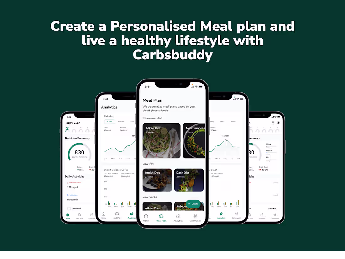
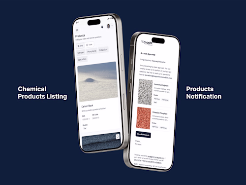
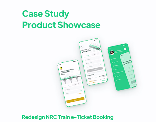
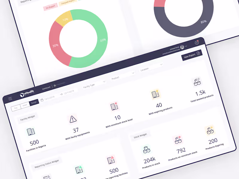
Example work

Victor 's other services
Contact for pricing
Tags
Adobe Illustrator
Figma
Jitter
ProtoPie
Sketch
Mobile Designer
Product Designer
UX Designer
Service provided by
Victor Churchill London, UK
- 1
- Followers
Interactive Mobile Application | UX/UI DesignVictor Churchill
Contact for pricing
Tags
Adobe Illustrator
Figma
Jitter
ProtoPie
Sketch
Mobile Designer
Product Designer
UX Designer
Crafting Intuitive, Visually Stunning Mobile Experiences (iOS & Android)
What's included
User Research & Design Rationale Documentation
This deliverable provides in-depth insights from user studies and a detailed account of the evolution of design. It clarifies user behaviours, pain points, and motivations while explaining the logic behind key design choices. Documenting this journey promotes openness and ensures solutions remain anchored in a user-focused approach while meeting project goals.
Wireframe Blueprints
These skeletal layouts map the app’s structure, content hierarchy, and core interactions. As a visual framework, they establish a user-friendly experience by organizing elements logically and prioritizing usability early in the design phase.
Low-Fidelity Prototypes
Simplified interactive models of the app are created to demonstrate basic workflows and screen relationships. These prototypes focus on functionality over aesthetics, enabling rapid testing of navigation patterns and user journeys. Early feedback from these drafts informs adjustments before investing in detailed design.
User Testing Reports
A methodical account of usability tests, including goals, participant demographics, task scenarios, and observed behaviours. This report pinpoints successes and friction points, translating raw feedback into actionable insights to refine the app’s usability and alignment with user expectations.
Visual Design Mockups
High-fidelity static screens depict the app’s polished aesthetic, including finalized colours, fonts, imagery, and spacing. These visuals offer a pixel-perfect interface preview, ensuring brand consistency and serving as a reference for developers to translate design into code.
High-Fidelity Prototypes
High-Fidelity Prototypes
Interactive, near-final prototypes simulate the app’s look, feel, and functionality. These realistic simulations allow stakeholders to experience nuanced interactions, animations, and transitions, ensuring seamless user flows before development begins.
Custom Visual Assets
A suite of tailored graphical components
Custom Illustrations
Unique artwork reflecting brand personality and enhancing storytelling.
Optimized Imagery
Crisp, licensed, or original photos/res graphics tailored for digital use.
UI Component Library
Buttons, icons, and micro-interactions are designed for consistency and accessibility.
Design Handoff Package
A consolidated resource bundle for development:
Final Documentation
A holistic archive of research findings, design decisions, and user feedback.
Compact Design System
A streamlined style guide covering colours, typography, components, and usage rules to maintain coherence across features and future updates.
Post-Launch Support (Bonus)
Post-release assistance to resolve unforeseen issues, implement minor tweaks, or adapt designs based on real-world usage. Offers sustained guidance to ensure the app evolves with user needs and technical requirements.
Example work
Victor 's other services
Contact for pricing