
Responsive Website & UX/UI DesignVictor Churchill
I specialise in crafting intuitive, visually stunning websites that adapt flawlessly to every screen size; mobile, tablet, or desktop. By the time we wrap up, you’ll have everything you need to bring your vision to life. Here’s how we’ll work together:
What's included
User Research & Thought Process Documentation
I start by understanding your users, what they need, how they think, and what drives their decisions. This phase includes thorough research, insights, and a documented thought process that guides every design decision. It ensures your website is built with user needs at its core, making every interaction intentional and impactful.
Wireframes for Different Screen Sizes (Mobile, Tablet & Desktop)
Before diving into visuals, I map out the structure. Wireframes lay the foundation, showing how content, layout, and functionality will adapt seamlessly across mobile, tablet, and desktop. This ensures a smooth and responsive experience for every user, no matter their device.
Low-Fidelity Prototypes
These early-stage prototypes simplify your website's view across different screen sizes. They help visualize the user journey, test fundamental interactions, and refine key flows before moving into detailed design, saving time and ensuring the right direction.
User Testing & Documentation
I test the design with real users to see how they interact with it, uncover pain points, and gather valuable feedback. The findings are documented, highlighting what works and needs improvement, ensuring an optimized experience before development.
Mockups for Different Screens
Bringing the design to life, I create polished mockups that showcase your website across all devices. Every page, whether it’s the homepage, contact form, or product page, is designed with consistency, accessibility, and brand alignment in mind.
High-Fidelity Prototypes for Different Screen Sizes
These interactive, near-final versions of your website mimic the real experience, complete with animations, transitions, and functionality. They allow testing, validation, and refinements before development, ensuring every detail is right.
Custom Illustrations, High-Resolution Images & UI Elements
To make your website truly stand out, I provide custom visuals tailored to your brand:
Custom Illustrations – Unique graphics that enhance your messaging.
High-Resolution Images – Optimised visuals for a clean, professional look.
Custom UI Elements – Thoughtfully designed buttons, icons, and interactive components for a cohesive user experience.
Final Documentation & Small-Scale Design System
I compile everything you need for a smooth handoff and future scalability:
Final Documentation – A detailed breakdown of design choices, research insights, and rationale.
Mini Design System – A lightweight guide covering colours, typography, and UI components, ensuring consistency across all future updates.
Bonus: Post-Launch Support
Your success doesn’t stop at launch; I provide ongoing support for any tweaks, technical issues, or design refinements, ensuring your website continues to deliver the best user experience.
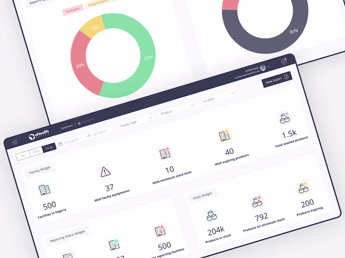
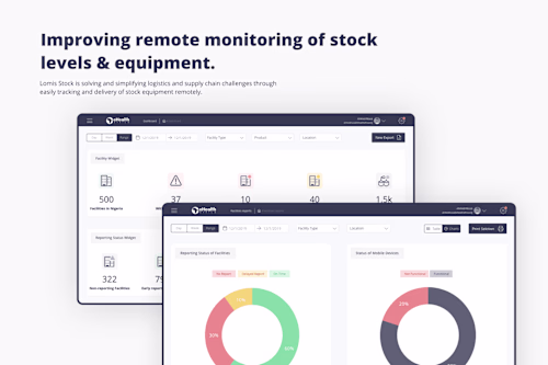
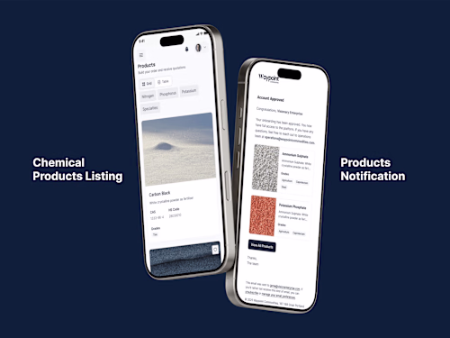
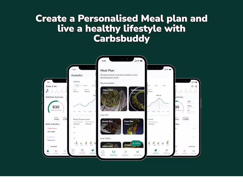
Example work
Victor 's other services
Contact for pricing
Tags
Elementor
Figma
Framer
Webflow
WordPress
Interaction Designer
UX Designer
Web Developer
Service provided by
Victor Churchill London, UK
- 1
- Followers
Responsive Website & UX/UI DesignVictor Churchill
Contact for pricing
Tags
Elementor
Figma
Framer
Webflow
WordPress
Interaction Designer
UX Designer
Web Developer
I specialise in crafting intuitive, visually stunning websites that adapt flawlessly to every screen size; mobile, tablet, or desktop. By the time we wrap up, you’ll have everything you need to bring your vision to life. Here’s how we’ll work together:
What's included
User Research & Thought Process Documentation
I start by understanding your users, what they need, how they think, and what drives their decisions. This phase includes thorough research, insights, and a documented thought process that guides every design decision. It ensures your website is built with user needs at its core, making every interaction intentional and impactful.
Wireframes for Different Screen Sizes (Mobile, Tablet & Desktop)
Before diving into visuals, I map out the structure. Wireframes lay the foundation, showing how content, layout, and functionality will adapt seamlessly across mobile, tablet, and desktop. This ensures a smooth and responsive experience for every user, no matter their device.
Low-Fidelity Prototypes
These early-stage prototypes simplify your website's view across different screen sizes. They help visualize the user journey, test fundamental interactions, and refine key flows before moving into detailed design, saving time and ensuring the right direction.
User Testing & Documentation
I test the design with real users to see how they interact with it, uncover pain points, and gather valuable feedback. The findings are documented, highlighting what works and needs improvement, ensuring an optimized experience before development.
Mockups for Different Screens
Bringing the design to life, I create polished mockups that showcase your website across all devices. Every page, whether it’s the homepage, contact form, or product page, is designed with consistency, accessibility, and brand alignment in mind.
High-Fidelity Prototypes for Different Screen Sizes
These interactive, near-final versions of your website mimic the real experience, complete with animations, transitions, and functionality. They allow testing, validation, and refinements before development, ensuring every detail is right.
Custom Illustrations, High-Resolution Images & UI Elements
To make your website truly stand out, I provide custom visuals tailored to your brand:
Custom Illustrations – Unique graphics that enhance your messaging.
High-Resolution Images – Optimised visuals for a clean, professional look.
Custom UI Elements – Thoughtfully designed buttons, icons, and interactive components for a cohesive user experience.
Final Documentation & Small-Scale Design System
I compile everything you need for a smooth handoff and future scalability:
Final Documentation – A detailed breakdown of design choices, research insights, and rationale.
Mini Design System – A lightweight guide covering colours, typography, and UI components, ensuring consistency across all future updates.
Bonus: Post-Launch Support
Your success doesn’t stop at launch; I provide ongoing support for any tweaks, technical issues, or design refinements, ensuring your website continues to deliver the best user experience.
Example work
Victor 's other services
Contact for pricing