
Design System Management

Contact for pricing
About this service
Summary
What's included
Design System Documentation
A detailed file that presents all atomic and component structure in a logical and development oriented approach. The file will include all the visual styles, components, variants and use cases for all UX back by solid design principles. This will include typography styles and uses, color schemes, grid systems, and general application guidelines to maintain consistency when applying to UX flows and implementation.
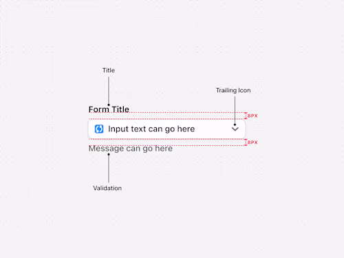
Components
Derived from the project or products you have, i can create and organise all reusable components, this can include buttons, input fields, toggles, dropdowns, filters , and navigation elements. Each component is documented to show its various states, accessibility and usage examples. The architecture of each component as well its its development props are also provided if required.
Prototypes & Example Usage
An interactive prototype that demonstrates how design system components are implemented into real UI as well as how they interact when being engaged. The prototype behaves as a functional guide for all stakeholders of the product such as other designers, developers, and product managers to help establish a unilateral understanding of how the system should be used.
Tokens & Styles
Building out the system using tokens by assigned colours semantical to their functions and creating distinct and logical naming conventions to ensure consistency across your product. Tokens are beneficial because they allow for: Scalability – Easily update design elements across multiple platforms. Consistency – Ensures a unified look and feel. Theming Support – Enables dark mode, brand variations, or accessibility adjustments. Developer-Friendly – Works well with code by integrating directly into CSS variables or token management tools like Style Dictionary.
Skills and tools
Design Systems Specialist
Product Designer
UX Designer

Figma