
Identify what is holding your users and boost your conversionsJessie Fournie
A comprehensive UX audit to understand what is holding your users back, identify areas for improvement, and enhance the clarity of your product.
Every screen, every interaction, every word is analysed using a professional evaluation grid based on Nielsen's heuristics and our experience in product design.
The result: a clear, prioritised report accompanied by visual recommendations ready to be implemented.
No fluff. Just clarity, consistency, and concrete solutions.
Ideal for: Startups, SaaS, and digital products looking to improve their user experience before a redesign or new release.
What's included
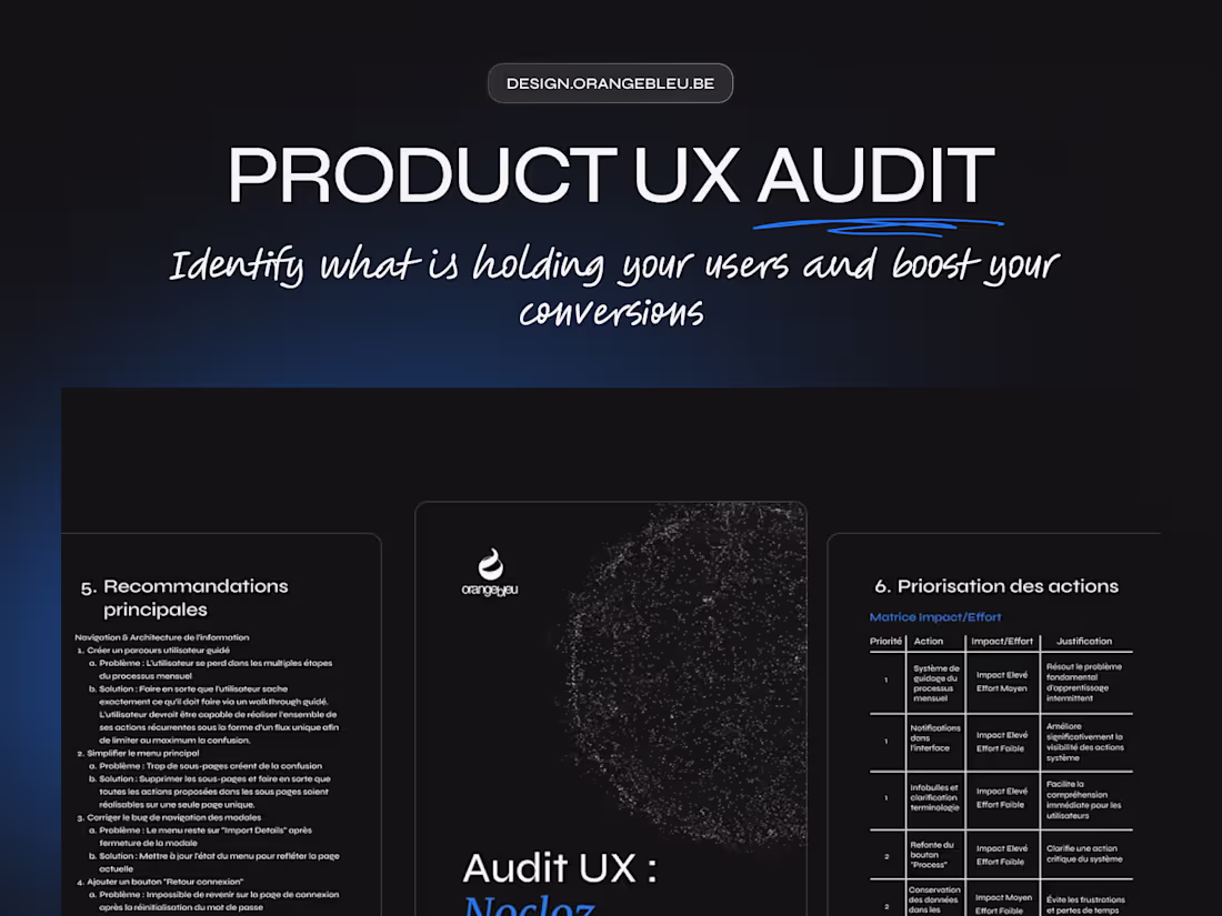
Audit Report
A structured document summarising all findings:
- Analysis of key paths and navigation
- Identification of UX friction points
- Evaluation according to Nielsen's heuristics (clarity, feedback, consistency, errors, etc.)
- Notes and observations by screen or step
Advices
Each issue detected is accompanied by:
- A concrete explanation of its impact on the user experience
- A simple, prioritised solution proposal
- A severity level (minor, medium, critical)
The objective: to provide a clear, jargon-free action plan that can be directly implemented by the product or development team.
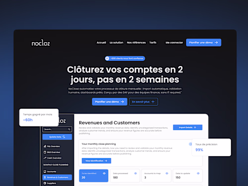
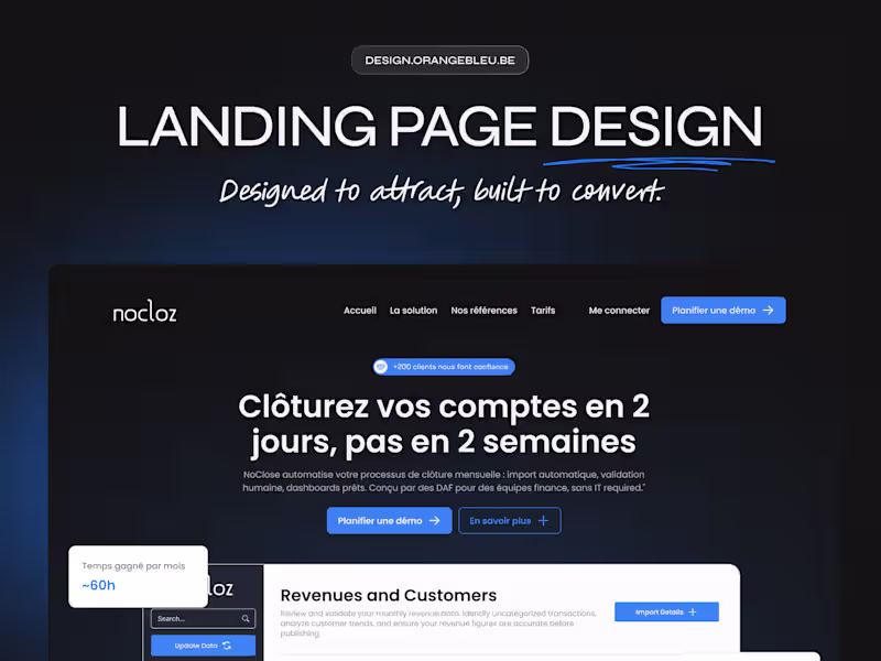
Figma Wireframes
Simplified representation (low-fi or mid-fi) of the corrected key screens.
- Redesigned content organisation.
- Improved visual hierarchy and CTAs.
- More intuitive navigation.
- Concrete example of how the recommendations were put into practice.
These wireframes serve as the basis for a future redesign or design system.
Basic Personas
2 to 3 representative profiles of your target users:
- Main objectives
- Pain points
- Context of use
These personas are used to frame recommendations without conducting a full user research study.
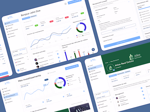
High Fidelity Wireframes (on quotation)
Interactive high fidelity wireframes representing the improved screens:
- Revised visual and logical hierarchy
- Simplified navigation and repositioned CTAs
- Integrated messages, empty states and feedback
- Optimised layout proposal (grids, sections, reusable components)
FAQs
Jessie's other services
Starting at$3,000
Duration4 weeks
Tags
Figma
Auditor
UX Designer
Service provided by
Jessie Fournie proMons, Belgium
- 28
- Followers
Identify what is holding your users and boost your conversionsJessie Fournie
A comprehensive UX audit to understand what is holding your users back, identify areas for improvement, and enhance the clarity of your product.
Every screen, every interaction, every word is analysed using a professional evaluation grid based on Nielsen's heuristics and our experience in product design.
The result: a clear, prioritised report accompanied by visual recommendations ready to be implemented.
No fluff. Just clarity, consistency, and concrete solutions.
Ideal for: Startups, SaaS, and digital products looking to improve their user experience before a redesign or new release.
What's included
Audit Report
A structured document summarising all findings:
- Analysis of key paths and navigation
- Identification of UX friction points
- Evaluation according to Nielsen's heuristics (clarity, feedback, consistency, errors, etc.)
- Notes and observations by screen or step
Advices
Each issue detected is accompanied by:
- A concrete explanation of its impact on the user experience
- A simple, prioritised solution proposal
- A severity level (minor, medium, critical)
The objective: to provide a clear, jargon-free action plan that can be directly implemented by the product or development team.
Figma Wireframes
Simplified representation (low-fi or mid-fi) of the corrected key screens.
- Redesigned content organisation.
- Improved visual hierarchy and CTAs.
- More intuitive navigation.
- Concrete example of how the recommendations were put into practice.
These wireframes serve as the basis for a future redesign or design system.
Basic Personas
2 to 3 representative profiles of your target users:
- Main objectives
- Pain points
- Context of use
These personas are used to frame recommendations without conducting a full user research study.
High Fidelity Wireframes (on quotation)
Interactive high fidelity wireframes representing the improved screens:
- Revised visual and logical hierarchy
- Simplified navigation and repositioned CTAs
- Integrated messages, empty states and feedback
- Optimised layout proposal (grids, sections, reusable components)
FAQs
Jessie's other services
$3,000