
Onboarding Flow Design: 3 to 5 ScreensElla Sh.
The three to five screens where most of your signups quietly disappear.
Who this is for. People sign up and never come back. The product is fine, but the first session asks too much before it gives anything, and nobody makes it to the moment where the value becomes obvious.
What onboarding is actually for. Not explaining features. Getting someone to the first useful outcome as fast as possible, and collecting only what is needed to make that outcome good. Every field you add before that moment costs you users, so each one has to earn its place.
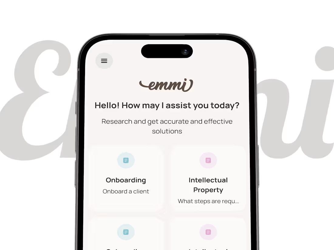
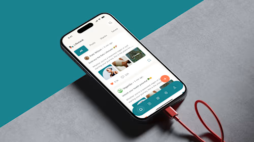
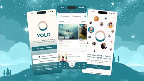
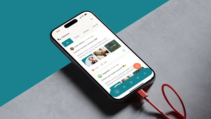
Where this comes from. In Emmi, an AI legal assistant, users start from labelled practice areas instead of an empty prompt, which removes the blank page problem and gives the model context before the first message. In Volo every screen defaults to one clear action because the users have no spare cognitive bandwidth. LifeStack was built for zero learning curve across a 30-year age range.
What you get. The full flow designed with states covered, plus the reasoning for the order, which matters more than the pixels when your team changes something later.
FAQs
Example work
Starting at$450
Duration4 days
Tags
Mobile App Design
SaaS Design
Product Designer
UI Designer
UX Designer
Service provided by
Ella Sh. Kyiv, 02000
- 5.00
- Rating
- 10
- Followers
Onboarding Flow Design: 3 to 5 ScreensElla Sh.
Starting at$450
Duration4 days
Tags
Mobile App Design
SaaS Design
Product Designer
UI Designer
UX Designer
The three to five screens where most of your signups quietly disappear.
Who this is for. People sign up and never come back. The product is fine, but the first session asks too much before it gives anything, and nobody makes it to the moment where the value becomes obvious.
What onboarding is actually for. Not explaining features. Getting someone to the first useful outcome as fast as possible, and collecting only what is needed to make that outcome good. Every field you add before that moment costs you users, so each one has to earn its place.
Where this comes from. In Emmi, an AI legal assistant, users start from labelled practice areas instead of an empty prompt, which removes the blank page problem and gives the model context before the first message. In Volo every screen defaults to one clear action because the users have no spare cognitive bandwidth. LifeStack was built for zero learning curve across a 30-year age range.
What you get. The full flow designed with states covered, plus the reasoning for the order, which matters more than the pixels when your team changes something later.
FAQs
Example work
$450