
Design Systems / UI KitsOlajuwon Oyeyipo
I help teams build consistent, scalable design systems that make product design faster and easier, from reusable components to detailed documentation. Whether you're growing a startup or streamlining an existing product, I’ll craft a system that aligns beautifully with your brand and works seamlessly for both designers and developers.
What's included
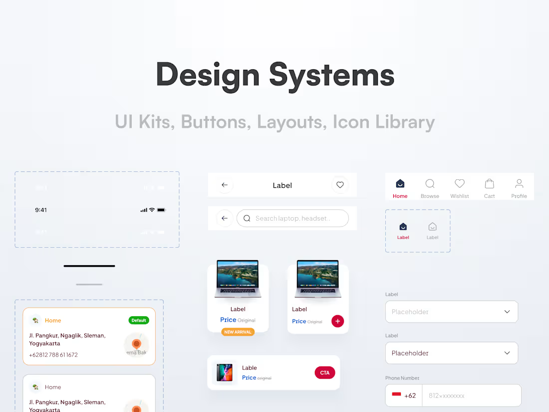
Component Library
A full set of reusable UI components (buttons, form elements, modals, cards, etc.) built in Figma, following atomic design principles.
Design Tokens
A systemized set of values (colors, typography, spacing, border radius, shadows) for consistent styling across platforms.
Typography System
Scalable font styles with hierarchy, usage examples, and accessibility considerations.
Color System
Brand, functional (error, success, info), and neutral color palettes with proper contrast and application use cases.
Layout & Spacing Guidelines
Grids, columns, spacing scales, and responsive breakpoints to maintain visual rhythm across devices.
Icon Library
A custom or curated set of icons sized, styled, and documented to match the system's tone.
Interactive States & Variants
Hover, focus, active, disabled, loading, success, and error states—documented and designed for each component.
Brand Assets Integration
Logos, imagery rules, voice elements, everything your UI needs to stay visually aligned with the brand.
Usage Documentation
A living style guide explaining how, when, and why to use each element—hosted on Notion, Zeroheight, or embedded in Figma.
Developer Handoff Kit
Organized Figma file, naming conventions, export-ready assets, token structure, and integration recommendations (for coded or no-code teams).
Two Rounds of Revisions
Structured opportunities to fine-tune the system with your feedback.
FAQs
Yes. I can either build on top of your current system, refine what's there, or help you create a fresh system that scales.
Absolutely. I create systems with collaboration in mind—clean Figma files, clear documentation, and dev-ready specs. I also offer handoff support and can loop in my dev team if needed.
Mostly Figma—paired with tools like Notion, Zeroheight, and Tokens Studio for documentation. If needed, I can also help integrate your system into Storybook or no-code platforms.
You’ll get up to 2 structured rounds of revisions. This ensures time for refinement while keeping the process smooth and focused.
I usually communicate via email and Notion for clarity, and Figma comments for design feedback. We can also schedule async Loom updates or quick calls as needed.
Yes! I offer Framer-ready versions and can assemble a dev team if you need help building or integrating the system into your product.
Starting at$500
Duration3 weeks
Tags
Figma


Notion

Storybook
Zeplin

UI Designer
UX Designer
Service provided by
Olajuwon Oyeyipo Lagos, Nigeria
Design Systems / UI KitsOlajuwon Oyeyipo
I help teams build consistent, scalable design systems that make product design faster and easier, from reusable components to detailed documentation. Whether you're growing a startup or streamlining an existing product, I’ll craft a system that aligns beautifully with your brand and works seamlessly for both designers and developers.
What's included
Component Library
A full set of reusable UI components (buttons, form elements, modals, cards, etc.) built in Figma, following atomic design principles.
Design Tokens
A systemized set of values (colors, typography, spacing, border radius, shadows) for consistent styling across platforms.
Typography System
Scalable font styles with hierarchy, usage examples, and accessibility considerations.
Color System
Brand, functional (error, success, info), and neutral color palettes with proper contrast and application use cases.
Layout & Spacing Guidelines
Grids, columns, spacing scales, and responsive breakpoints to maintain visual rhythm across devices.
Icon Library
A custom or curated set of icons sized, styled, and documented to match the system's tone.
Interactive States & Variants
Hover, focus, active, disabled, loading, success, and error states—documented and designed for each component.
Brand Assets Integration
Logos, imagery rules, voice elements, everything your UI needs to stay visually aligned with the brand.
Usage Documentation
A living style guide explaining how, when, and why to use each element—hosted on Notion, Zeroheight, or embedded in Figma.
Developer Handoff Kit
Organized Figma file, naming conventions, export-ready assets, token structure, and integration recommendations (for coded or no-code teams).
Two Rounds of Revisions
Structured opportunities to fine-tune the system with your feedback.
FAQs
Yes. I can either build on top of your current system, refine what's there, or help you create a fresh system that scales.
Absolutely. I create systems with collaboration in mind—clean Figma files, clear documentation, and dev-ready specs. I also offer handoff support and can loop in my dev team if needed.
Mostly Figma—paired with tools like Notion, Zeroheight, and Tokens Studio for documentation. If needed, I can also help integrate your system into Storybook or no-code platforms.
You’ll get up to 2 structured rounds of revisions. This ensures time for refinement while keeping the process smooth and focused.
I usually communicate via email and Notion for clarity, and Figma comments for design feedback. We can also schedule async Loom updates or quick calls as needed.
Yes! I offer Framer-ready versions and can assemble a dev team if you need help building or integrating the system into your product.
$500