
Design SystemsPamela Dodera
I build design systems that actually get used, not shelved.
Most design systems fail because they're built in isolation from the people who need them. I take a different approach: I design the system alongside real product work, so every component solves a real problem from day one.
I work in Figma for the design side and have hands-on experience with the code side too. I've built production design systems using Shadcn/UI, Tailwind CSS v4, and OKLCH color tokens. When my last team had no engineering resources for the design system, I learned the tools and shipped it myself in 14 days using AI-assisted development.
What I deliver: component libraries in Figma, token architecture (color, spacing, typography), a Storybook instance so your engineers have a living, interactive reference, and guidance on how to maintain and extend the system over time.
Deliverables
Deliverable 1: Design System Audit (if you have an existing system) A review of your current components, tokens, and patterns with a prioritized list of gaps, inconsistencies, and opportunities. Delivered as a written report with visual examples.
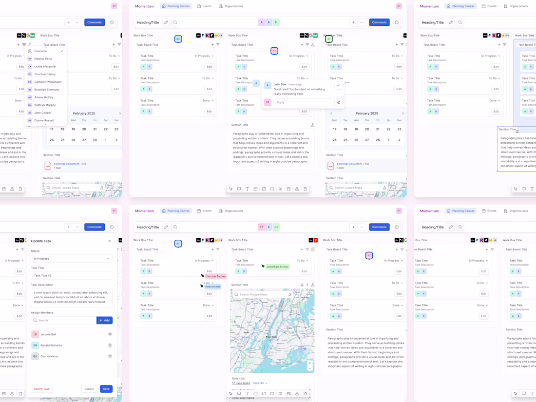
Deliverable 2: Component Library in Figma A structured, well-documented Figma library with components built using auto-layout, variants, and proper token references. Designed for your team to extend independently.
Deliverable 3: Token Architecture A complete token system covering color, typography, spacing, and elevation. Includes documentation of naming conventions and usage guidelines. Can include code-side token files (CSS custom properties or Tailwind config) if needed.
Deliverable 4: Storybook Setup A Storybook instance with your design system components built in React, so your engineering team has a browsable, interactive reference of every component, its variants, and its expected behavior. This bridges the gap between the Figma library and production code, giving developers a living spec they can inspect and build from directly.
My Process
Inventory. I audit your existing product UI (or your reference points if starting from scratch) to understand what components and patterns already exist.
Define the foundation. I establish your token system first: colors, type scale, spacing, elevation. Everything else is built on top of this.
Build iteratively. I start with the most-used components and expand outward. Each component is tested against real product screens, not just in isolation.
Document and hand off. I write usage guidelines for each component and token, so your team can maintain the system without me.
Requirements (what I need from you to start)
Access to your existing product (or designs/mockups if pre-launch)
Your brand guidelines (if any)
Clarity on your tech stack (so tokens align with your implementation)
A point of contact on the engineering side
Pricing
Typical engagements range $5,000–$10,000 depending on the size of the component library and number of platforms covered.
FAQs
Pamela's other services
Starting at$5,000
Duration4 weeks
Tags
Claude Code
Figma
React
Shadcn UI
Storybook
Tailwind CSS
Design Systems Specialist
Design Tokens
Frontend Engineer
Service provided by
Pamela Dodera proPrague, Czechia
Design SystemsPamela Dodera
Starting at$5,000
Duration4 weeks
Tags
Claude Code
Figma
React
Shadcn UI
Storybook
Tailwind CSS
Design Systems Specialist
Design Tokens
Frontend Engineer
I build design systems that actually get used, not shelved.
Most design systems fail because they're built in isolation from the people who need them. I take a different approach: I design the system alongside real product work, so every component solves a real problem from day one.
I work in Figma for the design side and have hands-on experience with the code side too. I've built production design systems using Shadcn/UI, Tailwind CSS v4, and OKLCH color tokens. When my last team had no engineering resources for the design system, I learned the tools and shipped it myself in 14 days using AI-assisted development.
What I deliver: component libraries in Figma, token architecture (color, spacing, typography), a Storybook instance so your engineers have a living, interactive reference, and guidance on how to maintain and extend the system over time.
Deliverables
Deliverable 1: Design System Audit (if you have an existing system) A review of your current components, tokens, and patterns with a prioritized list of gaps, inconsistencies, and opportunities. Delivered as a written report with visual examples.
Deliverable 2: Component Library in Figma A structured, well-documented Figma library with components built using auto-layout, variants, and proper token references. Designed for your team to extend independently.
Deliverable 3: Token Architecture A complete token system covering color, typography, spacing, and elevation. Includes documentation of naming conventions and usage guidelines. Can include code-side token files (CSS custom properties or Tailwind config) if needed.
Deliverable 4: Storybook Setup A Storybook instance with your design system components built in React, so your engineering team has a browsable, interactive reference of every component, its variants, and its expected behavior. This bridges the gap between the Figma library and production code, giving developers a living spec they can inspect and build from directly.
My Process
Inventory. I audit your existing product UI (or your reference points if starting from scratch) to understand what components and patterns already exist.
Define the foundation. I establish your token system first: colors, type scale, spacing, elevation. Everything else is built on top of this.
Build iteratively. I start with the most-used components and expand outward. Each component is tested against real product screens, not just in isolation.
Document and hand off. I write usage guidelines for each component and token, so your team can maintain the system without me.
Requirements (what I need from you to start)
Access to your existing product (or designs/mockups if pre-launch)
Your brand guidelines (if any)
Clarity on your tech stack (so tokens align with your implementation)
A point of contact on the engineering side
Pricing
Typical engagements range $5,000–$10,000 depending on the size of the component library and number of platforms covered.
FAQs
Pamela's other services
$5,000