
Branding & Web Style GuideDang Nguyen
This service is for brands that want their website and digital touch points to feel intentional, recognizable, and cohesive. You’re not just getting colors and fonts - you’re getting a. clear visual language that tells your story and speaks directly to your users without needing a lot of words. Our team is made up of award‑winning designers and a track record of highly creative web projects, the focus is on crafting a brand system that feels premium, modern, and uniquely yours.
The result is a practical, easy‑to-use style guide that your team, partners, and future collaborators can follow. It keeps every landing page, campaign, and product update on-brand, so you stand out consistently and your website feels like one clear voice instead of a mix of styles.
What's included
Brand & Audience Discovery Session
A 60–90 minute workshop to understand your brand story, values, positioning, and audience. Together, we define how you want people to feel when they interact with your brand online and what makes you different in your space.
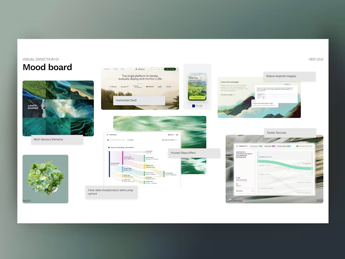
Visual Direction & Mood Exploration
1–2 visual directions (moodboards) that explore possible looks and feels—using references, textures, colors, and typography styles. You choose a direction and we refine it, so the final system is grounded in your preferences but elevated by our creative expertise.
Color System for Web
A primary and secondary palette optimized for screens, including neutrals and accent colors. Each color includes usage guidance (e.g., background, text, call-to-action, states) and accessibility considerations, so your website stays readable and consistent.
Typography System
A hierarchy that defines heading levels, body text, captions, and special styles (e.g., pull quotes, labels). You’ll see how each style should look and where to use it, making it easier to create new pages that still feel “on brand.”
Components & UI Elements
A set of core UI elements tailored for your website: buttons, links, form fields, cards, tags, badges, and simple navigation patterns. Each element includes spacing, sizing, and usage notes so designers and developers can apply them consistently.
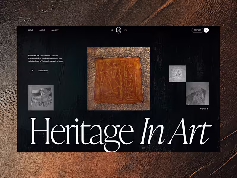
Imagery & Art Direction Guidelines
Recommendations for photography, illustration, and graphic styles that match your brand’s tone - plus examples of what fits and what doesn’t. This ensures your visuals and content all feel like they belong to the same world, even when created over time or by different people.
Interaction & Motion Principles
High-level guidance on how your brand should move on the web: hover behavior, scroll reveals, animation speed, and level of playfulness vs. restraint. This helps Webflow interactions feel intentional and branded instead of random.
Web-Ready Style Guide Document (PDF/Notion/Figma)
A polished, shareable document that pulls all guidelines together in a clear structure. It’s designed for both designers and non‑designers, so your team can quickly answer “How should this look?” without guessing.
Handoff & Walkthrough Session
A 45-60 minute walkthrough of the style guide with time for Q&A. Your team learns how to use the system in real scenarios - landing pages, campaigns, social graphics - so the guide doesn’t just sit in a folder, but actually shapes your day‑to‑day work.
FAQs
Dang's other services

Starting at$800
Duration2 weeks
Tags
Adobe Illustrator
Adobe InDesign
Adobe Photoshop
Adobe XD
Figma
Brand Designer
Brand Strategist
Digital Marketer
Service provided by
Dang Nguyen proVietnam
- $10k+
- Earned
- 5
- Paid projects
- 5.00
- Rating
- 43
- Followers
Branding & Web Style GuideDang Nguyen
Starting at$800
Duration2 weeks
Tags
Adobe Illustrator
Adobe InDesign
Adobe Photoshop
Adobe XD
Figma
Brand Designer
Brand Strategist
Digital Marketer
This service is for brands that want their website and digital touch points to feel intentional, recognizable, and cohesive. You’re not just getting colors and fonts - you’re getting a. clear visual language that tells your story and speaks directly to your users without needing a lot of words. Our team is made up of award‑winning designers and a track record of highly creative web projects, the focus is on crafting a brand system that feels premium, modern, and uniquely yours.
The result is a practical, easy‑to-use style guide that your team, partners, and future collaborators can follow. It keeps every landing page, campaign, and product update on-brand, so you stand out consistently and your website feels like one clear voice instead of a mix of styles.
What's included
Brand & Audience Discovery Session
A 60–90 minute workshop to understand your brand story, values, positioning, and audience. Together, we define how you want people to feel when they interact with your brand online and what makes you different in your space.
Visual Direction & Mood Exploration
1–2 visual directions (moodboards) that explore possible looks and feels—using references, textures, colors, and typography styles. You choose a direction and we refine it, so the final system is grounded in your preferences but elevated by our creative expertise.
Color System for Web
A primary and secondary palette optimized for screens, including neutrals and accent colors. Each color includes usage guidance (e.g., background, text, call-to-action, states) and accessibility considerations, so your website stays readable and consistent.
Typography System
A hierarchy that defines heading levels, body text, captions, and special styles (e.g., pull quotes, labels). You’ll see how each style should look and where to use it, making it easier to create new pages that still feel “on brand.”
Components & UI Elements
A set of core UI elements tailored for your website: buttons, links, form fields, cards, tags, badges, and simple navigation patterns. Each element includes spacing, sizing, and usage notes so designers and developers can apply them consistently.
Imagery & Art Direction Guidelines
Recommendations for photography, illustration, and graphic styles that match your brand’s tone - plus examples of what fits and what doesn’t. This ensures your visuals and content all feel like they belong to the same world, even when created over time or by different people.
Interaction & Motion Principles
High-level guidance on how your brand should move on the web: hover behavior, scroll reveals, animation speed, and level of playfulness vs. restraint. This helps Webflow interactions feel intentional and branded instead of random.
Web-Ready Style Guide Document (PDF/Notion/Figma)
A polished, shareable document that pulls all guidelines together in a clear structure. It’s designed for both designers and non‑designers, so your team can quickly answer “How should this look?” without guessing.
Handoff & Walkthrough Session
A 45-60 minute walkthrough of the style guide with time for Q&A. Your team learns how to use the system in real scenarios - landing pages, campaigns, social graphics - so the guide doesn’t just sit in a folder, but actually shapes your day‑to‑day work.
FAQs
Dang's other services
$800