
Strategic & Scalable Design SystemsHarsh Gogri
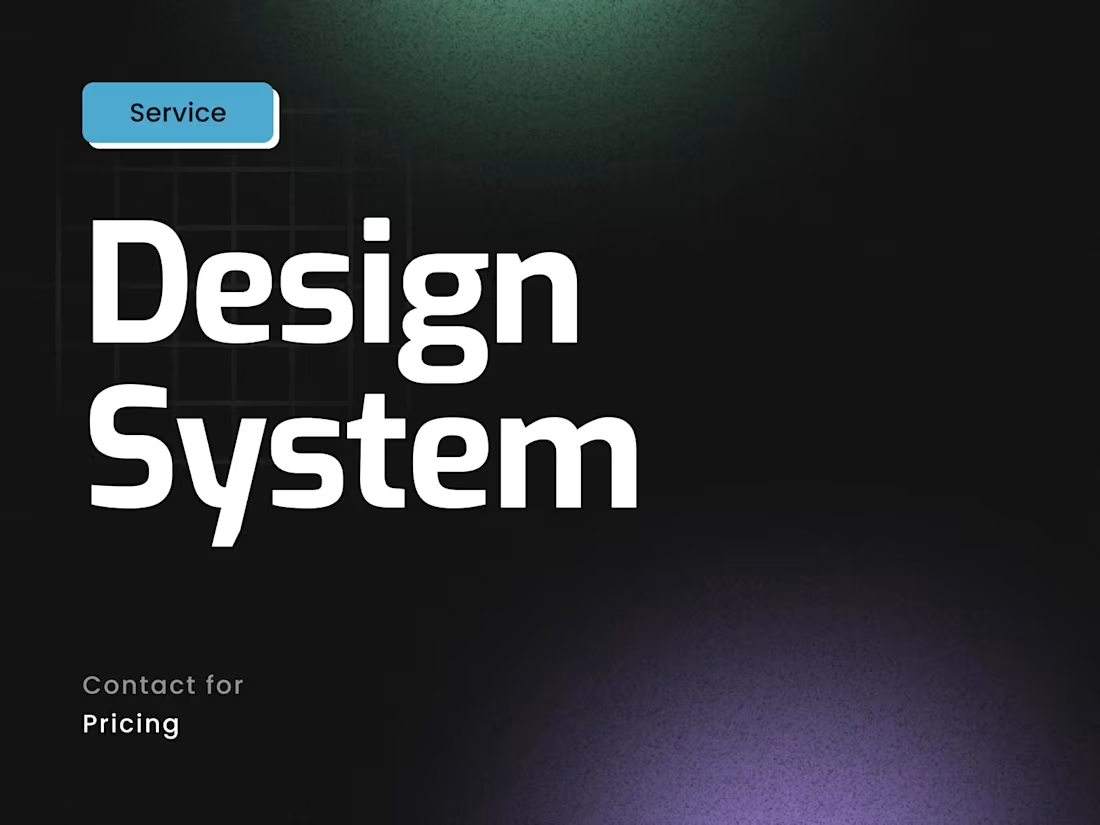
I create design-first systems that transform fragmented UIs into scalable, brand-aligned component libraries. Unlike template-based approaches, I build custom Figma systems tailored to your product's unique needs - structured for clarity, accessibility, and seamless handoff to developers or no-code tools.
Optional Webflow and Framer implementation available for clients who want design precision translated into live experiences.
What's included
Figma Design System File
A fully organized, multi-page Figma file containing your complete component library with logical layer structure, intuitive naming conventions, and easy navigation for designers and developers.
Design Tokens & Foundation System
Typography scales, color palettes, spacing systems, elevation styles, border radius values, and grid structures—all documented as reusable tokens that ensure consistency across every component.
Reusable UI Component Library
A comprehensive collection of production-ready components including buttons, form inputs, cards, navigation elements, modals, dropdowns, badges, and more - each built with variants and auto-layout for flexibility.
Component Variants & States
Multiple states for every component (default, hover, active, focused, disabled, loading, error, success) ensuring your design system handles real-world user interactions.
Responsive Behavior Documentation
Clear annotations and breakpoint specifications showing how components adapt across mobile, tablet, and desktop viewports with pixel-perfect precision.
Style Guide & Usage Guidelines
Embedded documentation within Figma explaining when and how to use each component, spacing rules, typography hierarchy, color application, and design principles.
Developer Handoff
Export-ready design specs including spacing measurements, color values (HEX/RGB), typography CSS properties, and component structure notes for seamless engineering implementation.
Accessibility Annotations
WCAG compliance notes including color contrast ratios, keyboard navigation specs, ARIA labels, focus state indicators, and screen reader considerations for inclusive design.
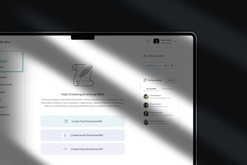
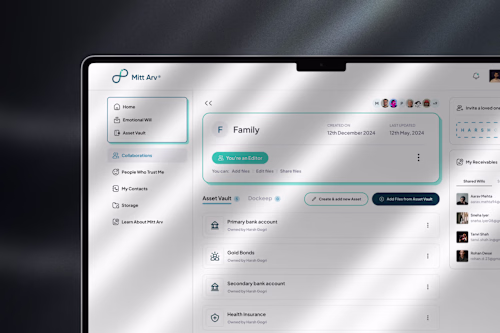
Brand Application Examples
Real-world mockups showing your components in action across common page templates, demonstrating how the system maintains brand consistency at scale.
Component Implementation in Webflow/Framer (Optional)
Your design system components translated into fully functional, production-ready elements within Webflow or Framer with pixel-perfect accuracy and clean code structure.
FAQs
Harsh's other services
Contact for pricing
Tags
Figma
Framer
Webflow
Design Systems Specialist
Product Designer
Service provided by
Harsh Gogri proMumbai, India
- 24
- Followers
Strategic & Scalable Design SystemsHarsh Gogri
I create design-first systems that transform fragmented UIs into scalable, brand-aligned component libraries. Unlike template-based approaches, I build custom Figma systems tailored to your product's unique needs - structured for clarity, accessibility, and seamless handoff to developers or no-code tools.
Optional Webflow and Framer implementation available for clients who want design precision translated into live experiences.
What's included
Figma Design System File
A fully organized, multi-page Figma file containing your complete component library with logical layer structure, intuitive naming conventions, and easy navigation for designers and developers.
Design Tokens & Foundation System
Typography scales, color palettes, spacing systems, elevation styles, border radius values, and grid structures—all documented as reusable tokens that ensure consistency across every component.
Reusable UI Component Library
A comprehensive collection of production-ready components including buttons, form inputs, cards, navigation elements, modals, dropdowns, badges, and more - each built with variants and auto-layout for flexibility.
Component Variants & States
Multiple states for every component (default, hover, active, focused, disabled, loading, error, success) ensuring your design system handles real-world user interactions.
Responsive Behavior Documentation
Clear annotations and breakpoint specifications showing how components adapt across mobile, tablet, and desktop viewports with pixel-perfect precision.
Style Guide & Usage Guidelines
Embedded documentation within Figma explaining when and how to use each component, spacing rules, typography hierarchy, color application, and design principles.
Developer Handoff
Export-ready design specs including spacing measurements, color values (HEX/RGB), typography CSS properties, and component structure notes for seamless engineering implementation.
Accessibility Annotations
WCAG compliance notes including color contrast ratios, keyboard navigation specs, ARIA labels, focus state indicators, and screen reader considerations for inclusive design.
Brand Application Examples
Real-world mockups showing your components in action across common page templates, demonstrating how the system maintains brand consistency at scale.
Component Implementation in Webflow/Framer (Optional)
Your design system components translated into fully functional, production-ready elements within Webflow or Framer with pixel-perfect accuracy and clean code structure.
FAQs
Harsh's other services
Contact for pricing