
Scalable Design System in Figma for Product TeamsMaty Sandoval
A production-ready design system that keeps your product consistent and your team shipping faster
A good design system means your team ships new features without rebuilding the same patterns from scratch or hunting through old frames. It keeps your product coherent even when several designers and developers touch it, and it should bend to your product, not the other way around.
Built for product and SaaS teams past their first version, where two or more people touch the UI.
We'll be a fit if:
Your UI has drifted: colors everywhere, one-off components, every screen feels a little different
You're about to grow the team and need a shared foundation before things get messier
You've shipped, but every new feature takes too long because there's no system to build from
You're starting fresh and want it built right from day one
What's included
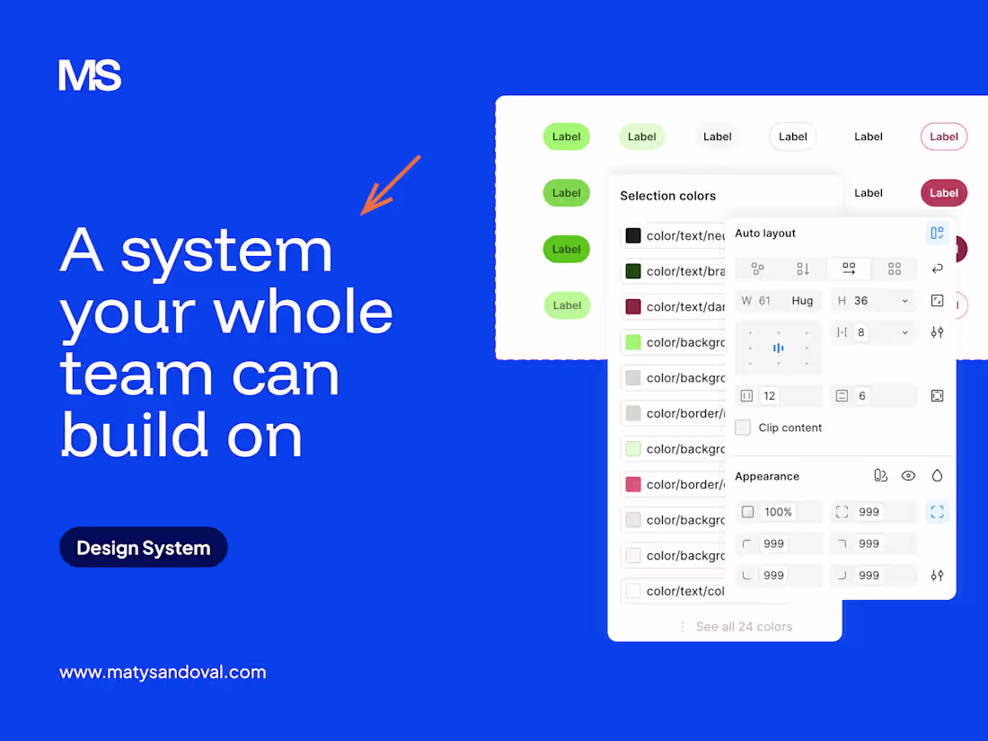
🧬 Design tokens & variables: Structured tokens for color, typography, spacing, radius, and shadows, set up as Figma variables so a single change updates the whole product.
📚 Core component library: Buttons, inputs, cards, modals, navigation, tables, forms and more, built with the variants and states your product actually needs.
🎨 Color & typography system: Semantic color and type scales with clear usage rules that hold up across light and dark, web and mobile.
🧩 Interaction & states: Hover, focus, loading, error, empty and disabled states defined per component, so nothing is left to guesswork.
📖 Usage documentation: Clear guidelines on what to use when, plus common patterns (forms, empty states, etc.) so your team actually adopts it.
🔄 Developer-ready handoff: Tokens exported in a developer-friendly format (Token Studio / W3C DTCG) so engineering picks it up without translation.
Process
Audit. I review your current UI and brand and map out the components you really need.
Foundations. We lock in tokens (color, type, spacing) and the core patterns.
Component build. I build the library with every variant and state.
Documentation. Usage guidelines written so the system gets used, not ignored.
Handoff. A walkthrough with your team and developers, plus time for questions.
Pricing & timeline
A full design system is $5,000 and runs about 3 weeks. That covers the audit, tokens, and a core library of 20–25 components (with the variants and states your product needs), full documentation, and dev-ready handoff. Bigger system? We scope it during the audit and price the difference at $1,000 per additional 8–10 components. Want ongoing updates once it's shipped? That's what my monthly design retainer covers.
FAQs
Example work

Starting at$5,000
Duration3 weeks
Tags
Figma
Design Systems Specialist
Product Designer
UI Designer
Service provided by
Maty Sandoval maxQuito, Ecuador
- $5k+
- Earned
- 2
- Paid projects
- 4.90
- Rating
- 93
- Followers
Scalable Design System in Figma for Product TeamsMaty Sandoval
Starting at$5,000
Duration3 weeks
Tags
Figma
Design Systems Specialist
Product Designer
UI Designer
A production-ready design system that keeps your product consistent and your team shipping faster
A good design system means your team ships new features without rebuilding the same patterns from scratch or hunting through old frames. It keeps your product coherent even when several designers and developers touch it, and it should bend to your product, not the other way around.
Built for product and SaaS teams past their first version, where two or more people touch the UI.
We'll be a fit if:
Your UI has drifted: colors everywhere, one-off components, every screen feels a little different
You're about to grow the team and need a shared foundation before things get messier
You've shipped, but every new feature takes too long because there's no system to build from
You're starting fresh and want it built right from day one
What's included
🧬 Design tokens & variables: Structured tokens for color, typography, spacing, radius, and shadows, set up as Figma variables so a single change updates the whole product.
📚 Core component library: Buttons, inputs, cards, modals, navigation, tables, forms and more, built with the variants and states your product actually needs.
🎨 Color & typography system: Semantic color and type scales with clear usage rules that hold up across light and dark, web and mobile.
🧩 Interaction & states: Hover, focus, loading, error, empty and disabled states defined per component, so nothing is left to guesswork.
📖 Usage documentation: Clear guidelines on what to use when, plus common patterns (forms, empty states, etc.) so your team actually adopts it.
🔄 Developer-ready handoff: Tokens exported in a developer-friendly format (Token Studio / W3C DTCG) so engineering picks it up without translation.
Process
Audit. I review your current UI and brand and map out the components you really need.
Foundations. We lock in tokens (color, type, spacing) and the core patterns.
Component build. I build the library with every variant and state.
Documentation. Usage guidelines written so the system gets used, not ignored.
Handoff. A walkthrough with your team and developers, plus time for questions.
Pricing & timeline
A full design system is $5,000 and runs about 3 weeks. That covers the audit, tokens, and a core library of 20–25 components (with the variants and states your product needs), full documentation, and dev-ready handoff. Bigger system? We scope it during the audit and price the difference at $1,000 per additional 8–10 components. Want ongoing updates once it's shipped? That's what my monthly design retainer covers.
FAQs
Example work
$5,000