
✦ Design System - Creating a UI foundation for your productGabriel Cordeiro
A well-structured design system can transform how your business builds digital products, ensuring cohesiveness and making the design process more efficient — It provides consistency across your brand and simplifies the design process, especially when working with a team.
If you're finding it hard to keep your design cohesive or want to build a strong brand recognition through a solid design foundation, I can help!
I'll create a customized library of reusable UI components in Figma, designed specifically to fit the needs of your product/service.
What's included
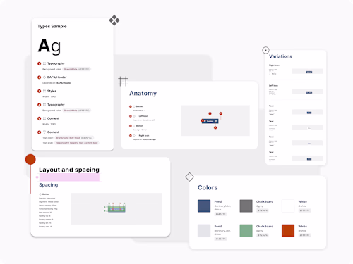
Component Library in Figma
Library of UI components created specifically for the needs of your product.
Typography System
Defined typography scales, font styles, and usage guidelines for different text elements (headings, paragraphs, captions, etc.).
Color System
A comprehensive & accessible color palette with primary, secondary, and tertiary colors, along with usage guidelines for different UI elements and states.
Design Tokens / Variables
Collection of variables for maintaining consistency in design elements such as colors, typography, spacing, and more.
Documentation and Usage Guide
Comprehensive documentation detailing how to use the design system, including examples and best practices.
Interaction Patterns
Documentation of interaction guidelines for each component + playground area.
Design Patterns
Collection of common design patterns – layout examples: essential screens like login/signup, etc.
Example work


Contact for pricing
Tags
Figma
Zeplin
Design Systems Specialist
Product Designer
UX Designer
Service provided by
Gabriel Cordeiro Huntsville, USA
✦ Design System - Creating a UI foundation for your productGabriel Cordeiro
Contact for pricing
Tags
Figma
Zeplin
Design Systems Specialist
Product Designer
UX Designer
A well-structured design system can transform how your business builds digital products, ensuring cohesiveness and making the design process more efficient — It provides consistency across your brand and simplifies the design process, especially when working with a team.
If you're finding it hard to keep your design cohesive or want to build a strong brand recognition through a solid design foundation, I can help!
I'll create a customized library of reusable UI components in Figma, designed specifically to fit the needs of your product/service.
What's included
Component Library in Figma
Library of UI components created specifically for the needs of your product.
Typography System
Defined typography scales, font styles, and usage guidelines for different text elements (headings, paragraphs, captions, etc.).
Color System
A comprehensive & accessible color palette with primary, secondary, and tertiary colors, along with usage guidelines for different UI elements and states.
Design Tokens / Variables
Collection of variables for maintaining consistency in design elements such as colors, typography, spacing, and more.
Documentation and Usage Guide
Comprehensive documentation detailing how to use the design system, including examples and best practices.
Interaction Patterns
Documentation of interaction guidelines for each component + playground area.
Design Patterns
Collection of common design patterns – layout examples: essential screens like login/signup, etc.
Example work
Contact for pricing