
Rohit Gangwar
Associate Director - Design | ASO & App Marketing Design | 1
New to Contra
Rohit is building their profile!


We created these App Store screenshots with a clear focus on communicating Zumba’s value within seconds. The visual system combines bold headlines, vibrant brand colors, real workout imagery, and strategically placed app UI to create a strong narrative—from discovering on-demand workouts and personalized goals to finding in-person classes and tracking progress. Each screenshot was designed to highlight a specific user benefit while maintaining a consistent visual flow across the entire gallery. The optimized messaging and engaging visuals helped make the app’s value proposition much clearer to users, contributing to a 600% increase in installs and significantly improving the overall performance of the App Store presence.
0
9
App Store Creative Design Service — Why I Designed This
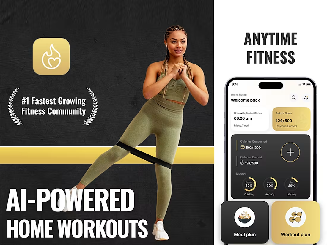
This App Store creative was designed to showcase the app’s core value proposition within seconds while creating a strong, premium fitness identity.
Why this design approach?
Communicate the main benefit instantly The headline “AI-Powered Home Workouts” immediately tells users what the app does and highlights AI as a key differentiator.
Combine lifestyle + product UI The fitness model creates an emotional connection with the target audience, while the smartphone UI provides tangible proof of the app experience.
Highlight the AI-powered experience The AI messaging positions the product as a modern, technology-driven fitness solution rather than just another workout app.
Create a strong fitness visual identity The dark textured background, yellow accent, bold typography and athletic imagery create a high-energy gym/fitness aesthetic that is consistent with the category.
Showcase the app experience The phone screen highlights important features such as:
Calories consumed
Calories burned
Macro tracking
Meal plans
Workout plans
Daily fitness goals This allows users to understand the product functionality without relying on lengthy descriptions.
Establish credibility The “#1 Fastest Growing Fitness Community” statement and badge-style treatment are designed to create a sense of community and social proof, assuming this claim is supported by the product's evidence. Design Philosophy Show the experience, don't just describe the features.
The composition intentionally balances three elements:
Emotion → Fitness lifestyle imagery
Function → App UI and feature visualization
Conversion → Bold benefit-focused messaging
The goal is to make the screenshot feel less like a traditional product interface presentation and more like a high-impact fitness campaign, while still making the actual app experience clearly visible.
App Store Design Service Description
App Store Screenshot Design
I design conversion-focused App Store screenshots that combine strong visual storytelling, clear messaging and authentic product UI to communicate an app's value within seconds.
My process includes:
App & competitor research
Feature and USP analysis
Screenshot storytelling strategy
Headline & messaging development
Custom visual direction
UI presentation and mockups
Lifestyle imagery & creative composition
Consistent visual system across the screenshot set
iOS & Android screenshot adaptation
A/B testing creative variations
Final App Store-ready exports The objective is simple: turn your app's features into a visual story that users can understand quickly and remember.
#appstorescreenshot
1
1
43
App Store Creative Design Service — Why I Designed This
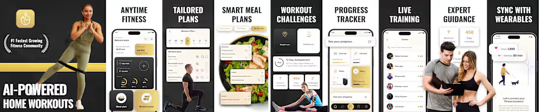
This App Store creative was designed to showcase the app’s core value proposition within seconds while creating a strong, premium fitness identity.
Why this design approach?
Communicate the main benefit instantly The headline “AI-Powered Home Workouts” immediately tells users what the app does and highlights AI as a key differentiator.
Combine lifestyle + product UI The fitness model creates an emotional connection with the target audience, while the smartphone UI provides tangible proof of the app experience.
Highlight the AI-powered experience The AI messaging positions the product as a modern, technology-driven fitness solution rather than just another workout app.
Create a strong fitness visual identity The dark textured background, yellow accent, bold typography and athletic imagery create a high-energy gym/fitness aesthetic that is consistent with the category.
Showcase the app experience The phone screen highlights important features such as:
Calories consumed
Calories burned
Macro tracking
Meal plans
Workout plans
Daily fitness goals This allows users to understand the product functionality without relying on lengthy descriptions.
Establish credibility The “#1 Fastest Growing Fitness Community” statement and badge-style treatment are designed to create a sense of community and social proof, assuming this claim is supported by the product's evidence. Design Philosophy Show the experience, don't just describe the features.
The composition intentionally balances three elements:
Emotion → Fitness lifestyle imagery
Function → App UI and feature visualization
Conversion → Bold benefit-focused messaging
The goal is to make the screenshot feel less like a traditional product interface presentation and more like a high-impact fitness campaign, while still making the actual app experience clearly visible.
App Store Design Service Description
App Store Screenshot Design
I design conversion-focused App Store screenshots that combine strong visual storytelling, clear messaging and authentic product UI to communicate an app's value within seconds.
My process includes:
App & competitor research
Feature and USP analysis
Screenshot storytelling strategy
Headline & messaging development
Custom visual direction
UI presentation and mockups
Lifestyle imagery & creative composition
Consistent visual system across the screenshot set
iOS & Android screenshot adaptation
A/B testing creative variations
Final App Store-ready exports The objective is simple: turn your app's features into a visual story that users can understand quickly and remember.
0
20
1. Project Overview
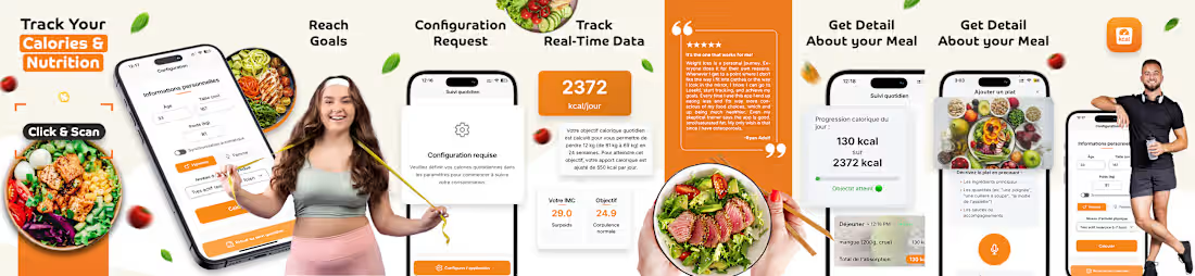
The supplied artwork is a wide App Store screenshot composition for a calorie and nutrition tracking application. The creative combines product UI, food photography, lifestyle imagery, data cards and short benefit-led headlines. The overall strategy is to communicate the app's core value through a sequence of practical user outcomes rather than describing features in isolation.
2. Creative Strategy
The screenshot set follows a feature-to-benefit storytelling approach. Each frame should answer one simple question: What can the user accomplish with the app? The visual system then uses the phone UI as evidence and lifestyle/food imagery to make the benefit immediately relatable.
0
44